Wanted to share a bit of the process of building Selection Colors, a little @figmadesign feature I feel rather (maybe strangely) proud of.
(This was originally meant to be a blog post, but the Covid-19 situation is sapping my energy…)
Marcin Wichary
14 April 2020 / 70 tweets / 45 images
Designing Selection Colors
This is an archive of a Twitter thread from 2020. I have since deleted my Twitter account.
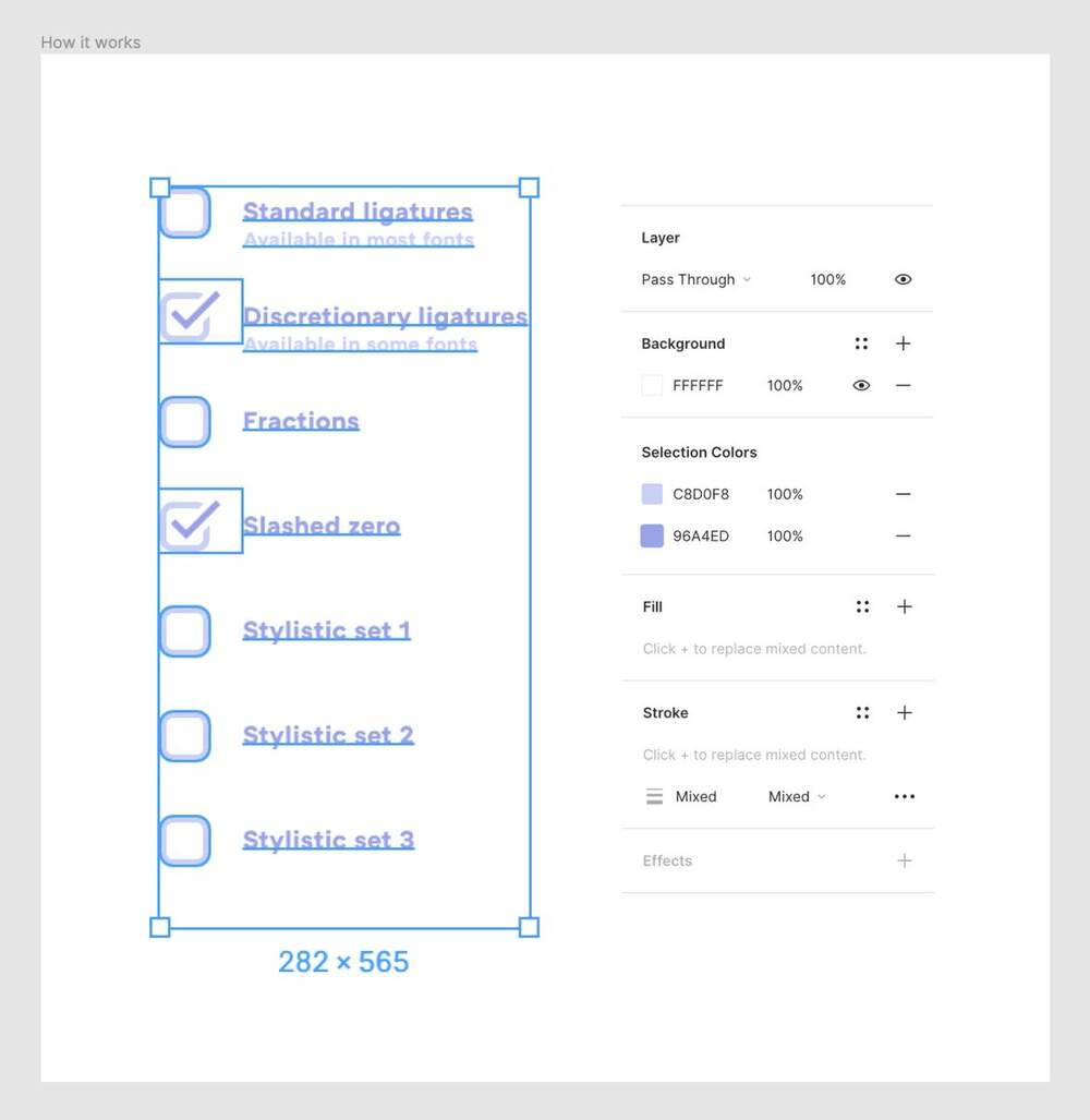
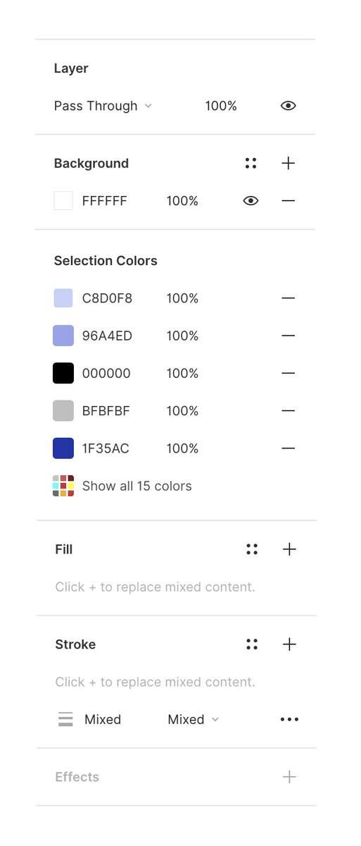
Selection Colors allows you to see all the colors and styles in your selection, no matter how far deep they reach. It’s meant to help with quickly changing palettes, promoting colors to styles, cleaning up your design system, and dealing with multiple colors in text.
This is my original (simple) pitch for Selection Colors. I talked to the design team, received some encouragement, and filed it away in a stash of ideas whose time is possibly to come.

(I also got immediate feedback that the last part – “removing” a colour and presumably replacing it with a closest surviving one, to clean up the list – was just confusing.)
I honestly didn’t think a lot more about it at that point. It was one of the many explorations that designers throw around.
But in the weeks and months after, I kept thinking about how nice it’d be to have something like it.
But in the weeks and months after, I kept thinking about how nice it’d be to have something like it.
Some months later, @SickingJ (an engineer on the editor team) approached me, proposing working on something together during Figma’s maker week. We both realized we wanted to build something more real rather than exploratory, and chose SC from a bunch of ideas.

For a few days, we plopped both of our computers and monitors at the same desk, and worked on this together. Jonas did more back-end work, and me front-end UI wiring, with a big overlap in the middle – and a lot of conversations.
We didn’t have all of it figured out; we approached this by trying to build a prototype and answer all the design questions as we went along.
SC felt like the kind of project where you don’t learn that much by thinking ahead, but you can get very far by thinking *while making*.
SC felt like the kind of project where you don’t learn that much by thinking ahead, but you can get very far by thinking *while making*.
Jumping to coding at this moment can be unnerving, as you can learn hard things that might make you revisit the whole idea. But we hoped the velocity of building would force us to come up with answers quicker.
There was another hope: Figma is complicated on the inside, and thinking of every edge case and contingency ahead of time can be suffocating.
But as you start building, the system itself can help you out, and make design decisions *for you* – the engineering wiring and the way UI was originally put together can offer solutions, too. (Some of the scary edge and corner cases will Just Work.)
As Jonas was teaching the front-end and back-end to talk to each other, I explored the design in more details.


The initial attempts to wire things together didn’t go well 🤪, but eventually we got it running.
(You might also notice the code name Spartacus, which is my stupid inside joke – I try to have a project codenamed Spartacus at every place I work. I think this is the fourth one?)
Anyway! As we dove deeper, we started peeling off more interesting challenges. Here are some decisions we discovered we needed to make.
Should we fuse or keep separate the same colour with different transparencies? (We went with keeping them separate.)


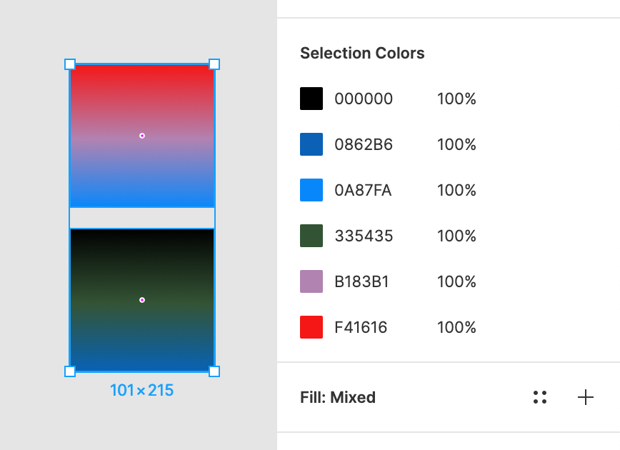
What do we do with gradients? (We decided to grab the individual colours from gradients and treat them as if they were independent.)
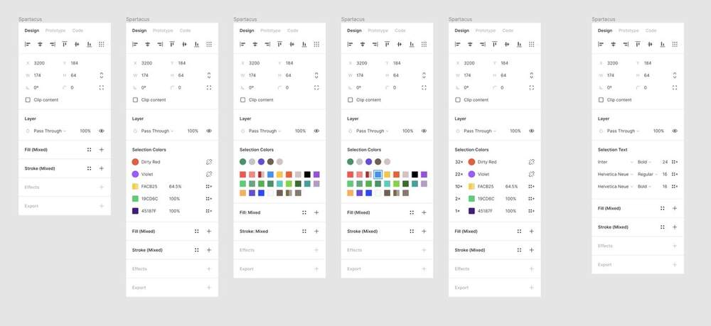
How do we sort styles and colours? I knew sorting colours in one axis is its own area of science (there is a different story here how I learned it the hard way) – but fortunately, we already had that solved in Document Colors.
We also decided to hide colours from hidden layers, masks (but not masked objects), layout grids, and effects like shadows. They all seemed to exist in unrelated – or inconsequential – universes and would just pollute this space.

Of course, we also had to decide on where to put SC itself, how often it should trigger (too often = overwhelming, not often enough = undiscoverable), and what was our overflow strategy.
But those were the easier questions. Here’s one that was hard.
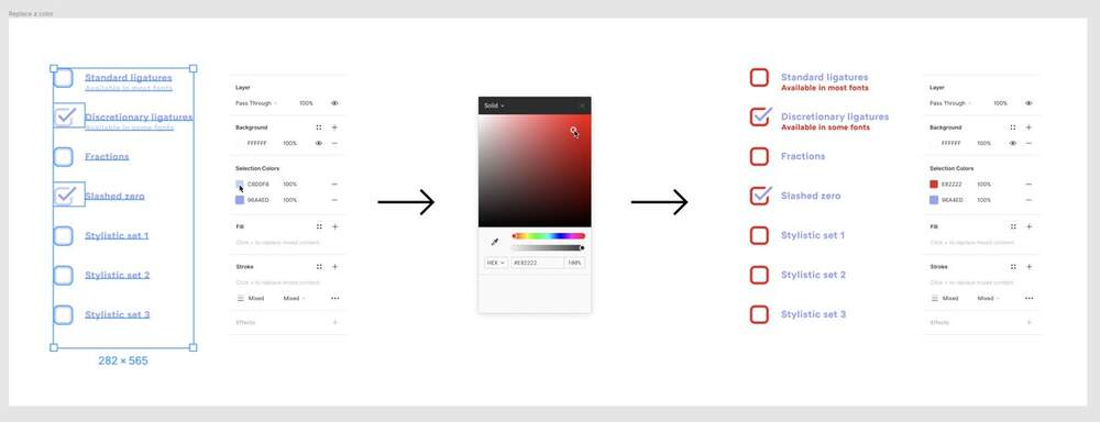
Let’s say you change this colour to an already existing colour, #FFC700. What should happen?
Let’s say you change this colour to an already existing colour, #FFC700. What should happen?
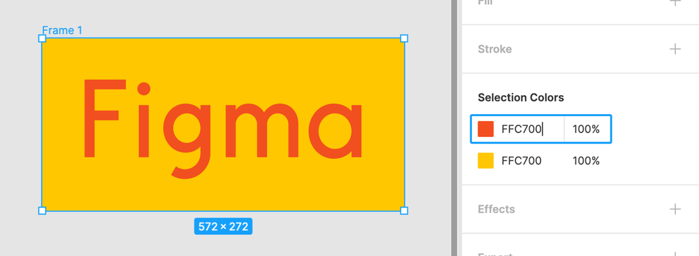
How about now?

In other words: Should a duplicate colour be immediately fused with an existing colour, or should it stay separate (but identical)?
You can make arguments for both: first when you’re cleaning up, but second when you want for two colours to trade positions.
You can make arguments for both: first when you’re cleaning up, but second when you want for two colours to trade positions.
This wasn’t just a hard design decision. The engineering consequences of this were even more daunting; just like Auto Layout, this pushed on the very fabric of Figma, which by its nature wants to reflect things immediately, and to everyone via multiplayer.
We really wanted to make it possible to trade two colours directly, because otherwise you would have to go through this unnatural and error-prone sequence:
c = a
a = b
b = c
c = a
a = b
b = c
The solution was to “freeze” the list when the colour picker was open. Only the moment you closed it, the list would get cleaned up again. (We hoped that people would figure it out.)
I’m vastly oversimplifying what “freezing” was (and honestly, not sure I fully understand it myself). But @SickingJ got it to work, and this enabled trading/swapping colours.
It required quite a bit of thinking and experimenting, though – see a bit of a doc that I wrote out just for the two of us to process this.

We also had to solve a problem of stopping aggressive sorting. Left to its own devices, it was unnerving when your color moved up and down as you were changing it.
(This is an earlier exploration where this exact thing happened.)
(This is an earlier exploration where this exact thing happened.)
We also had to solve a problem of you dragging a colour through existing colours – by default, they would automatically get fused together *as you were dragging*, which was logical… but confusing and destructive!
At the same time, we had to think about multiplayer. What if someone else changed the colour during any of the above – even in the middle of your drag? Or deleted the objects? Or edited the text you were changing?
We continued cobbling together the prototype with code we were increasingly sure wouldn’t ever make it to production. If you‘re curious, here are all our commits. (I actually became a better engineer thanks to this process – thanks, @SickingJ!)


Then we brought the prototype back to crit, and we learned a lot once again.
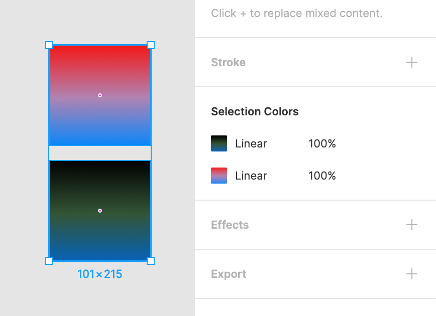
Mostly, our decision to decouple gradient colours was wrong – that’s just not how others thought about gradients.


Second of all, it was annoying that you could select and go deeper into a stack of colours, but not have a way to easily get back.
There were also smaller things. My overflow icons were confusing (one looked like a checkbox), and our triggering was off.
(That was a tricky one, too. Imagine you have just one object with the same Fill and Stroke – should SC show up, or would it be too much?)
(That was a tricky one, too. Imagine you have just one object with the same Fill and Stroke – should SC show up, or would it be too much?)

We decided to build Selection Colors for real a few months later, motivated partly by… Auto Layout. We were planning to change the frames to have fills, and that ruined an existing feature where you could easily colorize an icon just by selecting a parent frame.
I had nothing to do with code any more, save for an occasional UI fix or an icon swap. The real work was done by engineers on our team – @jessieteaa, @thejoannachen, @kenrickrilee.
Immediately, they found some more real-life problems, one of them being performance.
(Long story short: If you make a really large selection, we don’t show SC by default, because the list can get overwhelming, and the interactions quite slow.)
(Long story short: If you make a really large selection, we don’t show SC by default, because the list can get overwhelming, and the interactions quite slow.)

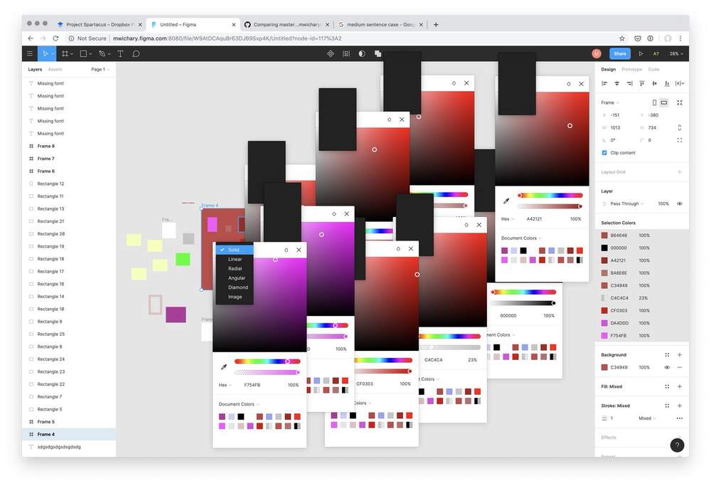
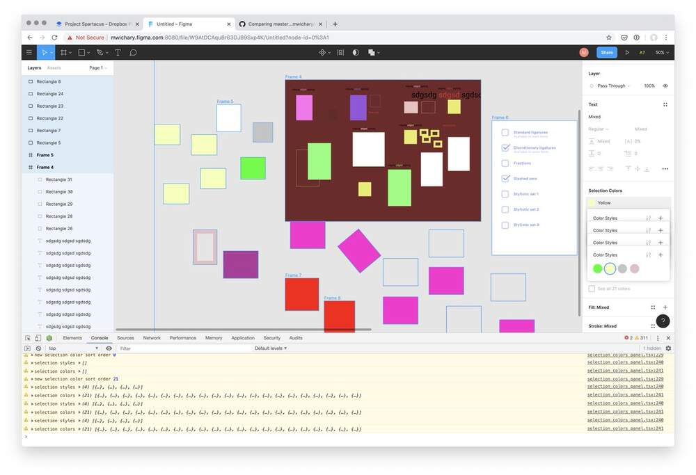
BTW here is a random fun screenshot from one of the few bug bashes. (I have tons of temporary Figma files like this. The style names here are particularly hilarious.)

But the biggest challenge was promoting to styles.
In our maker-week version, we built this “one-click style creation” – a fun experiment.
In our maker-week version, we built this “one-click style creation” – a fun experiment.
In real life, we already had an existing UI for that… but we also had a problem.
In Figma, an object can have multiple fills. And a style can have multiple fills. But an object cannot have multiple styles.
In Figma, an object can have multiple fills. And a style can have multiple fills. But an object cannot have multiple styles.
If you choose a colour to promote to a style, that colour could also be shared with other colours in some layers. What should we do when that happens?
This was the most “traditional” UI work I did on the project.
I collaborated with @thejoannachen and @nikolasklein and @rsms to figure that one out. Here are some explorations.
I collaborated with @thejoannachen and @nikolasklein and @rsms to figure that one out. Here are some explorations.


(The winning main flow came from @rsms and is beautiful in its simplicity.)

We also made a hard decision not to ship this part – and a few other things – in time for Config where SC v1 premiered, giving us a bit of time to get them right.
But as of last week, Selection Colors v2 is now true to its original vision, meticulously crafted to perfection, flawless in every regard!
Just kidding. Of course it’s not. There are a few things I don’t like about it, and I won’t even share them all because it’s too painful. 😬
1. I never figured out how to solve the “go back to master selection” problem. On top of that, the icon is not great – I don’t like anything reminding people of firearms – but we couldn’t think of anything else.

2. I introduced a deliberate inconsistency. In normal use of styles, the pop-up shows on top of selection (nicer for your fingers). But here, we decided to move it aside to be consistent between colours and styles, and to not cover the list you care about.


3. We still have this weird problem illustrated in the screenshots. It turns out, our colour precision is higher than a hex string can afford – these two colours are slightly different, so in a way SC isn’t doing anything wrong… but this can be confusing.

But that’s part of the deal, I guess. No, you don’t have to get everything right, but you have to know exactly what you chose not to get right.
Here’s what I *do* like about Selection Colors, though:
Here’s what I *do* like about Selection Colors, though:
1. It’s a flexible little beast. You can use it as color find and replace, you can use it to manage styles, you can use it to clean up your design – or to revel in its messiness (like I often do). It helps dealing with text, where selection can be particularly tricky.
It hopefully sits somewhere perfectly right on the curve of complexity/flexibility. Too little flexibility, and it wouldn’t be powerful. Too much complexity, and it’d be overwhelming.
(I’ve been there before with OpenType, which had some similar challenges. I’m still pretty happy with how that turned out: An ode to OpenType)
2. It provides a nice onramp to travel between the worlds of colours and styles. This felt very important to me. Design can be messy and organized, often within the same day. Design systems can be accelerants, but they can also suffocate.
I was hoping for SC to give a set of tools to navigate those two extremes, at least when it comes to colours – and also force us to answer questions that will help in even more projects of this nature.
3. I thought this was a great collaboration between design and engineering; something I also care a lot about, and something I see a lot inside Figma.
We do not only have great engineers, and not only try to cultivate a great respect for either profession (and encourage thoughtful cross-pollination), but we understand that designers alone could not create a useful design tool.
(As an example, with Auto Layout, our engineers – @kenrickrilee and @willyvvu and @jessieteaa – all made design decisions, and some of them I only became aware of after launch. It was great.)
And now, two codas:
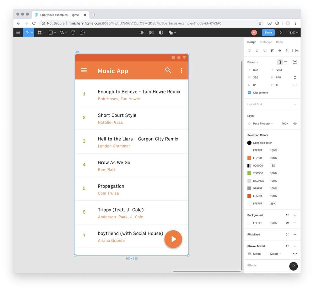
One is that I got to use Selection Colors to work for some visuals on my personal book project.
One is that I got to use Selection Colors to work for some visuals on my personal book project.

This wasn’t the most important part of this effort, but I’m not going to lie – it’s pretty awesome to use the tools you helped create. It’s like creating on two different levels at the same time.
Two: Just last week, @nlevin reminded me that what I always thought was the beginning of the project, actually wasn’t.
I forgot that long before I joined Figma, I actually pitched Selection Colors as an external fan/observer. This completely slipped my mind.
Here is that Medium (of course) post:
Quick UI idea: Selection colours
Here is that Medium (of course) post:
Quick UI idea: Selection colours

This was the past – what’s the future? I am not sure. Some of you requested Selection Text, and I’m onboard with that, but also I realize it requires quite a bit more thinking.
Twitter
Over time, my guess would be the crosshairs icons are likely to make an appearance in others parts of Figma UI where that feature would be useful. (Which was yet another part of building SC: sketching the future where SC already exists.)
But nothing is set in stone is yet, and none of these are promises in any way. Let’s just use it for a while and see what we learn. And that includes you. Please send @figmadesign your feedback or use the ? menu to file a support ticket. (We read all of them!)
BTW this wasn’t a complete walkthrough of the process, but parts that stood out to me most.
Any thoughts or questions? Let me know!
Any thoughts or questions? Let me know!
In the meantime, I’ll look at some other ideas put aside long time ago, and see if any of them deserve more attention. :·)
(Credit should also go to @eymlin and @skuwamoto who PM’ed this project, the entire design team at
@figmadesign, and many other people helping with bits and pieces!!!)
@figmadesign, and many other people helping with bits and pieces!!!)