Words by Marcin Wichary / Technology by Mihai Parparita at Infinite Mac
8 July 2025 / 8,800 words / 10 emulators
Frame of preference
A history of Mac settings, 1984–2004
As a designer, I’m meant to dislike settings. As a user, I love them. Every year I celebrate Settings Day: a day when I take a look at the options and toggles in all the apps I use. I do this out of curiosity – what was added since the last time I looked? – but also because I love this way of getting to know software: peeking under the hood, walking the back alleys, learning what has been tricky or important enough to be equipped with a checkbox.
During the last Settings Day, I had a realization that the totemic 1984 Mac control panel, designed by Susan Kare, is still to this day perhaps the only settings screen ever brought up in casual conversation.
I kept wondering about that screen, and about what happened since then. Turns out, the Mac settings have lived a far more fascinating life than I imagined, have been redesigned many times, and can tell us a lot about the early history and the troubled upbringing of this interesting machine.
Join me on a journey through the first twenty years of Mac’s control panels.
1984
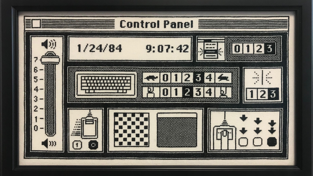
It’s rare when software matches hardware so well.
Even already in 1979, the Macintosh was envisioned as a home appliance akin to a toaster or a TV. This was documented in one of my favorite memos of all time. Get the machine out of the box. Leave the screwdriver in the drawer. There is no step three.
Once you do that, open the Apple menu, and then launch the Control Panel, and you will find a small appliance hiding inside the machine, too. A European appliance, even – outside of the title bar, there are absolutely no words present here.
The Control Panel is a handsome and tight design, put together by Susan Kare as the last desk accessory, just weeks before the Mac’s announcement. It feels alive, depicting a perhaps surprising amount of movement sometimes via animation, and sometimes via comic book-inspired conventions: soundwaves exiting the speaker, menus blinking upon activation, a finger pressing a key, the mouse rolling on the desk. It’s also a playground of sorts for early GUI experiments: there is an early slider here, some steppers for date and time, a custom cursor, and a mini map showing a miniature desktop.
The last two are in service of the most contentious addition: customizing the desktop pattern. The original Mac team was divided on this one, worrying this would lead to “abominable patterns” and therefore “ugly desktops” – an ongoing design challenge for any setting that is not about how something works, but about how something looks.
Future, more garish desktop options on computers and eventually smartphones would render these early reservations quaint. This might be the best that the Mac desktop will look for about the next twenty years. But at this moment, it felt serious. The creator of MacPaint rebelled and built his app so that any custom background would be drawn over by a default 50% checkerboard anyway. But can you even make an ugly desktop pattern with just 64 black pixels to mess with? Maybe… The most surprising is the fact that the team also prepared 41 beautiful built-in patterns, but hid them inside this control panel with the only hints how to get them appearing in the manual.
At this point in time, this was the only way you could truly customize your Mac to fit your personality, and it’s nice that it also happens to be one that’s fun to use, ironically perhaps inspired by MacPaint and its FatBits setting.
Other controls might be slightly surprising: out of just ten settings, three are dedicated to motor memory. The two keyboard toggles make sense. Even in the early 1980s, there were keyboards – terminals or electric typewriters – whose repeating style you might have gotten used to. We already knew that once something lodges itself in your fingertips, it’s really hard to override it, even consciously, so it was clever to add customization to work around that.
But the third option is for double clicking that never existed before. There weren’t really decades or even years of studies done on mouse usage, either. I imagine the creators felt it was better safe than sorry.
This early Control Panel has been celebrated since, even though there are mistakes here: the inconsistent Chicago 3, the top section being one pixel too short, and an occasional uneven border. The UI, like the whole Mac, is slow and clunky – you can see the panel, the windows, even the menus struggling to be drawn with required haste. (Only the mouse pointer is speedy, and it was a small miracle how it got this way.)
For people using this early Mac, this was likely frustrating as hell. Today, it feels like a perfect intro for a new little machine, the best dense collection of pixels this side of Winamp. It’s cute, it gets the job done, and it has tons of charm.
1986
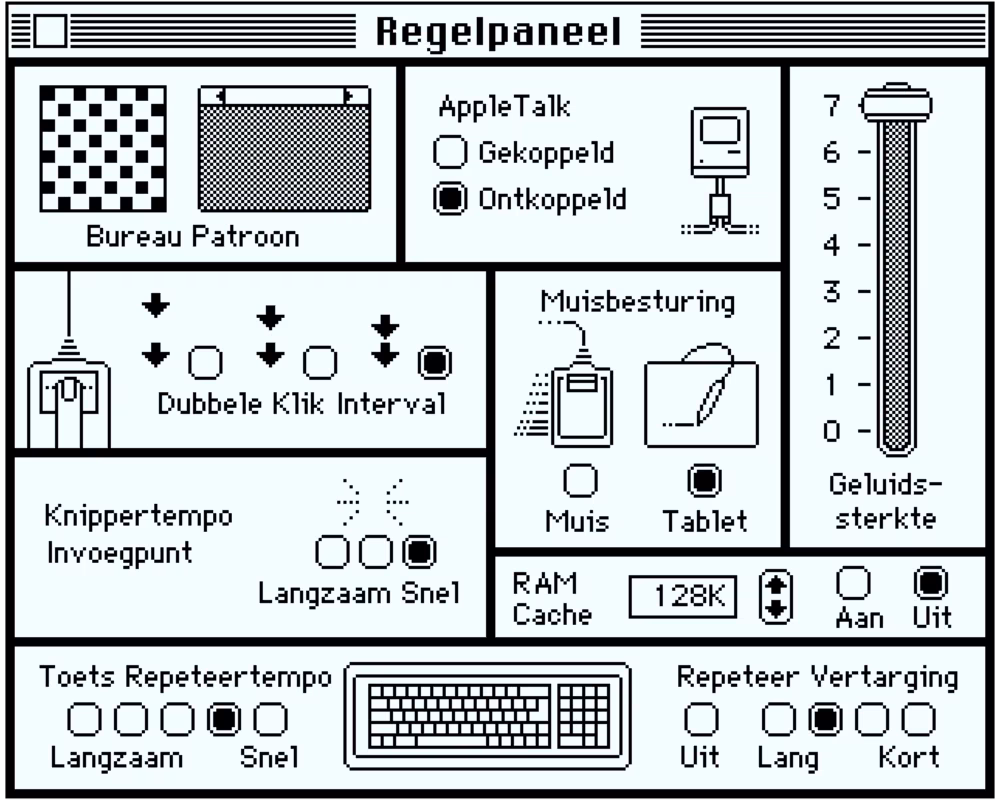
Two years later, and a lot of that charm is gone. Susan Kare and Steve Jobs had already departed to NeXT. This is Control Panel Radio Button City Music Hall edition, 50% larger than its predecessor, exchanging some of the visuals for boring text labels.
It can be disappointing to see the Mac growing up so quickly. But boring can also mean “clear”; it’s a simple case study of two extremes of UI design: attractive but mysterious vs. clunky but understandable. Perhaps Apple received feedback from early Mac adopters confused by the iconography, and unwilling to check the manual:
But to me it’s more likely that the new team needed to present choices icons could not explain on their own. (Tooltips were not invented yet; they will only be popularized a decade later by Windows 95.)
The main one is RAM Cache, which also happens to be an immediate betrayal of the idea of an appliance: it’s not a gentle slider or a fun customization. This here is the equivalent of asking you to open the machine and poke at it with a screwdriver, next to some components with “high voltage” stickers on them. Even the user manual spends many words to help little.
People of a certain age who used DOS machines still recoil at the mention of HIMEM.SYS and needing to pre-portion scarce computer memory so precisely that it required pencil-and-paper calculations. Perhaps this was unavoidable when running computers in this era. But it’s hard seeing it on a Mac in particular, and if you think this is just a temporary detour before things get better… no. Things will still get so much worse.
This addition to the panel is one portent of the troubled 1990s of the Mac, but the other one points toward a brighter future: a simple AppleTalk on/off toggle. One day, every computer will be networked.
A cynical part of me thinks the labels appeared here just so “AppleTalk” could be mentioned by its trademarked name. But maybe it deserved it. Hiding somewhere else inside this version of a Mac is an app beautifully named Chooser where you can do what back then must have felt like future: choosing any printer on the network, all powered by AppleTalk.
What else to add on the UI front? A lot of these radio buttons could have been replaced by sliders, but perhaps sliders have not yet proved themselves. Any UX writer will also tell you: avoid “your” and “my” in user interface strings: it’s never clear whether it’s the computer talking to you, or you talking to yourself. And yes, the previously “secret” way to see predesigned desktop patterns now has an affordance.
I also found a few non-English versions of this window. People dealing with internationalization, will recognize that mixture of love for languages mixed with the terror of having to support them. The truth is that each language requests something new from you and you can see it here, even so early: different capitalization, accented characters, hyphens, and that age-old trope – a German word that barely fits.

1987
But things get complicated even without languages. There comes a time in your life where settings simply stop fitting on the screen, and then you’ll find yourself with a really tricky bargain.
As the old saying goes, a reward for good work is more work. And a reward for creating a nice settings surface? It’s settings. More settings.
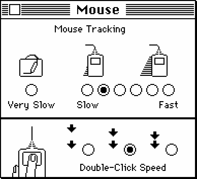
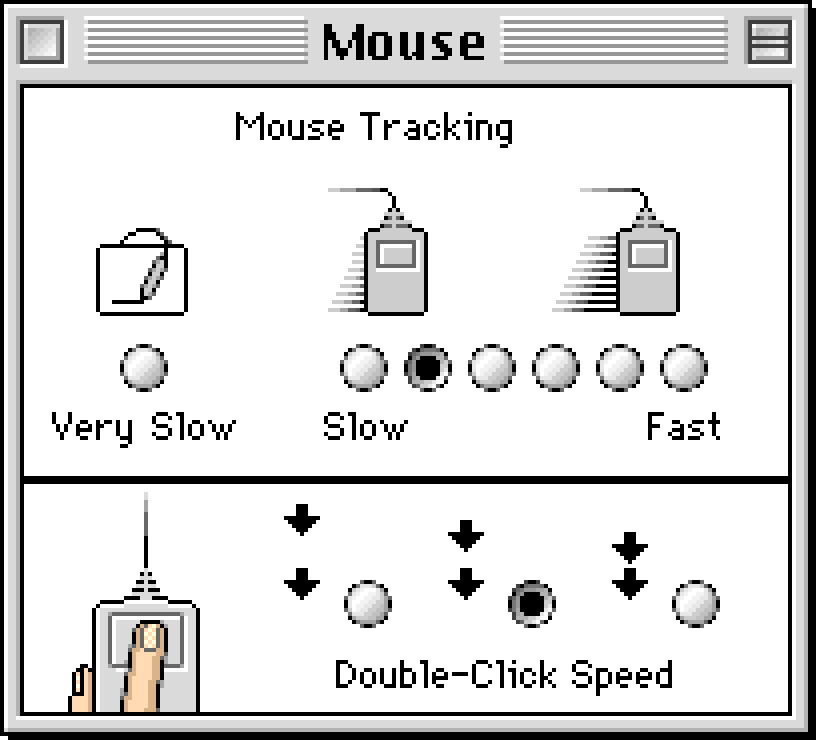
In 1987’s Mac OS, the refreshed control panel’s sidebar hierarchy is done relatively well, reusing some of the visual vernacular from the Finder. It probably had to be done since apps can install their settings next to the four original icons.
But new freeway lanes mean new traffic. A scrollable area controlling another area that can also be asked to scroll? This is a UI blank check, infinite room you can fill with infinite stuff. The temptation to add yet another radio button will be much higher than if that radio button had to be fought over, discussed, or traded off against another one. Look at all of that space in Keyboard and Mouse panels – don’t you just want to fill it with more options?
(An astute reader using macOS will check out how many keyboard and mouse settings exist today, 30+ years later.)
If you organize your junk drawer, the stuff in the drawer stops being junk. And perhaps settings need to feel like junk – like the place behind the TV with cables and dust bunnies you visit only occasionally and always under duress.
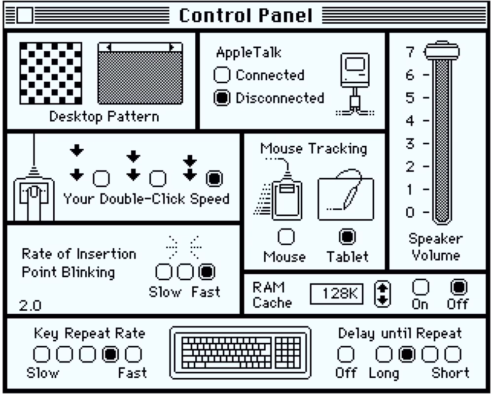
This is a choice you sometimes have to make not as much for your users, but for you, the designer. Case in point: What used to be four sections in 1987 grew to be 10+ by 1990, including some Sounds to choose from (as clunky and amateurish as their compatriots in Windows 3.0), and date and time brought back from exile.
But then again, there are some wonderful additions, too.
The Map, with its cheap but charming blinking lights, will be a Mac staple for years to come. “Besides being useful and educational, the Map CDEV illustrates Apple’s intent to make the Mac a truly international computer,” quoted one book.
CloseView, with its strange capitalization (Apple outsourced this feature to a different company) is one of those options that can show by example that accessibility is for everyone. It’s genuinely useful for many things, including everyday pixel-peeping. It’s still there on macOS in 2025, now simply called Zoom. I use it all the time.
Good accessibility means you can also click on labels to activate the radio buttons. It’s this panel perhaps, with all its complexities, its necessities to explain and involve keyboard shortcuts, and its mission to do good by people, is what might make someone want to become a settings designer.
Otherwise, Control Panel visually feels more clunky than ever. The whitespace in the Keyboard panel, the strange size of the Mouse panel, the curious alignment of Startup Device all suffer because they’re being squeezed into one size. To solve that, Apple designers will soon try a different idea.
(Outside of settings, it’s worth checking out the beginnings of the MultiFinder with its ugly icon in the upper right corner. It’s hard to imagine computers and specifically Macs with their overlapping windows not having multitasking – but up until then only one app could be running, with only desk accessories in the Apple menu being able to run concurrently.)
1991
The first color Mac was released in 1987, and the first pixels reaching for color were inside apps like PhotoShop and PixelPaint.
But starting with System 7 four years later, and possibly inspired by Windows 3.0 released a year before, the interface itself began choosing pixels other than black or white. The UI chrome for the first time felt a bit… well, actually a bit like chrome. The icons were slowly waking up to a limited color palette, too. And some objects, like the iconic desktop Trash, started feeling more three-dimensional.
The new Control Panel embraced those icons, too, but it went further than that. If 6.0’s Control Panel was only mimicking the Finder’s iconographic roots, 7.0 embraced it wholesale. If 6.0 was adding lanes to a freeway, 7.0 created an entire freeway system. The designers abandoned the listy sidebar, embracing the spatial nature of the pride and joy of Mac OS – the Finder itself.
Each of the suddenly very many control panels has its own icon that, like physical objects, can be moved to a particular place and stay there. You can group favorite control panels together, and move others out of view.
Every panel is a completely new window of whatever size it desires. Like other icons in Finder, open panels leave behind hollow space to illustrate they’re akin to physical objects: only one can exist, just in two different states. And cleaning up positions from the Special menu invokes a small animation that helps understand what’s going on. It’s all very clever, and very fun…
…and a huge overkill. Yes, you could drag your favorite icon onto the desktop and keep it there, and you could even make an alias and rename it at will, but would you? Ever?
Double clicking to open each panel, dealing with resizing the main window and then moving up the icons – it all feels too heavy for something like this, and shows how the desktop metaphor can feel overbearing.
And desktop metaphor is the only thing you get. Sure, you can ask the Control Panel to use small icons, or even show panels as a list… but those views don’t really feel too great.
It all appears to me like “dumb consistency” – this notion that consistency is a binary toggle you just choose to employ (if you’re great) or not (if you’re lazy). But consistency is complicated: more often than not, it’s about making hard choices about what to be consistent with and what not.
Perhaps aping Finder was not as good as it seemed. Once you start double clicking, however, you’ll find tons of fun.
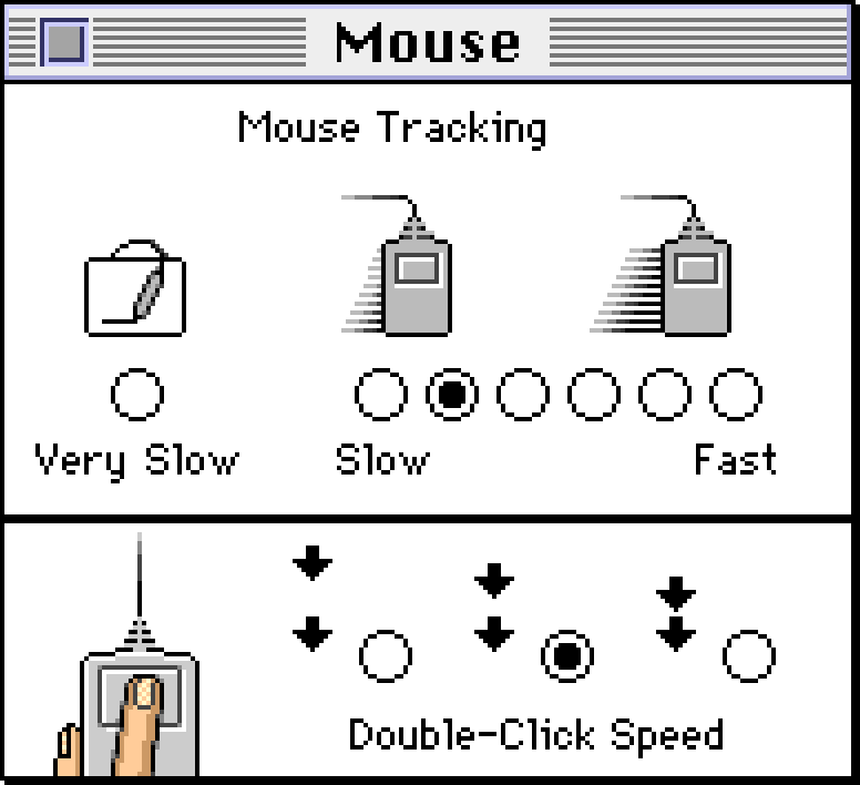
The slightly colorized Mouse panel is genuinely beautiful. The Memory panel is filled with goofy icons that show perhaps RAM Cache iconography in 1986 wasn’t out of reach. Easy Access joins CloseView in forging pathways toward better accessibility. And Monitors steal the show, explaining various complex color options and allowing rearranging and identifying multiple screens in a way familiar even today.
General Controls, with its icon strangely again focusing on blinking (every designer knows: the “miscellaneous” icon is the hardest thing to draw), contains the updated version of desktop patterns, but the colors feel bolted on and we’re back to keeping secrets: double click on each of the 8 new colors and you can visit a completely new color picker – both exciting (on the right) and frightening (on the left).
(Another place to find colors is choosing the highlight color for text selection.)
It’s fun to keep both General Controls and Monitors open side by side – thank you, MultiFinder (now mandatory, renamed Finder, and with a much better icon) – and seeing how the system tries to reconcile various windows asking for more colors than available. The little palette preview is a sign of the times: this is 1991 and “Millions” that are standard today were rare, expensive, and at times slow: most computers and operating systems still had very limited palettes, which was particularly hard in a windowing environment where two apps side by side could request mutually exclusive colors.
The Views panel hints at UI future, with more checkboxes, smaller font sizes, grouping, and smart tactical pull down menus. But right next door, the first panel you’d expect to embrace color – Map – still feels like put together shoddily in the 1980s and stuck there.
This growing control panel inconsistency will never stop bothering Macs. The reality is: at any company, it’s hard to find funding to update a settings panel that already works, unless someone really cares.


1994
It’s hard to believe today, but the battery level and a clock in the upper right corner didn’t even come from Apple. It was a third-party app, SuperClock, that Apple chose to buy.
It’s hiding under the ever-growing Date & Time, and then inside Clock Options, with a bewildering array of settings. Showing the battery? Sure. The day of the week? I guess I’ll take it. But you can also change the color, the font – if not the perennial vertical misalignment – and even specify distinctive chimes for each quarter of an hour.
In theory, there is nothing wrong with overloading settings, especially if they’re hiding deep inside. But you won’t make any friends with engineers (who’ll need to maintain it all), support team (who will have to double check many more things with users – why do you think so many of these panels have visible version numbers?), but maybe most importantly: your future self. Every setting finds its eager heart, and the person who’s thanking you for one today might be the same person who’ll throw you off some very tall and sharp stairs once you even propose removing it 8 years into the future.
To wit: WindowShade with its handsome panel, arriving on the scene to catapult its way to many people’s hearts and motor memories. It was yet another third-party option sucked into the system, and a nice differentiation from Windows. It will disappear in 2001 – in modern Macs, apps are minimized into the dock instead. But occasionally, 20-some years after its demise, people are still asking about WindowShade.
Another unique app is Stickies, put in the Apple menu next to Notepad as another way to jot down things. They’re still there in macOS today (and they still window-shade if you double click their title bars), although both Stickies and the stalwart Notepad lost to Notes, born on the iPhone many years later.
There’s also Launcher and – in the upper right corner – Balloons, one of the many attempts to “simplify” graphical user interfaces in the 1990s. (Vide: Microsoft Bob.) I’m not sure if they ever became popular; only a few years later, one reviewer would write about “the still-useless balloon help.”
We’re getting gestures toward a modern desktop wallpaper inside Desktop Patterns. The pixels have become too small to toy with them individually, but the memory is still too expensive to accommodate full photos. In this interregnum, you can choose one of the many patterns, or drag in your own, but they can’t yet be too impressive.
Control Panel in general? It didn’t take long for the list to come back because sometimes there’s nothing better than a simple list – it’s now a submenu of the Apple menu (with a meta control panel to control submenus themselves). And it’s already a long list.
To be fair, the list is longer than it would normally be. I hacked some panels so that you compare Mouse to Trackpad, and visit the relatively young PowerBook window, complete with a custom and slightly annoying toggle to open options to make batteries behave better. Decades from now, most computers will be portable, and that style of a toggle, rotated 90 degrees, will multiply in thousands and come after a venerable checkbox.
But that’s beyond the horizon. In 1994, the Control Panel is only hinting at a tricky present and an even darker future. PC Exchange is an admission file extensions (that Macs never had) matter, because PCs matter now. 1994 became 1984.
It gets worse. In the universe of Macs “extensions” meant something else: little system improvements for anything from serious productivity to eyeballs following the cursor from the safety of the menu bar. People love them, but they don’t love how often they crash and burn. To control and – all too often – micromanage them, you can open the new Extensions Manager, complete with a mistifying checkbox cursor and an oversized Help screen.
The Map is still in black and white.
1997
Let’s not beat around the bush. It’s 1997 and Apple is dying. Windows 95 is kicking Mac OS’s ass in the market. Macs are pricier, but they don’t necessarily feel better than their Intel equivalents.
Both Mac OS (recently renamed from the generic “System” during the misguided Mac cloning initiative) and Windows 95 are built on rickety foundations that no amount of settings can paper over. Either operating system is a funny uncle, too soft to resolve family dinner drama, rather than a tyrant that an operating system needs to be. Instead of kicking an (intentionally, or as it happens often, accidentally) misbehaving app to the curb, Mac OS relies on apps willingly cooperating with each other. An app, or – in Mac’s case – an extension can hang the entire computer. And they do.
Those woes are visible throughout the system. The About This Computer still shows memory allocation and uses scary terms like “largest unused block.” The Extensions Manager control panel is now so much more sophisticated, forcing you to deal with extensions that do not like each other but won’t ever tell you that, and understand that the nearby buttons named Restart and Revert are not one and the same. Using Mac OS is starting to feel like operating an unstable nuclear reactor, continually moving the rods up and down to achieve momentary balance. (Go to the menu bar and choose Special > Restart, and you will see extension icons appear slowly below the main marquee. This was not a cute visual; this was a helpful debugging tool to spot which extension hangs or crashes the system before it’s even done booting.)
Windows 95 is bad, too, but Microsoft already has an answer in the wings: a much better engineered Windows NT, which in time will become the hyper-successful Windows XP. But Apple is not even zeroing in on a solution, still reeling from various half- or fully-aborted operating systems with beautiful codenames like Taligent and Copland that deserved better projects. At this point, the company is looking to buy or license an OS elsewhere: perhaps Solaris, perhaps the young darling BeOS, perhaps NeXTStep – the last two helmed by figures of some Apple renown.
Even on the interface layer the tables have turned. The original Mac team’s decisions, some big and some small, were mirrored in early versions of Windows. But now it’s Windows setting the tone. The new “platinum” appearance in Mac OS 8.0 seems like a response to Windows 95’s metallic clothes. Windows 95 also popularized tabs (seen in File Sharing control panel), sliders (in Keyboard or Speech control panels), scrollbars showing results in real time, and menus that could be opened by simply clicking on them. The move from the venerable Chicago to Charcoal seems to be motivated by the Windows’ embrace of fresh and attractive Tahoma a few years prior.
It’s not that no innovation is happening – nice to see Control Strip in the bottom left (you still use it today, except it’s now in the opposite corner, right next to the clock) and its attendant panel. In the Finder, you can use the View menu or drag any window to the bottom of the screen to make it a pop-up. And in that same menu, you can also switch icons to buttons for easier operation in some situations. (The original 1984 double click was meant to be a shortcut to invoke the first action – which happened to be Open – but in the process a lot more of the OS started relying on double clicking, which is inherently difficult for some people.)
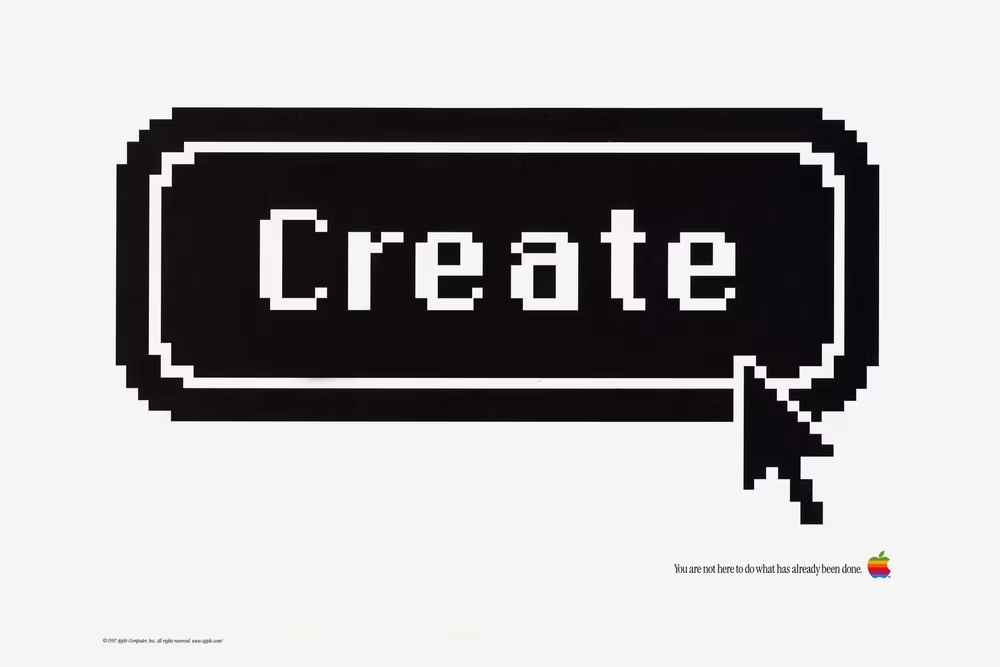
But those are small examples in a field where it feels Microsoft is now lapping the Cupertino company. An Apple job ad for UI designers that year proclaims “You are not here to do what has already been done,” but the reality tells a different story.
Lastly, we will see it more next year, but the push and pull of various graphical styles continues apace. On one hand, the Map is finally in color – still small, but rendered in a 16-bit style. But Desktop Pictures (née Patterns) offer some amateurish patterns that get worse as you get along – as the old saying goes, Teddy Bears make Rubber Bands feel like The Rocks. There are also four nice photos you can choose from, hinting at how wallpapers will behave in the future, even if mixing patterns with pictures feels strange from the perspective of today.
You should also check out Appearance, if only because it will soon grow into something… fascinating.
1998
1998 finds Apple in the most peculiar of moments. Steve Jobs is back, as the “interim” CEO, and a lot of what Apple’s getting out in the world feels interim, too.
On the hardware side, things are looking up; the iMac might be Apple’s most exciting machine since the original Mac. But software still has a ways to go. It’s not just that Mac OS 8.5 feels ancient. It also – if you dig deep enough – has the strangest battle scars.
The biggest one is the Appearance panel, largely salvaged from one of the aborted Mac OS operating system efforts. It’s endlessly captivating.
You might have already noticed the sounds accompanying every small interaction. You can find them in the Sound tab; I don’t believe any mainstream operating system before or after has done a sound layer that was so pervasive.
A few tabs over, Fonts has more peculiarities. Just last year, 8.0 swapped the system font to Charcoal. 8.5 adds font smoothing, but done in a way that feels… peculiar. The fonts are not smoother – it’s just that the solid pixels are now surrounded by slightly-less-solid pixels. It’s a very cheap version of antialiasing; not the worst visual effect, but it’s Mac OS once more pretending it’s something it is not – like a motor hastily added to a horse carriage – while a better operating system is being built in the background.
You can turn it off, but you’ll be rewarded for staying in this tab a beat longer. Because it’s not just Charcoal and Chicago that are on the table now. The list has 5 more fonts, and they’re all horrible. With the possible exception of Gadget, these are not good system fonts. Would you ever want to spend more than a minute staring at your interface set in Capitals? Or Sand? There’s some historical curiosity in here – Techno is the font used for Apple’s shortlived eWorld – but overall… these are the settings you’d want to put under the hated “you have to restart the system for this to take effect,” just so not too many people experience them.
But it gets worse. Check out the Appearance option in the Appearance tab within the Appearance panel (sigh). For a brief moment in time, Apple designers imagined various different visual themes you could apply to the entire operating system. They demoed a few in beta versions, and I included them here.
They should have sent an anti poet. Gizmo makes Windows XP feel like Windows NT. It’s a fever dream, a fountain of garishness, an MTV show rather than a user interface. Drawing Board takes skeuomorphism to a chilling conclusion. Hi-Tech is the most prescient, a “dark mode” before its time, but still with a heavy dose of “they didn’t think whether they should”-itis visible in its overbaked details.
This was real, and seriously considered, but ultimately abandoned before 8.5 got out of beta.
In 1984, the team was worrying about a few 8×8 desktop patterns ruining the Mac’s desktop. In 1998, Mac OS shipped with goofy sounds, inappropriate typeface choices, and almost shipped with amateurish themes. Here’s to the crazy ones! (derogatory)
Perhaps I am too cruel here, kicking Apple while they’re down. Perhaps this felt fun to people. Perhaps I’m a settings purist, a snobby designer. A lot of computing in the 1990s went in this direction, from Kai’s Power Tools to the aforementioned, even more skinnable Winamp. But all of this looks like a serious lapse of something that Apple always claimed it had an abundance of: taste.
iMac’s new enclosure feels fun in a good way. This feels fun in a bad way, a tech demo run amok, last throes of a dying operating system, a “how do you do fellow kids” of pixels forced to dress up to do some embarrassing things. As a settings designer, you might not be able to prevent people from shooting themselves in the foot – but it doesn’t mean you have to hand them a shotgun, with a twitchy trigger, pointing downwards.
To give Apple designers credit: the rest of the Appearance tab – the highlight hue and the variation – gives options that are subtle and fun to play with, and still in use today. And the Desktop patterns are better with more muted and attractive options.
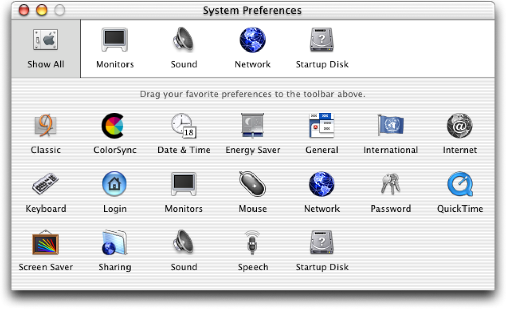
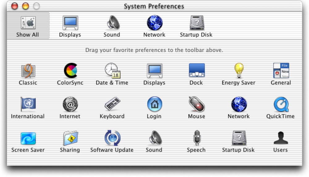
Appearance aside, the first iMac was heavily advertised as an internet-friendly machine, and elsewhere in Control Panel you see many traces of that. The Internet panel allows you to set your basic personalities, Web Sharing has a cute icon and suggests making a personal website, and even Date & Time allows you to sync your time from the big clock in the internet sky. File Synchronization is paving the way for an eventual appearance of iCloud. The web is here. It will never not be here again.
But if you look at other Control Panels dispassionately, it feels like a mess.
Text and Startup Disk have old-school liveries basically plucked from the 1980s – while Apple Menu Options and others are more platinum-plated, and Users & Groups (which learned a lesson Preferences didn’t yet, and completely abandoned 1991’s spatial orientation) is dripping in metal, sporting buttons basically stolen from Windows.
The icon styles don’t match, either – compare CloseView or Mouse with Speech, or Date & Time, and then jump into Monitors & Sound to witness have ugly icons in a vector style resembling word art.
Appearance and Internet use tabs, Energy Saver uses… something else (before committing the cardinal sin of throwing a lot of instructions you have to hold in your head, instead of showing them in context), QuickTime Settings has a little menu, and Control Strip and CloseView stick with older ways of organizing things. Some of these are skating where the puck mouse is going; others are stuck in the past – General Controls almost resembles System 3 if you squint.
I’m describing it all obsessively, and it will appear as if I’m complaining. As a designer, I feel like I should. But be careful what you wish for: You don’t know how good things are until they are gone. In time, these will all become more uniform and consistent, and there will be a price to pay for that.
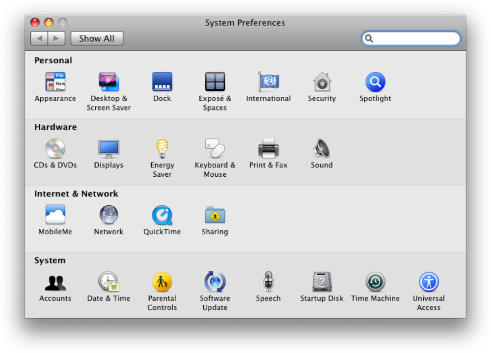
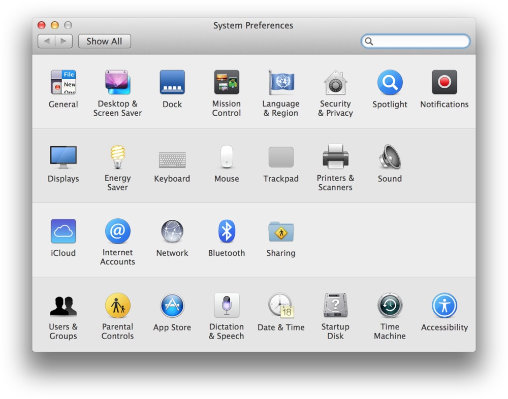
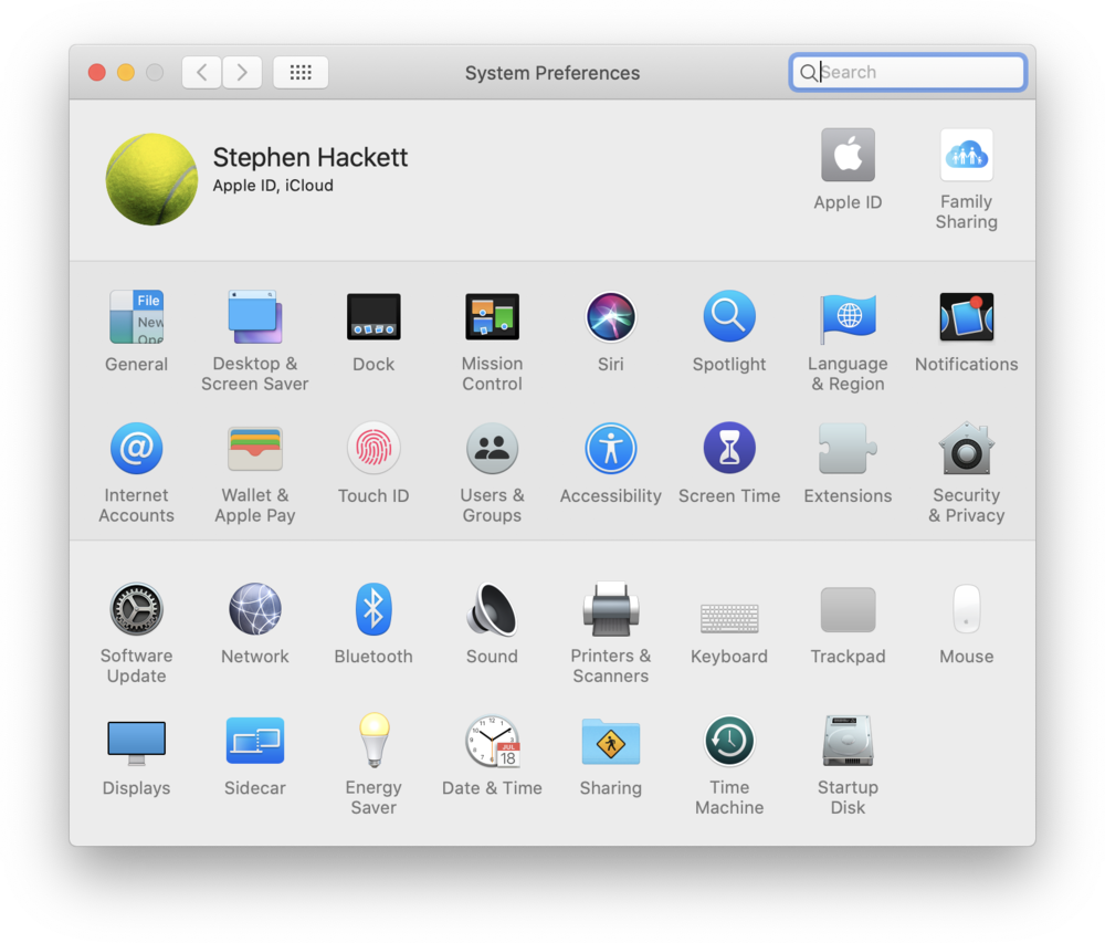
2001
But this is 2001 and we’re only witnessing an early salvo in the battle for the future. And what a salvo it is: The “TiBook” is, I think, Apple’s most beautiful machine. Ever. The new design language peaks right off the gate. Later aluminum PowerBooks and MacBooks veered too much into minimalism, but this one has, to me, just the right amount of ornamentation and personality.
Power it on and, after a familiar happy Mac icon, the rest of the interface is brand new as well. These aren’t the incremental visual updates of Mac OS 8 or 9. This is a blank slate: new icons in a new style, new text rendering, new windowing decorations, all contributing to a look and feel that leaves so much behind.
It’s interesting that even at this point, the mismatch and the interimness are still plaguing Apple. The new interface is named Aqua, inspired by the iMac’s plastic and translucent design language – but that industrial style is already on the chopping block.
This discrepancy will resolve itself over time. And it’s a small issue compared to the problems of yore. This is not Mac OS 8 Appearance panel’s shenanigans to pretend things are better than they are. The soul of this new machine is right, and good, and trustworthy. The OS is ruthless to misbehaving apps. The extensions are gone altogether.
Open the freshly-renamed System Preferences, and you can sense that, too. The pixels are smaller and more plentiful and more colorful, but this feels similar to the 1984 Macintosh. The unpleasant feeling you’re walking through the underground tunnels at a Disney theme park is mostly gone – these options (with a possible exception of ColorSync) is stuff you might actually be interested in changing as a user.
The operating model is new and interesting also – click to open a view, click on the first icon to go back. No more windows to move, no more double clicking, no more closing leftover panels. There’s still customization, but of a lighter variety: you can grab a favorite setting and drag it to the top shelf for easier access that feels like the old list. (This brings up an interesting question: Do people have favorite settings? Or is it just settings they have to toggle often?)
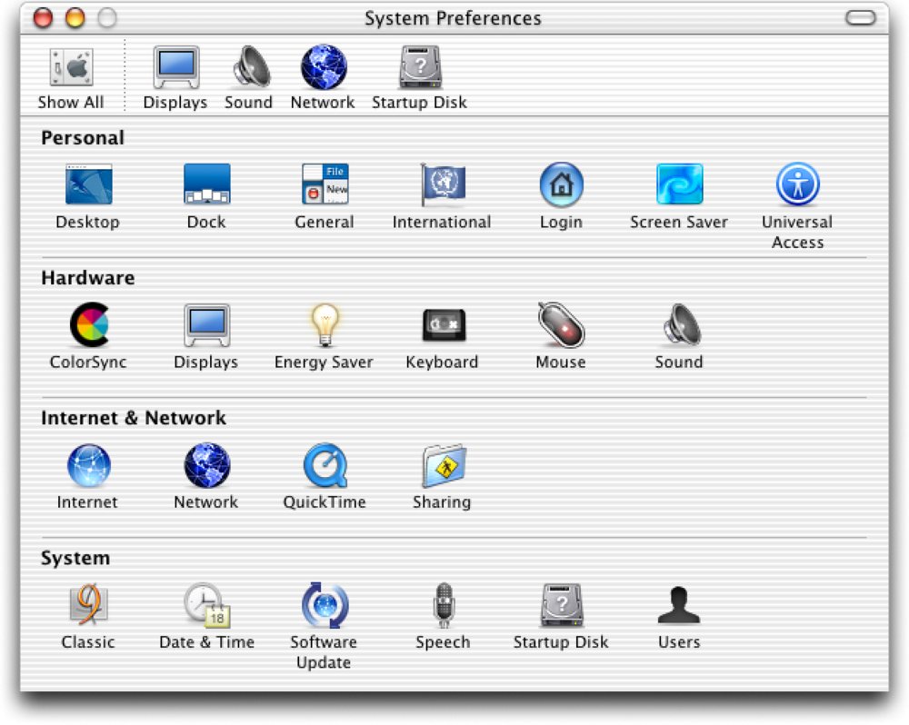
But even if this feels like the first Mac, we’re long past the days of ten options. This is the first control panel with double hierarchy – groups of settings named Personal, Hardware, Internet & Network, and System. There will always be one-off settings, so it was perhaps unavoidable that any collection of toggles and fields would not only have one “miscellaneous” section, General, but now also one miscellaneous group: System.
But that’s at the bottom. The top row celebrates all the cool things about Mac OS X: new wallpapers in Desktop, a more professional Graphite appearance (in General), and a completely new Screen Saver section (would you believe that a platform famous for flying toasters didn’t have built-in screensavers until now?).
And then there’s the dock, the most demoable aspect of Mac OS X, with photorealistic icons growing as if the cursor was magnetized, jumping up and down during launching, and with a “genie” effect the moment you click any yellow pill in sight. That minimization was demonstrated extensively, often holding Shift for a dramatic effect. A QuickTime movie slowly minimizing into a dock while still playing made for a particularly entertaining – and perhaps even convincing – demonstration of the power of the new system. (This was many years before Dunkirk and before memes, but imagine the Dunkirk memes!)
The Dock control panel offers a surprising amount of configuration for such an early feature, perhaps betraying how important it felt to Jobs. (Make sure you turn on magnification!)
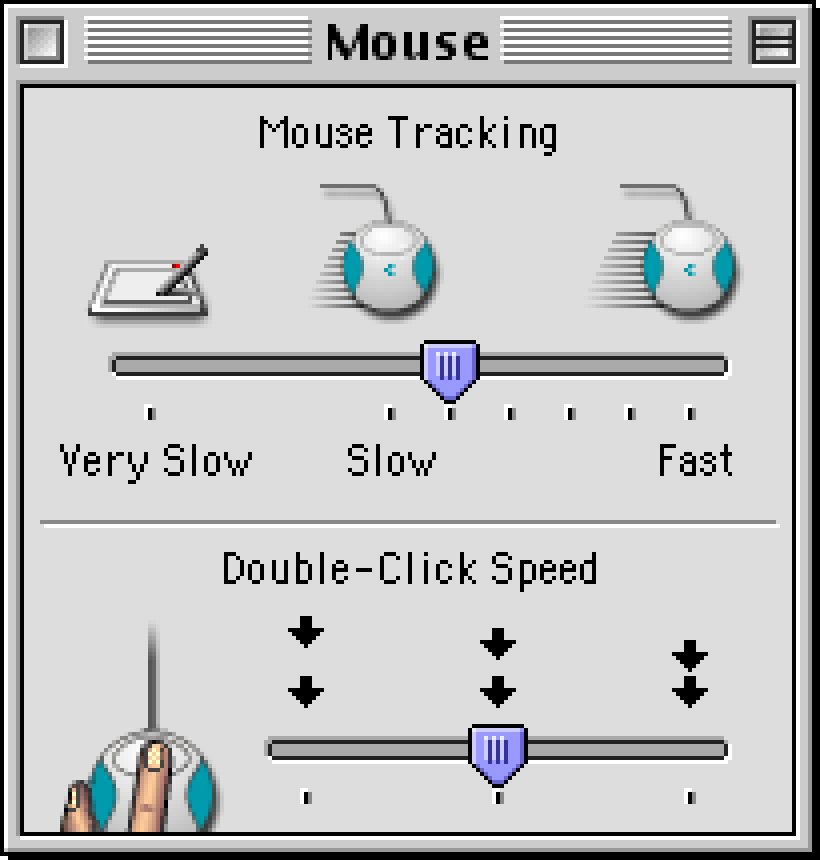
And there’s passing of a torch. Keyboard and Mouse panels still have the same options as in 1984 – that pesky motor memory – but for the first time in Mac’s history, the menus will blink as many times as they want to, and you won’t have any say. It makes sense: we know how to use menus by now, and it’s time to move on to customizing newer ideas.
Elsewhere, Internet upsells people to iTools, which is the second in Apple’s five generations of internet services with peculiar names (eWorld, iTools, .mac, MobileMe, iCloud), and Software Update points to the future where all apps will come from the internet, underlined by two overshadowed and overtransparented buttons that you definitely were not supposed to lick.
This was all good fun, although many Macs of the time struggled to run the new system well, just as the emulator is today. Drag a window and you will actually drag it, but the effort feels like repaving the street. Minimize to the dock, but without holding Shift the transition might get lost in the choppy sea of low framerates. Even the delightful Preferences transitions when switching panels are easy to miss.
The hardware will catch up to all that, and to increasingly braver transparency effects, and (in the 2010s) to blurring, retina pixels, and 120-hertz displays and then (in the 2020s) to glass of varying liquidity. The visual inconsistency of it all – we didn’t even talk about iTunes, QuickTime, or iMovie, each one with more metal than Platinum and Windows 95 combined, fusing it with glass like a world-class alchemist – will get cleaned up, too. Mac OS 8.5 was squeezing the last drop of old juice. This is biting into an orange before even peeling it.
Except, Mac OS X was not a blank slate. Steve Jobs came back from NeXT, and he came back not just with a cadre of trusted people, but with some software they all liked, too.
NeXTStep’s rock-solid underpinnings were just what Mac needed, and those underpinnings were there as early as in the late 1980s, at the inaugural release of the famous (and famously expensive) cubic NeXT Computer married with its new operating system. So let’s look at that one, too.
Back to 1992
The NeXT Computer is an alternate-universe Mac, a do-over of a kind. It’s sort of, almost, Mac going to college or maybe even graduating from one. The machine is dark and looming (the first onscreen trash can was a black hole, for god’s sake!). The UI has a very “academic” feel – still black-and-white, but sharper, grayscale, and beveled and dithered to hell and back.
The huge icons inside tiles became a visual staple of the interface. There are oblique fonts, too, and a certain pretentiousness that Mac never had, especially not in the zany moments of Hi-Tech and Gizmo. It’s all somewhat idiosyncratic and not always internally consistent – NeXT’s keyboard eschewed function keys, even if academics using the machine were perhaps the main group of people who’d benefit from them.
Of course, no one building this OS in 1988 knows that a decade later, over the course of a few rather tumultuous years between 1998 and 2001, their creation will be repurposed to power computers marked by many for death, helping fuel the biggest tech comeback story of all time.
Those years deserve its own future essay – if you are curious, look up OPENSTEP, Rhapsody, Mac OS X Server, and Mac OS X DP – but while it’s easy to assume the innards of NeXT were asked to power old Mac’s interface redressed in new Aqua livery, the story here mirrors the “reverse takeover” vibes of the whole acquisition: the influences of NeXT were bigger, and many modern Macs owe a lot to decisions made in the 1990s away from Cupertino.
Even in this early version of NeXTStep, you can spot some of the dad’s genes that will eventually reappear in the kid eventually called OS X. Scrollbars are proportional and fun to drag. Windows move and scroll in real time: you will only see outlines when you try to resize them. (The manual calls it “rubberbanding.”)
Workspace Manager is what we know as Finder, and its once contentious column view will find its way into Mac OS. Since columns are not “spatial” in the classic sense, to help users orient themselves, its designers added a comically prominent visual path. (By the way, NeXTStep has a Finder: that’s what it calls its Find function. Among other ways, you can invoke it by… just starting to type – a UI pattern that appears time and again and never seems to stick.)
There’s a Mail app here (with a letter from Steve Jobs!), a font picker (to be found in Format menu when writing an email), and a Preview app (in NextApps) – all of these are still there also on your Mac today. There are open file dialogs with path menus at the top, and even a proto-Dock, although split between top right and bottom left parts of the screen.
Mac OS won in other ways: the strange menus here (did you already try to detach a submenu to make it a window?) will revert to the 1984 originals, the scrollbars will end up on the right after all, the trashcan remain a trashcan, file icons will be back on the desktop, and most keyboard shortcuts will follow the Mac traditions.
How about Control Panel? Here, it’s called Preferences. You can open it by double clicking on the clock/calendar in the upper right corner, and admire yet another organizational theme: visual tabs that run at the top of the screen.
The preferences are quirky. Key Repeat Rate has a fun typographical visualization of speed. The Mouse panel has a nice hand visual that flips over, but be careful: if you swap it to Left, you will need a right click to restore it.
I always believed every settings panel should have one fun setting: one that doesn’t make any logical sense, and one that’s just enjoyable to play with. Menu Location seems to be that here – you can drag the menu minimap to move the menu itself (even though you can also drag the menu). It’s a rare early application of parallax in the UI that we will see a lot more of once iPhones and Android phones make themselves comfortable.
There is the junk drawer of General Preferences, in a pretty awkward position, and also an expert junk drawer, located in the correct place. Date & Time appears with a time zone map, and it’s this map verbatim that will eventually take over the classic Mac map with its blinking city lights and an aversion to color.
But my favorite feature is lurking back in Menu preferences. There, you can provide alternate keyboard shortcuts for menu items, based on their names. It’s clunky as hell and doesn’t work very well, but the heart is in the right place: Just like the 1984 Mac recognized people could already be used to typing and they had to provide a few options for “keyboard feel,” this one recognizes that a decade later people’s motor memories already have specific key combinations in them, and it’d be a nice gesture to accommodate that.
This setting helps you add a shortcut to any feature you want, remove one you keep pressing by accident, or – maybe most importantly – unify incompatible shortcuts in different apps. It understands that motor memory has its own rules and is hard to negotiate with. To me, any setting related to motor memory is free to add without design worries. It’s just accessibility with a different name. (The custom keyboard shortcuts persist in modern Macs, 30 years later. Unfortunately, they’re only marginally less haggard.)
The last funny part: The Workspace Manager has its own preferences (if you can find them). They also have hints of the future – the visually interesting Dock one is basically the equivalent of Open at Login – but the funniest thing is that they come with yet another organizational model: a menu at the top. A year or two into NeXT machine’s existence, things are already messy.
If a group of really smart people tasked with starting over and doing things better this time around arrived at this outcome, how much chance do we have?
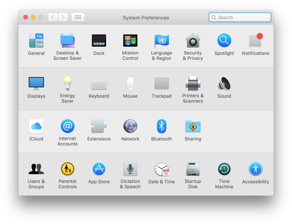
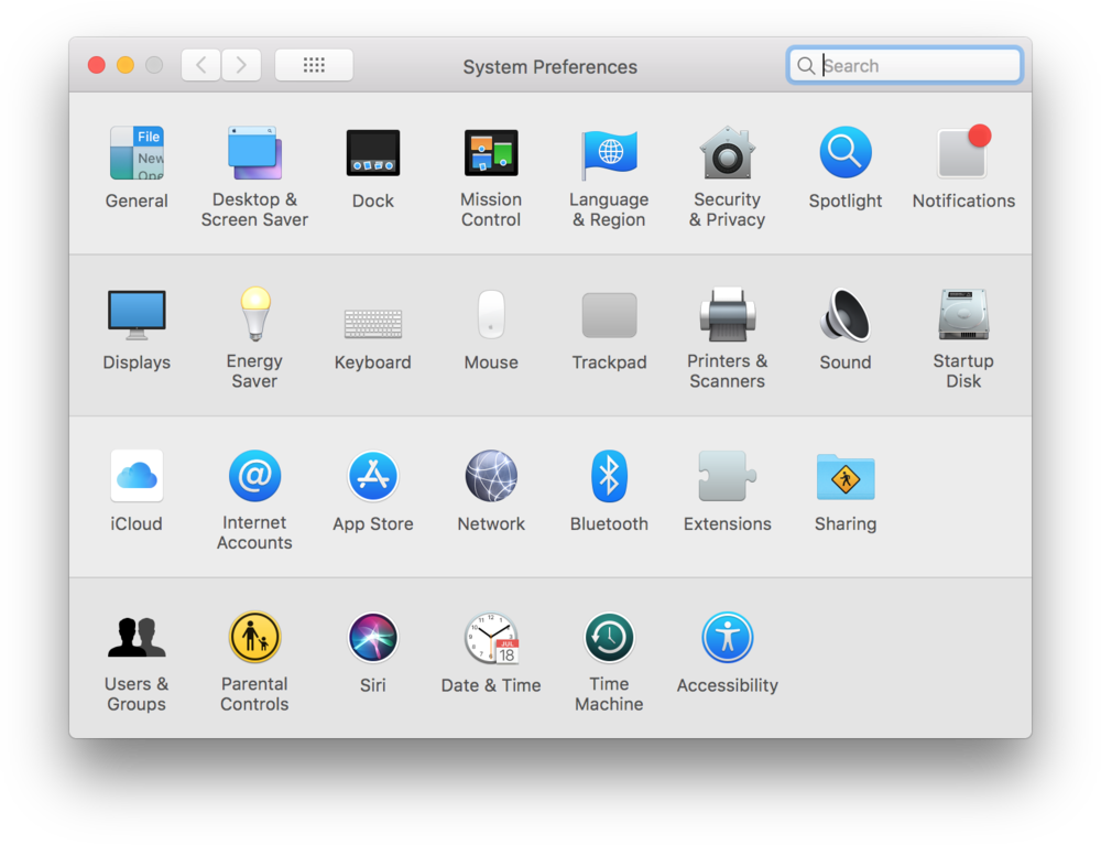
2003
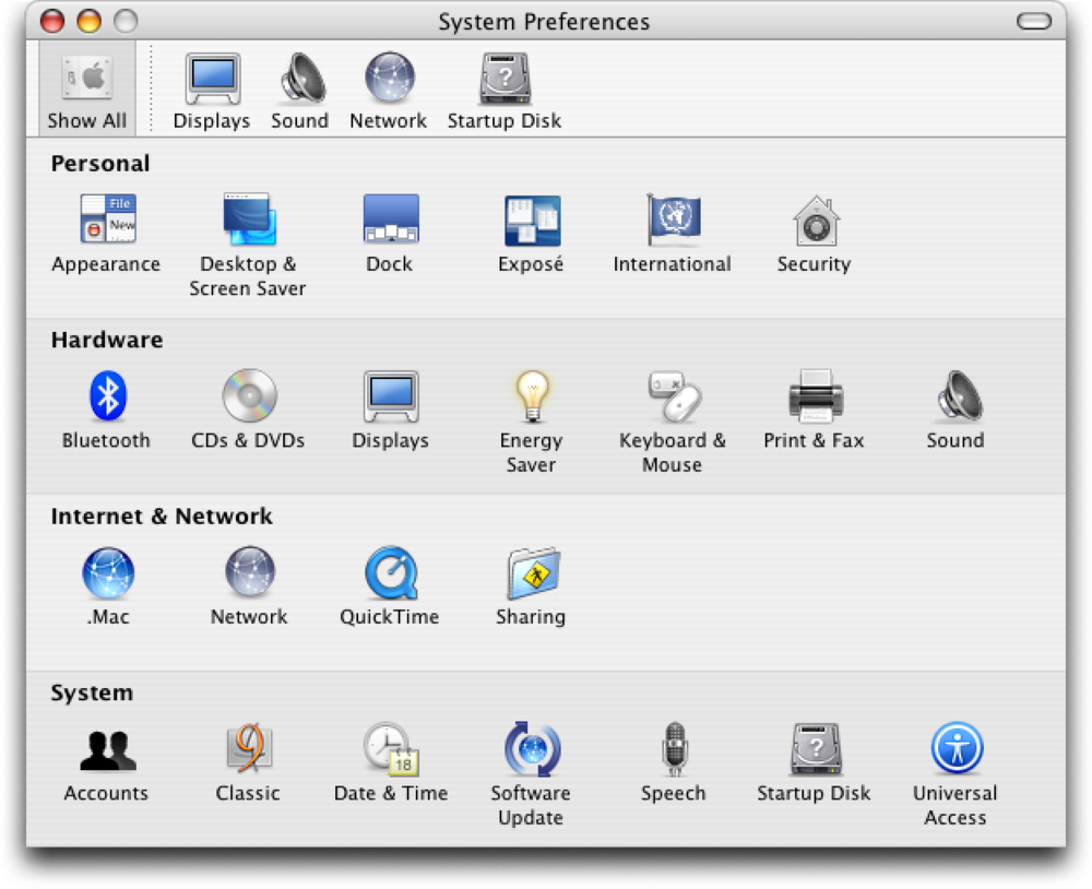
Back in our main timeline, a more refined version of Aqua arrives with Mac OS X Panther. But remember how 10.1 was behind the then-new titanium design language? 10.3 both overshot and undershot here in a perplexing way.
You’re welcomed with the most professional wallpaper to date (honestly, all of the options in Desktop & Screen Saver control panel feel handsome) and the UI is still Aqua but tighter, and with subtler striping, too. But elsewhere the UI has so much metal in it it’s setting off airport detectors, and not just in the apps we already know – even the goddamn Finder is clad in it.
I have never figured out what dictated which app gets the metal treatment. Originally the livery was reserved for appliance-like apps, but that warship has long sailed. It’s not just Finder now, but also iCal, Calculator, and the brand-new Safari. Yet, the System Preferences are sporting the chaste “plastic” look, surprising given their appliance origins.
Maybe that’s for the better; it’s honestly possible that in 40 years of Mac history, this is the best its settings will ever look. Every panel feels designed and refined, consistent when it needs to be and bespoke when it’s necessary. Universal Access is my favorite, laid out exquisitely, written in plain language, and meant to aid people who would otherwise struggle reading it.
This might be the third-revision-of-the-second-version effect. “The second version” was the move to Mac OS X, which made it possible to completely rethink settings and start again with 15 years of lessons under the belt. And, the few revisions since the first Mac OS X allowed the panels to be chiseled into the best versions of themselves. Third-revision-of-the-second-version is a favorite moment as a designer – from now on, you are up against entropy and other things that will slowly erode what’s in front of you if you’re not careful.
What’s in front of you are also fun reminders of peculiarities of this era of computing: a whole panel dedicated to figuring out what happens when you insert an optical disc, or a hint – in the Appearance control panel, at the bottom – about the ongoing battle between old CRT displays, and new “flat panel” LCDs. In Apple’s internet eras, we’re on step 2 out of 5, otherwise known as .Mac. (Somewhere in Utilities, there’s an AirPort Admin Utility, too.)
Right next to Dock is the control panel of a brand-new invention, Exposé (just like WindowShade years before, originally heavily branded, and then becoming a generic function of the OS). Date & Time sports a new, marginally nicer map.
And now, having seen the NeXTStep’s excitement about shelves, it will make sense that the top of System Preferences itself is a shelf – although maybe less sense for a pill-shaped button to exist to remove it; after doing that, there is no easy way to come back to the main menu, except via a View menu option.
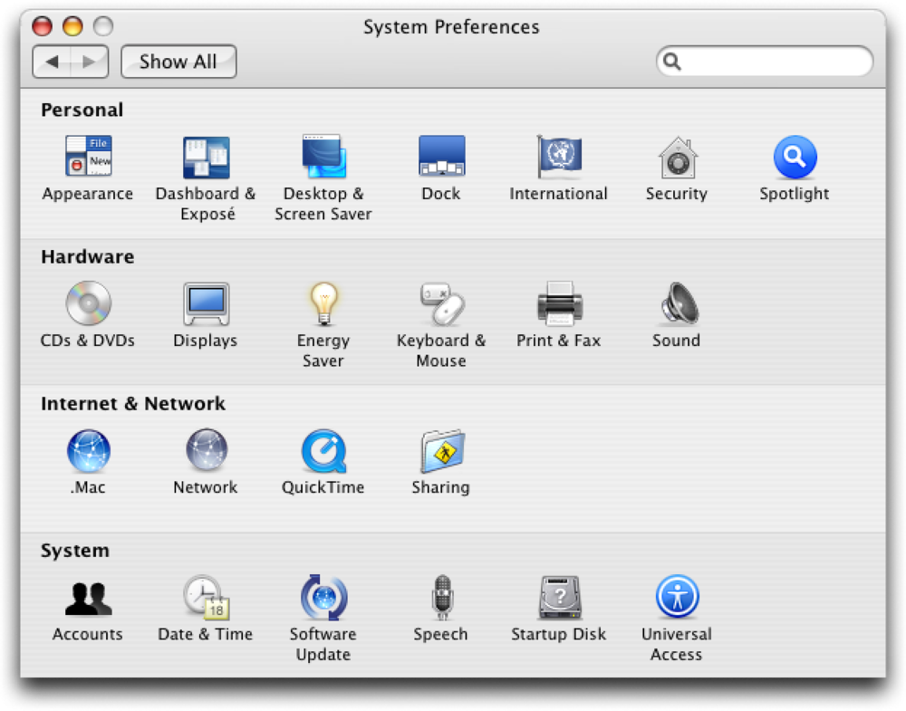
Somewhere in that menu, there’s also an option to skip the categorization altogether and order the panels by name – something that will be there for 14 more years, and a discovery that will keep blowing people’s minds for about the same amount of time.
Progress has its benefits, and progress has its price. Tucked at the bottom of these preferences happen to be the final years of Classic, the backward-facing environment, its panel filled with advanced settings that might remind some of the Mac’s dark 1990s, an increasingly distant dream filled with extensions, crashes, platinum, and icons softened in equal measure by Susan Kare’s talents and imperfections of CRTs.
And, when in the Display pane, you switch the resolution to the lowest available, 640×480, the operating system protests. What once used to be high end, today is something better left forgotten.
Epilogue
The story of Mac settings ends here not just because web emulators for post-2004 versions aren’t yet available. It also ends here because those emulators are not necessary. After two decades of zigs and zags the pace of change slowed down quite a bit.
Not that there weren’t stories in the next twenty years. People struggled with wi-fi settings, fought over “Scroll direction: natural,” admired the literal spotlight of Spotlight, gasped at videos of hands on trackpads, and laughed at the uselessness of Screen Time. Retina displays reclaimed some of the sharpness Aqua diluted. Modern macOS’s Settings are witnesses of Apple’s 21st-century successes (Apple Pay, Touch ID, iCloud) as well as failures (Game Center, Apple Intelligence). Somewhere deep within Wallpaper, there is even a nod – although a rather cheap one – to the original Macintosh.


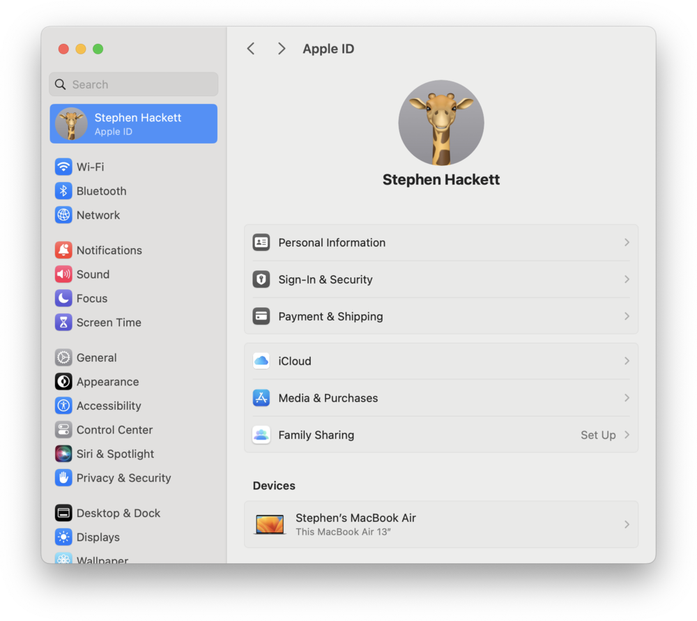
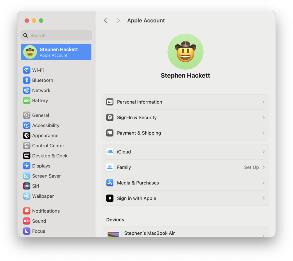
But there was only one truly big change to what’s today called System Settings, in 2022, and that one you can check on your computer now. It wasn’t a popular change, and I count myself among the many frustratees.
I think I understand why Apple did this: the double argument of (inwardly) maintenance costs and (outwardly) consistency with iOS. But, what a mess. At this point we seem to have finally run out of organizational ideas and we’re back to System 5’s left nav. Except the double hierarchy is extremely confusing, there are panels but there are also windows, the search tries too hard, and the whole thing relies too much on right alignment, and tiny menus, and stuff that’s custom, but somehow feels the opposite of first Control Panel’s beautiful, bespoke nature.
If Mac OS 8.5 was a hot mess, at least it was a mess with a soul; inconsistent, but inconsistent like a city would be – with layers of history and human touch. (I’ve been told Windows feels similar these days.) Modern macOS is sort of consistent, but it feels designed by a machine. It’s forms, after forms, on top of other forms.
Even the Control Center (hey! another name!) borrowed from the iPhone, and perhaps conceptually the closest to the revered 1984 panel, is missing some fine-tuned physics and wonderful haptics of its iOS predecessor.
It all reminds me of something, actually – a now rather forgotten Apple machine from 1983, sold in small numbers, and toward the end of its very short life, offended by being rebranded “Macintosh XL.”
Lisa was a machine designed for the office, and it had very little of the delight dripping out of its younger and smaller sibling that arrived on the market a year after it. Lisa was square even if its pixels weren’t, and its settings were just a bunch of things thrown on the screen like a database spitting out its results during the last week of the tax season.
It was sad. It took the Mac’s team in 1984 to push it in a different direction.
I know you can’t easily compare 1984 and 2025. “They don’t make them like they used to,” I know, but often that’s actually good.
Mac’s early decades were shaped by technical limitations – scarce memory, drives in need of lubrication, exhausted multitasking – that all had to be combined with awkwardly teaching everyone how to take their baby steps with computers.
And, I truly don’t love some of the control panel directions we’ve seen. I’m glad we moved away from spatial orientation, the strange horizontal icons of NeXTStep, or some of the hideous fonts.
In 2025, Mac might be more of an appliance than ever before. You can unpack a new machine, and live for years without ever touching its System Settings, via only the menu icons and the janky Control Center.
Yet, I still regularly visit the settings, and especially its Accessibility section. This is a place Apple keeps adding new and genuinely innovative options, and a place where you can learn a lot about the human condition and develop some empathy just by toggling settings and trying to understand how they’re trying to help.
0
0
0
I wish the rest of the panels felt the same. But 2020s are the Lisa years. Outside of Accessibility, everything feels anodyne and disposable. There might not be a single control panel in modern macOS that feels like someone cares.
Teddy Bears, managing memory, and Gizmo I don’t miss. But the care I do.