Marcin Wichary
15 January 2026 / 3,800 words
Design details:
Table of contents
This is a design deep dive on the table of contents UI (and some attendant functionality) I implemented for my website’s more elaborate essays.
Whether you are reading this on a laptop or on a smartphone, you can experience the table of contents inside this very essay, look at the video below, or come to these pages to test it on other essays I wrote: example 1, example 2, example 3, example 4, example 5.
I treat my website as a playground for web interactions. I’m curious what you think about my take. Also, my code is not eminently reusable, but feel free to take a peek, and of course steal any or all of these design details from below that you find useful!
My design goals for the table of contents
Help people orient themselves in longer essays
This is the obvious one – the modern post-Medium web reading experience means that with any essay you are always flying close to the ground, with sometimes even a single image not fully fitting on the screen. It’s possible to get lost. A scrollbar doesn’t feel like enough, and a good table of contents experience can help you find your way around.
Make it available anywhere on the page
Table of contents that’s only available on top of the page is not fully useful, because it requires you to scroll up (which takes time), and also abandon your current position (which can be disorienting).
Don’t make it annoying
This was maybe the most important thing for me: I didn’t want the table of contents to be annoying or intrusive. I imagine many people might read those essays without ever needing to use table of contents, so it should never be in the way.
I am a huge fan of European books putting their table of contents at the end, in a predictable place. I do see value in some types of essays showing the table of contents at the top of the article – lay out all the cards, so to speak – but that has never been a style I wanted for my writing.
On top of that, the modern web made us all afraid of things popping up, causing reflow, etc. so I wanted to tread carefully here, and be as minimalistic as possible, especially for invoking the table of contents in the middle of reading.
Make it support many kinds of essays
The table of contents had to be compatible simple essays with a few sections, and more complex pages with multiple levels of navigation. For every page the user interface of the table of contents must match the complexity of the page itself.
Try to improve intra-page scrolling and linking
Any sort of scrolling within the page (using # URL fragments) has a potential to confuse. The relatively recent addition of smooth scrolling to CSS/JS is a welcome thing to help people stay oriented as things are moving around… but it doesn’t feel enough. For example, I don’t know if it feels natural or safe to press back button (which typically does inter-page navigation) after intra-page navigation.
Moreover, those # URL fragments always felt tricky to me in daily use. Arriving on a page with a further-down-the-page-#-link doesn’t help you understand that there’s stuff above. After you scroll, # fragments stick around and no longer match the part of the page you are on, which can be confusing – although auto-updating to match where you are also has challenges. And, there is no good in-browser convention to help people to link to specific parts of the page, even for example in a right click menu.
I’ll be honest: I do not think I know how to solve it all, but I wanted to try some new things as part of this project.
By the way, is it worth it?
From my past experience, some people reading this will be incredulous, or even angry. Websites should not adorn browser behavior this way. Allowing JavaScript on pages results in a bloated web. Websites should not be like apps. Maintenance of this will be hell.
On a particularly rainy day I am sympathetic to these arguments, but I’m a designer and my responsibility is always to imagine best experiences for my users/viewers. (And I was never above dirty hacks to get to where I wanted.)
Also: I feel browsers never figured it out. Had there been a good, reliable table-of-contents experience in the browser’s UI, cleverly integrating #, intra-page scrolling, and scrollbars, then I could rely on that.
You can, of course, choose your own way! But this is what I did, now in more detail:
Desktop (computers with large screens)
I added an entry point at the top, in the article’s header. I used an icon not just for decoration, but because it will be reused in other surfaces later.
The list has regular <a> elements, so after opening you can ⌘-click or middle click them, bookmark them directly, and generally do everything you otherwise can do with links.
However, the entry point in the header alone felt not really that useful, so I needed to figure out how to make the table of contents available in the middle of the page as well.
Over the last decades, a quasi-standard emerged for showing navigation or other UI elements: show stuff on scroll up. I have mixed feelings about it because when things are too sensitive, or the thing being shown too large or overwhelming, it doesn’t feel great. You might also scroll up a bit by accident, or naturally even in the process of moving down (we are all messy interactors) – and suddenly there’s a lot of UI being thrown at you, distracting you, maybe even covering stuff you were looking at or, if not implemented well, jerking the entire page around.
The way I attempted to solve this was threefold. First, I fine-tuned the logic so it’s not too aggressive (reverse 400px cumulatively to show, forward 200px cumulatively to hide).
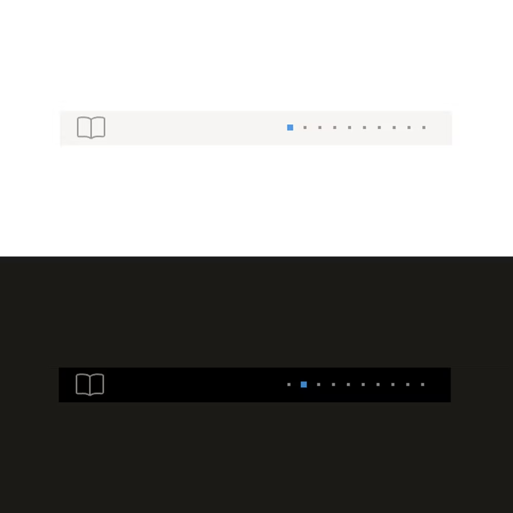
Then, instead of showing the entire table of contents, what you get is a compact version (which I called a “lens”) that gives you a visual representation that’s hopefully understandable: it includes the same icon and it’s in the same place as the topmost table of contents. It also shows where you are in the story, and I placed it squarely within the right column, so it never covers anything important.
Lastly, the page also shows the lens when you put your mouse pointer where you saw it last. This is typically a bad idea – it can create interfaces that feel like minefields – but here I thought the area was so small, and in such a faraway place, that there was no real danger.
Clicking on the lens reveals the same table of contents as from the topmost entry point, with the “current” section indicated by the accent color. Hovering on table of content items highlights them in the lens as well, hopefully helping understand what the dots are for.
By nature of attaching the menu to a sticky object, the menu can no longer scroll away – but positioning it above the typically empty right column means that in theory, you could read an entire essay with the table of contents open!
You can dismiss the menu by clicking anywhere and, keyboard-wise, you can tap Esc to close the menu, or arrow keys to move up and down quickly, which is actually kind of fun. What naturally follows from these two is Enter dismissing the menu as well.
Scrolling
Mechanics
CSS has smooth scrolling now, but I still overrode it to get a few things: a transition curve I liked more (more “ease out” oriented – I wanted a feel of machinery that “lurches” to meet your demand), and being able to interrupt the transition if needed programmatically.
The most important thing for me was to pair the duration with the distance. If you use the one duration to scroll from the top to the bottom of the page (which means tens of thousands of pixels) and then the same for a small movement, then the first one will feel too fast, or the second one too slow. Here, my duration varies between 500ms and 1500ms depending on the distance, clamped in a similar way you could interpolate and clamp a responsive type scale.
(By the way, Chrome already varies smooth scrolling duration depending on distance! But Safari doesn’t yet.)
Lastly, I clear the # part of the URL if you scroll again after arriving at the destination. I want to avoid a # dangling forever, and the user accidentally linking to the wrong part of the story later on.
(I am not sure about this, and still figuring it out. In other parts of my site I also experiment with auto adding # to link to the currently seen playground, or big interactive element, for example.)
Intra-page navigation
I personally learned to distrust footnotes on websites because clicking on them sometimes throws me to the bottom of the page without an elegant way to go back exactly where I was (often it’s just a disorienting approximation), or sometimes to go back at all. And, even if footnotes support back button, this doesn’t feel intuitive for me (back button is for inter-page navigation) – and if they don’t support it, now pressing the back button can get me in even more trouble!
Overall, it feels a bit like a minefield. I solved footnotes in a different way, but even outside of footnotes I sometimes want to link between sections of one page, and the above challenges remain.
The way I tried to help here is by doing a few things. First, any internal link is adorned with the arrow pointing either up or down to denote direction you will move in, and tell you this link is not going anywhere outside.
Second: any scrolling is smooth as described before, so it gives you orientation and continuity.
Third – any internal navigation immediately pops up the lens to help you understand the way you can control this kind of movement in general.

Lastly, while I support the browser back button here, I also show an extra back button in the lens you can use to go back to where you where in case the intra-page scroll was an unpleasant surprise. (You can test it by quickly jumping back to mechanics.)
Arriving in the middle of the page
I also found myself wanting to add a little affordance when you’re given a link with # in it, and land in the middle of a page. (I sometimes worry that people might not understand they’re not at the top, especially in the world of hidden scrollbars!)
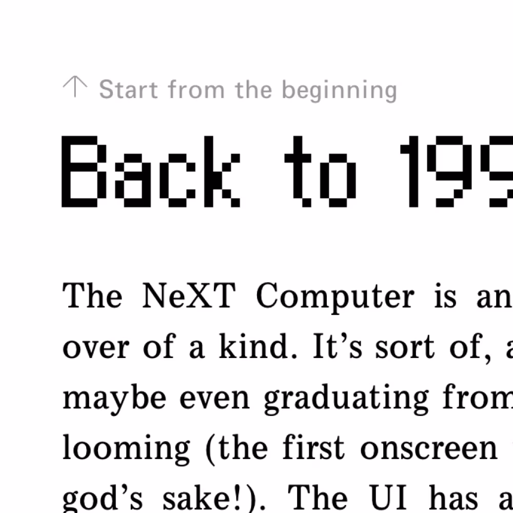
Luckily, there is a CSS property called scroll-margin-top that can create a padding above the item where you land, which helped me to imagine putting a new thing there – an explicit, but unobtrusive link to “start from the beginning.”
That little callout disappears the moment you use it or as you interact with the page otherwise.
(This link will open deep inside one of my essays in a new tab if you’d like to try that out.)
Mobile
Smartphones
The mobile challenges of making this kind of stuff work are well-understood: less room to do things, no hover actions, and expected support for gestures like swiping that are harder to code.
In addition to that, recent mobile trends (Dynamic Island, punch-out cameras, etc.) made it hard to top-align anything to the viewport.
So, I decided to go with a vertical lens. I was initially thinking of putting it on the right, close to the scrollbar (which is related!), but I already had an asymmetric free little column on the left, so it felt natural to plop the lens in there.
The scroll up/down logic is the same as on desktop, but there was no possibility for a hover state. However, a mobile convention for showing/hiding extra UI is a simple tap on a safe place, so I did that here as well – tap anywhere on the text or white space, and the lens appears or disappears.
I am not sure about this, to be honest. This was a bit wonky to code (for example, I have to detect a tap that deselects text in a pretty harrowing way so it doesn’t also show a lens). Curious what you think! I was also considering supporting tapping in the place where the lens usually sits, but that didn’t feel intuitive or helpful.
If you tap away to close the lens, it won’t appear again, even on scrolling up. This is meant to help if you find it frustrating, as it’s a bit “in your face” in the confines of a small smartphone screen. And hopefully, after that, you would how to bring it back. (The only exception for that rule are intra-page links where the lens appears all the time, as it’s an entry point to the back button.)
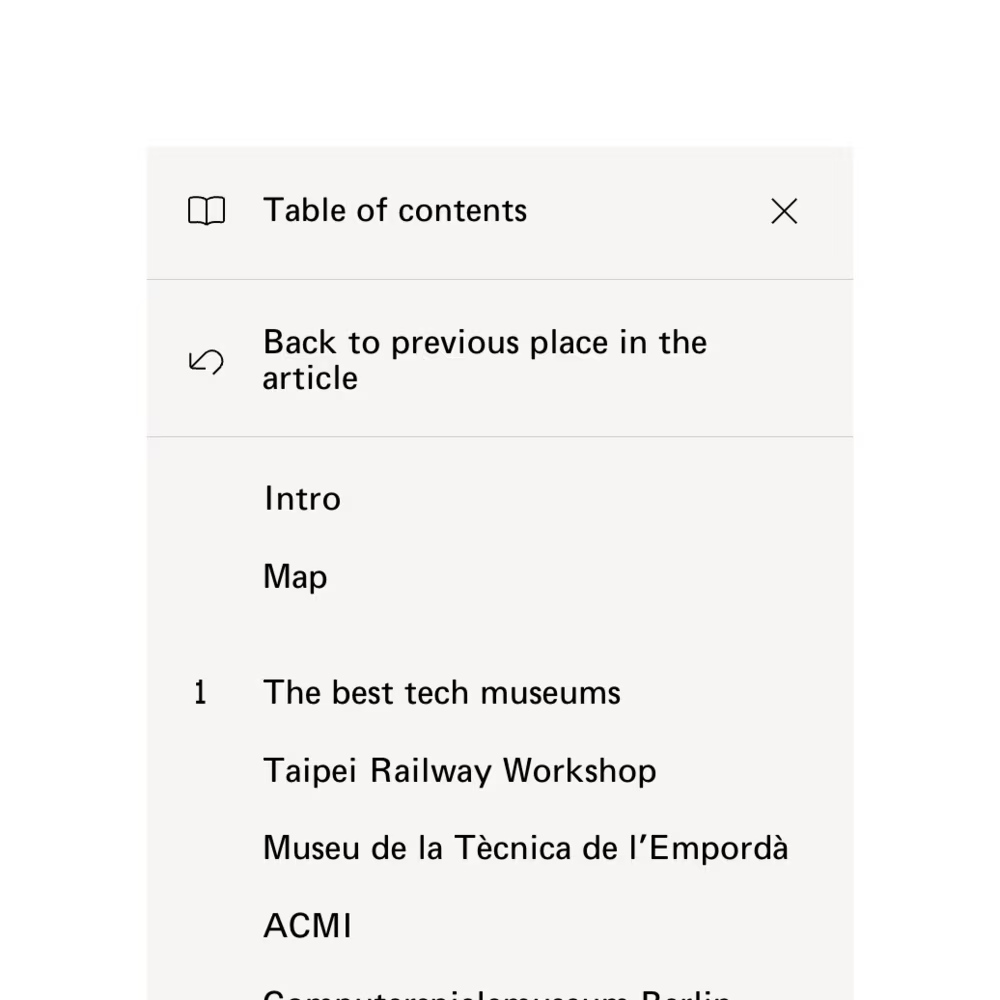
The menu slides from the left to help tie the surfaces together. There is now a shield behind it to separate it from the words underneath, and tapping on that shield closes the table of contents. But the shield is not large enough, so I also added an explicit close box. This also allowed me to repeat the book icon otherwise missing from the lens.
But this is still not good enough. Since this is a touch interface, I also had to support a gesture: swiping to the left to dismiss, with rubberbanding if you go the other way. (This is harder to do in JavaScript and I wish I had skills to do it even better. I mostly dream of some built-in features in HTML to make things feel like physical objects with rubberbanding, momentum, etc.)
I also briefly considered adding swipe right on the lens since that feels natural for edge objects, but that felt tricky. In order for this to be really reliable, I would have to support swiping all the way from the left edge, but I didn’t know if it was even possible to cancel out the browser gesture to go back in history, and even if it was: would I want to override it? In the end, I thought it’d be better not to teach people this can be relied upon, so I decided not to support swiping on the lens at all. Instead, I added a 20px invisible touch area on the right that makes it easier to tap the lens to open the menu.
For intra-page links, given the mobile lens is so small, I couldn’t think of a way to put a back button in it. But at least opening the menu in that situation shows a momentary prominent “go back to where you were” option.
Tablets
Tablets are tricky in another way. They largely avoid the “small screen” problems, but they also add a possibility of touch coexisting with mouse/trackpad, which always creates an unsolvable conundrum of “how big should the UI elements be.”
I have decided to keep largely the desktop UI here, but make the lens appear and disappear on tap as well. I kept the lens small, however, aware that it would be harder to touch – but it’s the same issue mobile has already.
Additional nuance
Appearance
1
I am not adding the table of contents to all my essays, but only those that are long enough to require it. I think consistency here is not the most important factor, trumped rather by complexity of seeing extra UI in a situation that doesn’t need it.
2
If there is no intro, the first item in the menu scrolls all the way to the top of the story; basically, the topmost entry point always “goes back to the very top.” This is, again, to avoid any confusing “where am I really” moments.
3
I have a certain set of soft rules about my website’s visual appearance, and one of them is: no shadows. This is partly for arbitrary practice, and partly to respect a certain “old-school” feel of my site I’m trying to convey.
I’m hoping that my use of gray still provides enough visual distinction, and in dark mode, the lens and the menu can be pure black because the default background isn’t.
4
If you have scrollbars visible all the time, I use the CSS property called scrollbar-width: thin to make the scrollbar in the menu more narrow, given it’s such a small surface area.
(On Chrome or Safari on a Mac, that setting doesn’t seem to influence the modern/disappearing/smartphone-influenced scrollbars – only the persistent scrollbar when you attach a mouse or toggle the right setting.)
5
The “1” in the old pixel font I resurrected was very narrow, like the digit tends to be, but that made it too thin and out of proportion with the other numbers. However, I also didn’t want to use monospace digits because they can feel uncomfortable in casual places.
So, I added a special “1” with a serif, but only if the digit stands on its own.
Interactions
1
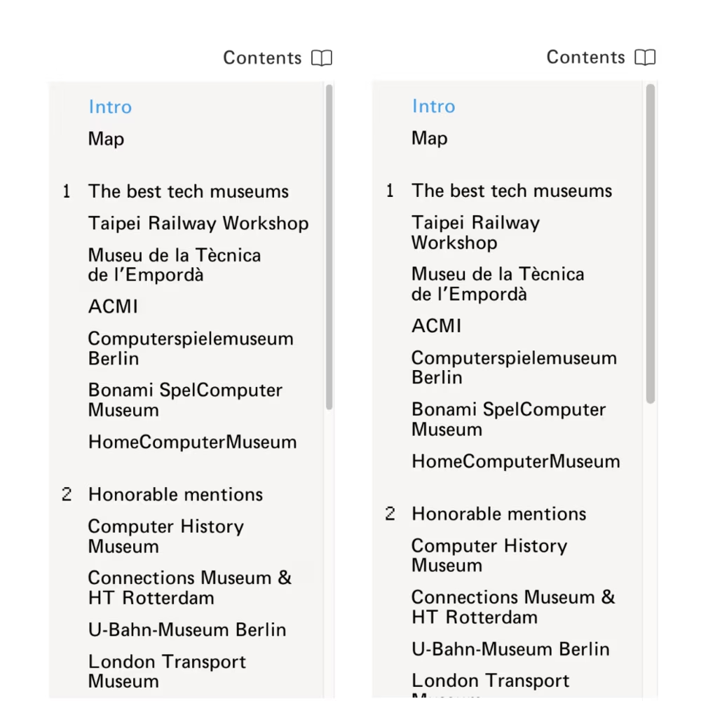
You can keep the menu open and scroll the page, and the current section updates as you scroll. (If I were using React, I’d get that for free! But I hate React.) It also scrolls internally to make sure the current section is always visible.
This part does use browser scrolling, which accompanied by CSS options behavior: smooth and block: nearest (minimum amount of scrolling instead of naïvely keeping the item in the center) and scroll-margin-top/bottom (don’t have the item appear glued to an edge, but add some distance) results in a pretty nice experience.
By the way, I also prevent overscroll leaking to the below page – if you two-finger or wheel scroll within the menu, that scroll won’t affect the page underneath even if you reach the edge.
2
If you open the menu quickly after closing, it defaults to the scroll position it had when you closed it. This is to help you not lose orientation – otherwise the menu will scroll to make sure the current section is visible.
I do generally like interfaces that understand a difference when you come back immediately vs. some time later. (For example, some search engine apps preserve the query when you return quickly, but reset it if there’s a longer break between launches.)
3
The menu and the lens support the mousedown-drag-mouseup menu operation, in addition to the traditional (and slower) click-click menu operation. It feels faster (and, honestly, more powerful!) if you can do this in one single gesture – and that gesture can become even more cool and Engelbartian, as you can still use a mouse wheel or two fingers to scroll in the middle of it if needed.
Many menus on the web do not support that, even if it’s a very easy front-end change, and it can feel annoying if you’re used to that interaction from the operating system itself. (Not all UI elements should support mousedown activation, since while faster, it doesn’t allow you to change your mind before mouseup by moving the cursor aside. But the menus always have that escape hatch by their nature.)
4
I made sure every item is padded to the edges so that click and tap operations are easier. However, there are still dividing spaces between sections. Clicking on an empty space like this doesn’t close the menu, as it’s assumed that the click was a mistake and the user wanted to click something nearby, and having to reopen the menu would be a more costly recovery method than just not closing the menu to begin with – especially if you use the mousedown interaction.
5
When you use arrow keys to navigate through the menu, you never have to wait for the transition to be over. This is very important for me, because transitions that make you wait are really frustrating in repeated use.
Also, whenever you use arrow keys, the current indicator in the menu (immediately showing the new item) gets disconnected for a moment from the current indicator in the lens (which moves more slowly and matches the scroll position). This small inconsistency felt worth it for a better experience where you don’t feel like you are waiting for the menu to catch up with your keystroke.
6
On mobile, the lens animates from the left when you tap to open, matching the animation of the menu replacing it. However, when the lens appear or disappears as you scroll, the movement is in the Y axis instead. This is because I find movement that goes counter the axis of scroll unpleasant and unnatural, and in this case this felt like it was worth the inconsistency.
7
As you can tell by this point, I love asymmetry in graphic design, but I also love it in interactions. To me, every “close” interaction should be faster than “open” because that mimics real life, and I apply that rule in all the transitions of the lens and the menu.
8
Speaking of asymmetry, the lens appears quickly when you hover over the place where it “lives,” but it disappears with a small 300ms delay. This is a relatively standard method, a flavor of Fitts’s Law or “debouncing,” to make the UI slightly less jittery – you might accidentally overshoot and come back on the way there, and so on.
But also, if you hold our cursor over the lens, it will never disappear (even if it normally would) as you scroll, so you can hold it in place this way. This reinforces the idea that this is a constant “home” for the lens.
9
The lens disappears when you leave the page, for example when you ⌘Tab to another app. This is so that you don’t end up on extra detritus when you come back, and can also be helpful if you want to take a screenshot or something like that. (Note that typically holding state on cmd tab and return is better. Too many apps mess up focus here, for example, so you cannot easily jump out to copy something to the clipboard, and immediately jump back and paste. But here, the lens is meant to be ephemeral.)
10
As for accessibility: I operated under the assumption that screen readers are actually ahead on this, and already have built-in functionality that allows to effectively generate the table of contents of any site – and that they will do a better job than any on-screen experience read out loud would, so outside of using standard methods of denoting hierarchy and navigating (<h2>/<h3> tags for hierarchy, <a> for links, # for linking, ⌘-clicking, and so on) I let it all be. But, let me know if that’s a wrong assumption.
Other implementations
Mathieu Triay’s What can board games teach us about remote interactions? on desktop shows the table of contents constantly and expands within the section, and on mobile bottom-aligns the entry point. It also jumps immediately without animations, as an intentional choice.
That’s it! If you enjoyed this or found it useful, drop me a line – I could also do the same for the image gallery experience that I have on my site, and other things.