Marcin Wichary
14 February 2025 / 6,100 words / 600 photos
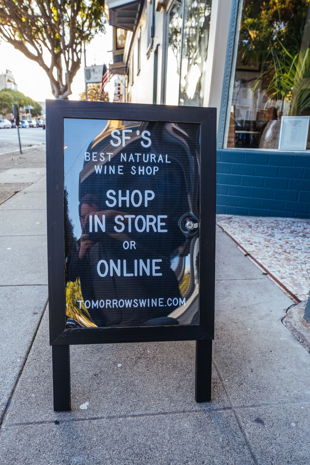
The hardest working font in Manhattan
In 2007, on my first trip to New York City, I grabbed a brand-new DSLR camera and photographed all the fonts I was supposed to love. I admired American Typewriter in all of the I <3 NYC logos, watched Akzidenz Grotesk and Helvetica fighting over the subway signs, and even caught an occasional appearance of the flawlessly-named Gotham, still a year before it skyrocketed in popularity via Barack Obama’s first campaign.
But there was one font I didn’t even notice, even though it was everywhere around me.
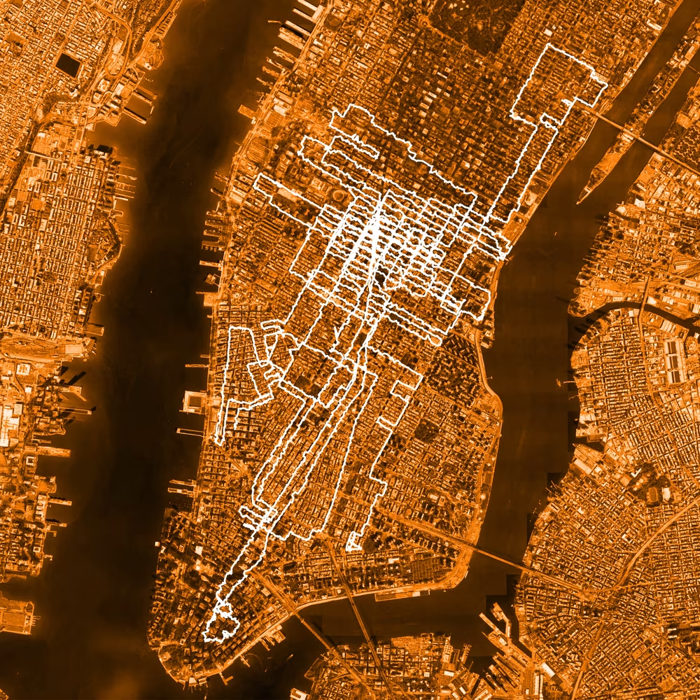
Last year in New York, I walked over 100 miles and took thousands of photos of one and one font only.
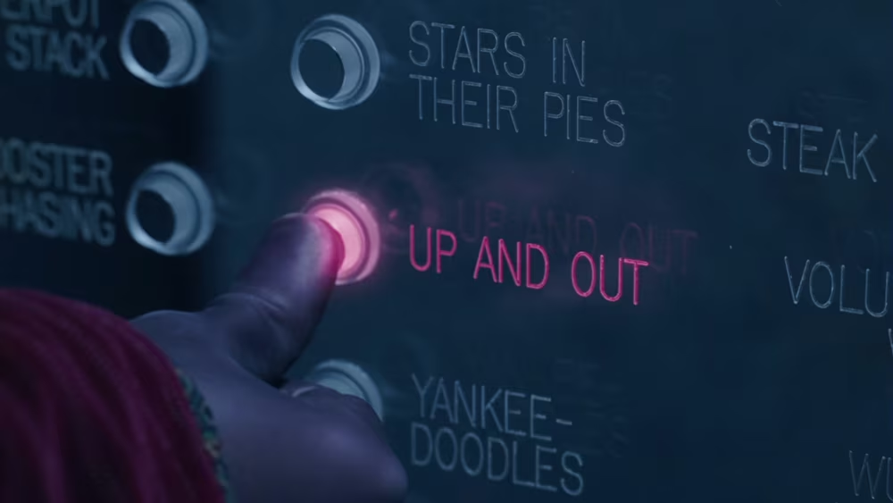
The font’s name is Gorton.
1
It’s hard to believe today that there was a time before I knew of Gorton and all its quirks and mysteries. The first time I realized the font even existed was some time in 2017, when I was researching for my book about the history of typing.
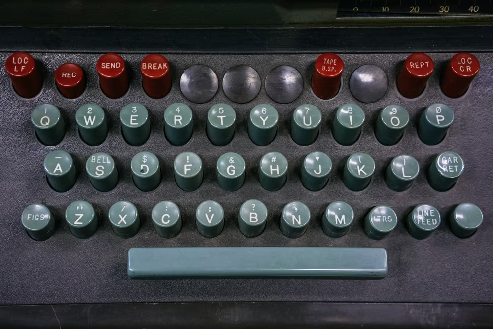
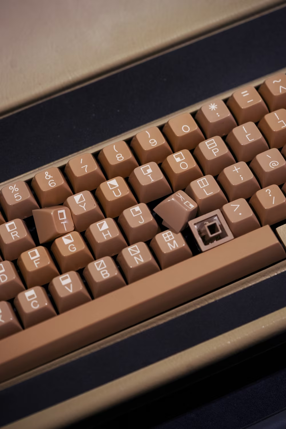
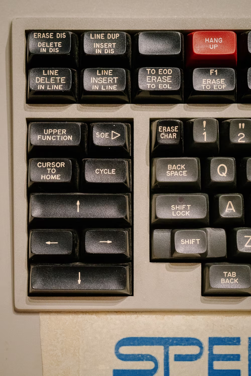
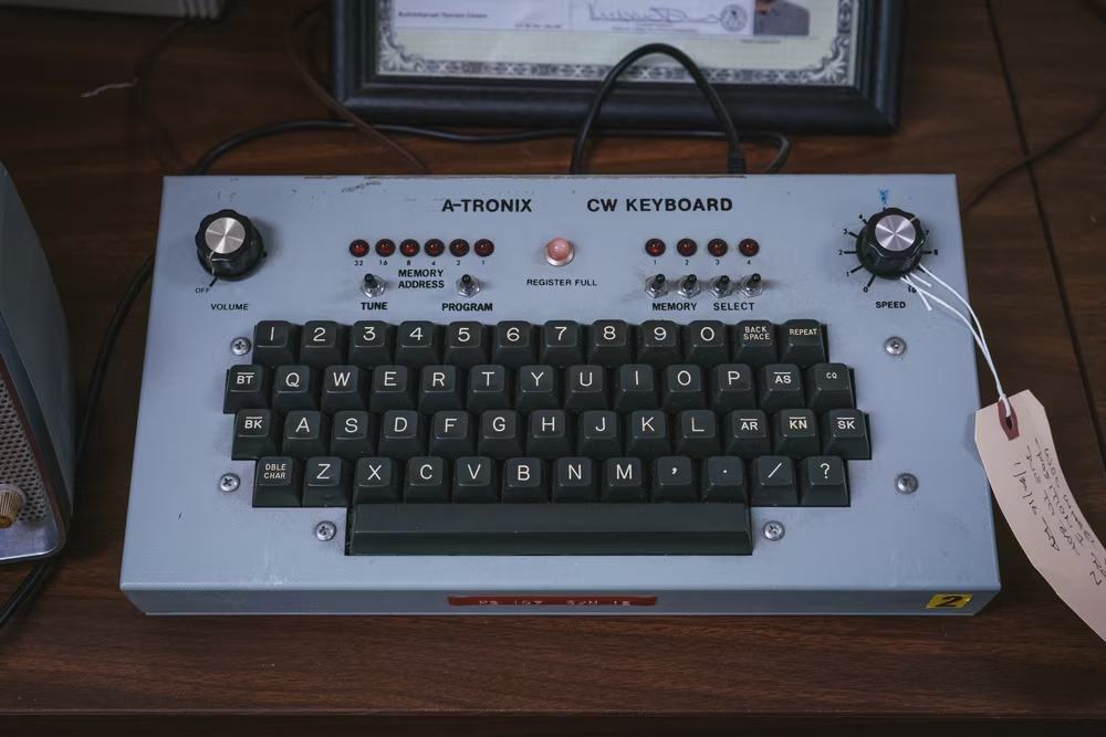
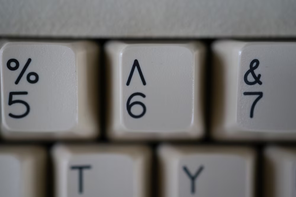
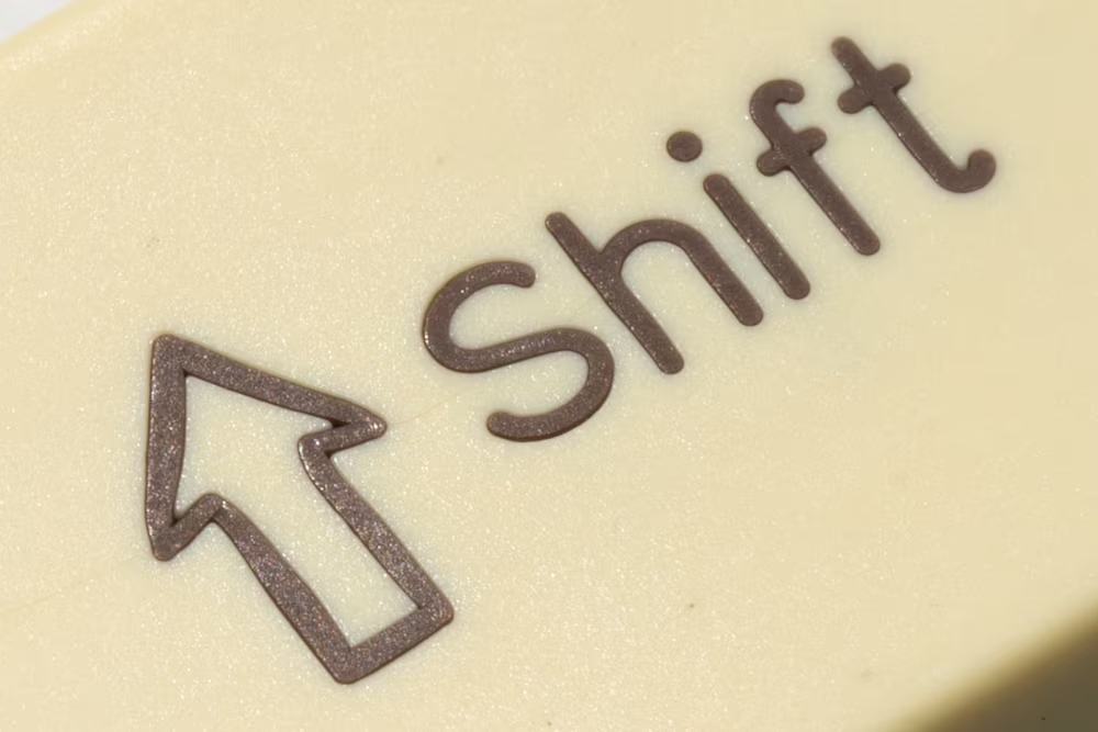
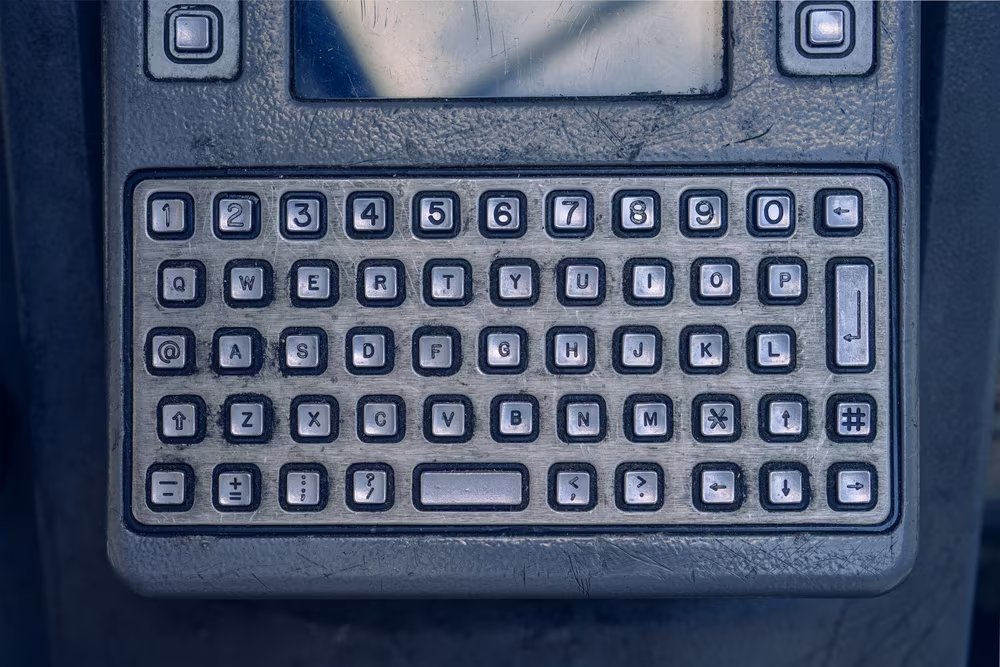
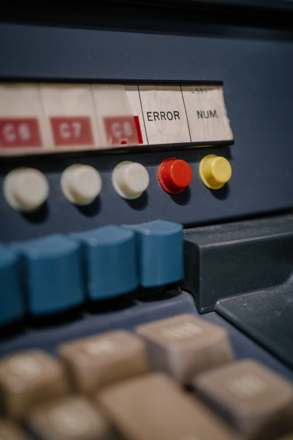
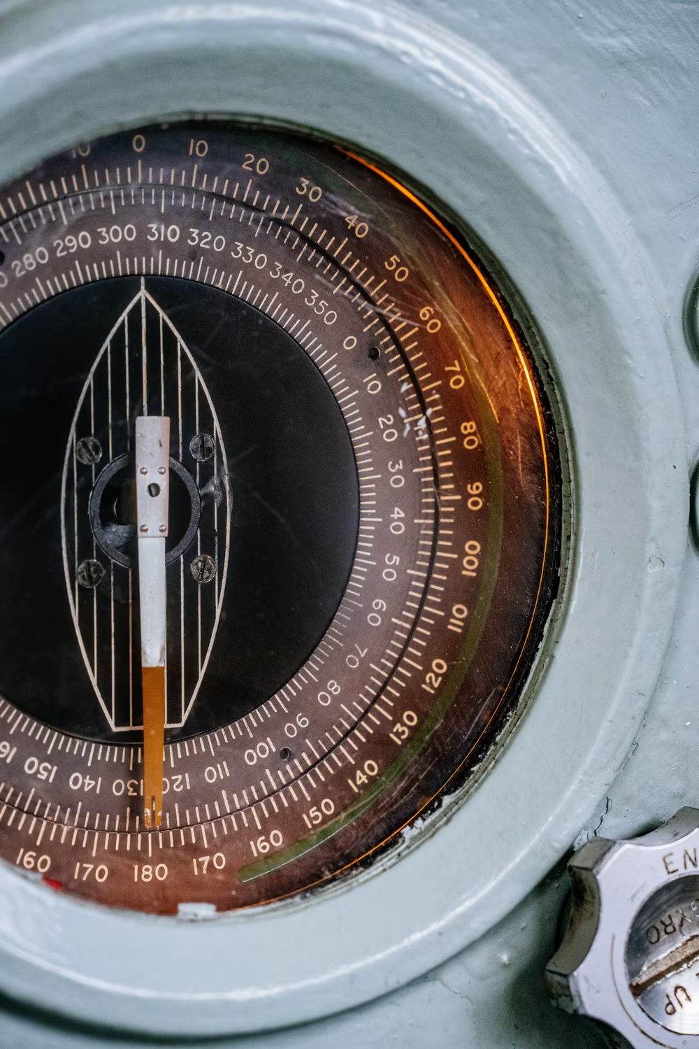
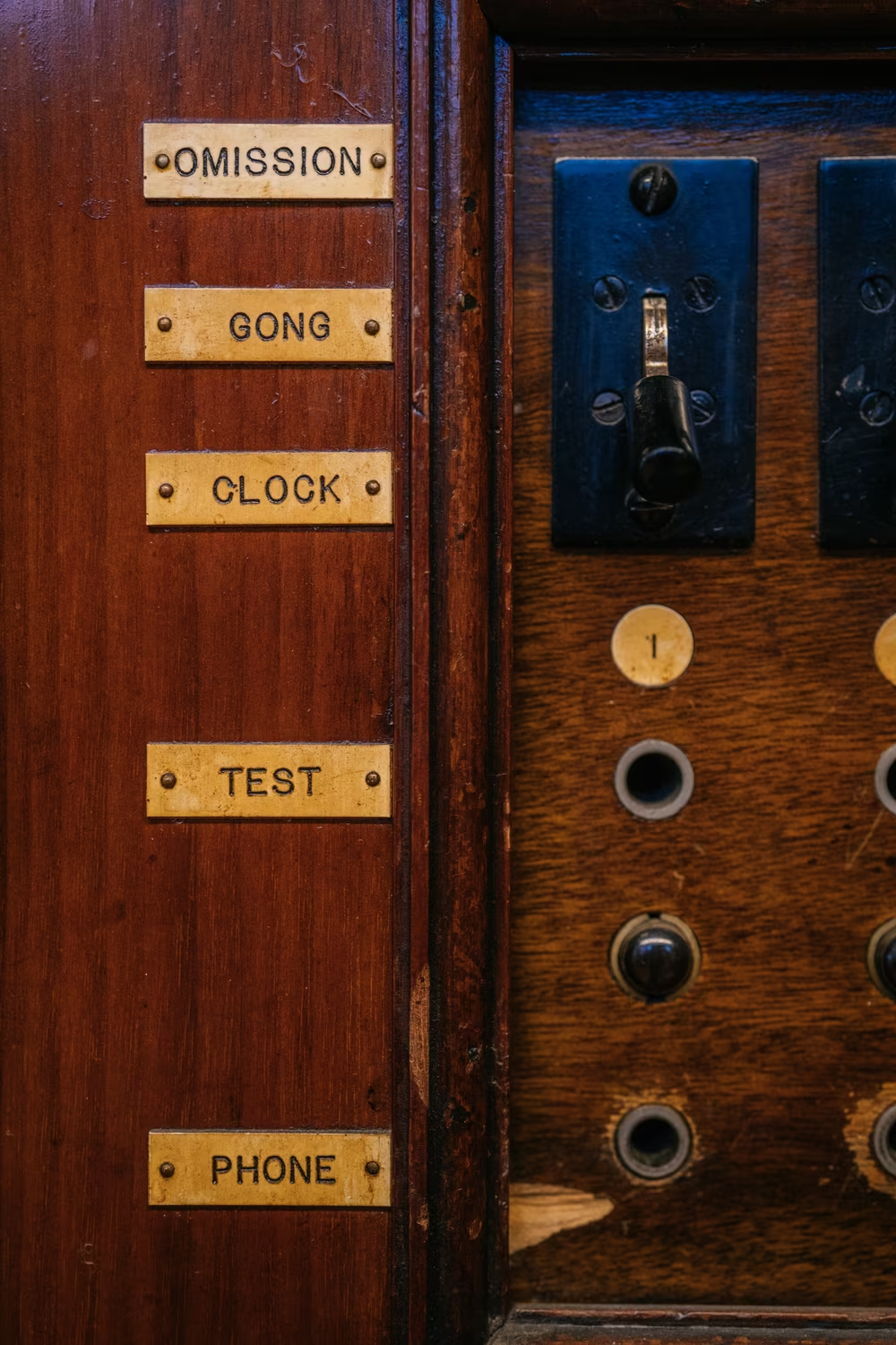
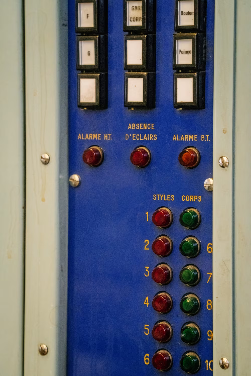
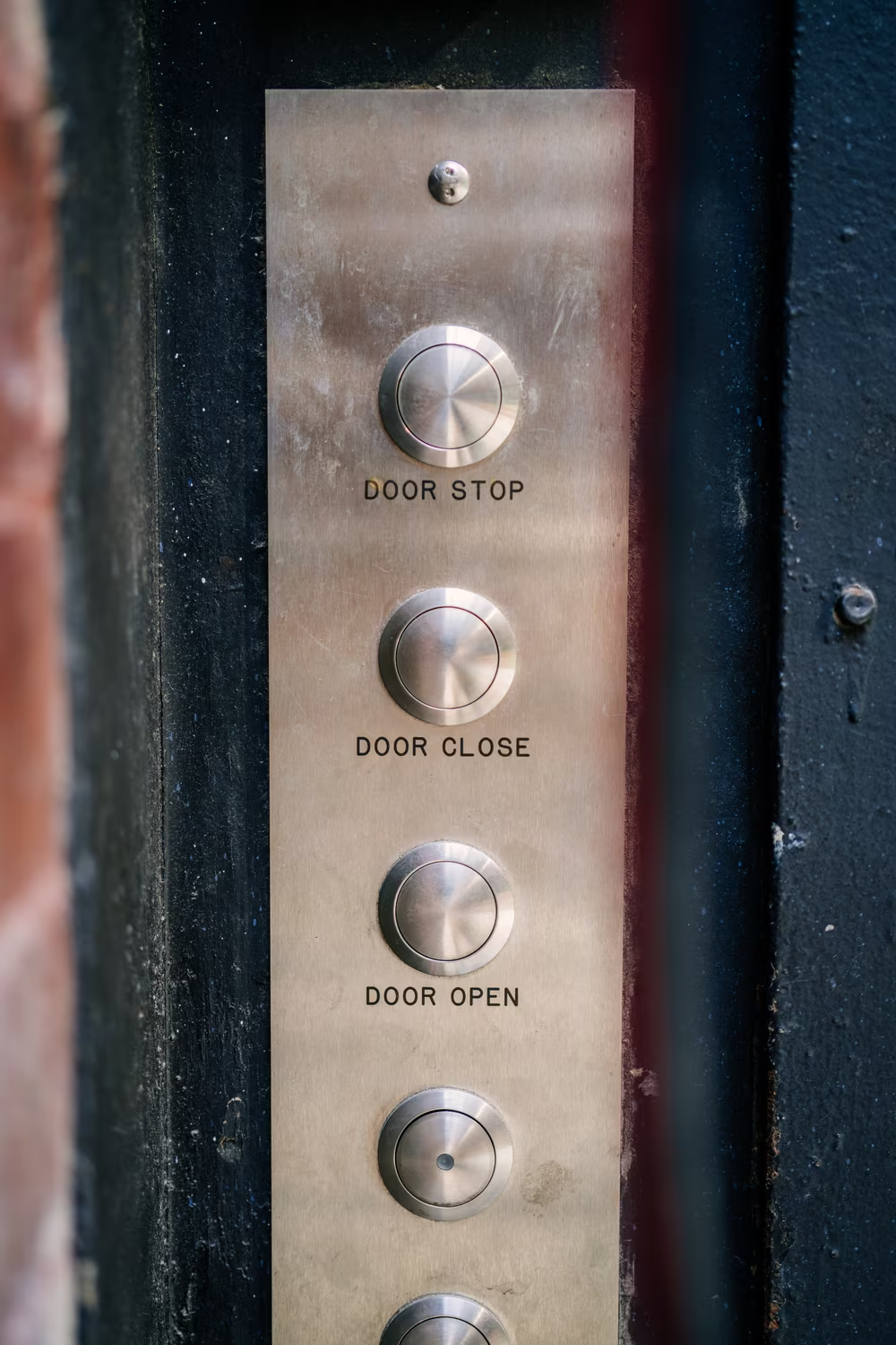
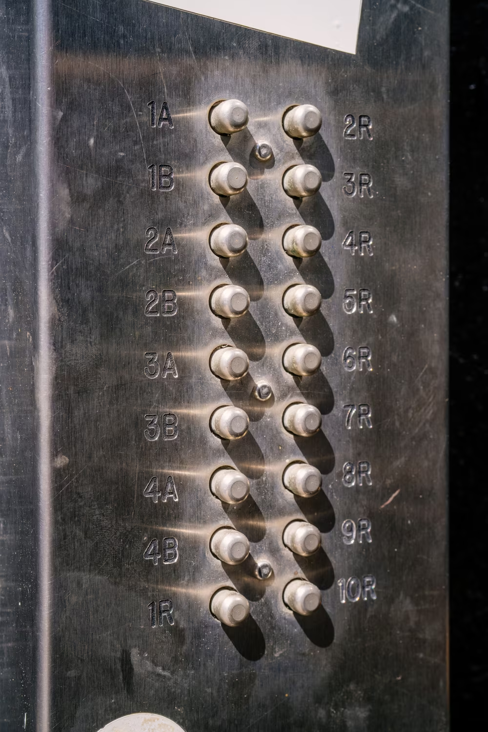
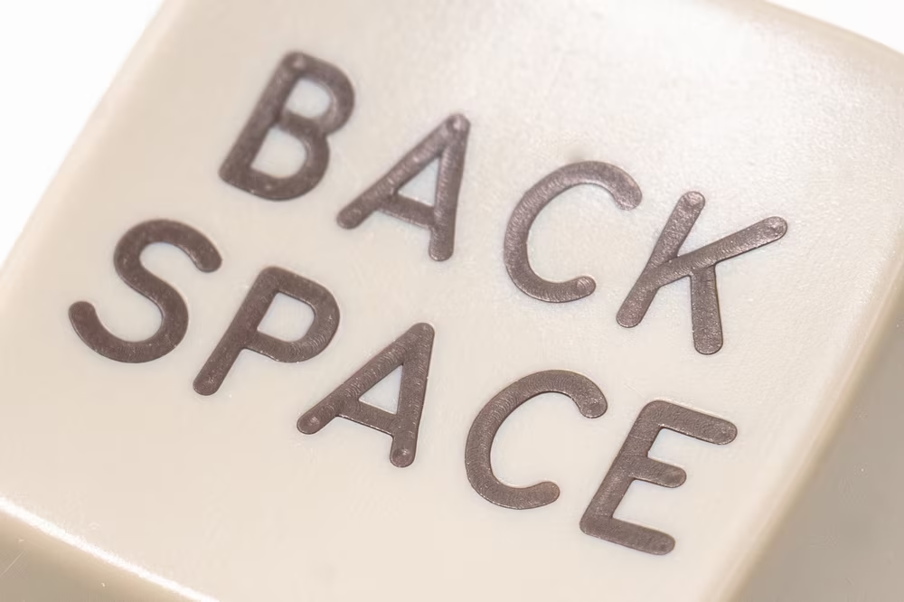
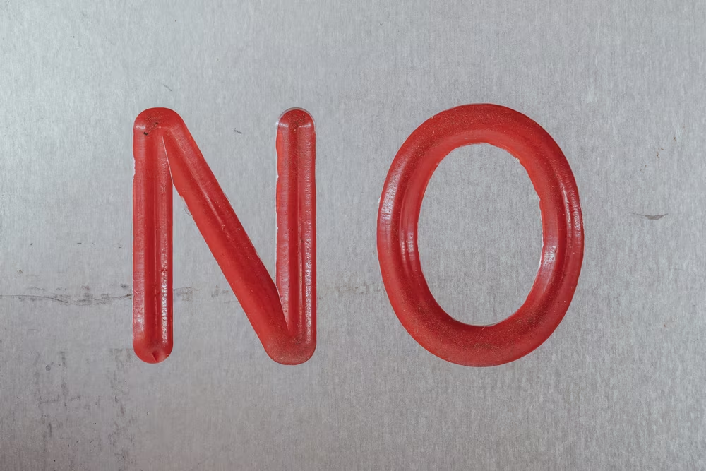
Many keyboards, especially older ones, sported a particular distinctive font on their keycaps. It was unusually square in proportions, and a weird mélange of “mechanical” and “childish.”
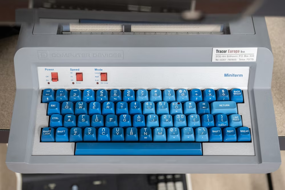
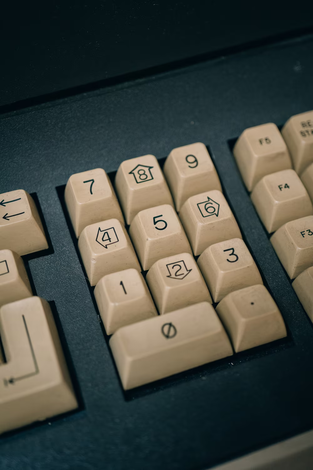
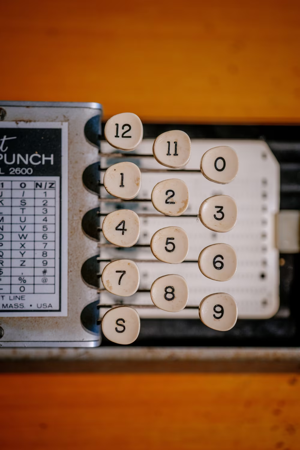
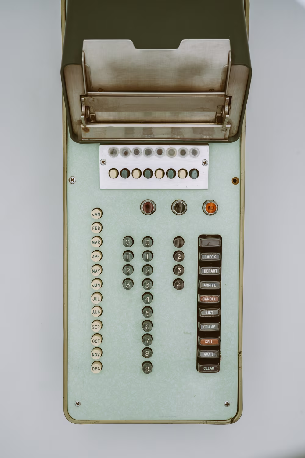
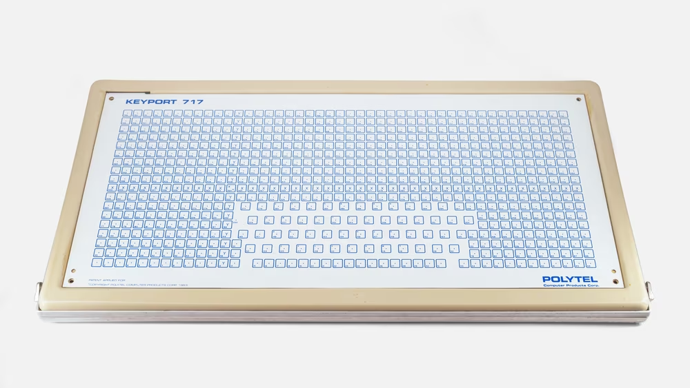
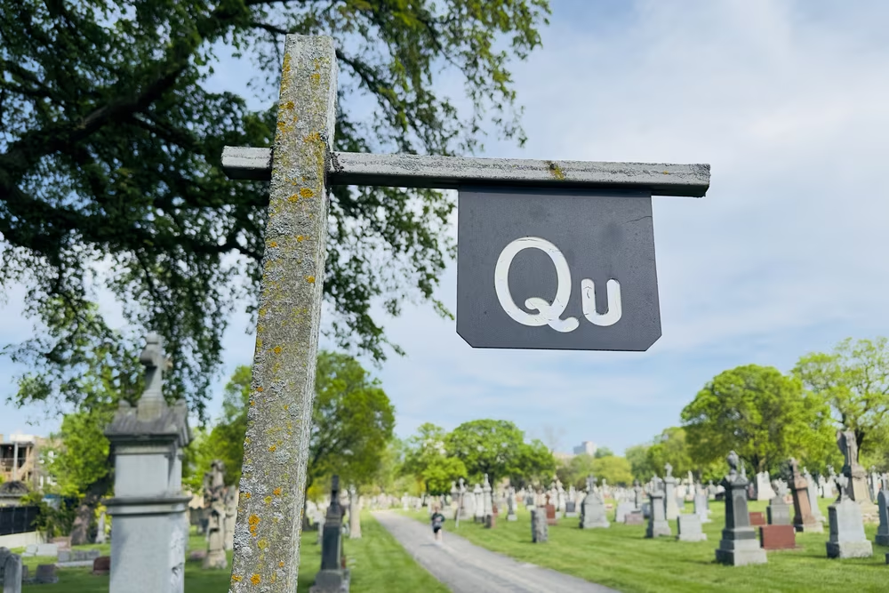
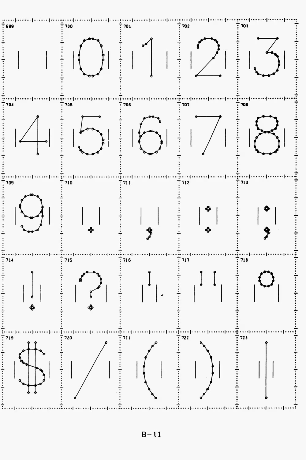
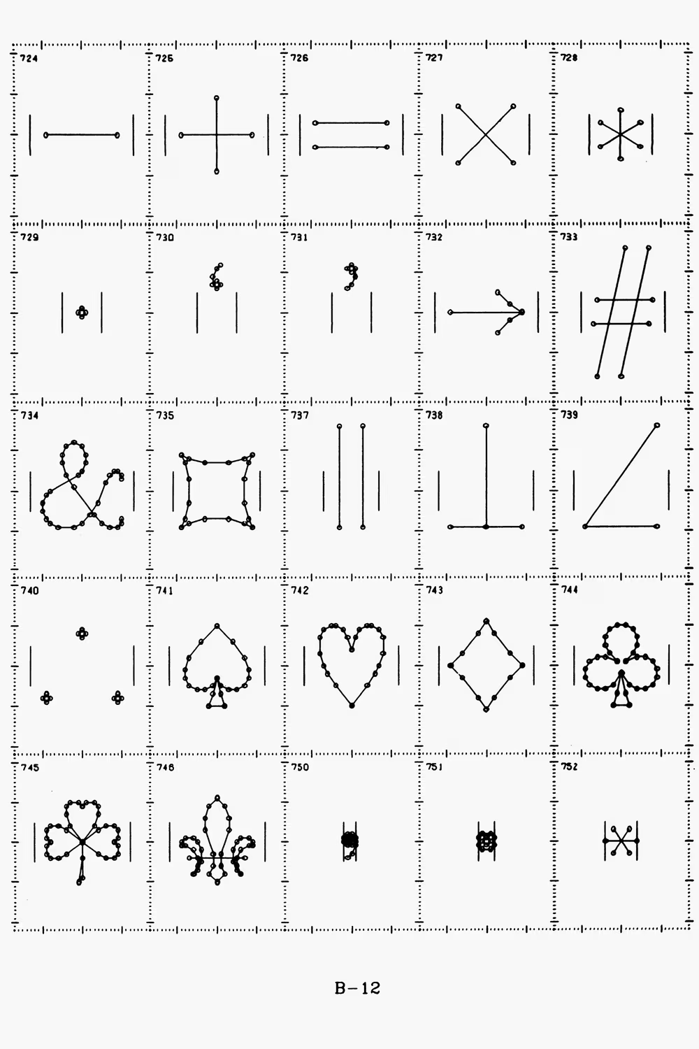
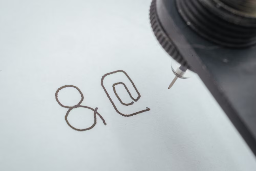
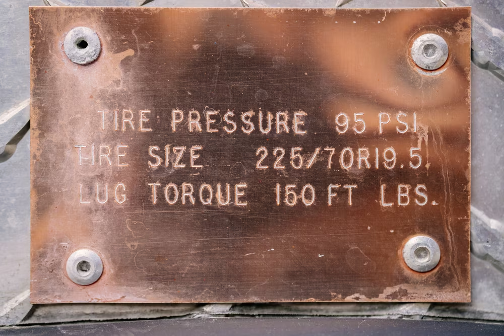
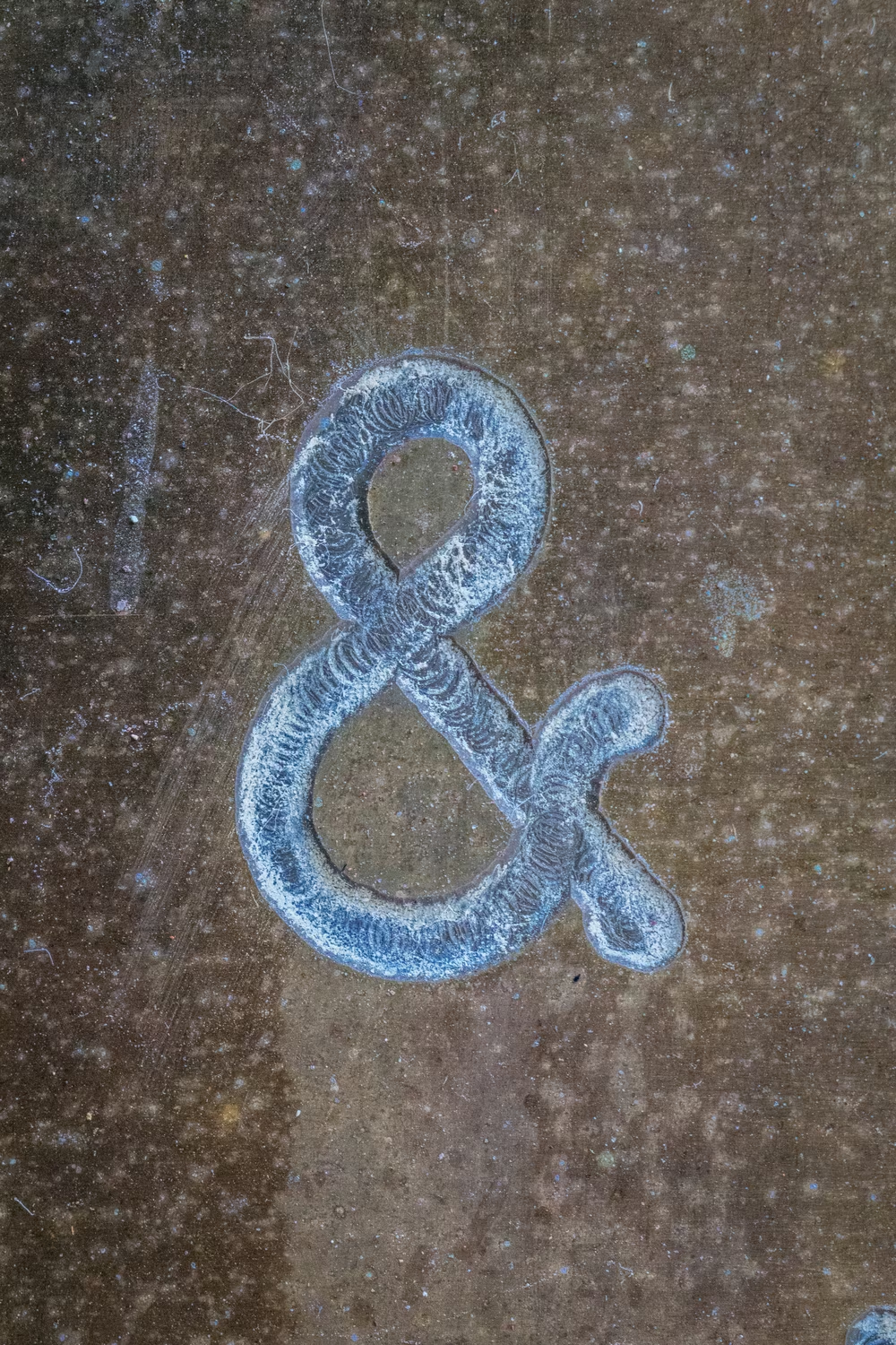
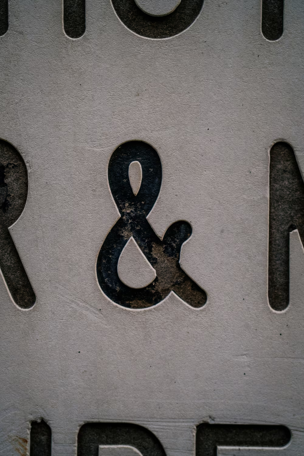
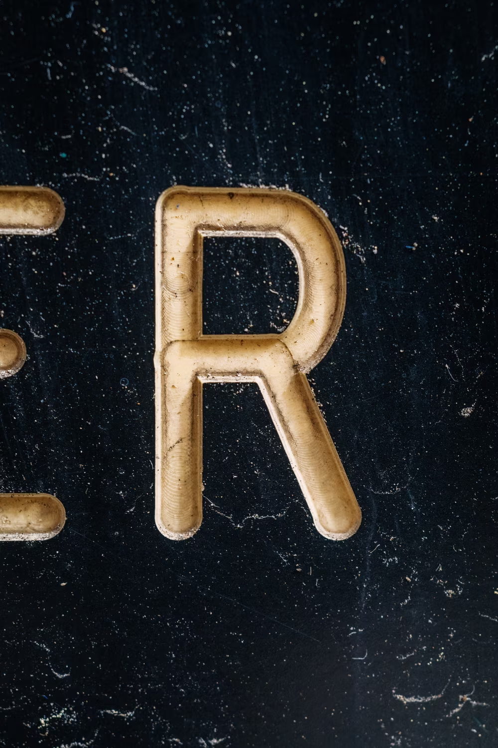
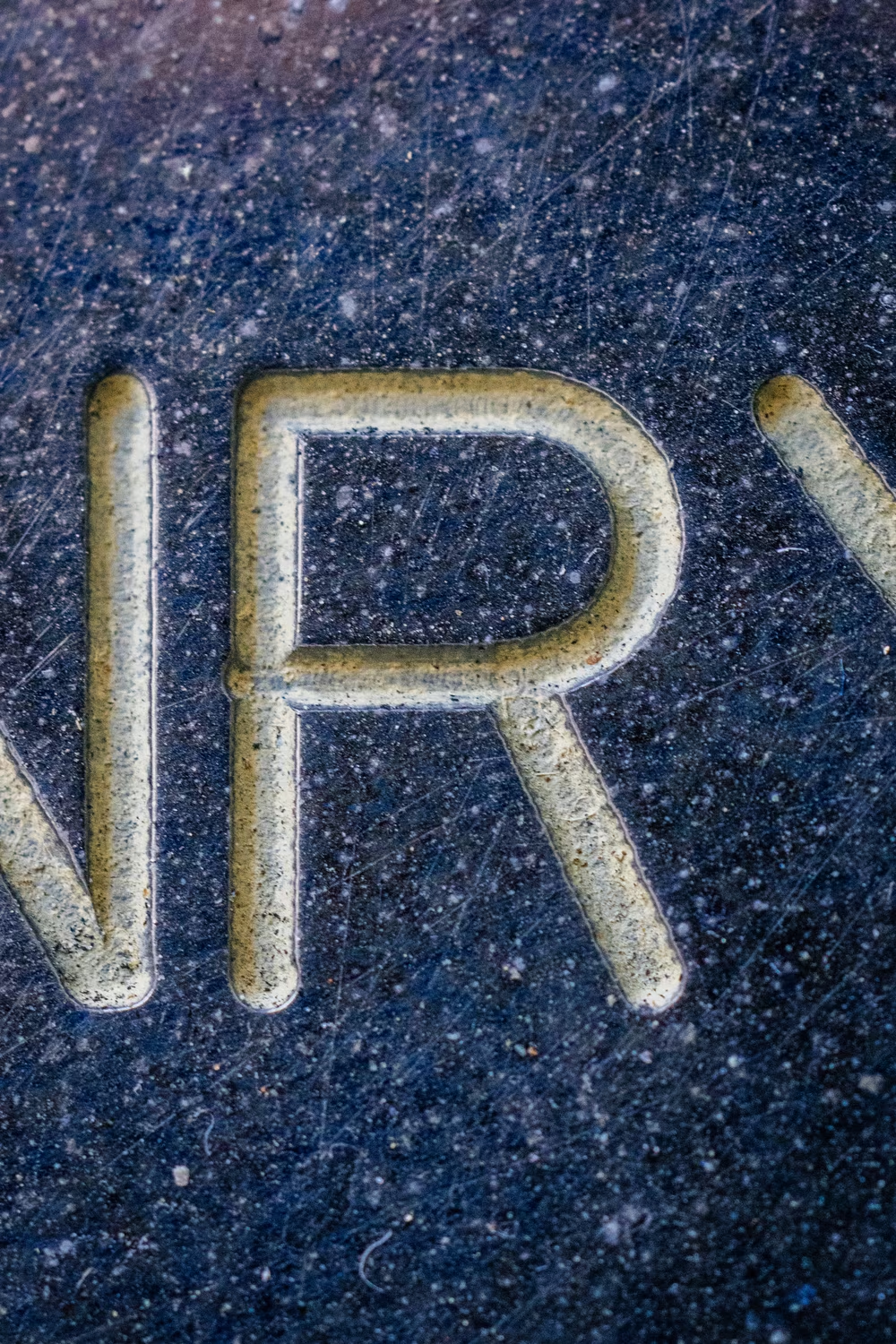
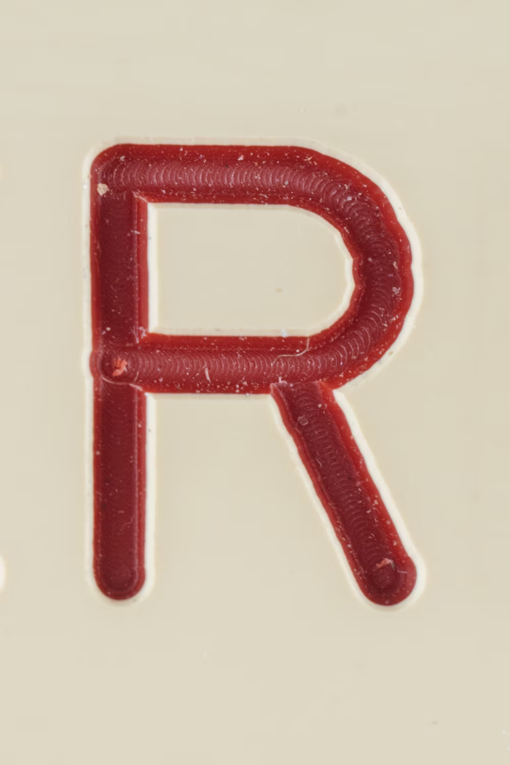
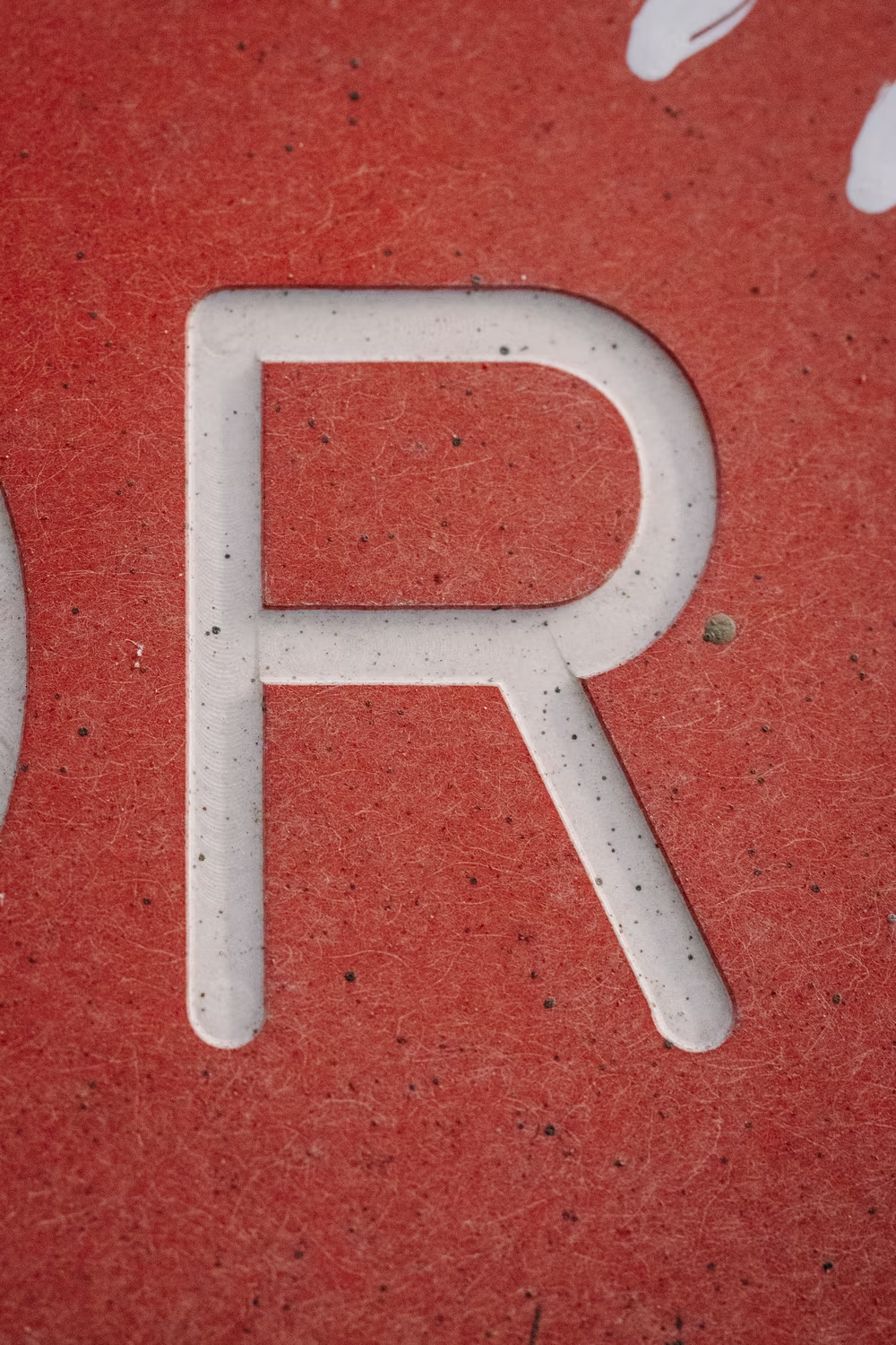
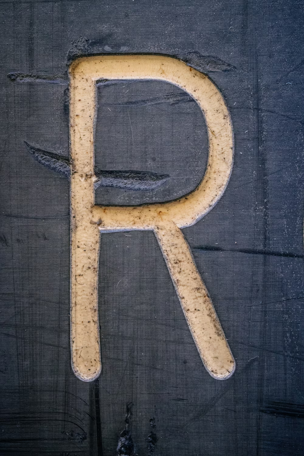
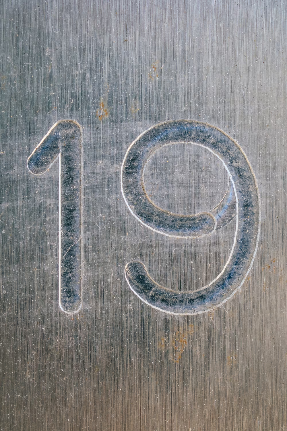
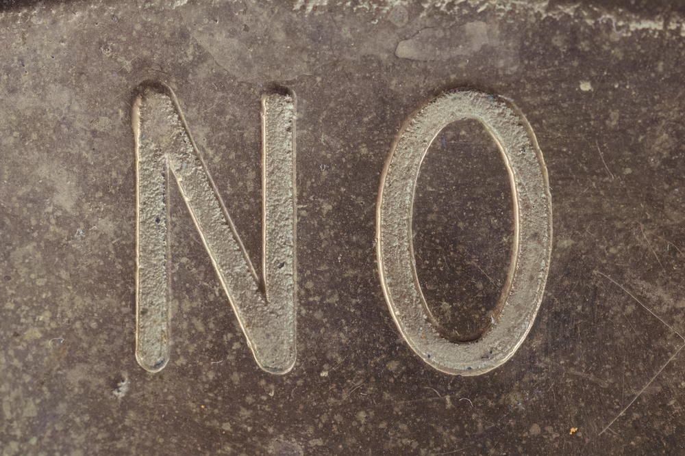
The more I looked at it, the more I realized how bizarre and amateurish it was. The G always felt like it was about to roll away on its side. There was a goofy wavy hook sticking out of Q. P and R were often too wide. & and @ symbols would be laughed away in a type crit, and the endings of C felt like grabbing something next to it – a beginning of a ligature that never came.
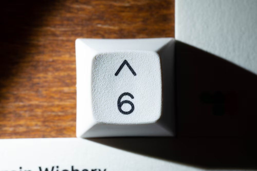
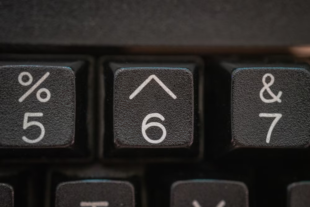
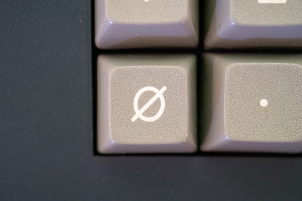
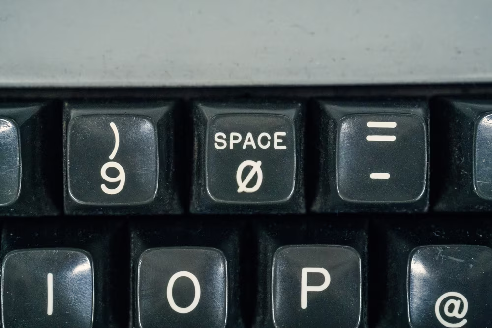
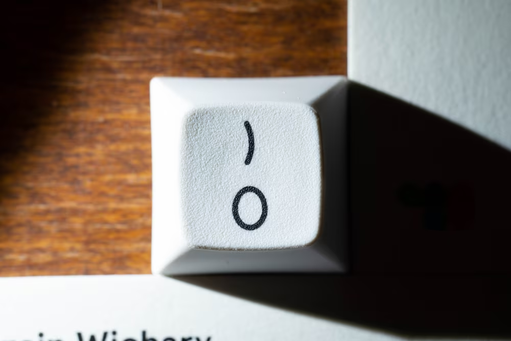
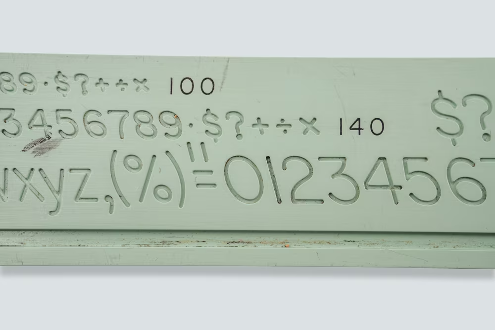
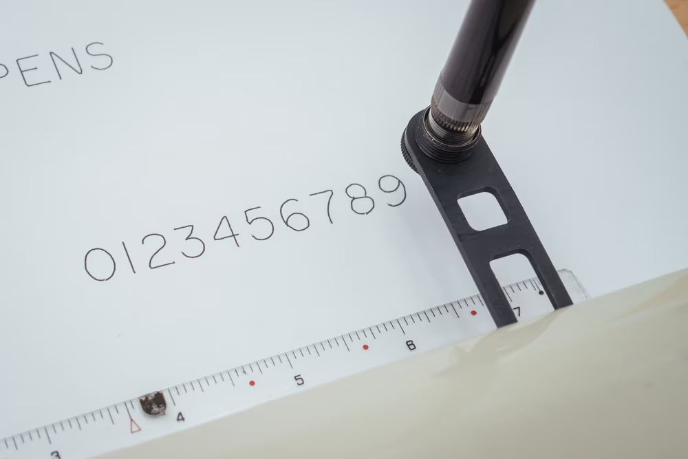
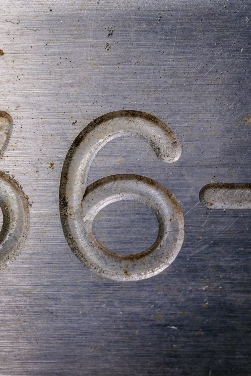
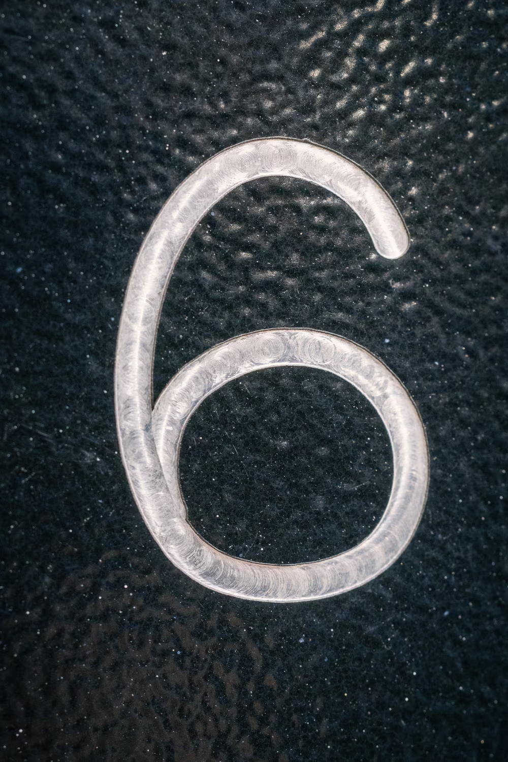
The strangeness extended to the digits. There was a top-flatted 3 resembling common Cyrillic styling, 7 sloping down in a unique way, a very geometric 4, an unusual – perhaps even naïve – symmetry between 6 and 9, and a conflation of O with 0 that would be a fireable offense elsewhere.
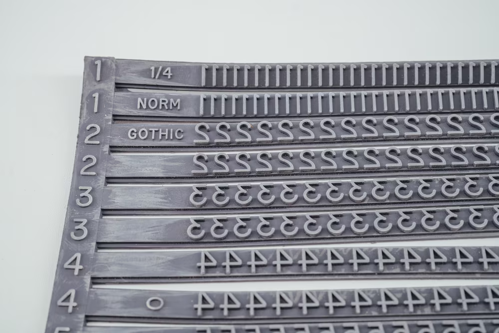
Looking at just a few keyboards, it was also obvious that it wasn’t just one rigid font. There were always variations, sometimes even on one keyboard. 0 came square, dotted, or slashed. The usually very narrow letter I sometimes sported serifs. The R and the 6 moved their middles higher or lower. There also seemed to be a narrower version of the font, deployed when a keycap needed a word and not just a letter. (Lowercase letters existed too, but not very often.)
My first thought was: What a mess. Is this how “grotesque” fonts got their name?
Then, the second thought: I kind of like it.
But what font was it? What The Font website posited TT Rounds, Identifont suggested it could be Divulge, my early guess was DIN Rounded or something related to road signage. Whatever it was, a flat R clearly separated it from Helvetica, and the shapes were not as round as even the un-rounded Gotham’s.
A few places for keyboard nerds referred to the font as “Gorton,” but that phrase yielded zero results anywhere I typically looked for fonts I could download and install.
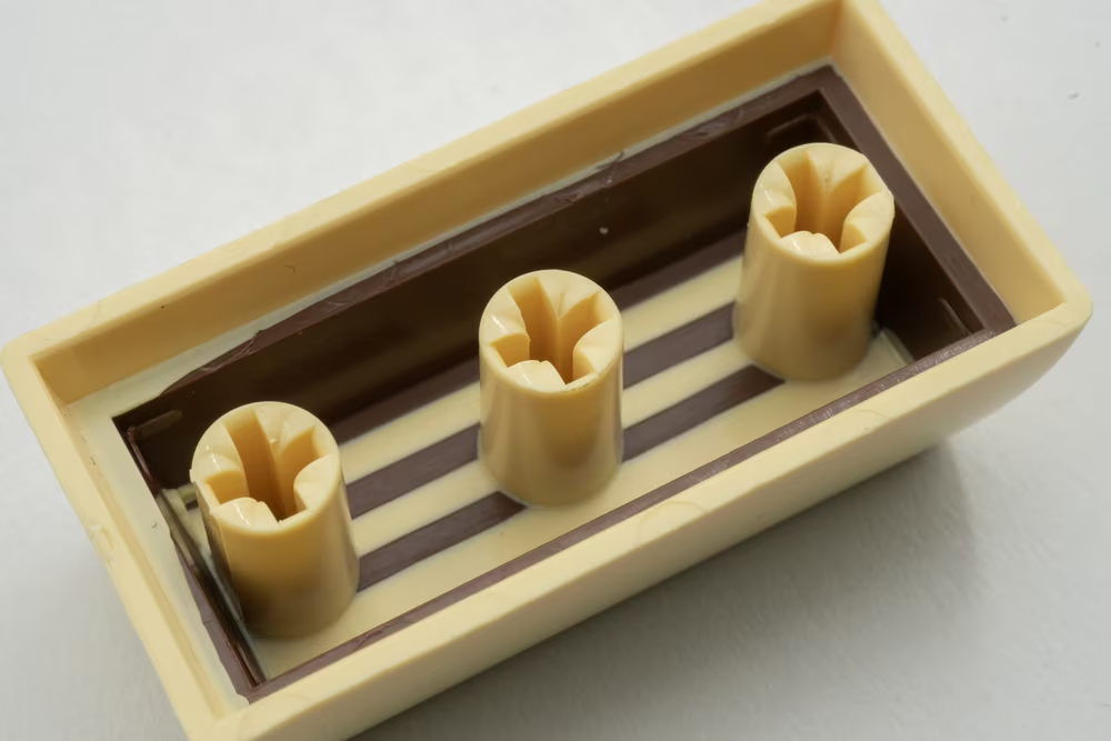
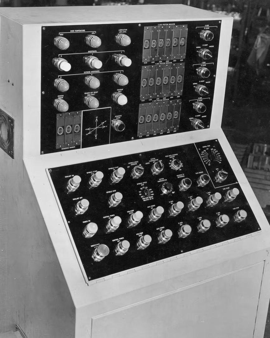
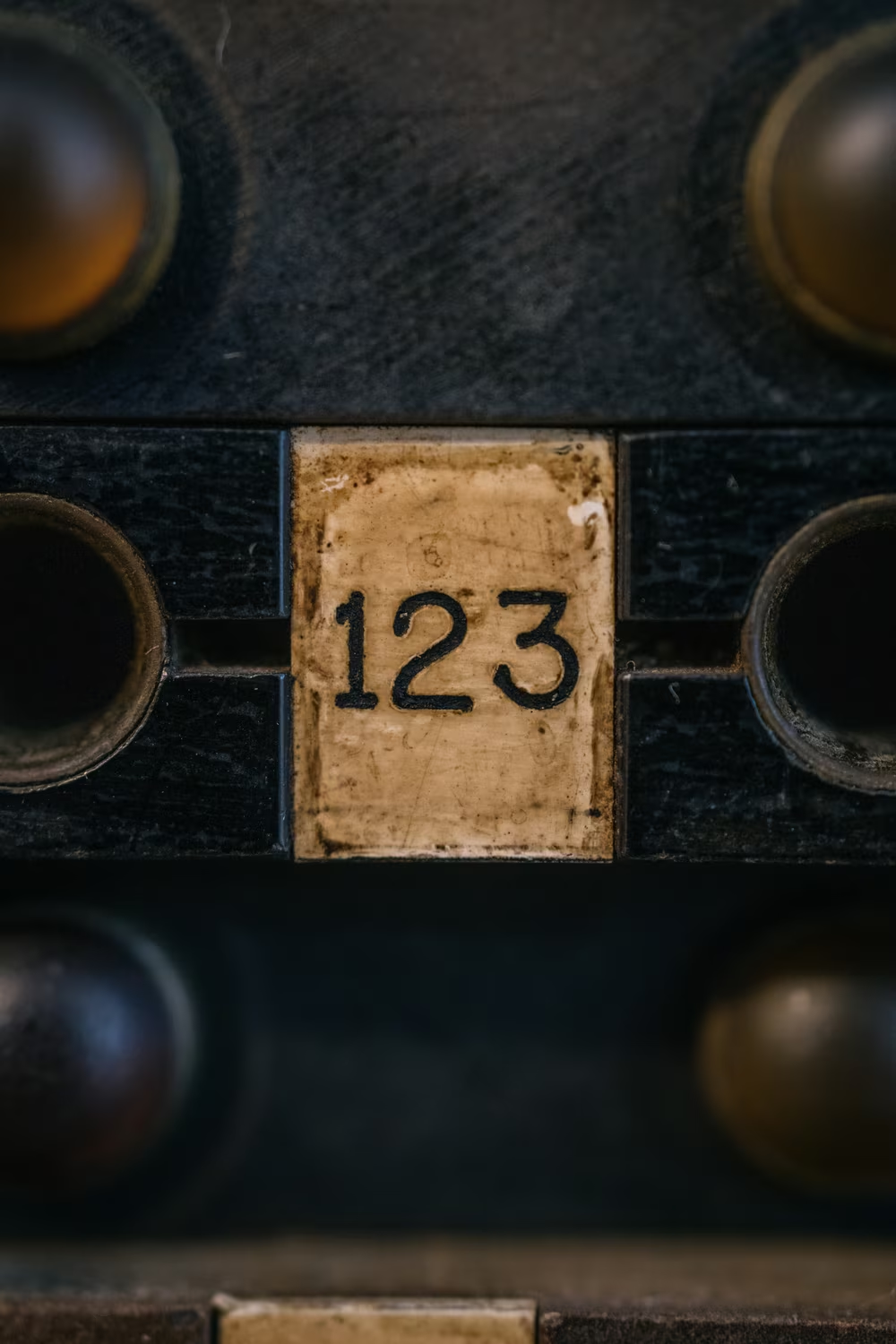
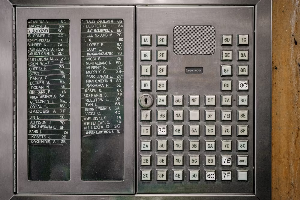
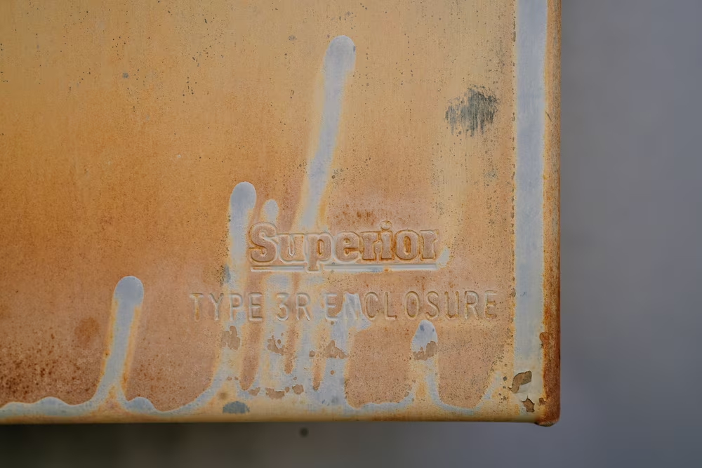
I originally thought this had to do with how keys were made. Only in newer keyboards are the letters printed on top of the keys, or charred from their surface by a laser. In older ones – those from the early 1960s laboratory computers, or the 1980s microcomputers – the way every key was constructed was by first molding the letter from plastic of one color, and then grabbing a different plastic and molding the key around the letter. A Gorton letter was as physical as the key itself. It made the keys virtually indestructible – the legend could not wear off any more than its key – and I imagined required some specialized keyboard-making machinery that came with the “keyboard font” already there.
2
But then, I started seeing Gorton in other places.
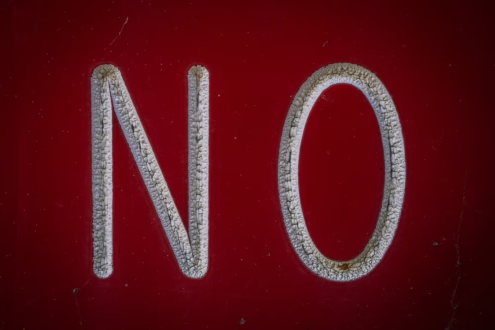
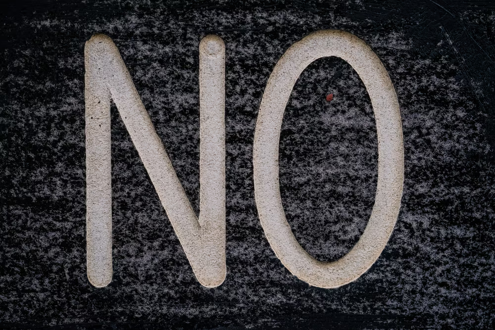
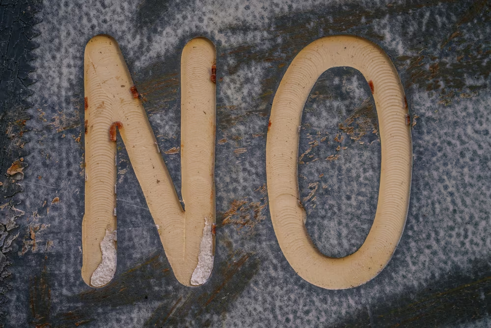
Hours of looking at close-ups of keys made me sensitive to the peculiar shapes of some of its letters. No other font had a Q, a 9, or a C that looked like this.
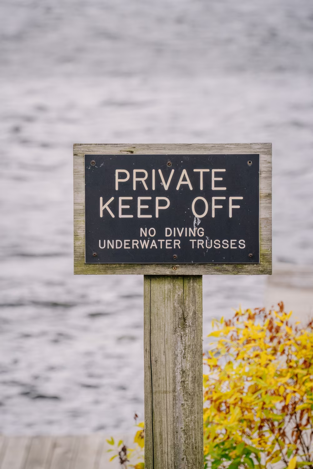
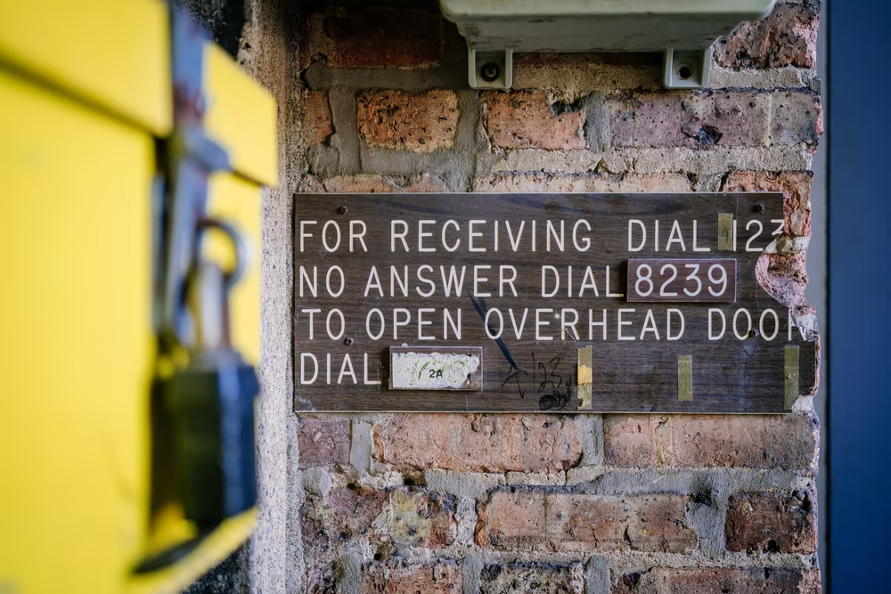
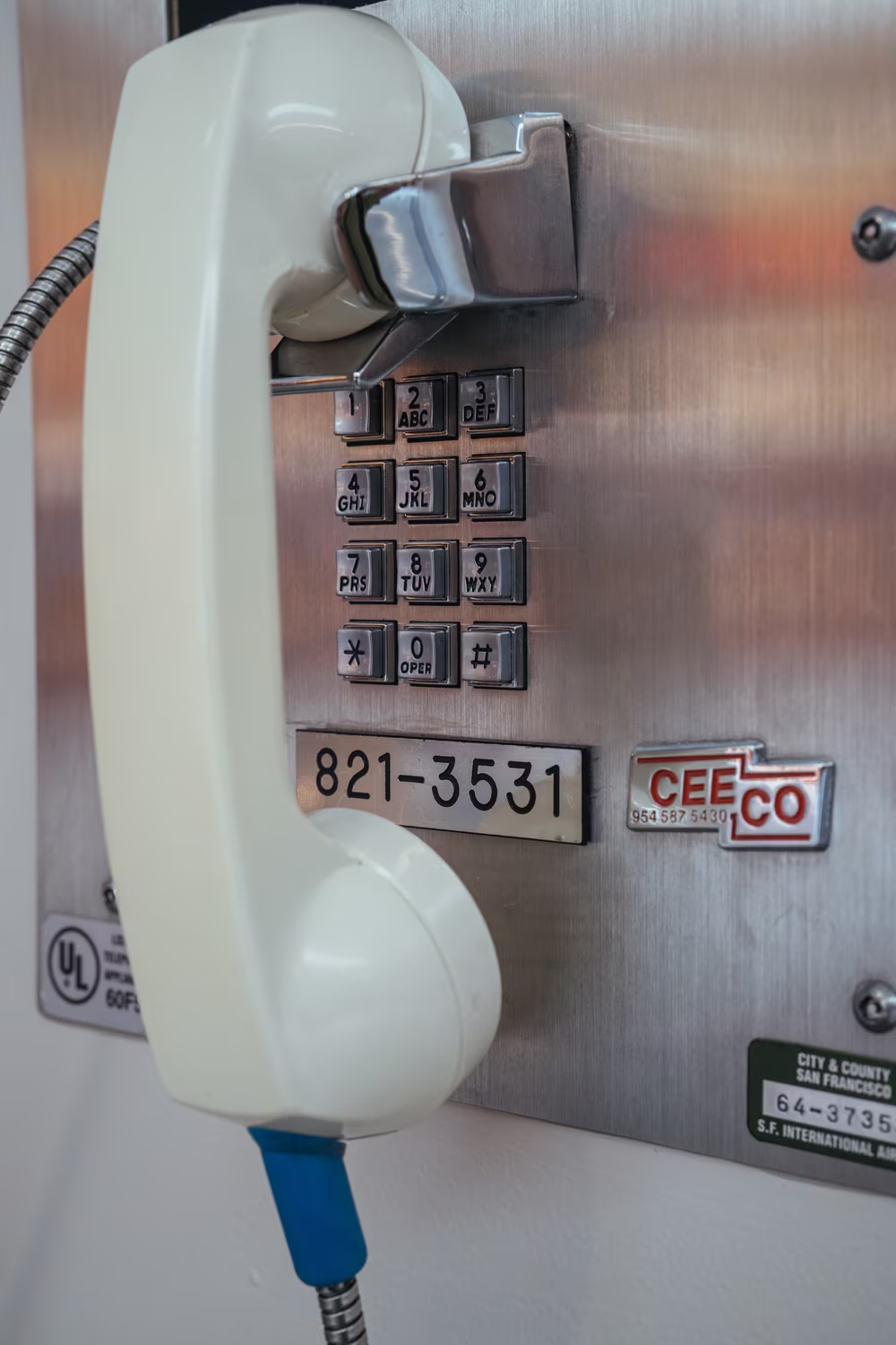
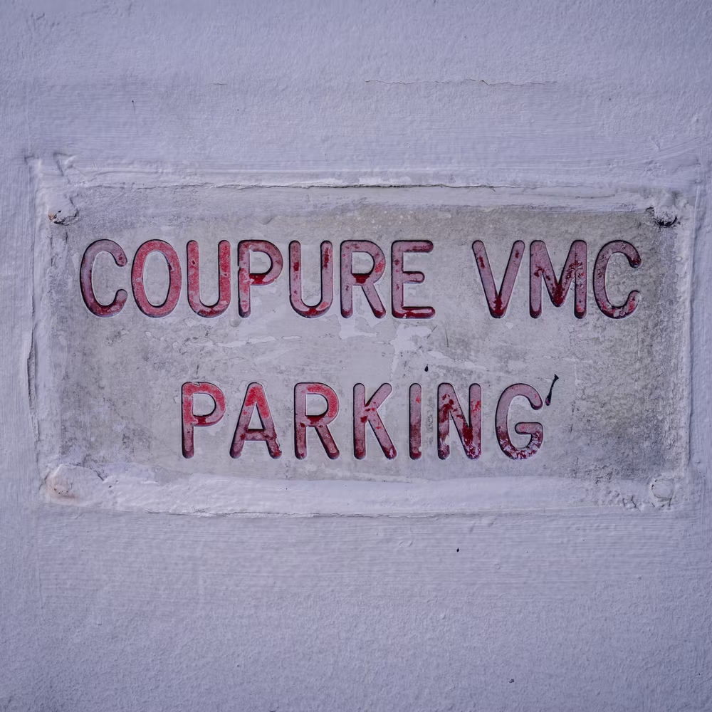
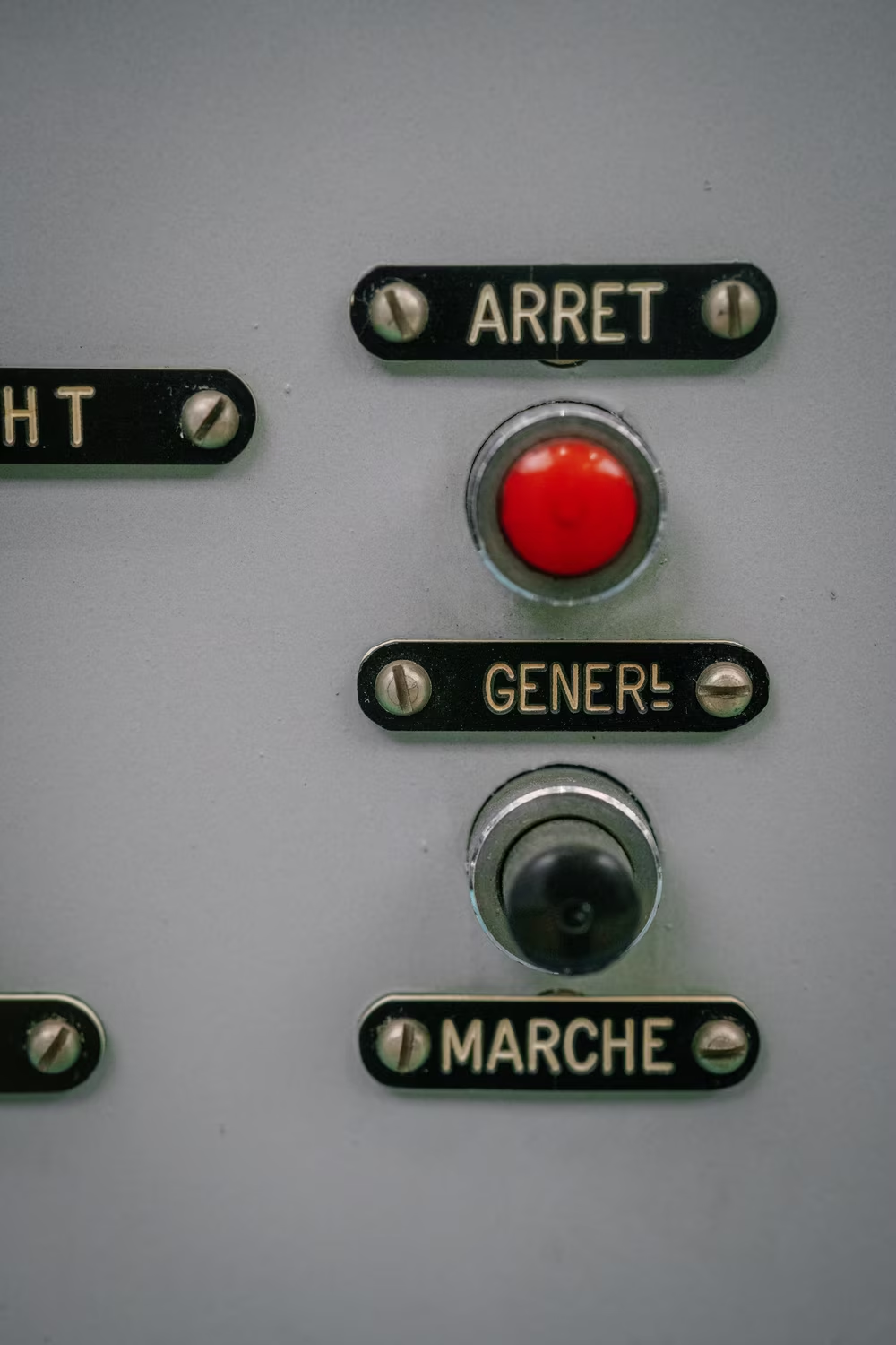
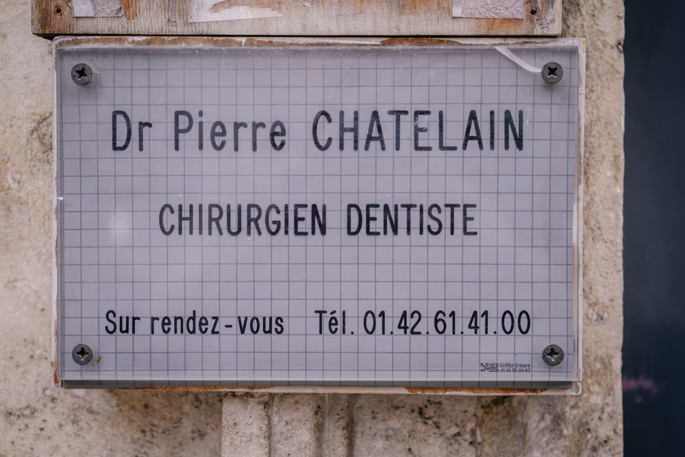
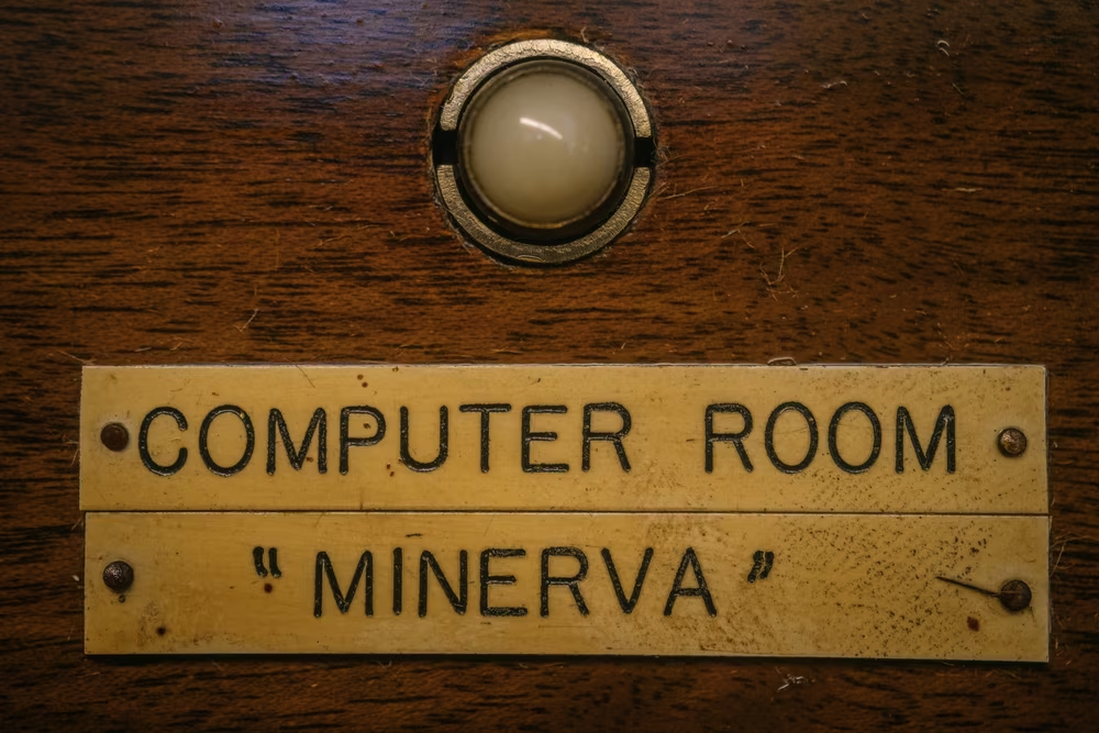
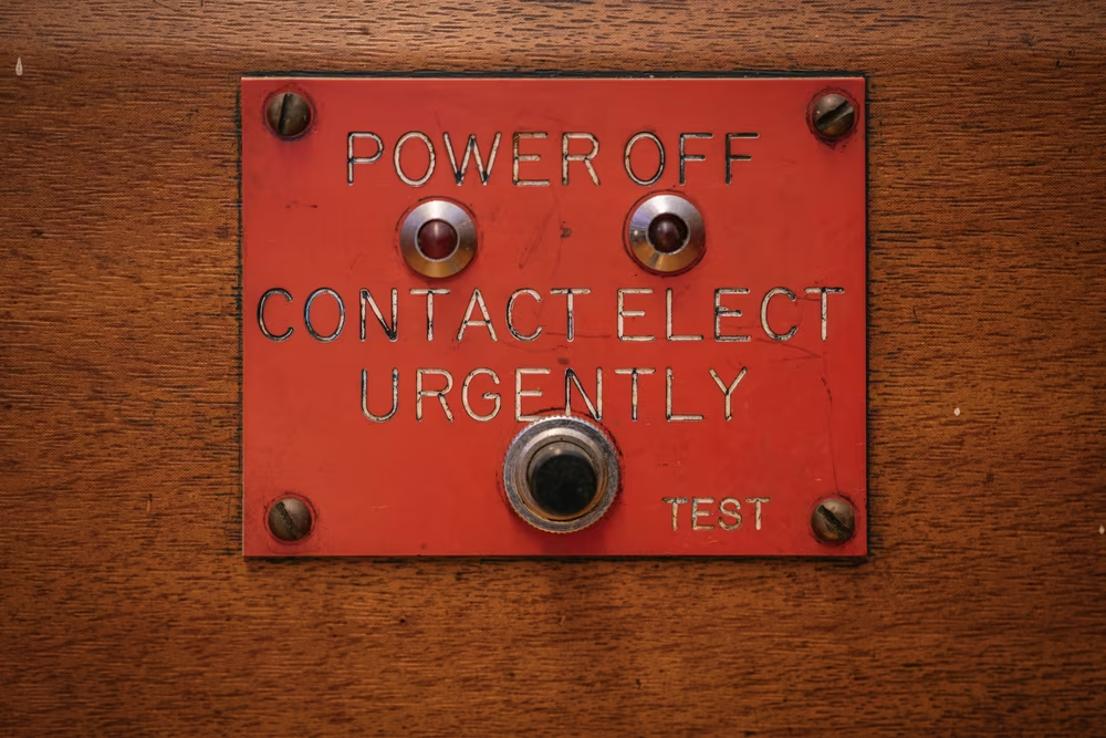
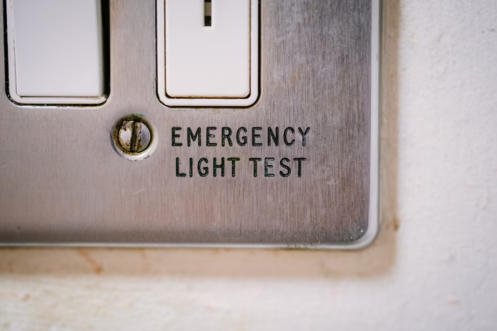
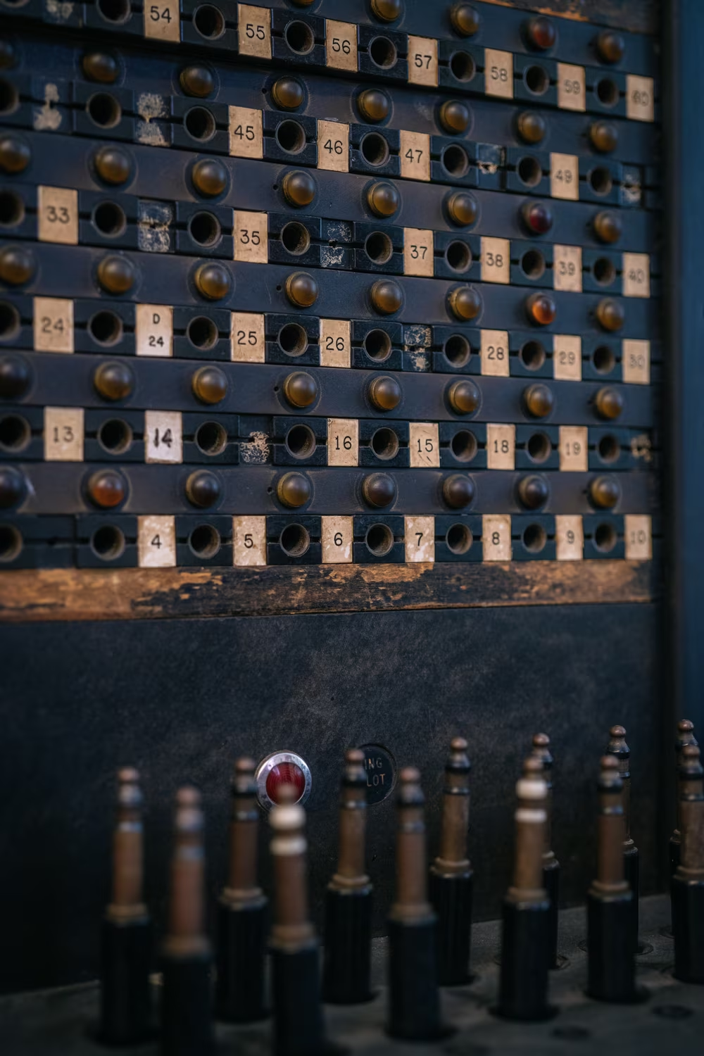
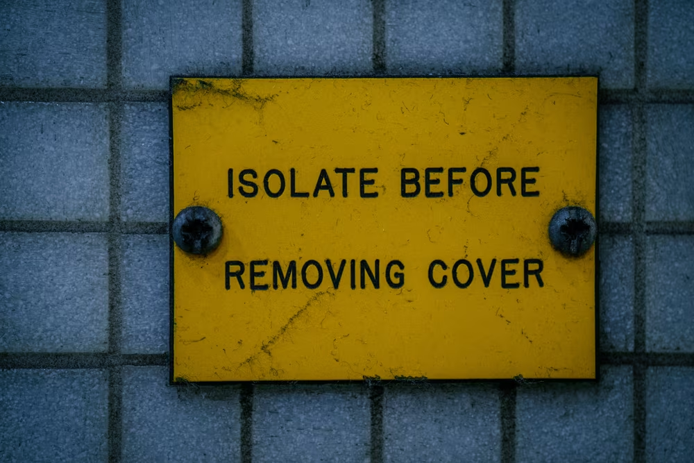
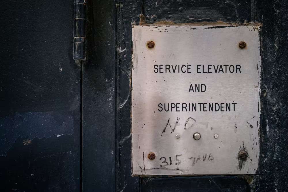
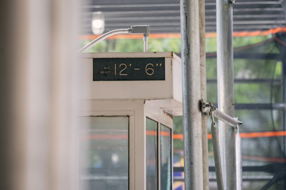
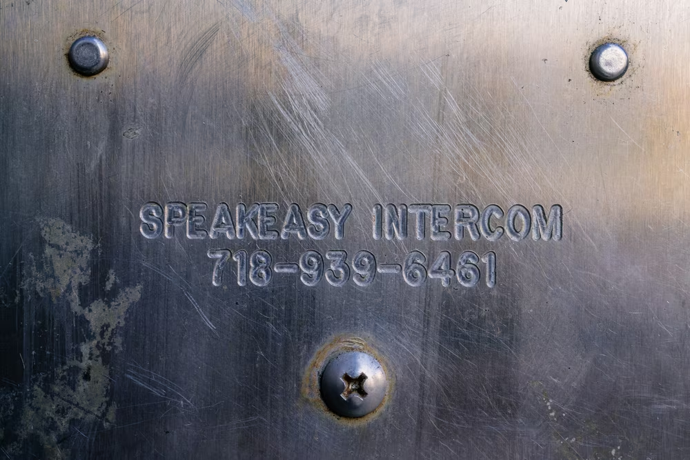
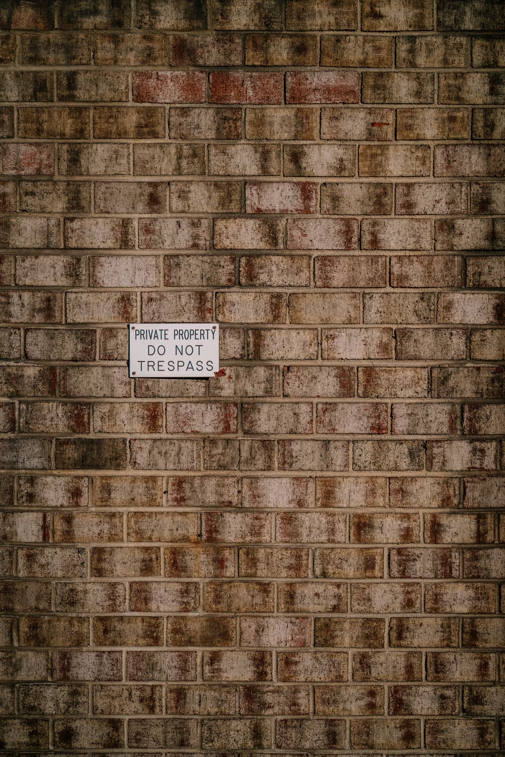
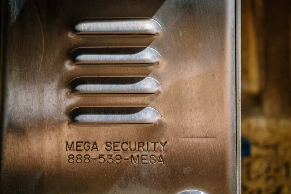
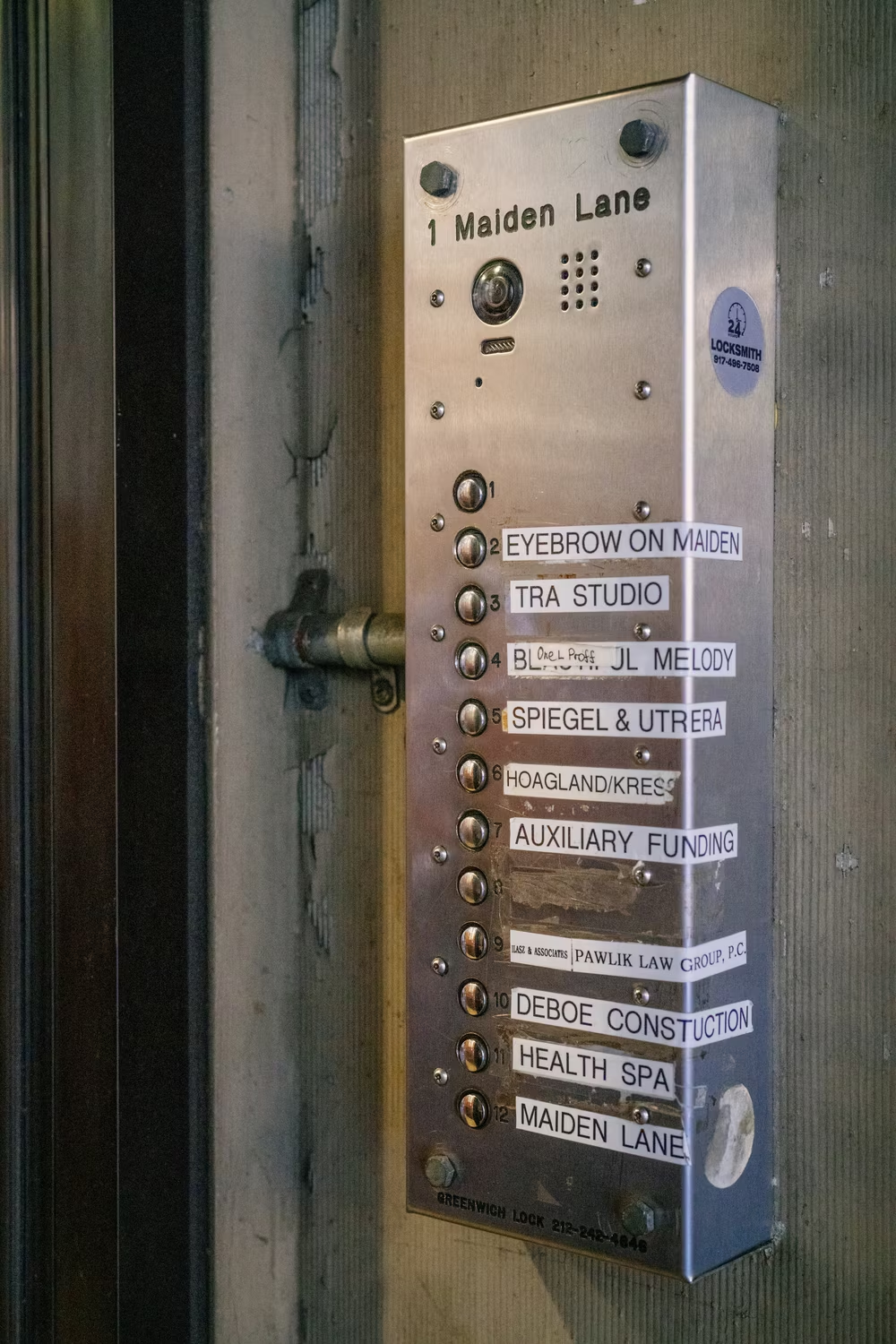
One day, I saw what felt like Gorton on a ferry traversing the waters Bay Area. A few weeks later, I spotted it on a sign in a national park. Then on an intercom. On a street lighting access cover. In an elevator. At my dentist’s office. In an alley.
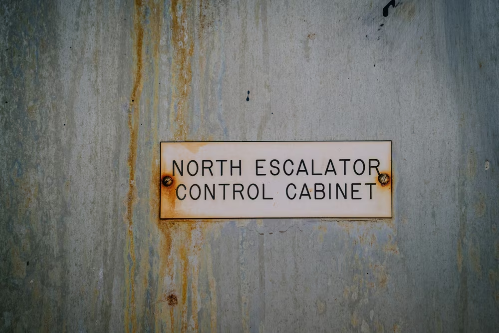
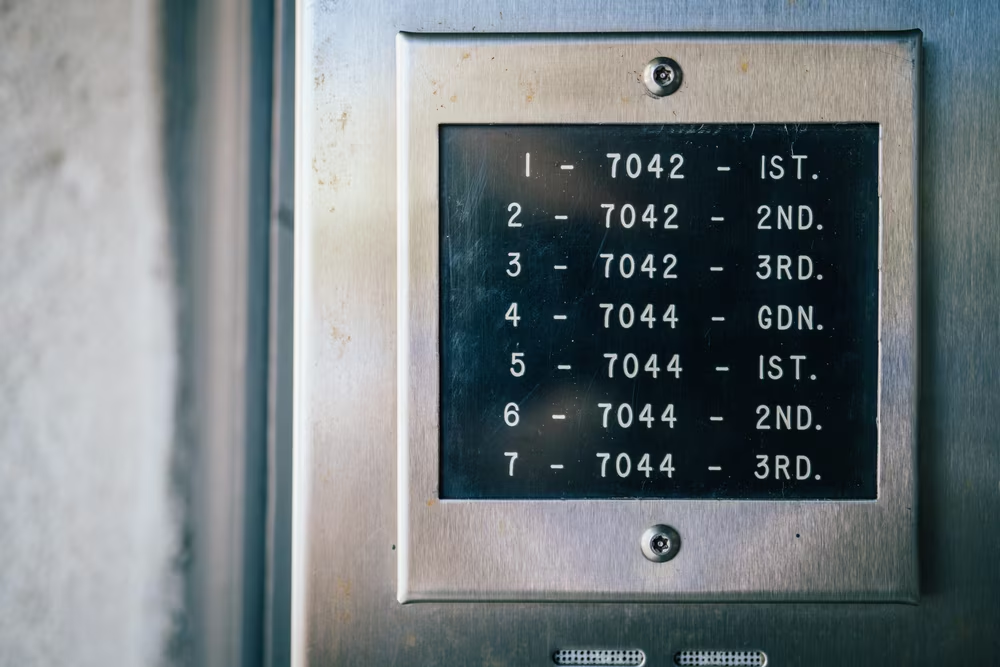
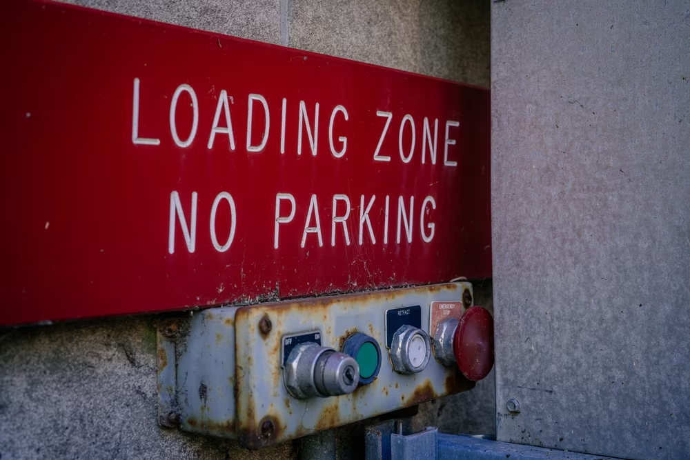
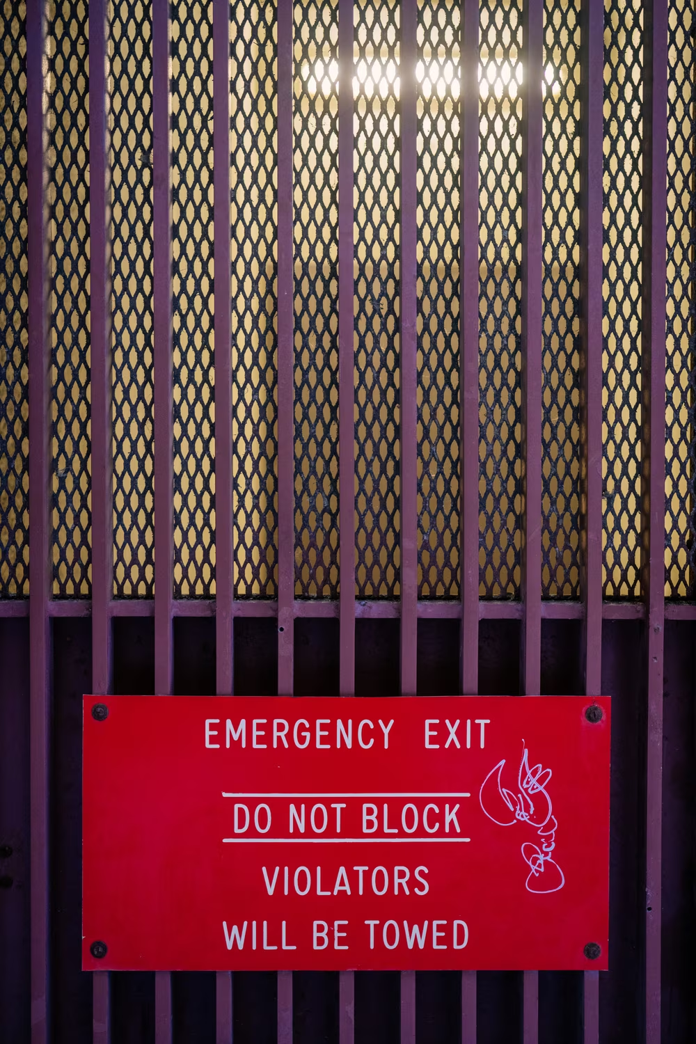

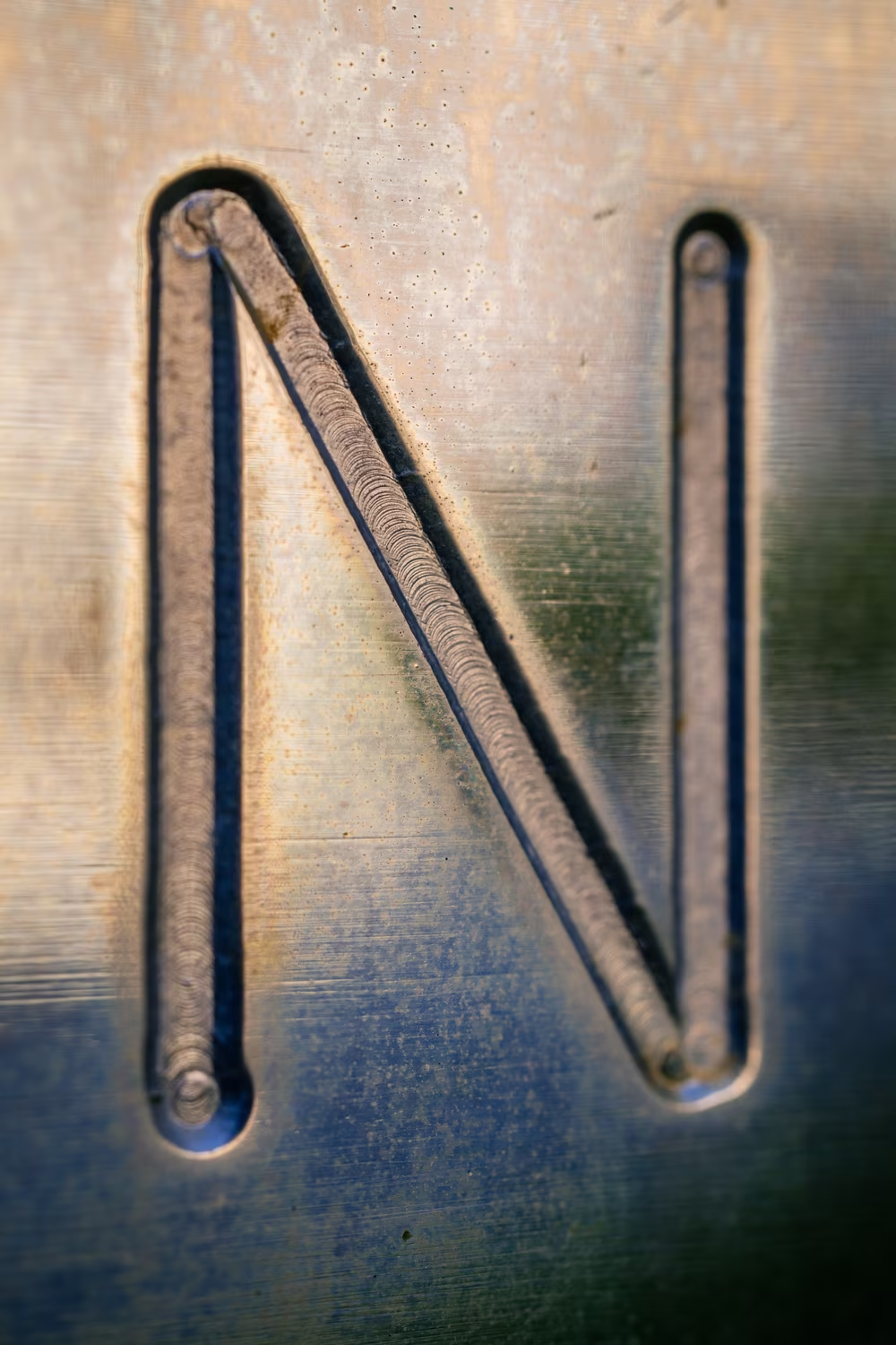
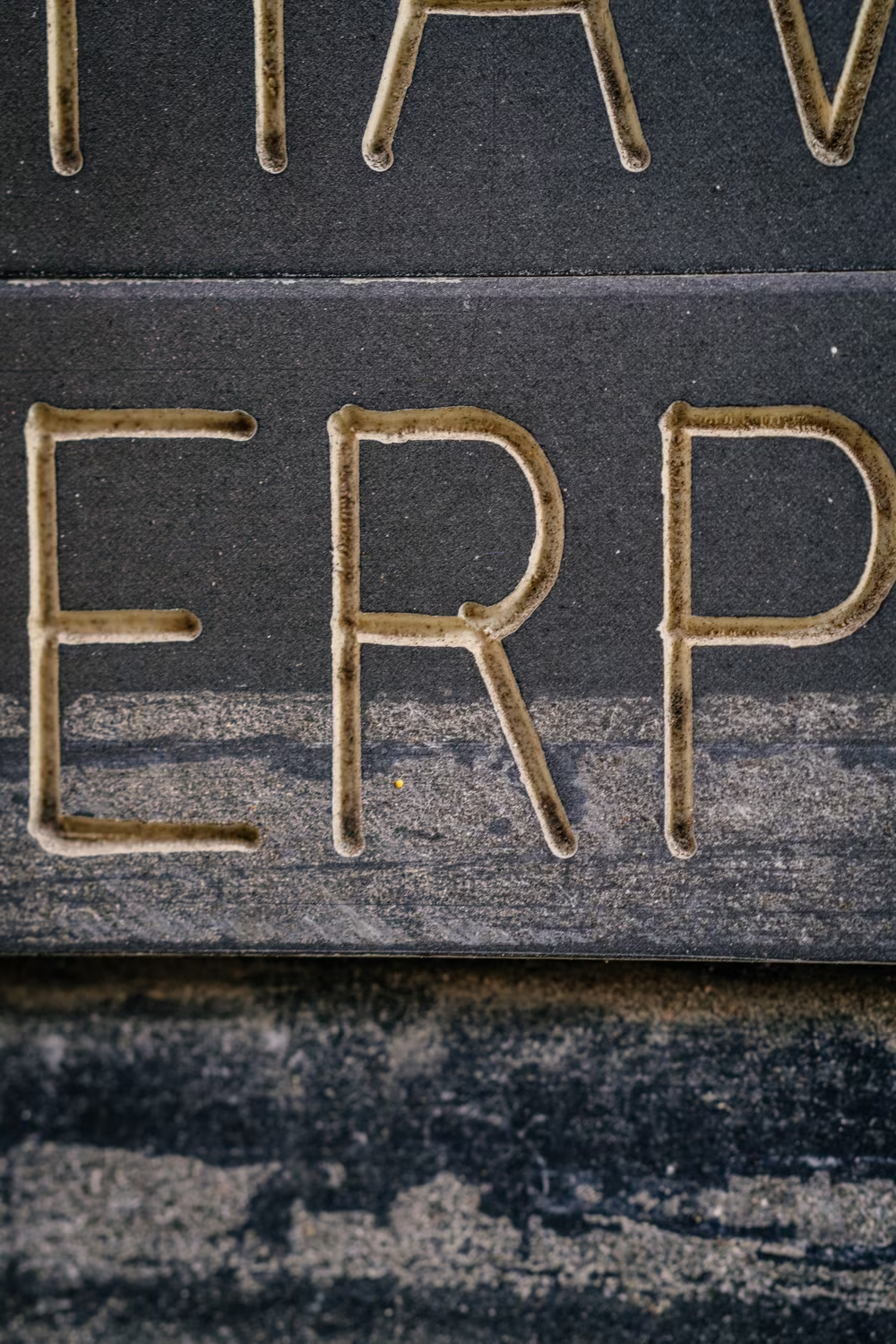
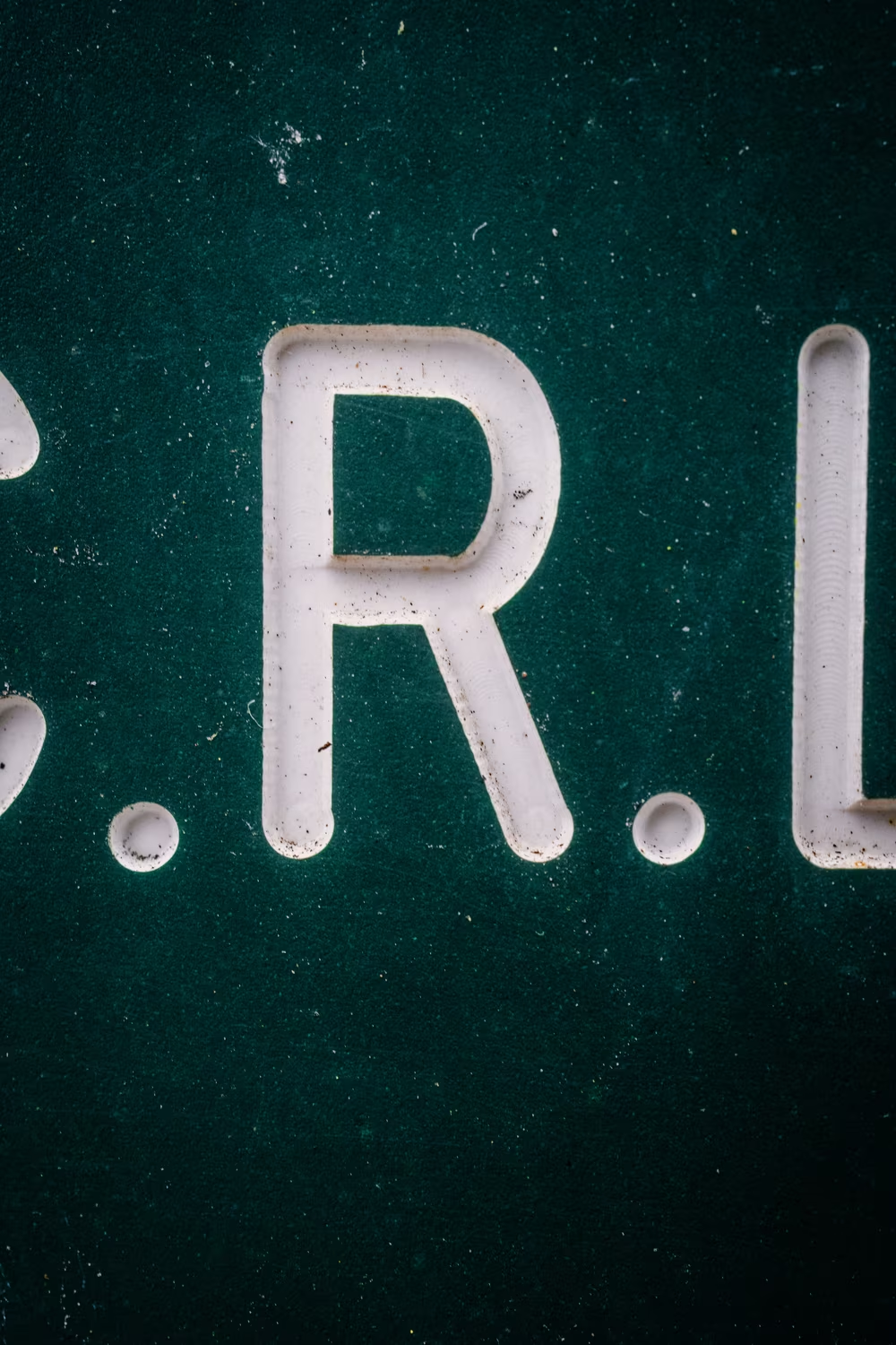
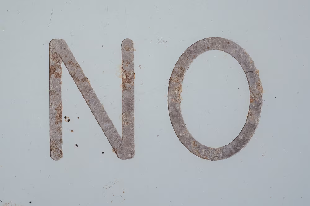
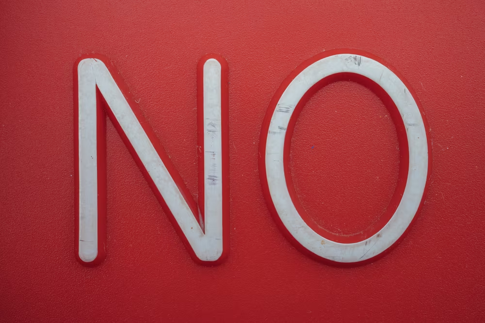
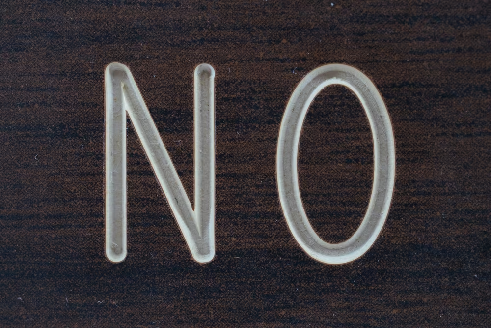
These had one thing in common. All of the letters were carved into the respective base material – metal, plastic, wood. The removed shapes were often filled in with a different color, but sometimes left alone.
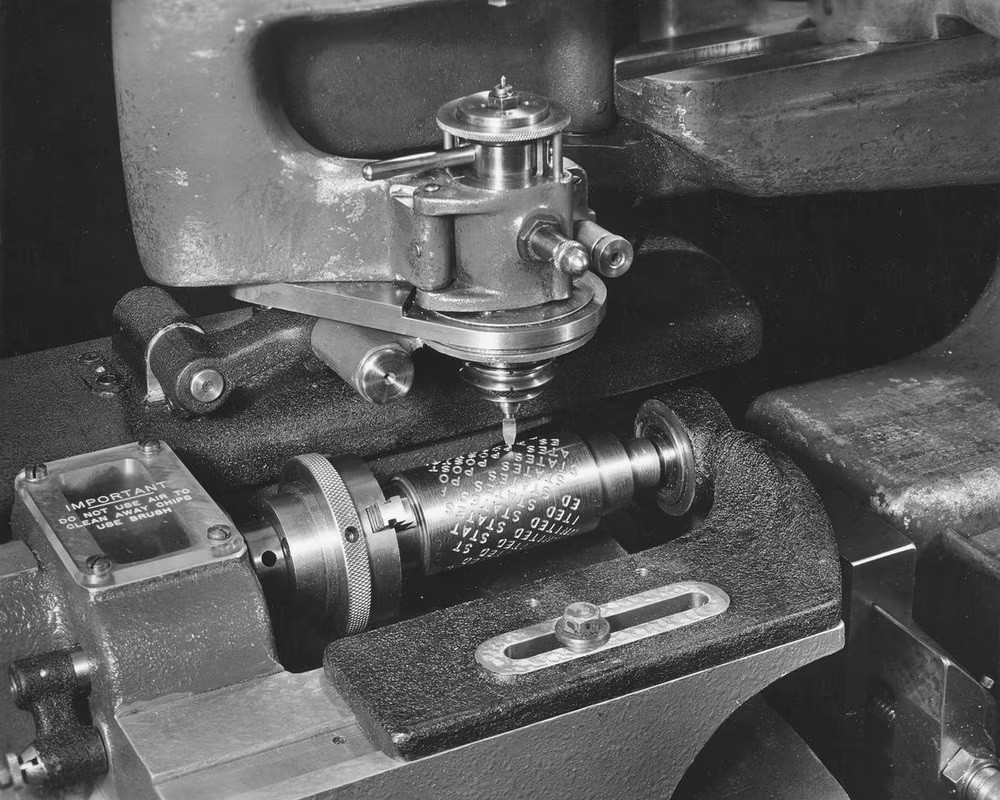
At one point someone explained to me Gorton must have been a routing font, meant to be carved out by a milling machine rather than painted on top or impressed with an inked press.
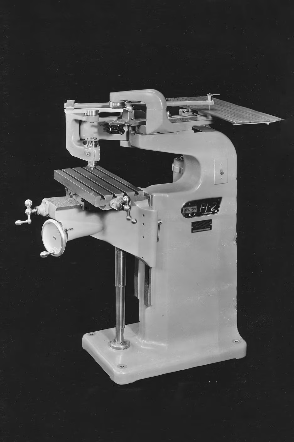
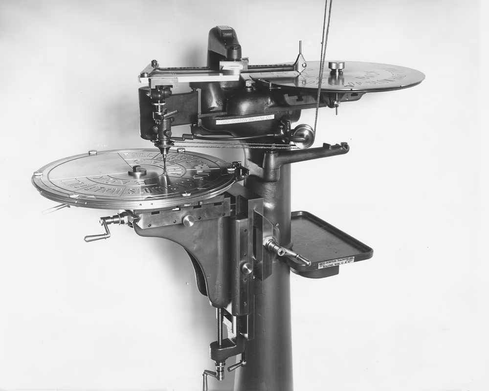
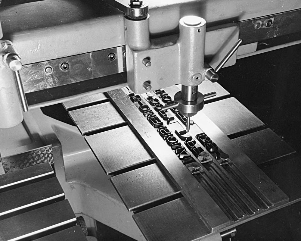
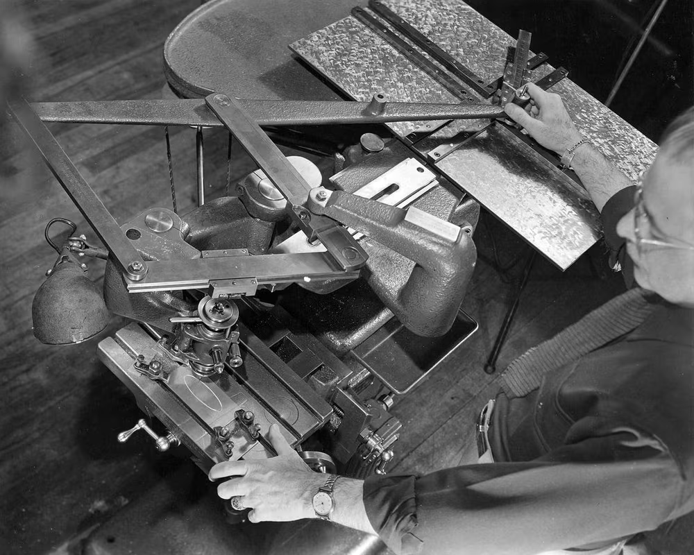
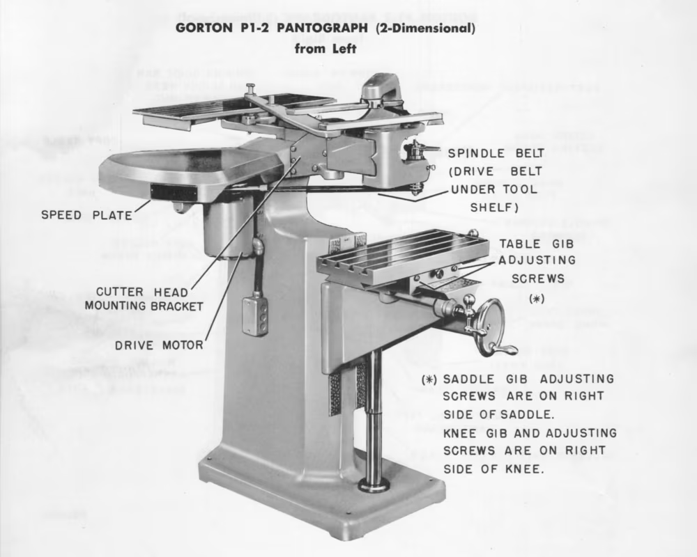
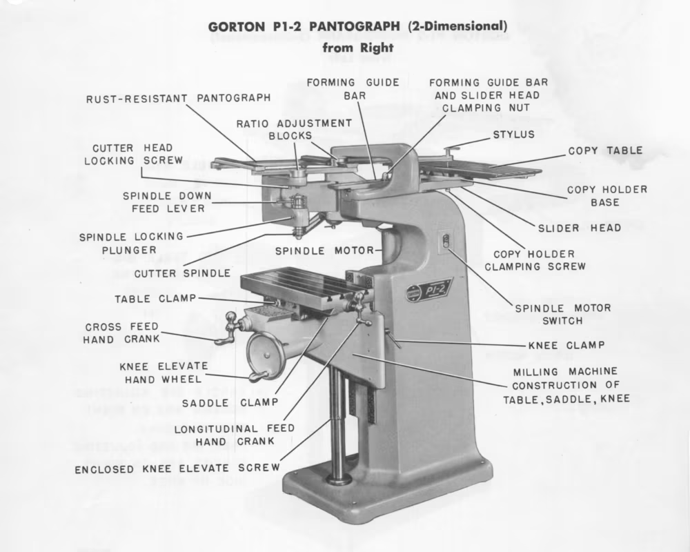
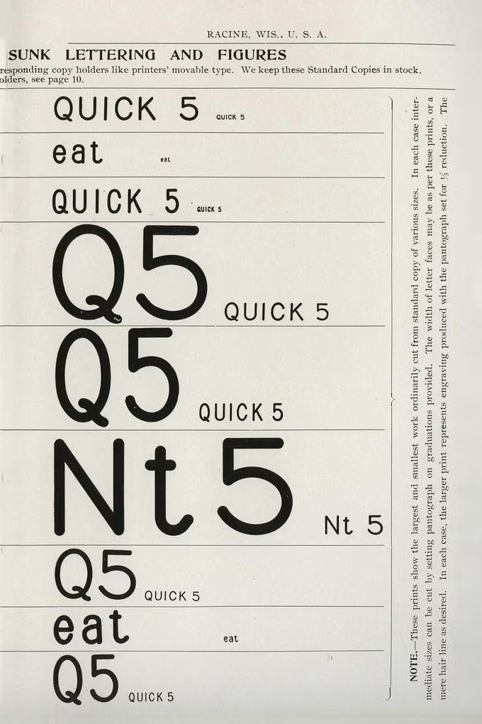
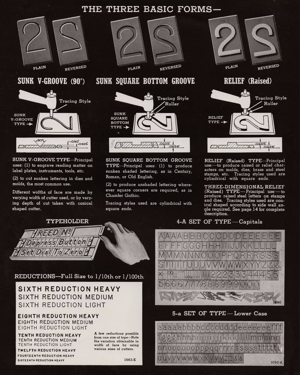
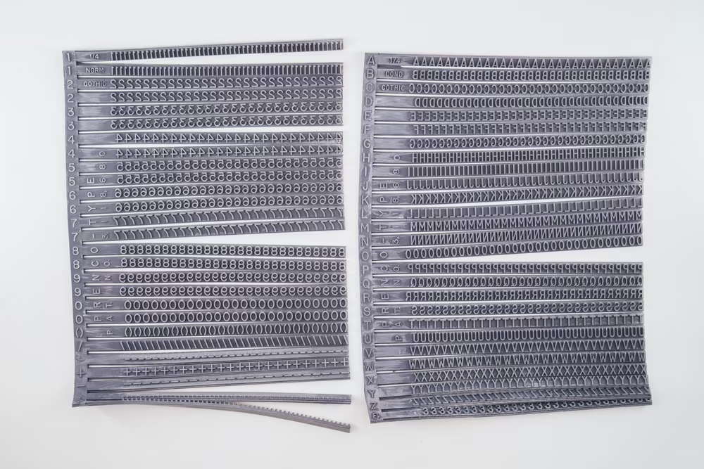
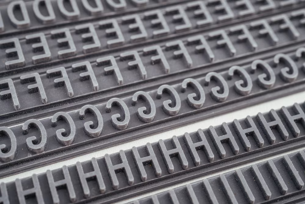
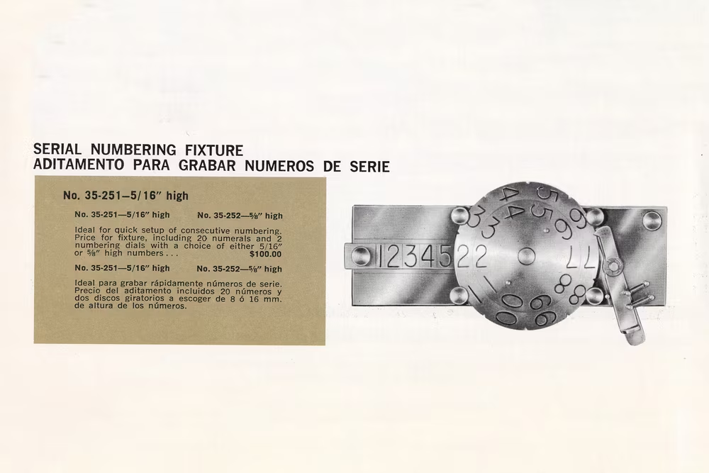
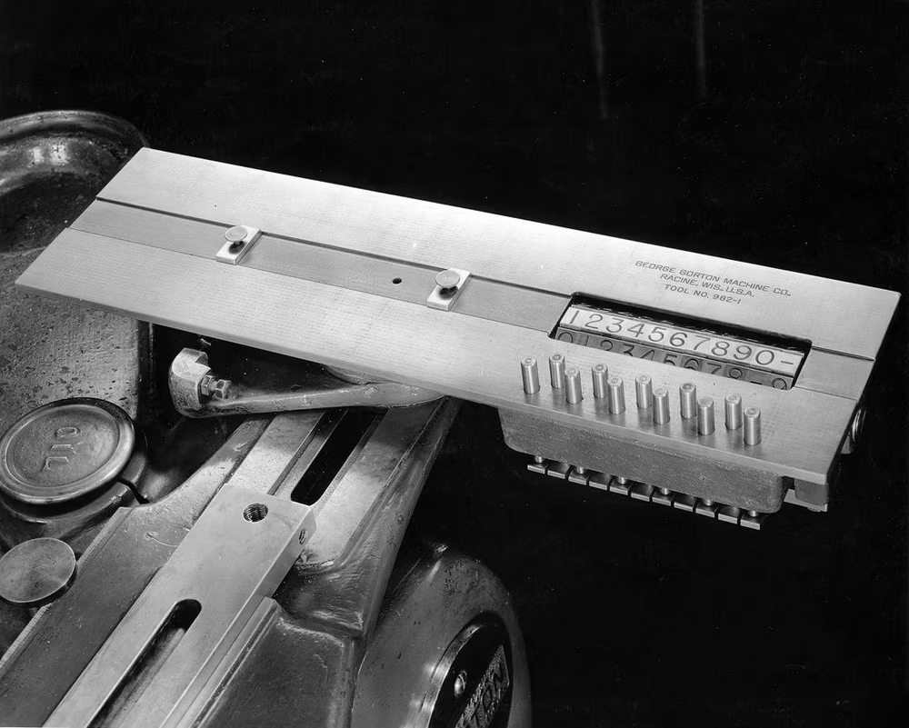
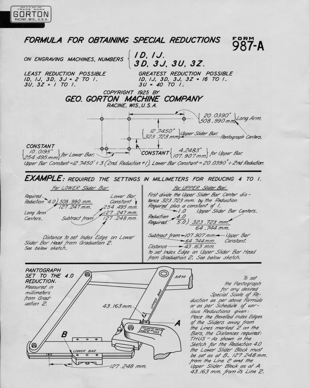
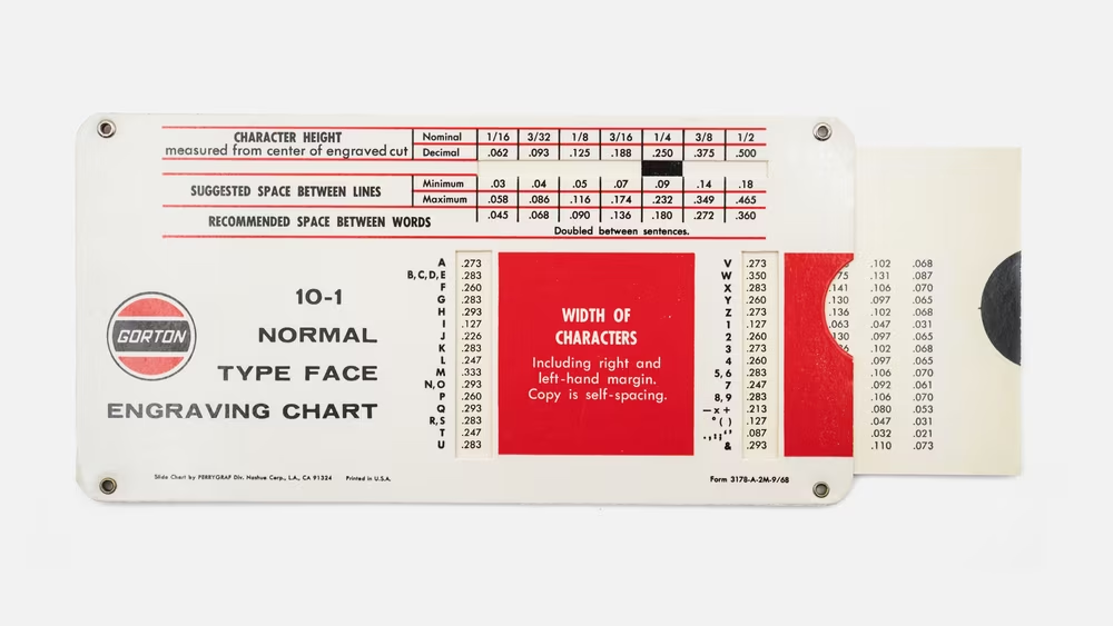
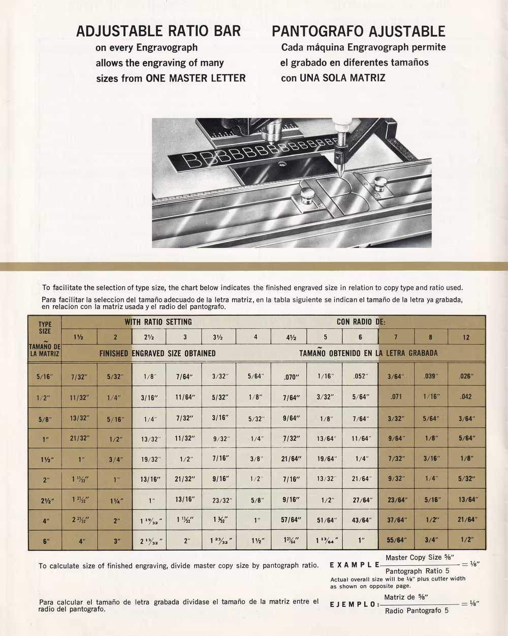
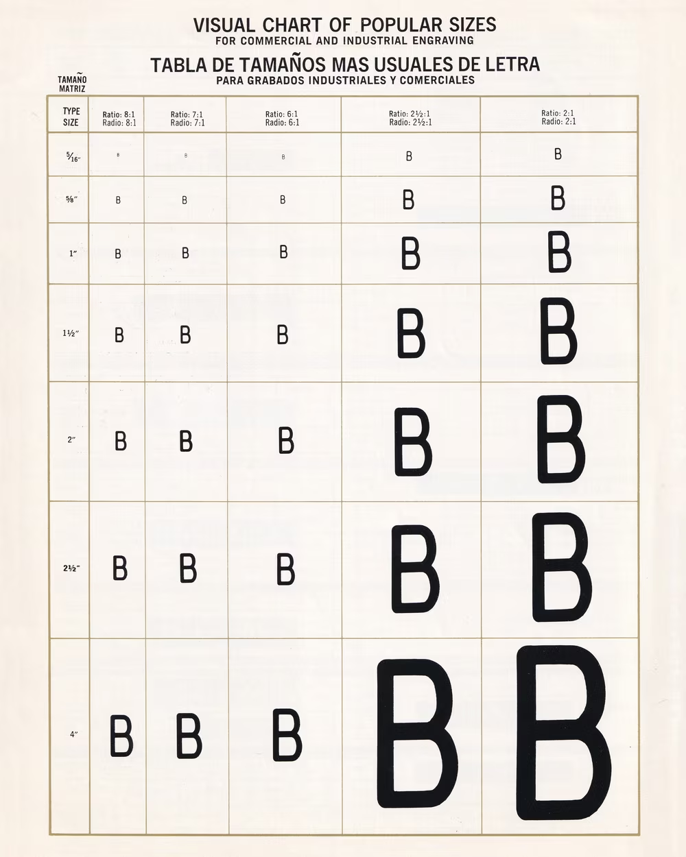
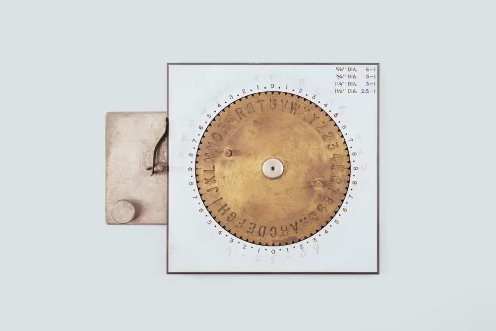
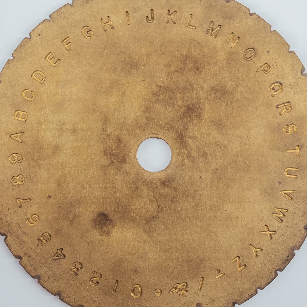
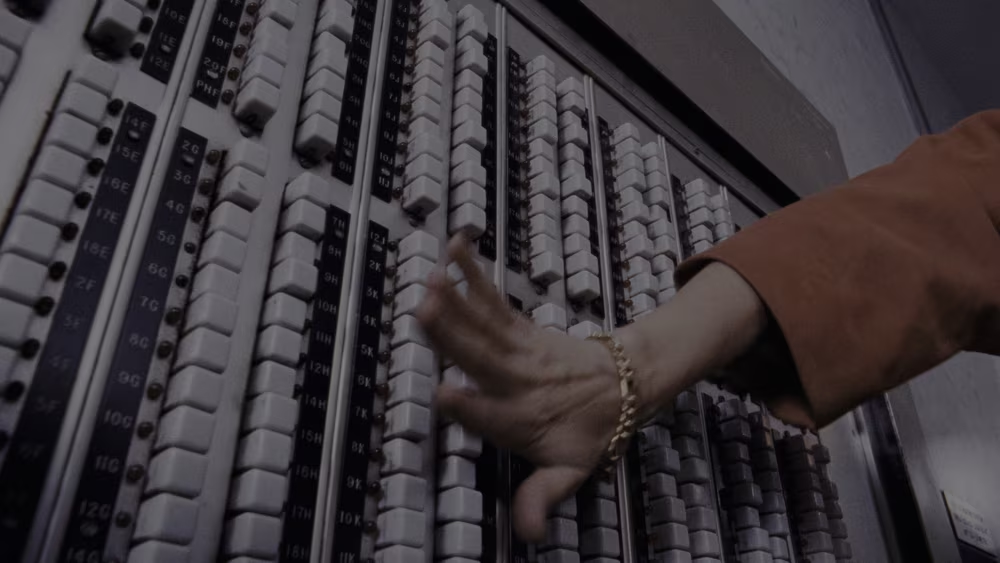
Some searches quickly led me to George Gorton Machine Co., a Wisconsin-based company which produced various engraving machines. The original model 1 led to model 1A and then 3U and then, half a decade later, P1-2. They were all pantograph engravers: They allowed you to install one or more letter templates and then trace their shape by hand. A matching rotating cutter would mimic your movements, and the specially configured arms would enlarge or reduce the output to the size you wanted.
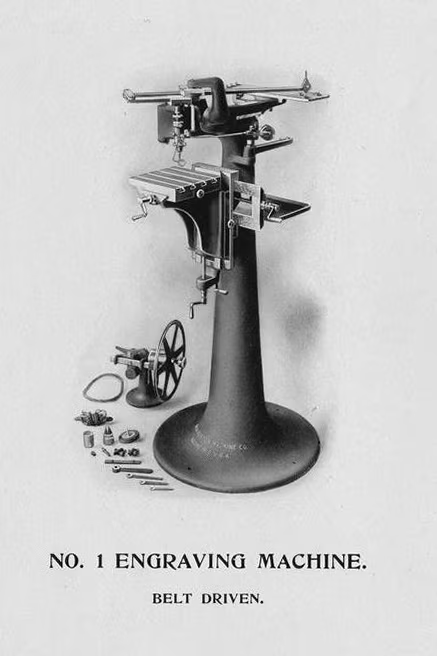
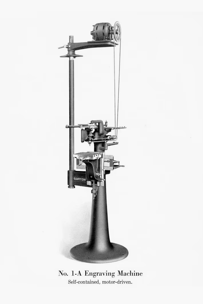


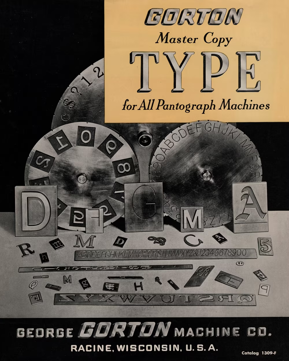
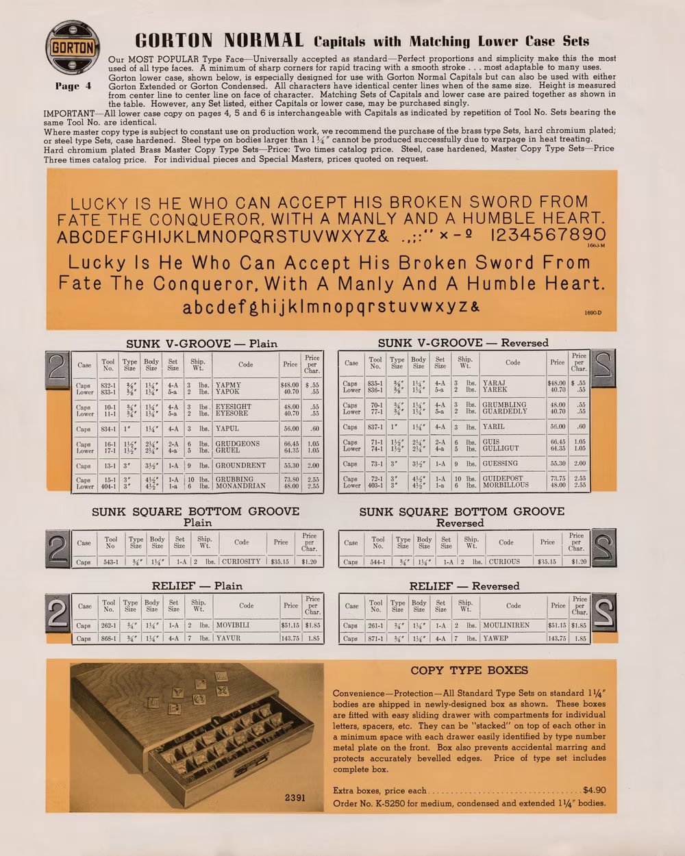
The first font in the 1952’s company catalogue was called Gorton Normal and I felt I already knew it by heart.
This immediately explained both the metaphorical and literal rough edges of Gorton.
A lot of typography has roots in calligraphy – someone holding a brush in their hand and making natural but delicate movements that result in nuanced curves filled with thoughtful interchanges between thin and thick. Most of the fonts you ever saw follow those rules; even the most “mechanical” fonts have surprising humanistic touches if you inspect them close enough.
But not Gorton. Every stroke of Gorton is exactly the same thickness (typographers would call such fonts “monoline”). Every one of its endings is exactly the same rounded point. The italic is merely an oblique, slanted without any extra consideration, and while the condensed version has some changes compared to the regular width, those changes feel almost perfunctory.
Monoline fonts are not respected highly, because every type designer will tell you: This is not how you design a font.
3
It seemed at this point that perhaps P1-2 and its predecessors were a somewhat popular machining product during the 20th century’s middle decades. But casual research through materials preserved by some of George Gorton Machine Company’s fans – including the great-grandson of the founder – revealed something even more interesting. Gorton the font was a lot older than I expected.
I found a 1935 catalog showing the very same font. Then one from 1925. And then, there was one all the way from 1902, showing the shapes I was starting to be mildly obsessed with.
To put it in perspective: the font I first assumed was a peer to 1950s Helvetica was already of retirement age the day Helvetica was born. Gorton was older than Gill Sans, Futura, or Johnston’s London Underground font. It was contemporaneous to what today we recognize as the first modern sans serif font, Akzidenz-Grotesk, released but three years before the end of the century.
Imagine how stripped down and exotic Gorton must have felt right next to George Gorton Machine’s then-current logo!
Now I was interested.
I started researching Gorton more. Unfortunately, as I already suspected, no one ever wrote “I used Gorton to typeset this,” because Gorton was a tenuous name at best. It was the first font, and perhaps originally the only font that came with the engraver, so it suffered a nameless fate, familiar later to many bespoke bitmap fonts adorning the screens of early computers.
The difference from these fonts, however, was that Gorton was meant to travel. And so, since searching for it by name was impossible, for months and years I just kept looking around for the now-familiar shapes.
And I found… a lot.
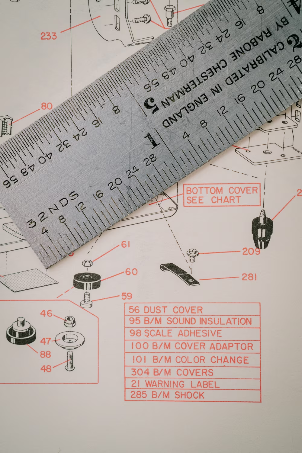
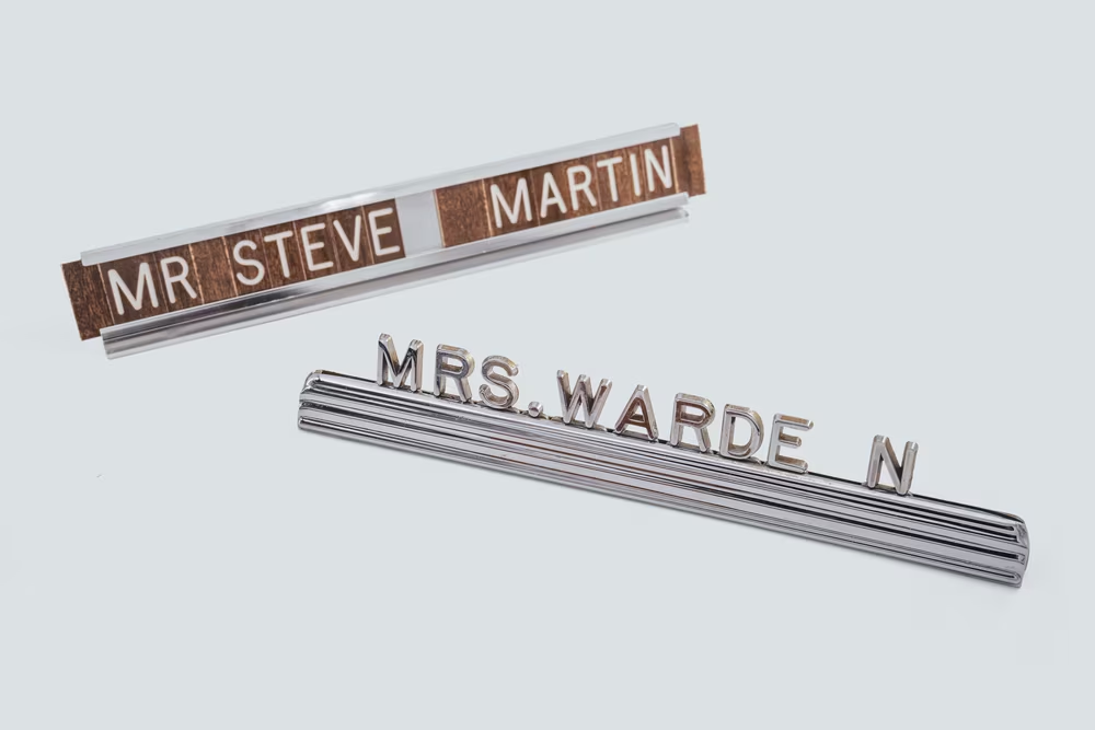
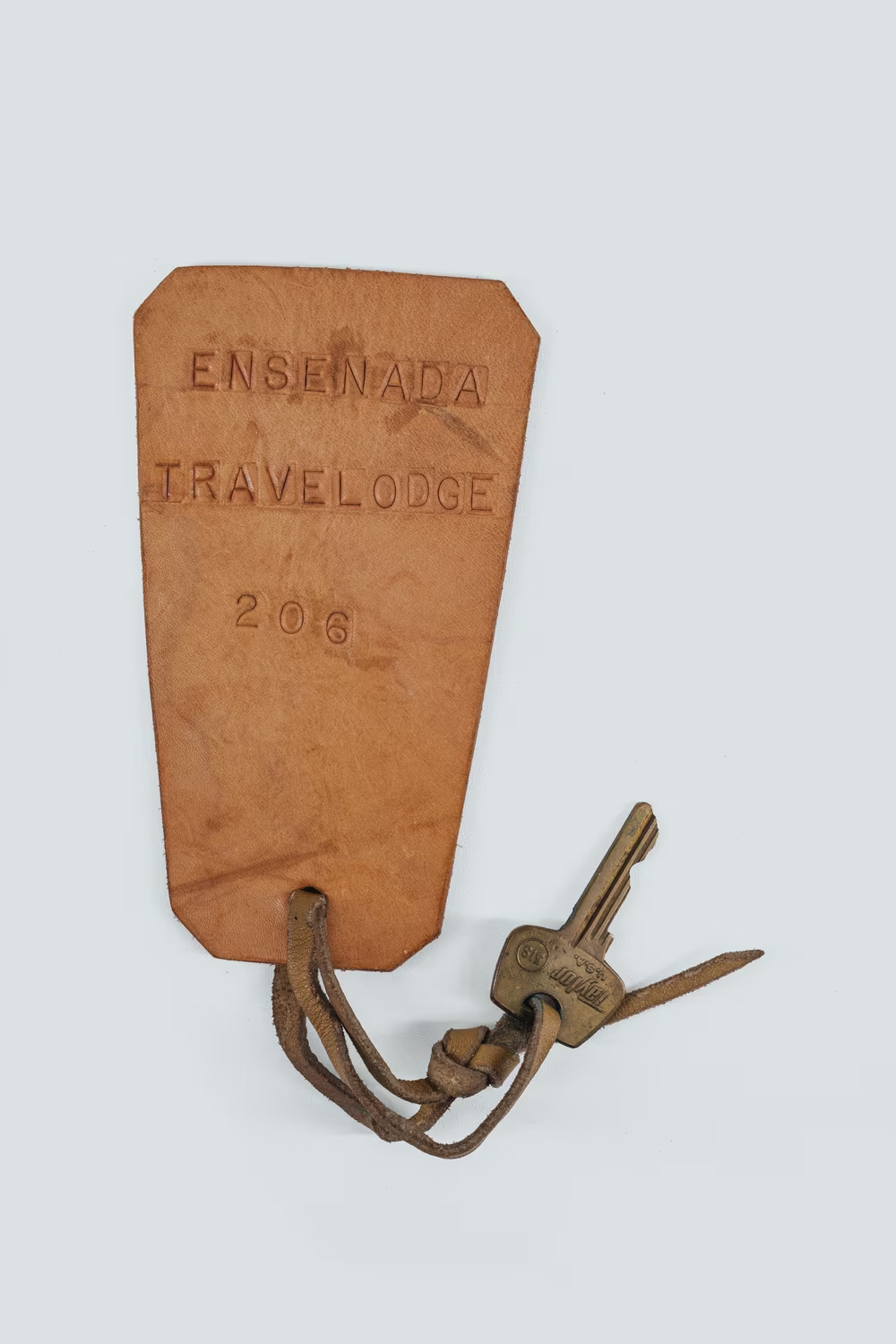
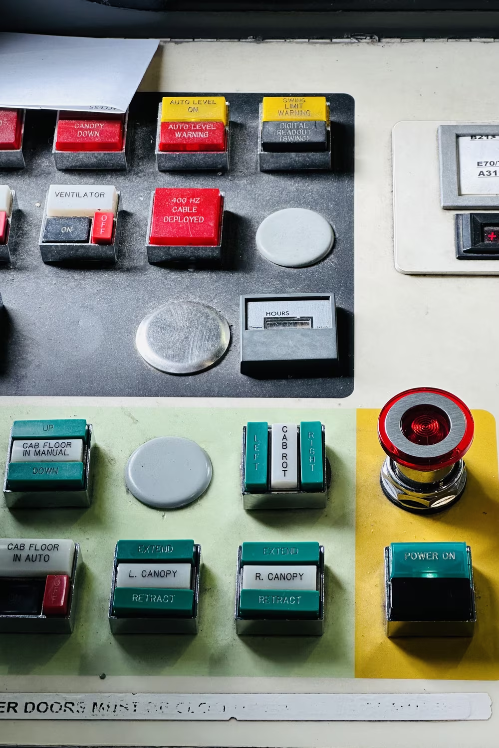
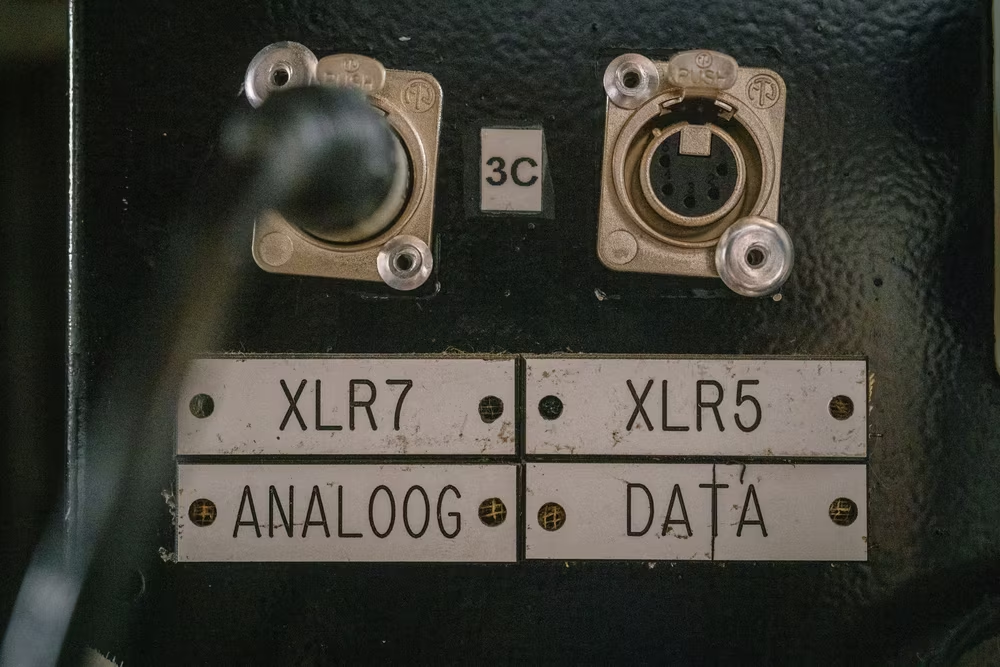
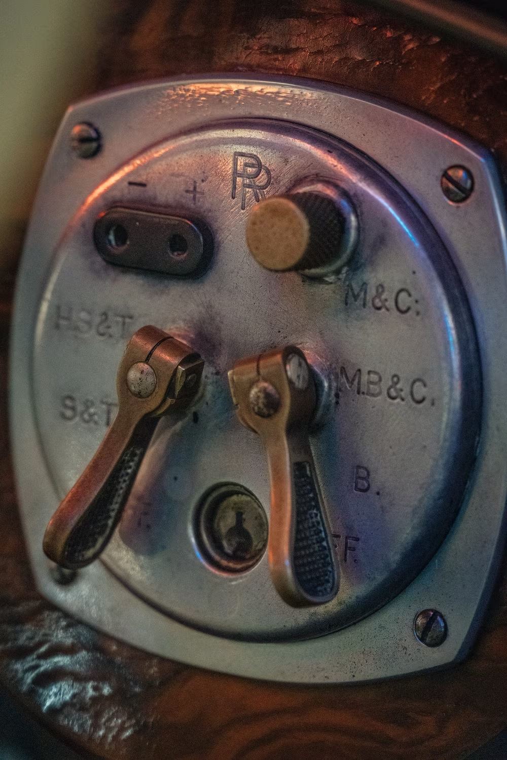
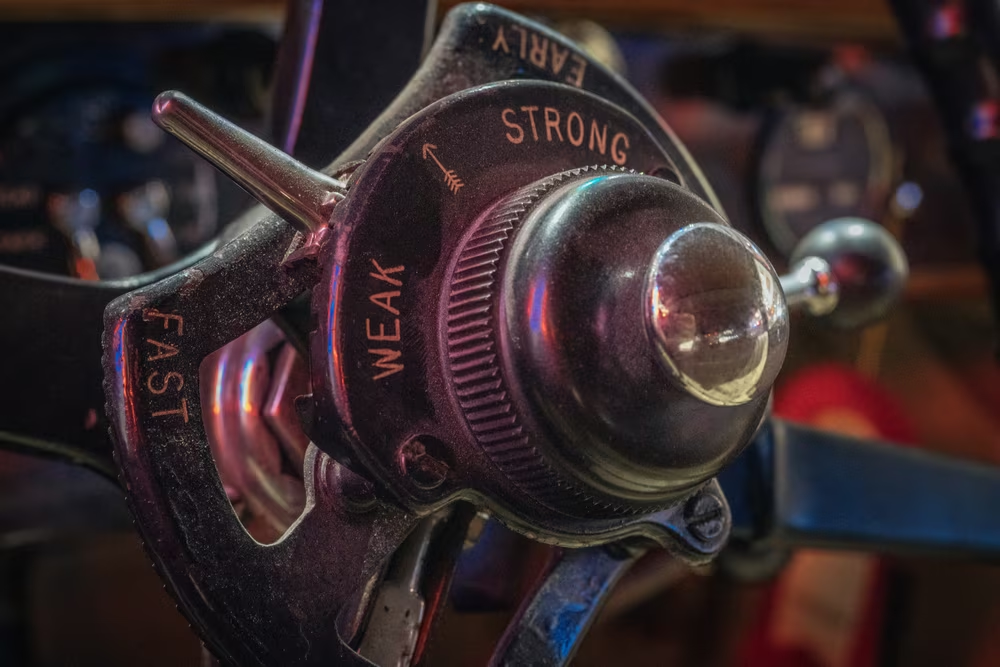
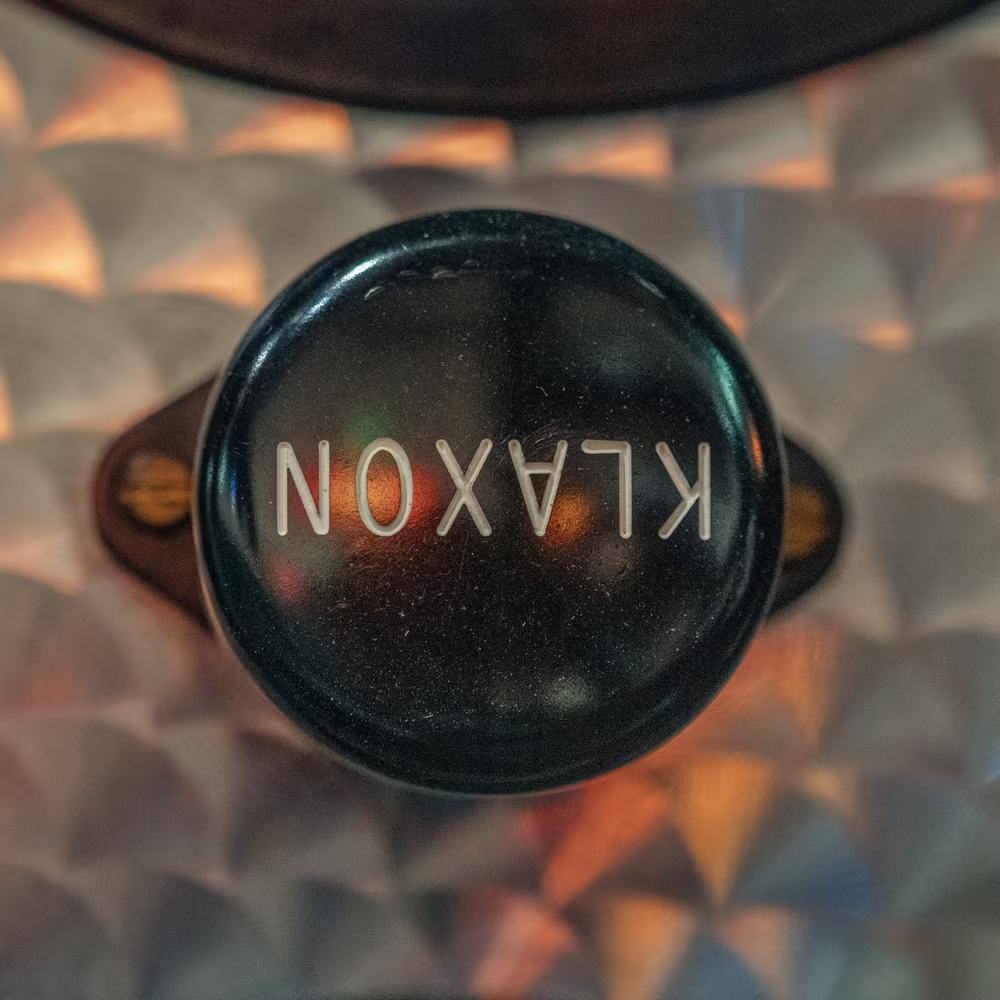
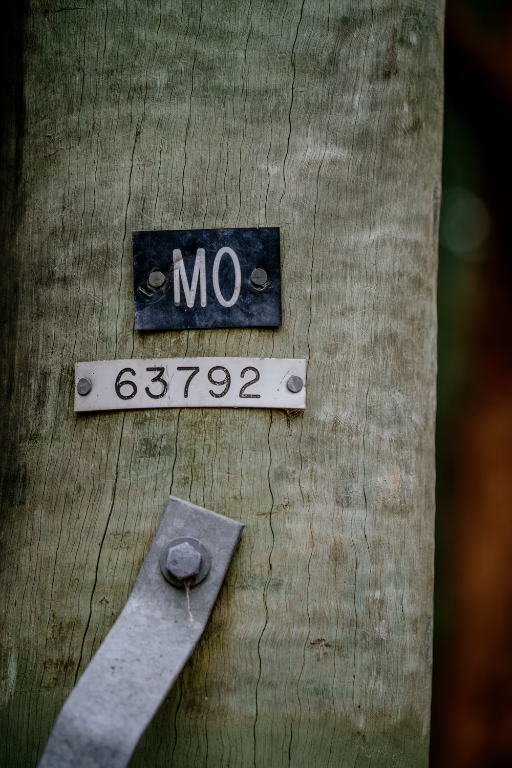
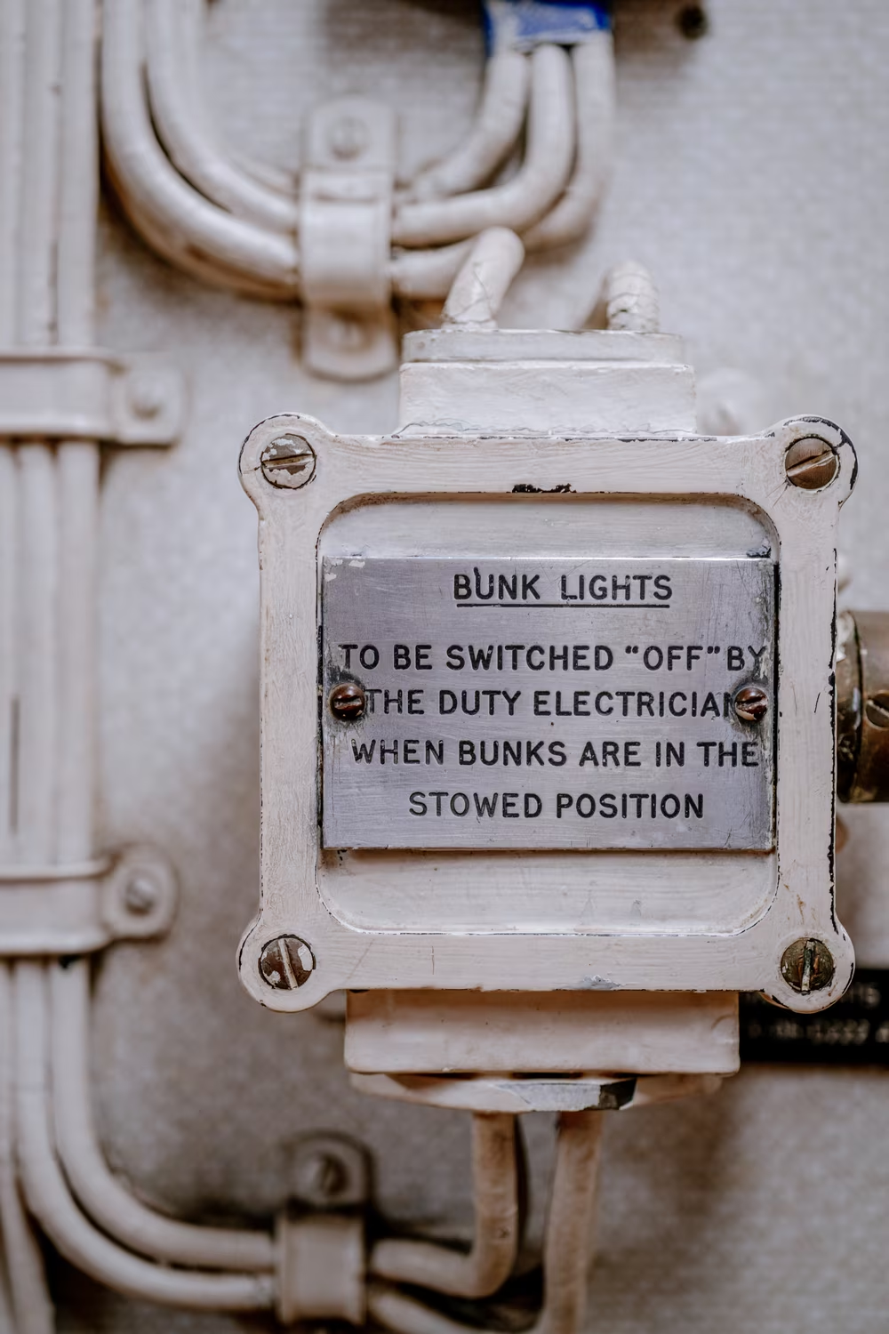
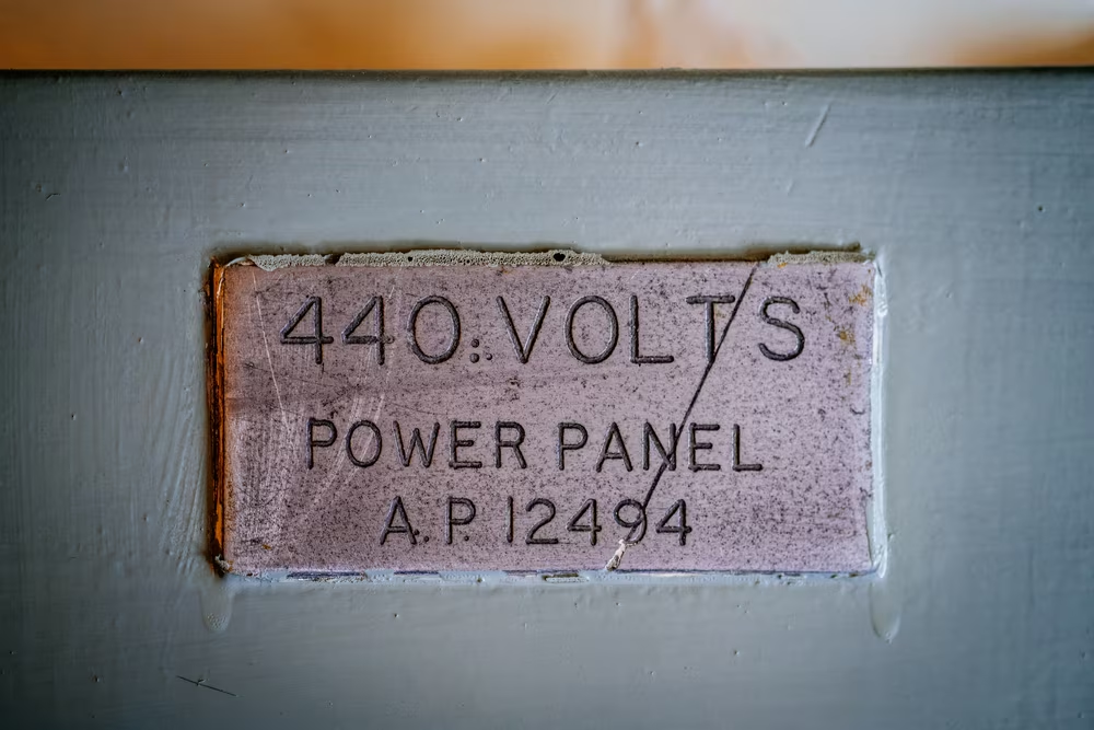
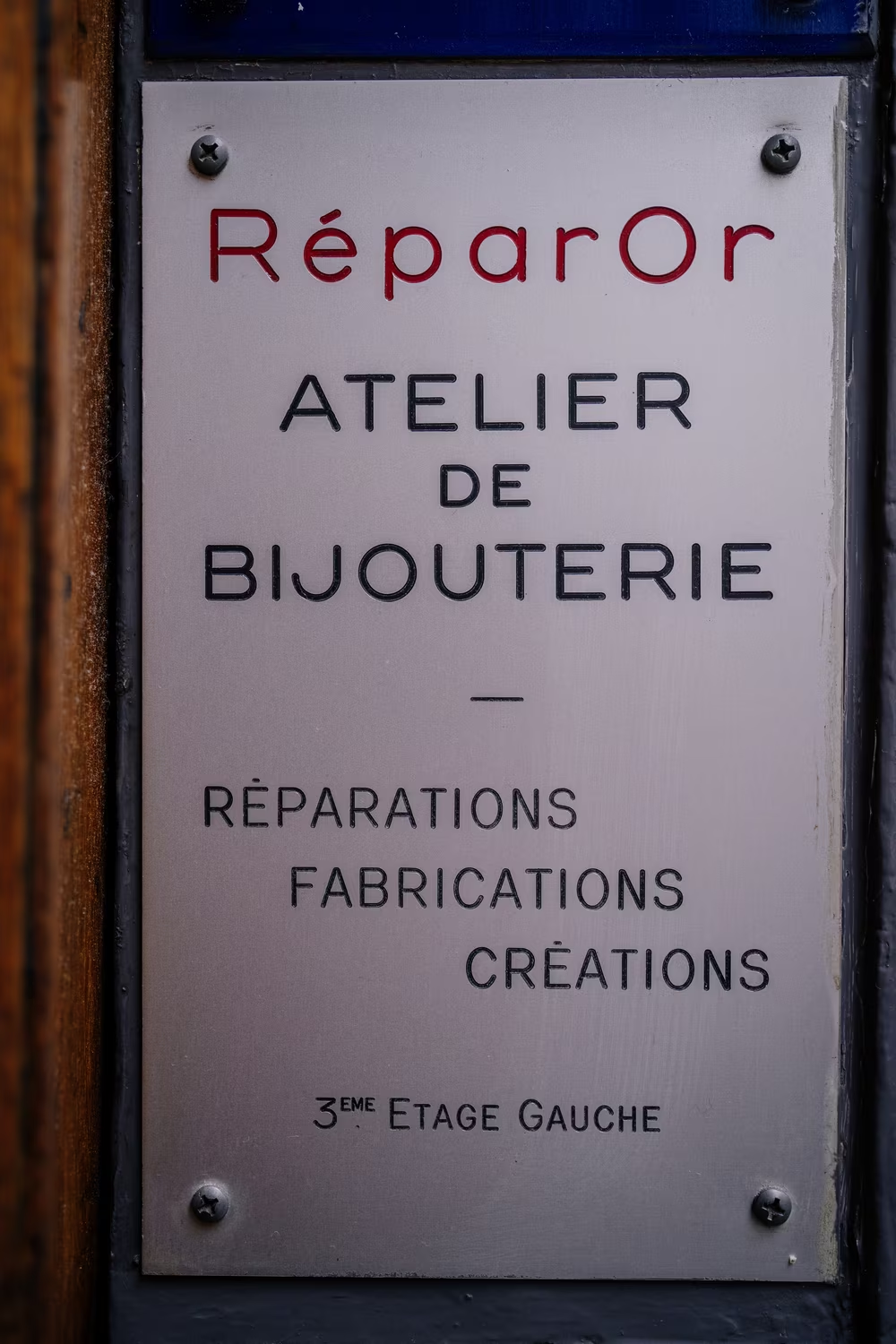
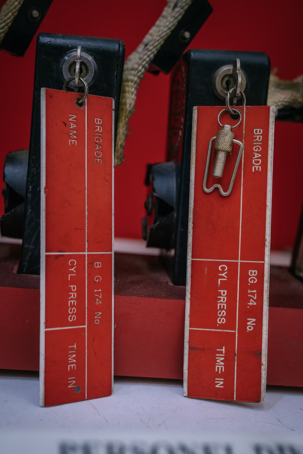
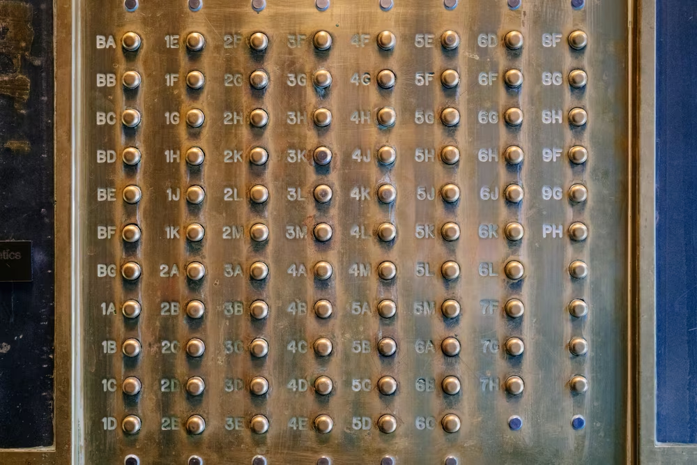
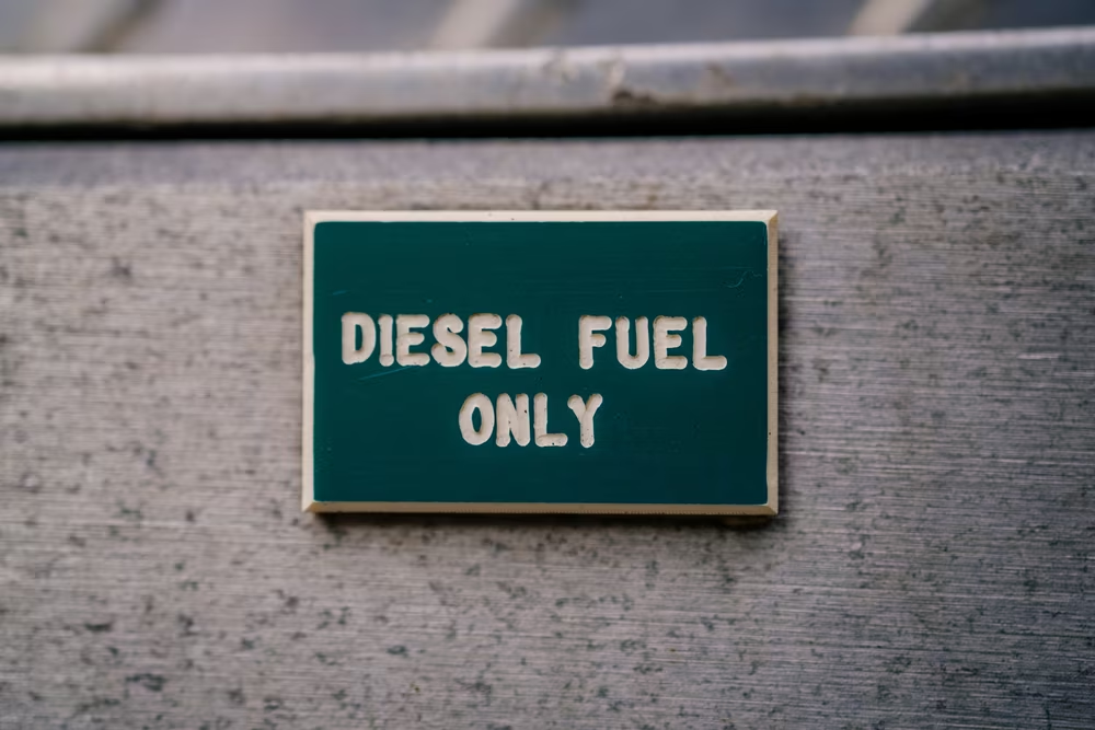
Gorton wasn’t just on computer keyboards, intercom placards, and sidewalk messages visited by many shoes. Gorton was there on typewriter keyboards, too. And on office signs and airline name tags. On boats, desk placards, rulers, and various home devices from fridges to tape dispensers.
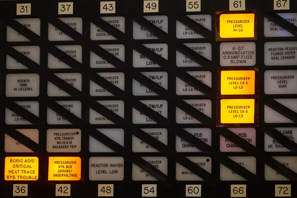
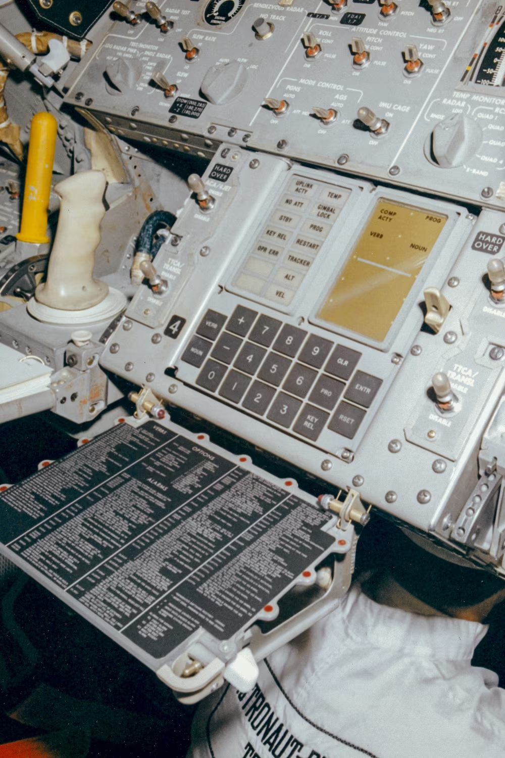
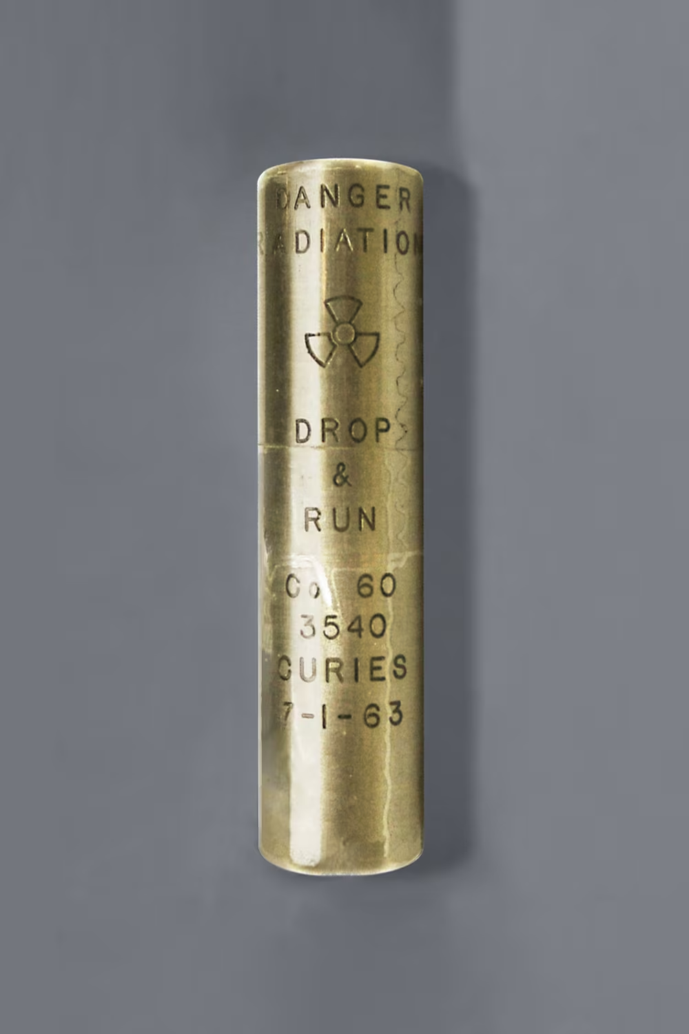
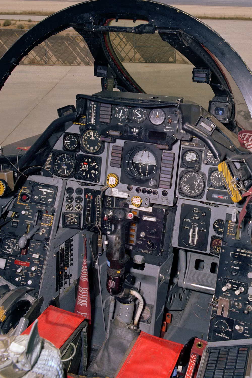
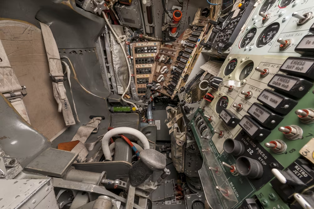
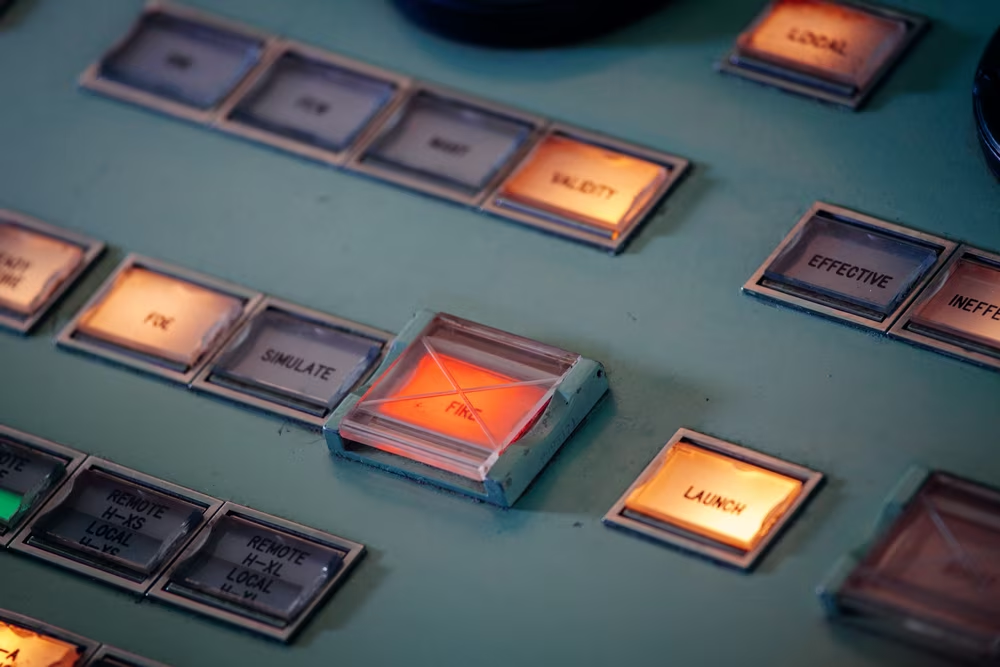
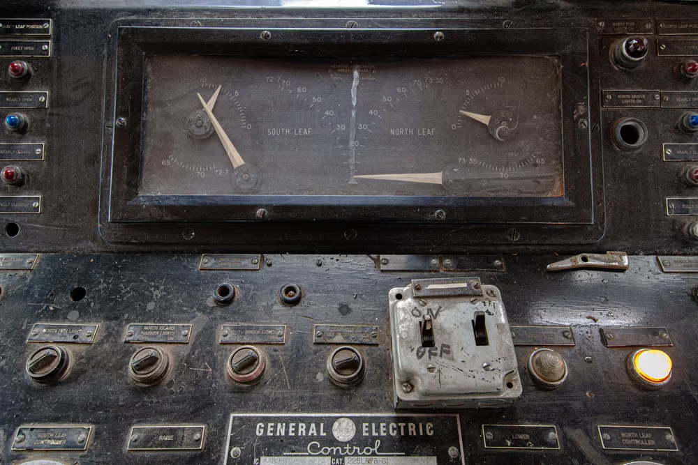
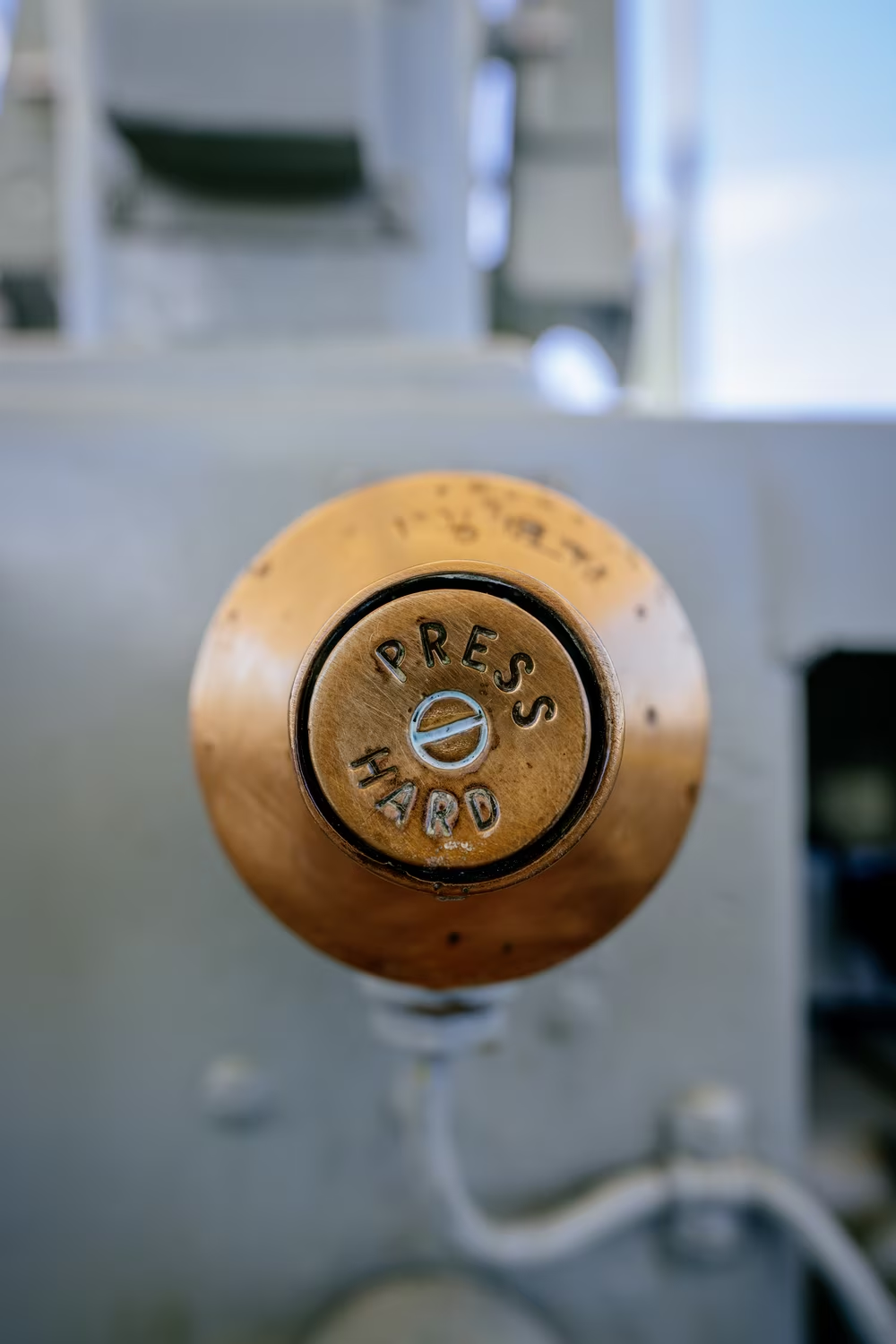
It was also asked to help in situations other fonts rarely did. I spotted Gorton on overengineered buttons that were put to heavy industrial and military use. I saw it carved into surfaces of traffic control devices, elevators and escalators, locomotives and subway trains, submarines and jet fighters. Gorton made its way to peace- and wartime nuclear facilities, it was there on the elevator at the Kennedy Space Center with labels marked EARTH and SPACE… and it went to actual space, and then the Moon, as key legends on Apollo’s onboard computer.

But why? Why would anyone choose this kind of an ugly font where so many nicer fonts have already been around for ages?
Some of it might be the power of the default. Popular engraving equipment comes with a built-in font that’s so standard it reuses the router’s name? Of course you will see it, the same way you saw a lot of Arial in the 1990s, or Calibri today.
Gorton was also convenient. If your previous engraving work required you do to the routing equivalent of handwriting or lettering – every letter done by hand – then a modern font you could simply copy, and one designed with “a minimum of sharp corners for rapid tracing with a smooth stroke,” must have felt like a breath of fresh air.
But why engraving to begin with? Because the affordable and casual printing options we enjoy today – the office laser printers and home inkjets, the FedEx Kinko’s, the various cheap labelers – weren’t there. Even things that today feel obsolete, like dot matrix printers, Letraset, and popular letter stencils, were yet to be invented. Often, your only realistic option was the complicated and time-consuming lettering by hand.
On top of that, Gorton’s longevity must have felt attractive. Ink smudges. Paint fades away. Paper can catch fire (quickly) or germs (slowly). Carve something into plastic, on the other hand, and it can survive decades. Substitute plastic for metal, and you just turned decades into centuries. The text is not added atop heavy-duty material. The text is the material.
4
I felt good about all my findings: What a strange story of a strange routing font!
But it turns out I was just getting started. Because soon, I noticed Gorton as ink on paper, and as paint on metal.

We’re used to the flexibility of fonts today. Fonts as bits inside a computer can become a website, paint on paper, CNC routing, a wall projection, and many other things. But those freedoms weren’t as easy back when fonts were made out of metal. Life’s not as much fun outside of the glamor of a TTF file, and a routing font couldn’t immediately become a regular font – so seeing Gorton being additive and not subtractive was an unexpected discovery.
It turns out that there developed a small cottage industry of things that extended Gorton past its engraving origins.
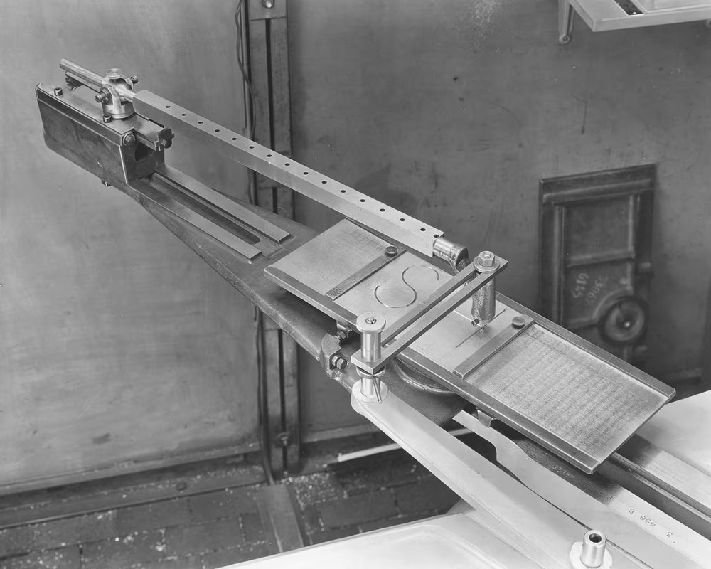
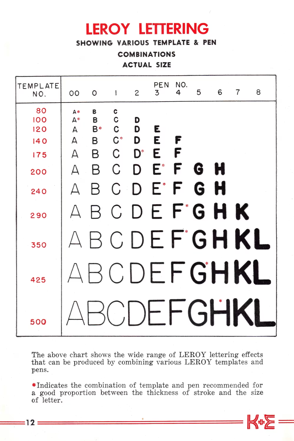
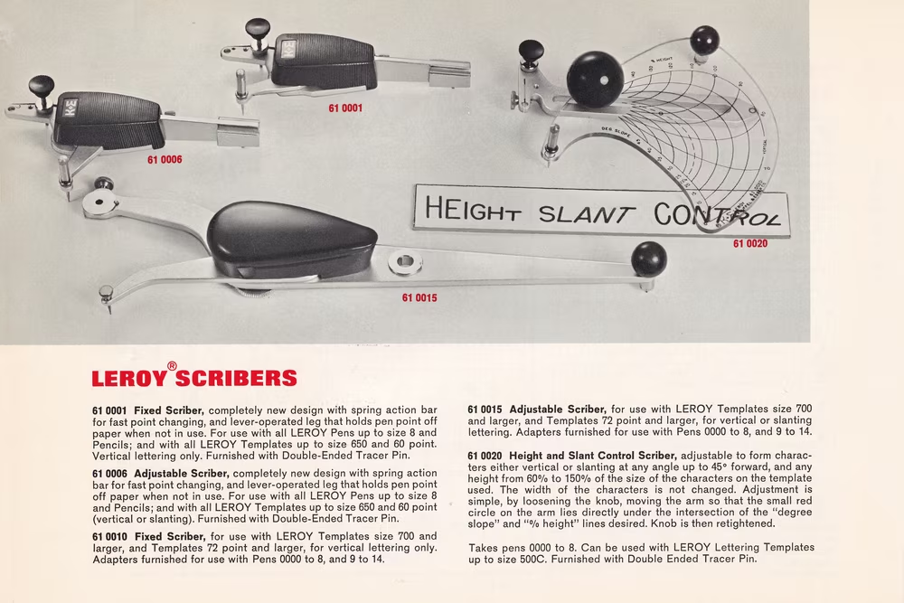
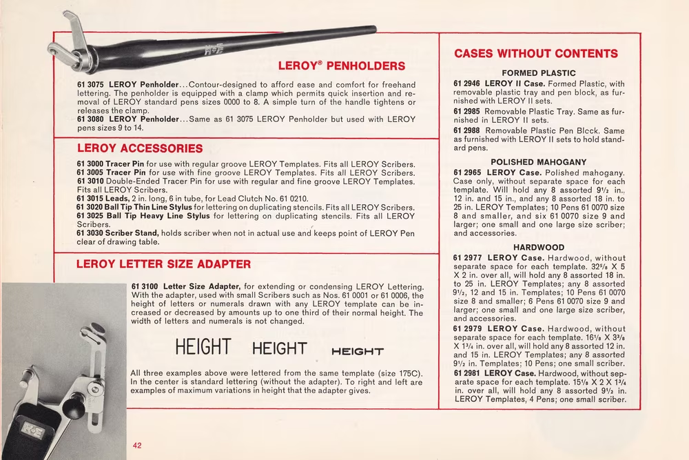
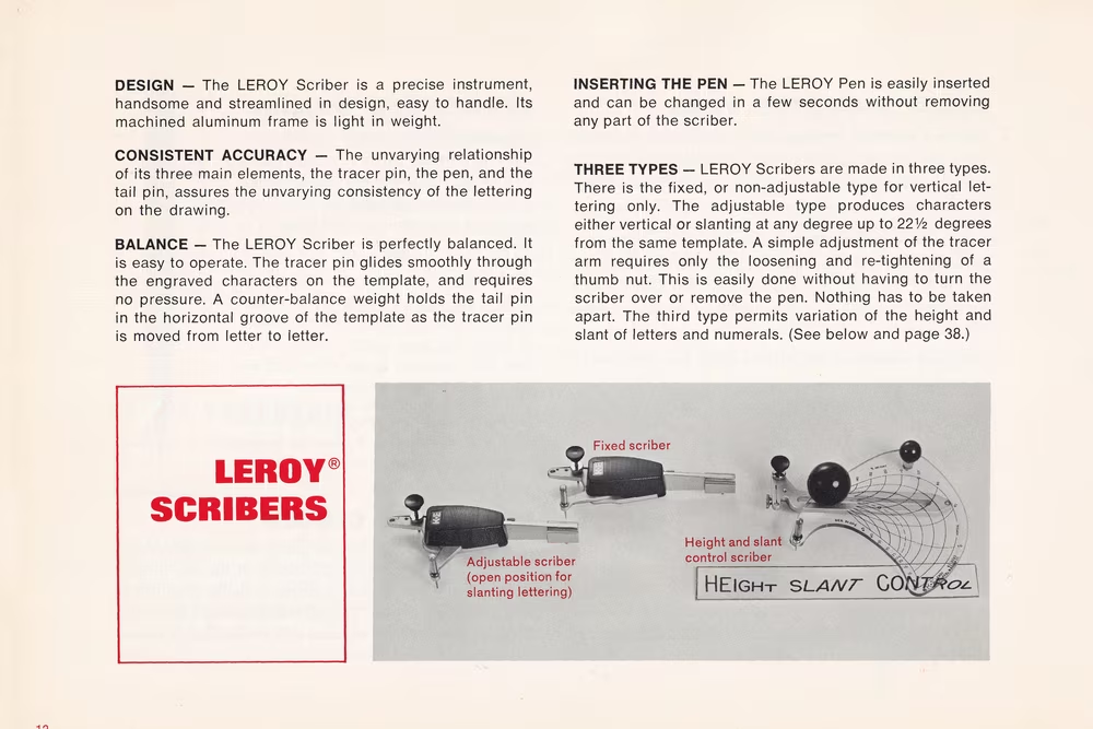
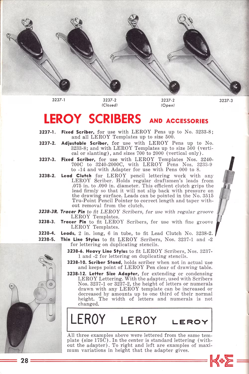
A company called Keuffel & Esser Co. grabbed Gorton’s machines, and used them to create lettering sets called Leroy. This was Gorton abstracted away – still a pantograph, but cheap, small, completely manual, and a vastly simplified one: no possibility to make things bigger and smaller, and no carving – instead, you’d mount a special pen and draw letters by tracing them.
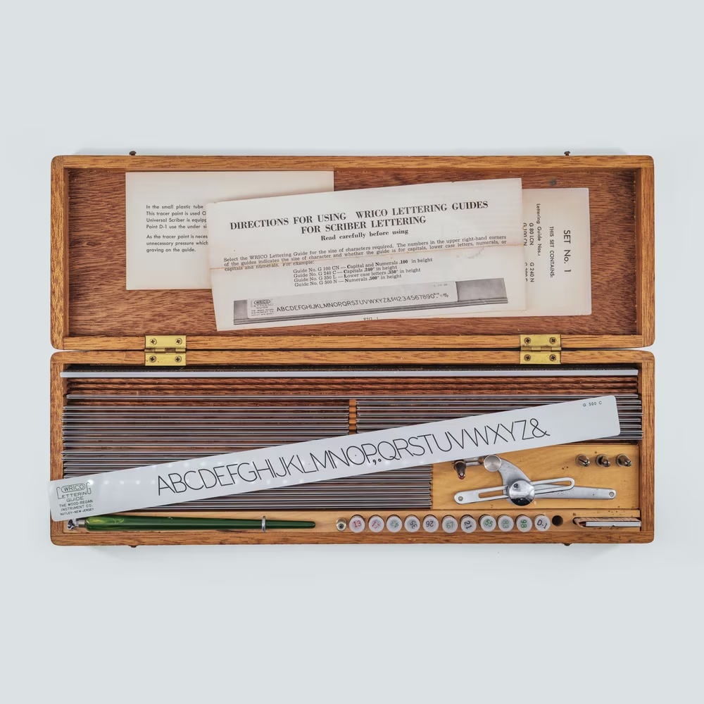
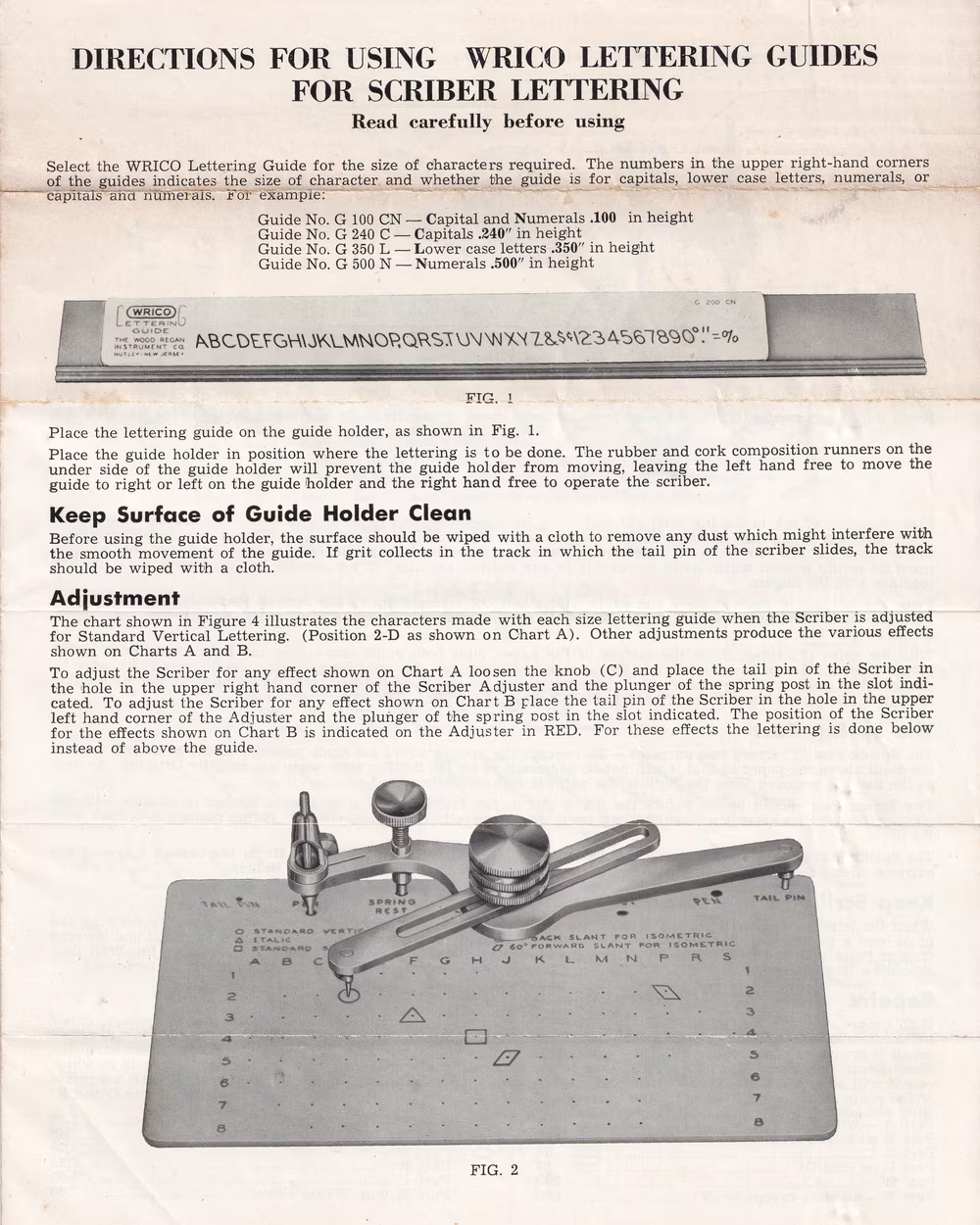
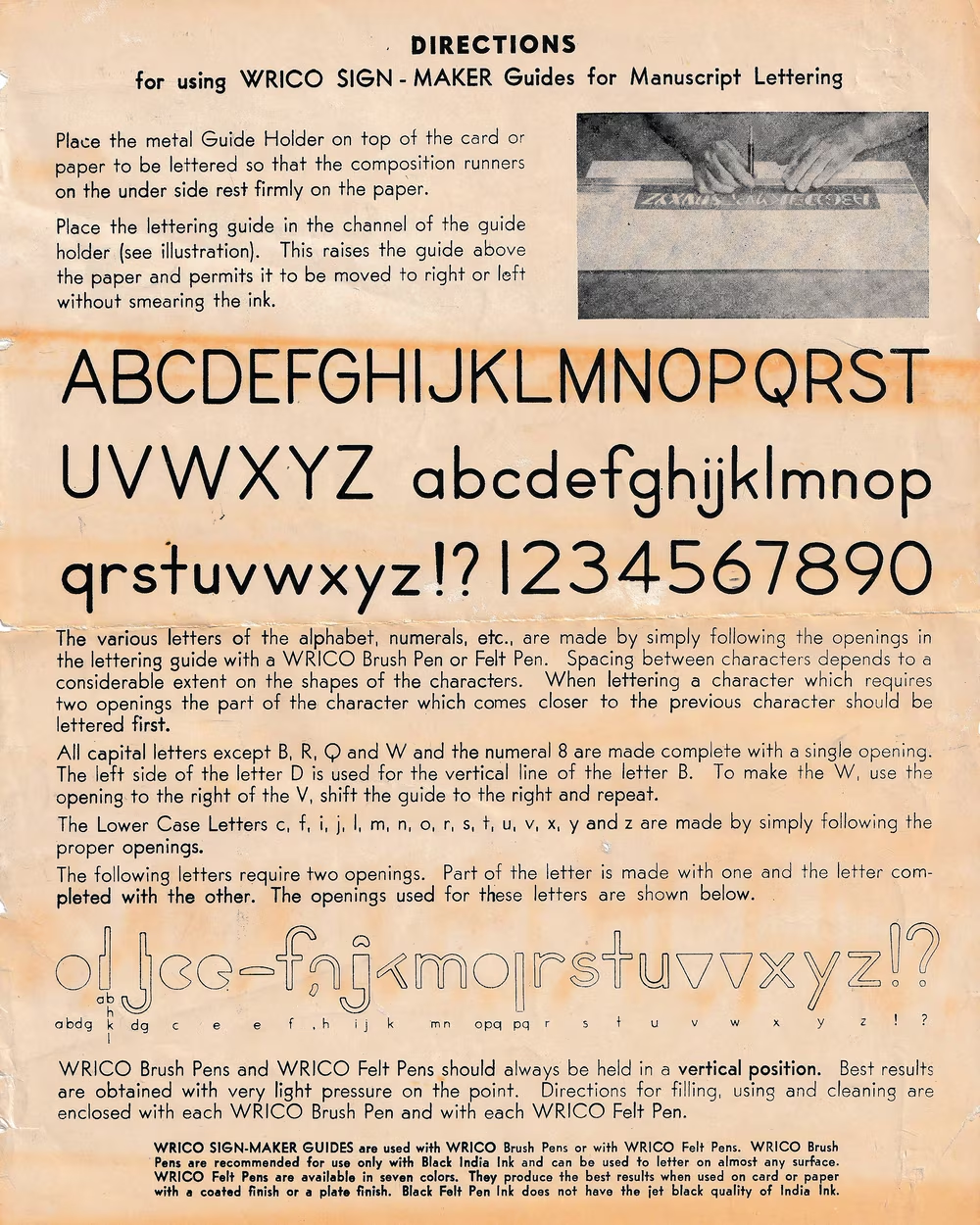
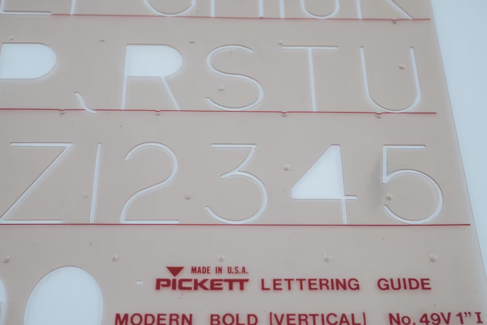
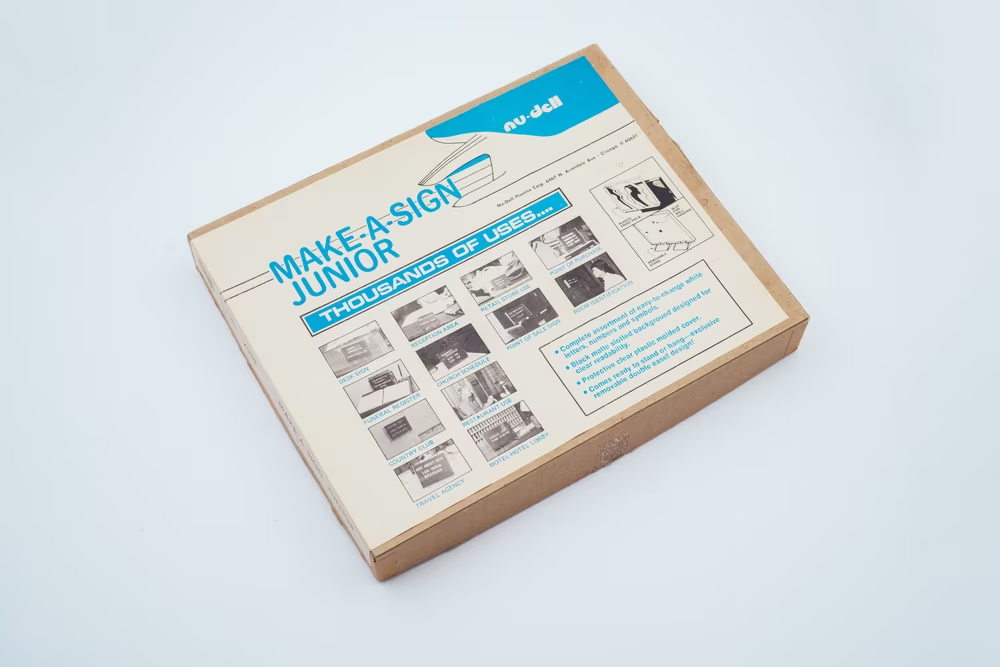
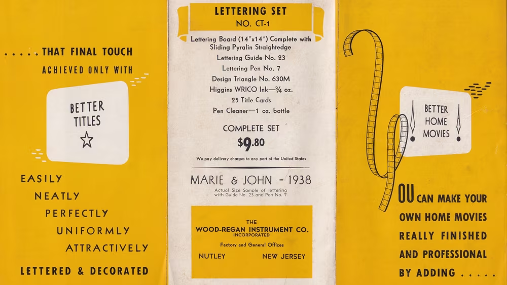
Another company, Wood-Regan Instrument Co., made a similar set called (semi-eponymously) Wrico. But then, they simplified the process even more. Instead of a pantograph, they offered for sale a set of simple lettering guides used to guide your pen directly on paper.
Some of the traditional draftspeople pooh-poohed these inventions – one handbook wrote “[Those are] of value chiefly to those who are not skilled in lettering. A professional show-card writer could work better and faster without it. A Leroy or Wrico lettering set permits work that is neat, rapid, and nearly foolproof, if not inspired.”


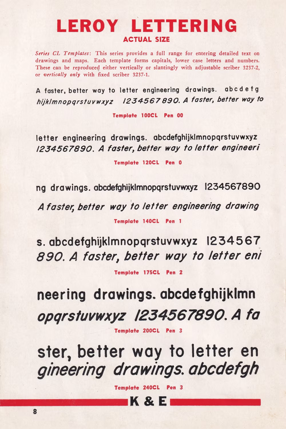
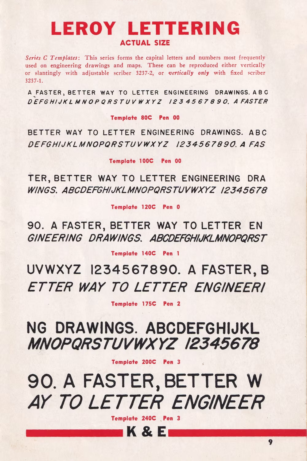
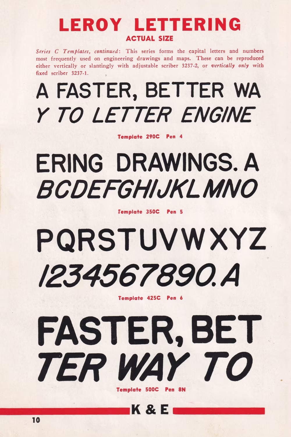
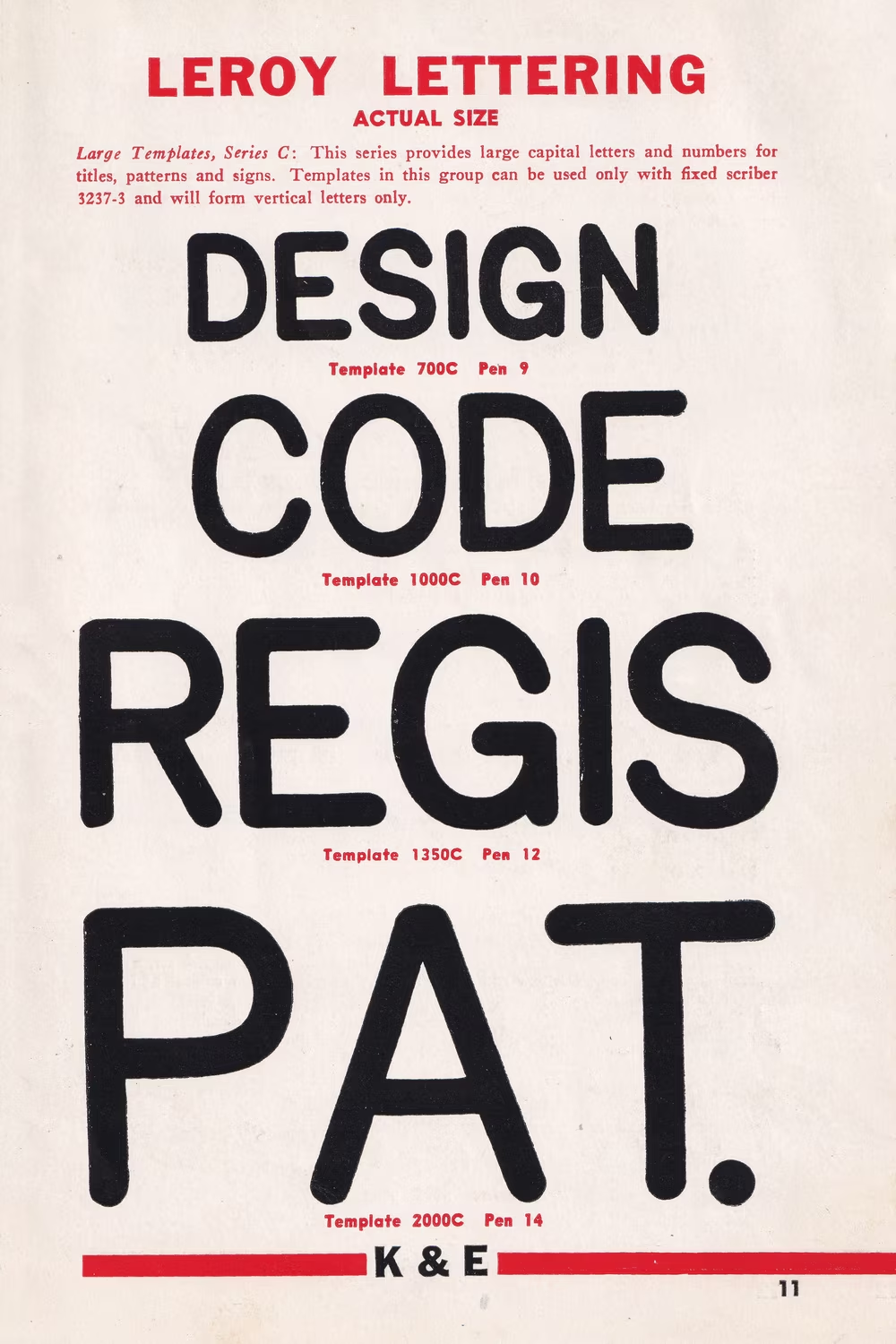
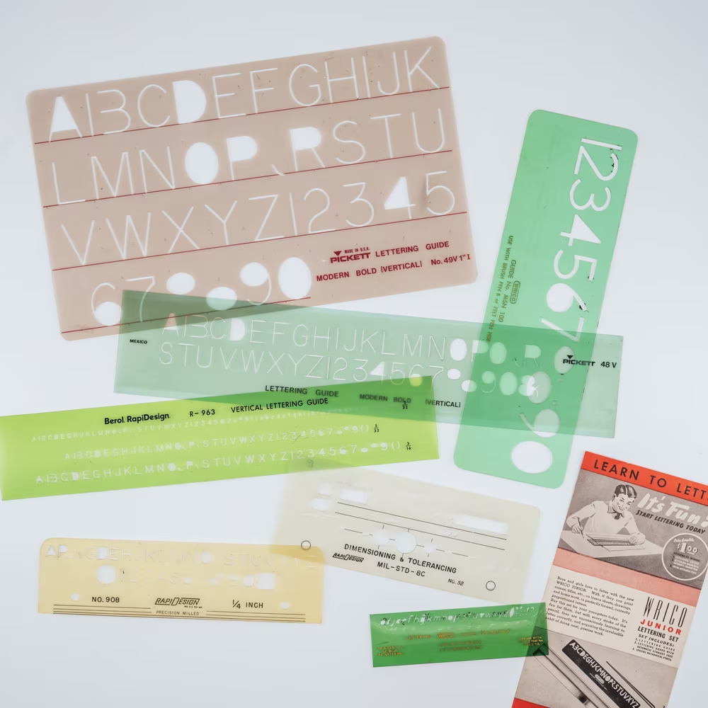
But the products ended up being popular and influential. Their output appeared in many technical documents, but spread even a bit further than that. Eventually, there were stencils made by Unitech, Lutz, Tacro, Teledyne Post, Tamaya, Tech Graphic, Ridgway’s, Faber Castell, Zephyr, Charvoz, Rotring, Pickett, Alvin, Uno/A. West & Co, and probably many more.


Then, both EC Comics and All-Star Comics used Leroy in the 1940s and 1950s, most notably in the first comic book that introduced Wonder Woman. This was Gorton spreading further than just technical documents, and inspiring more people.

Elsewhere silkscreening – a pretty cool technique of applying paint on surfaces through a wet mesh of fabric – took Gorton and Leroy in a different direction, by allowing paint on metal.

There was more. The popular plastic letters attached to felt boards, popularized by restaurants decades ago, and more recently revisited by Instagram mom influencers, also clearly derive from Gorton and Leroy.

I also counted at least three different systems of “Gorton movable type” – some where you could assemble physical letters, and some where you could impress them into soft materials using steel types – and I imagine there were probably more.
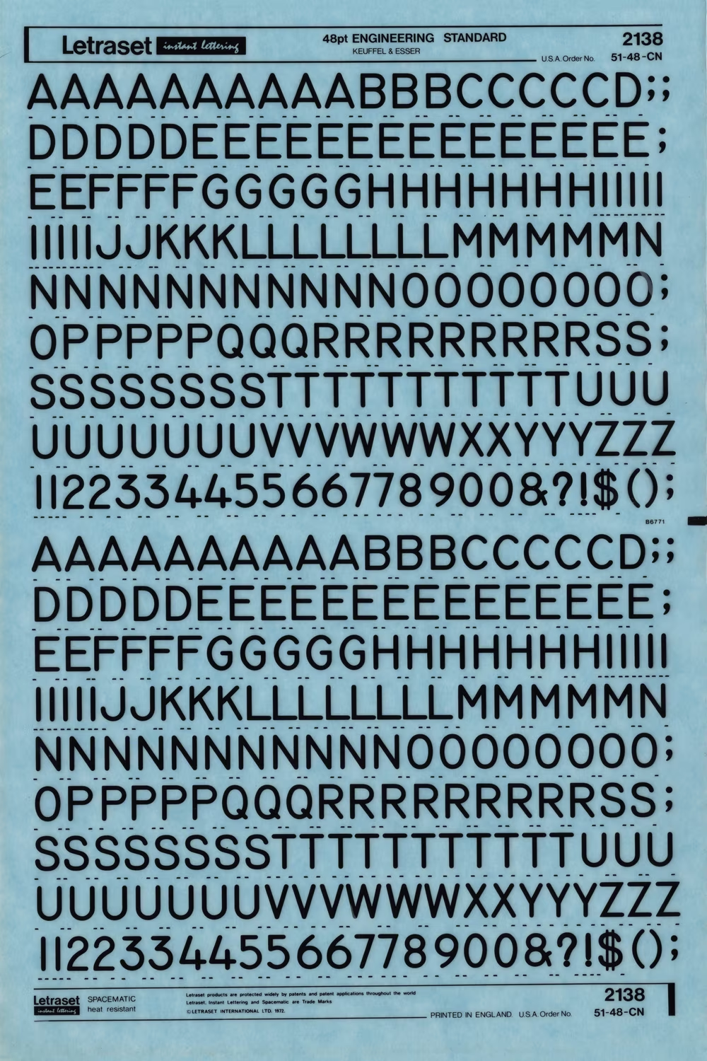
Letraset, a cheap technique of applying a font by rubbing a letter from a provided sheet onto paper, popular throughout the 1960s, introduced first- or second-hand Leroy too – and so did a few competitors.
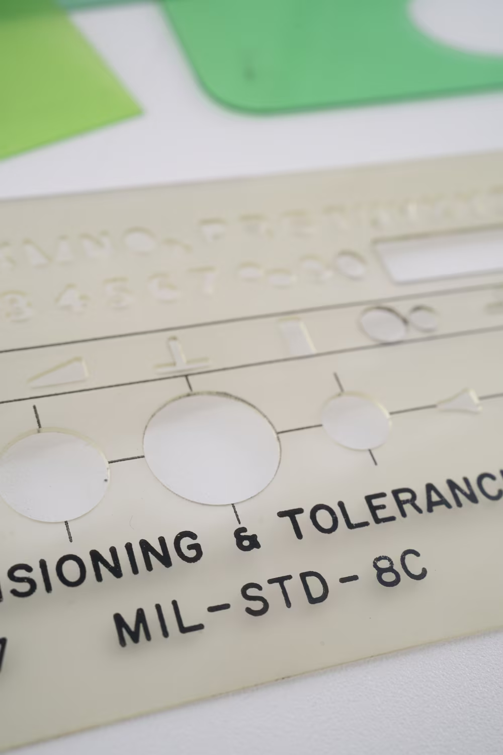
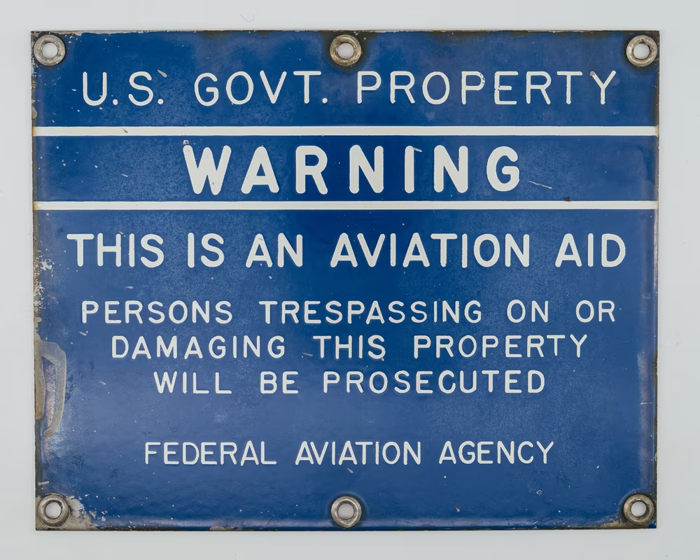
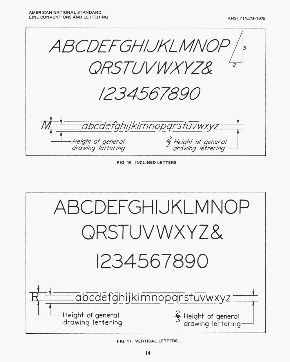
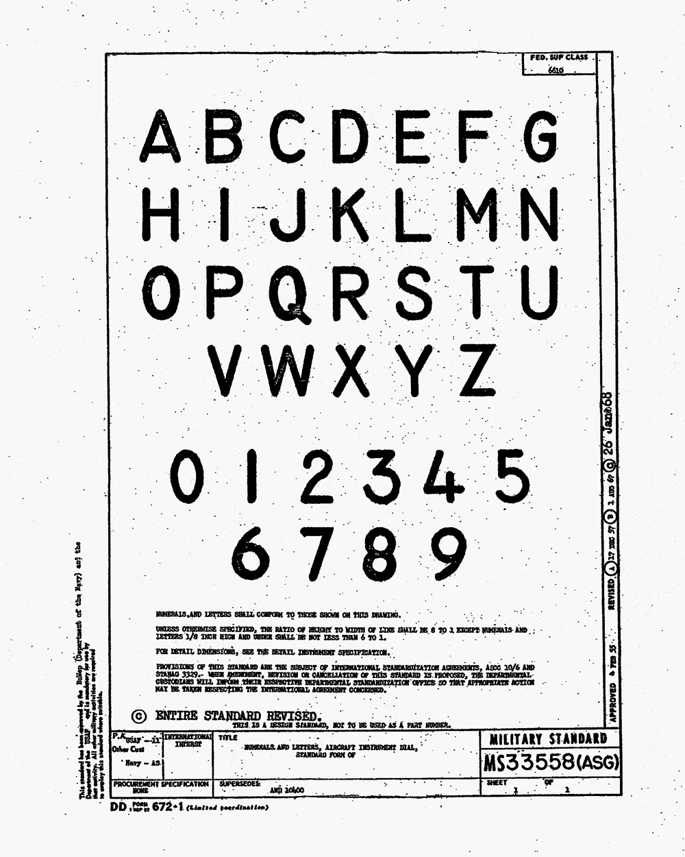
In the regulatory space, the U.S. military canonized Gorton in 1968 as a standard called MIL-SPEC-33558 for aircraft and other equipment dials, cancelled it in 1998… then brought it back again in 2007. NATO and STANAG followed. ANSI, American standardization body, made a more rounded Leroy an official font for technical lettering via ANSI Y14.2M, and so did institutions like the US National Park Service.
Gorton went on and on and on. The early Hershey vector fonts, developed on very early computers and still popular in CAD applications today, were also derived from Gorton/Leroy shapes, simplified so that the already-simple curves weren’t even necessary – any letter could now be drawn by a series of straight lines.
And even in the first universe Gorton inhabited things weren’t standing still.
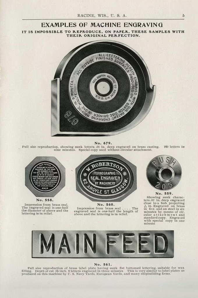
As the engraving industry learned what’s popular and what is not, the offerings started getting more and more sophisticated. A promotional booklet called “The Whereabouts of 230 Engraving Machines” listed Gorton customers ranging from biscuit makers to fire engine constructors. Other catalogs proudly listed applications like book covers, billiard balls, organ keys, and toothbrushes, as well as “tools making more tools” – using Gorton engravers to create legends for other machines.
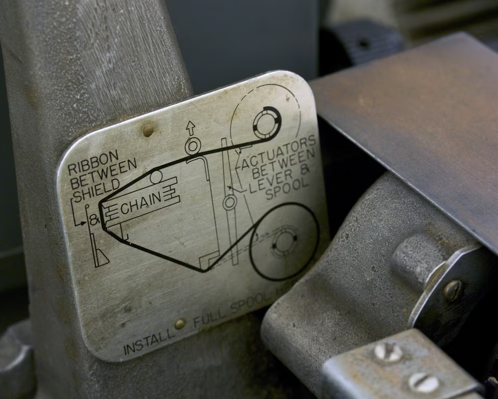
After you bought your pantograph engraver, you could buy attachments for sometimes surprising use cases:


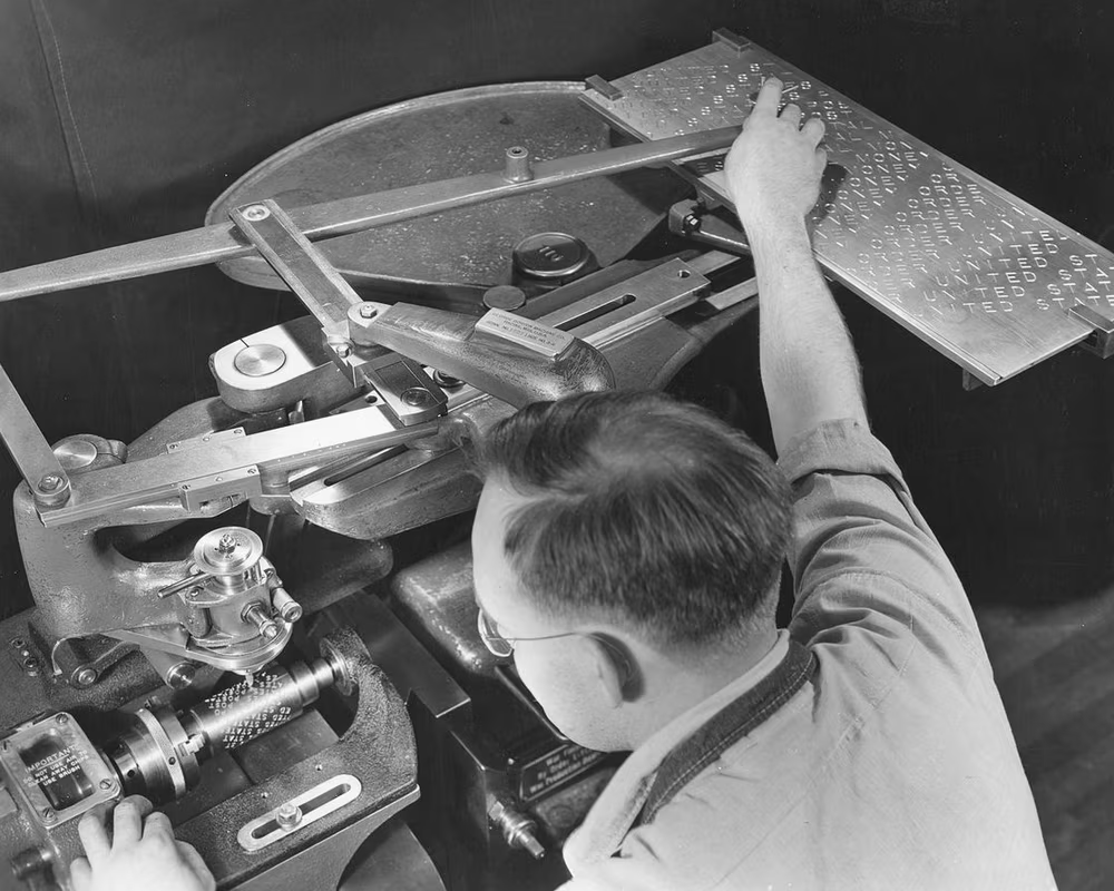
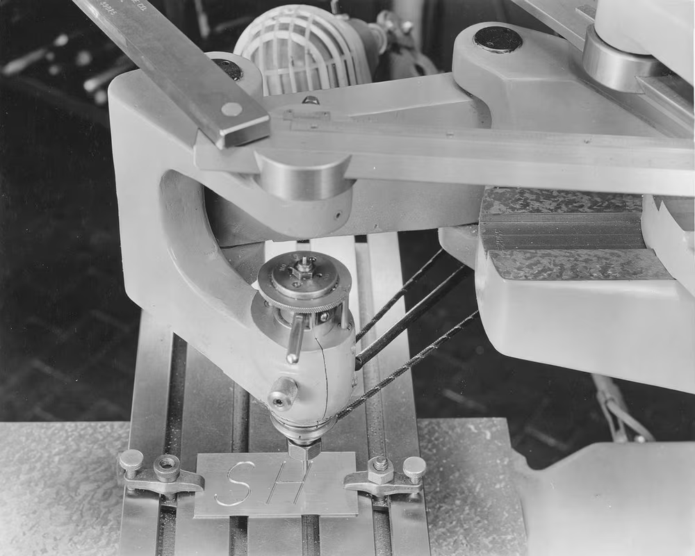
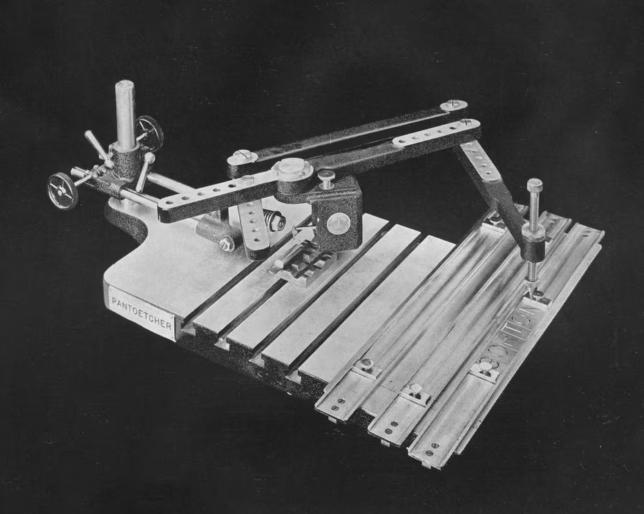
The original machine-shop pantographs were supplanted by smaller portable units (called Pantoetchers) on one side, and by increasingly complex electronic devices on the other. First generation of those were still huge room-size endeavors with old-fashioned displays and complex interfaces labeled… in Gorton itself.
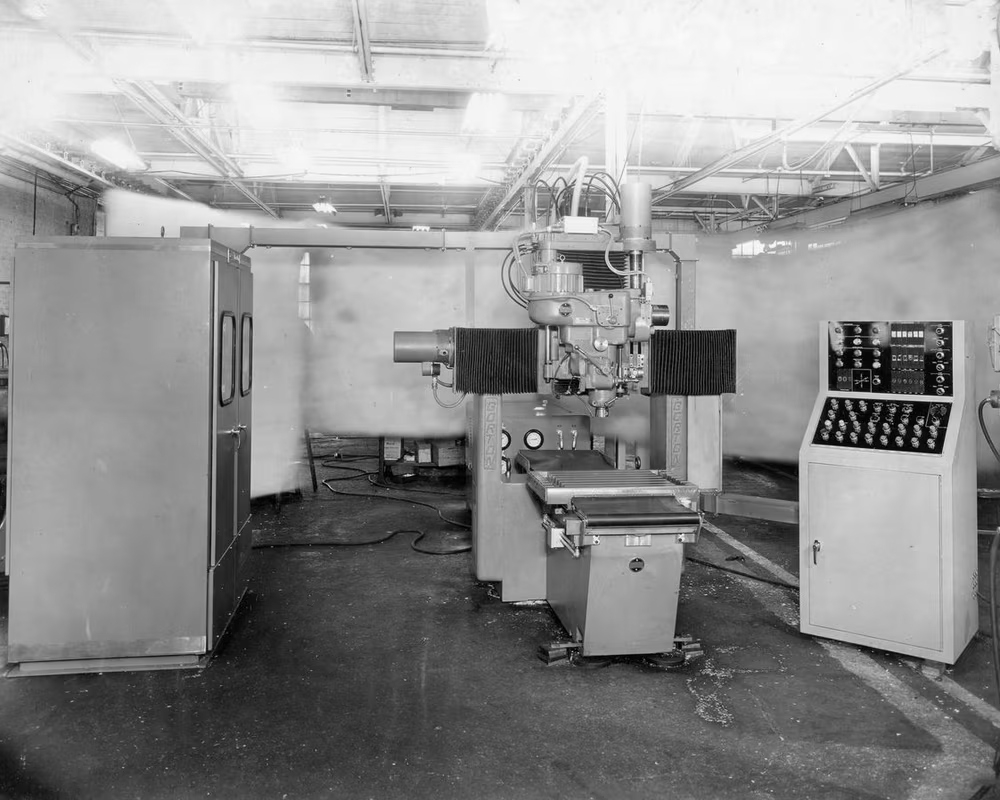
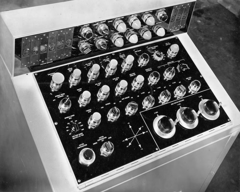
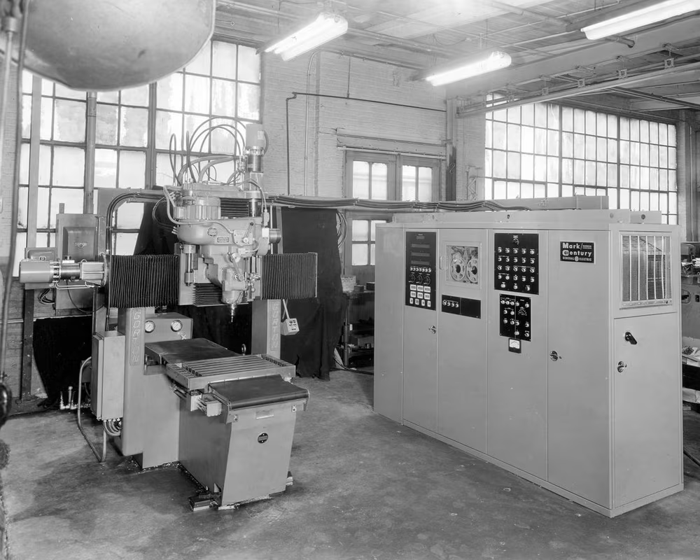
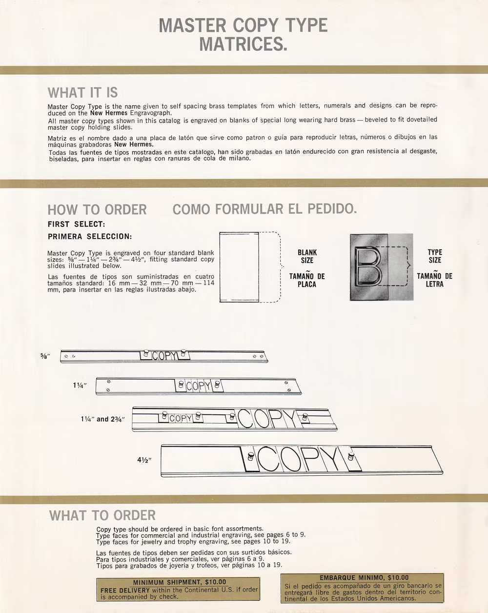
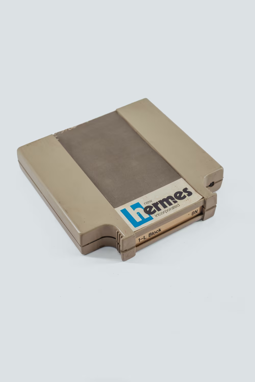
But the technology matured quickly and soon more and more early manual “tracer-guided” pantographs that forced the operator to put letters side by side and then trace them by hand, were superseded by computerized ones, with both the composition and the routing completely automated. They came from George Gorton Machine Co., and from competitors like New Hermes or H.P. Preis.
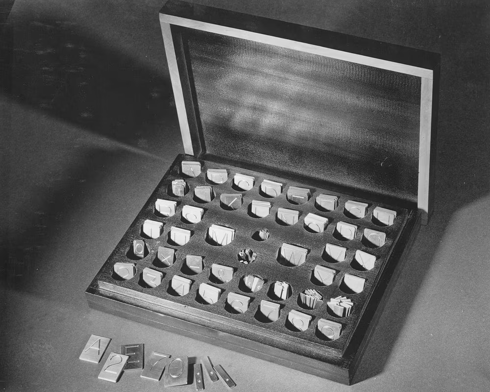
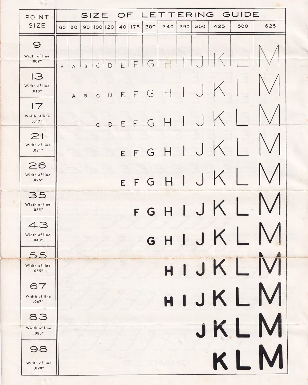
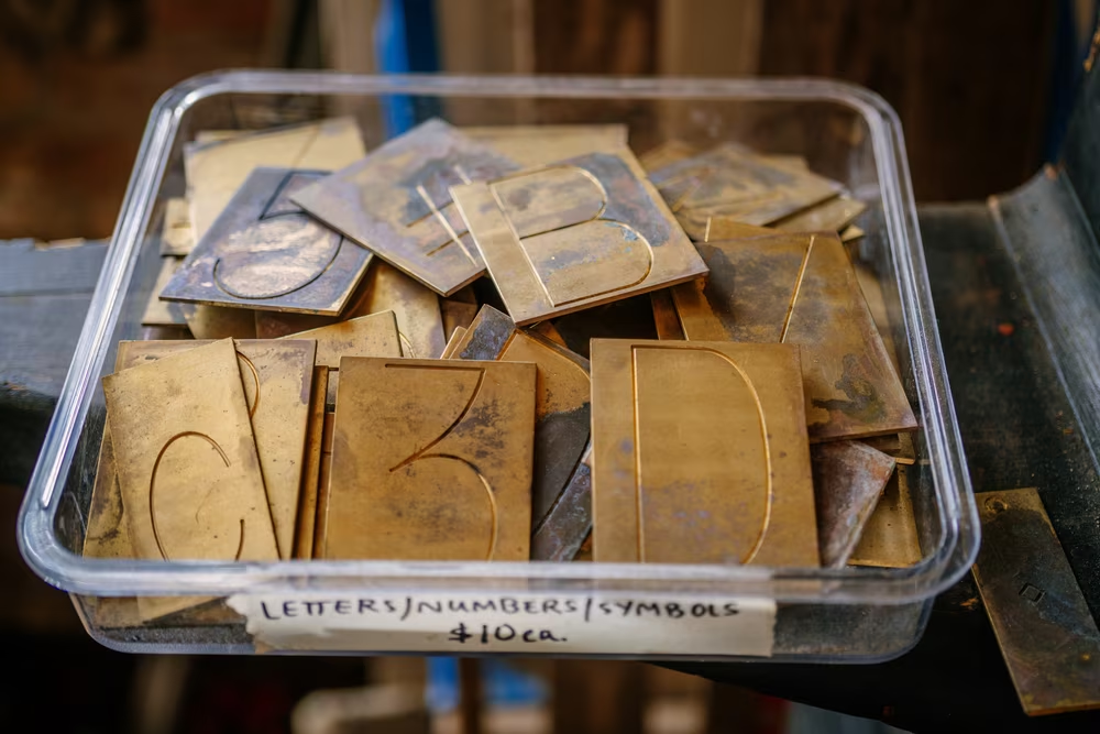
You no longer had to buy the chromium-plated brass alphabets weighing up to 13 pounds, choosing the right size from 3/8´´ to 3´´ ahead of time (pantographs allowed for reductions and enlargements, but only gave you a few steps within a specific range.)
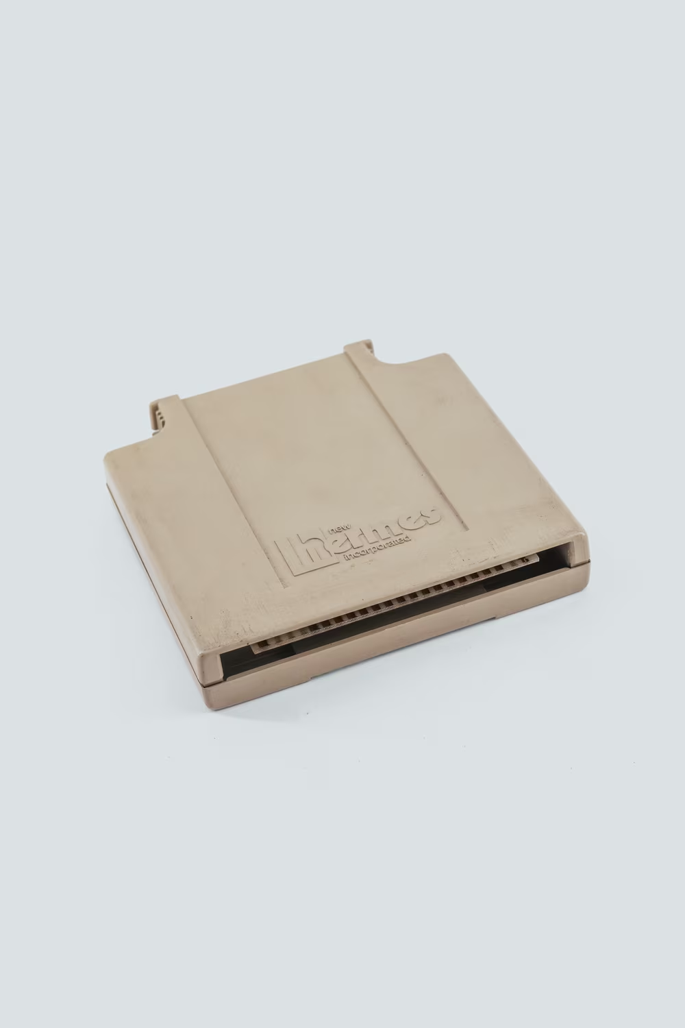
Now, fonts came as digits or formulas built into computer memory, or – for a moment in time – as separate cartridges you’d insert in eager slots. (And yes, before you ask: there were other routing monoline fonts, too. But I really don’t care about any of them.)
It was the same story as in word processing right next door, where old-fashioned Gutenberg-era typesetting was being replaced by increasingly smaller and cheaper computers equipped with first-laughable-then-capable software.
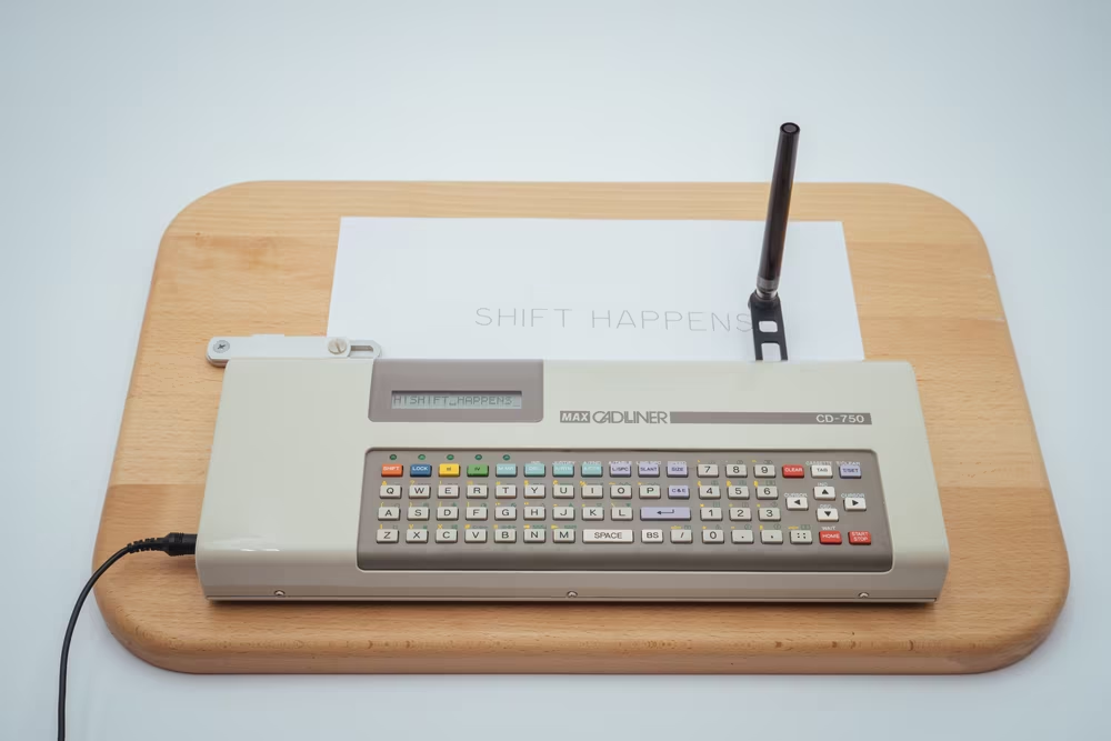
And automation came for the Leroy branch of the tree as well. A few companies grabbed Leroy lettering templates and abstracted them away once more. They created curious small typewriter/plotter hybrids where typing letters on a keyboard would make the pen draw them on paper for you. (I own one of them, a Max Cadliner. It might be one of the strangest typewriters I’ve seen – a weird combination of a machine pretending to be another machine pretending to be a human hand.)
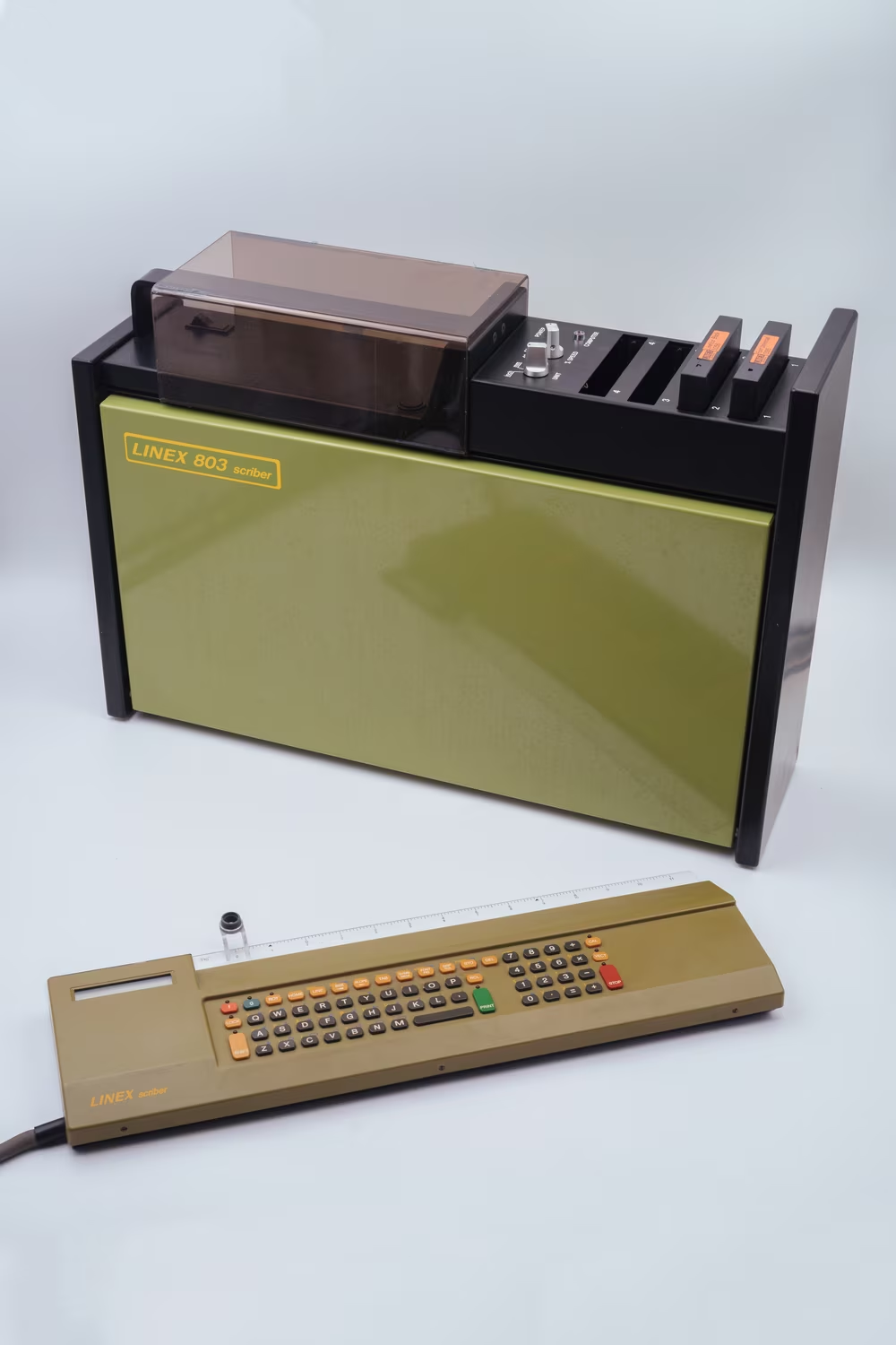
If this was a Gorton typewriter, there were also Gorton computers, even more sophisticated 1980s machines whose text could be programmed in advance rather than typed one line at a time, and mixed with graphics.
5
I don’t think the – by now 80 years and counting – fractal explosion of Gorton made its original creators rich.
Copy protection in the world of typography is complicated. The font’s name can be trademarked and other companies legally prevented from using it, and you can’t just grab matrices or font files and copy them without appropriate licenses. But take any text output using a font and then redraw it – and you are within your right to do so, and even to sell the final result. At least in America, or in some other countries until somewhat recently, the shapes of the letters themselves are not legally protected.
This is why Keuffel & Esser, Wood-Regan Instrument, and Letraset could potentially grab Gorton and claim it their own, as long as they didn’t name it Gorton.
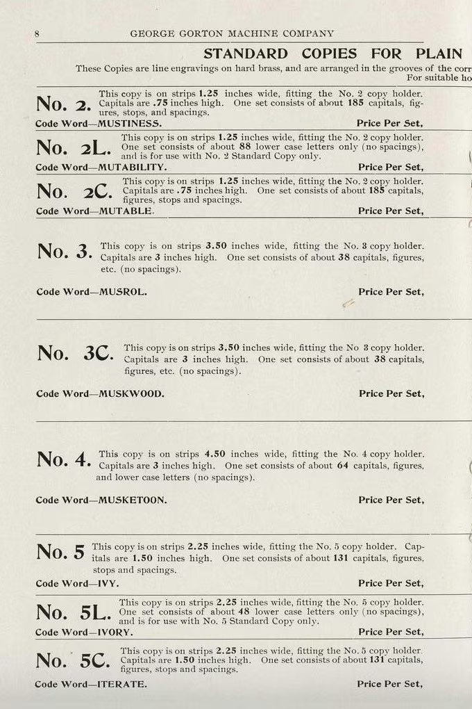
But of course, Gorton was barely named “Gorton” to begin with. In the early days of George Gorton pantographs, as the default pantograph font, it came without a name. (The font sets for purchase were called “standard copies.”) Then, as other fonts were added, it was retroactively named Gorton Normal – the name of the company and the most generic word possible.
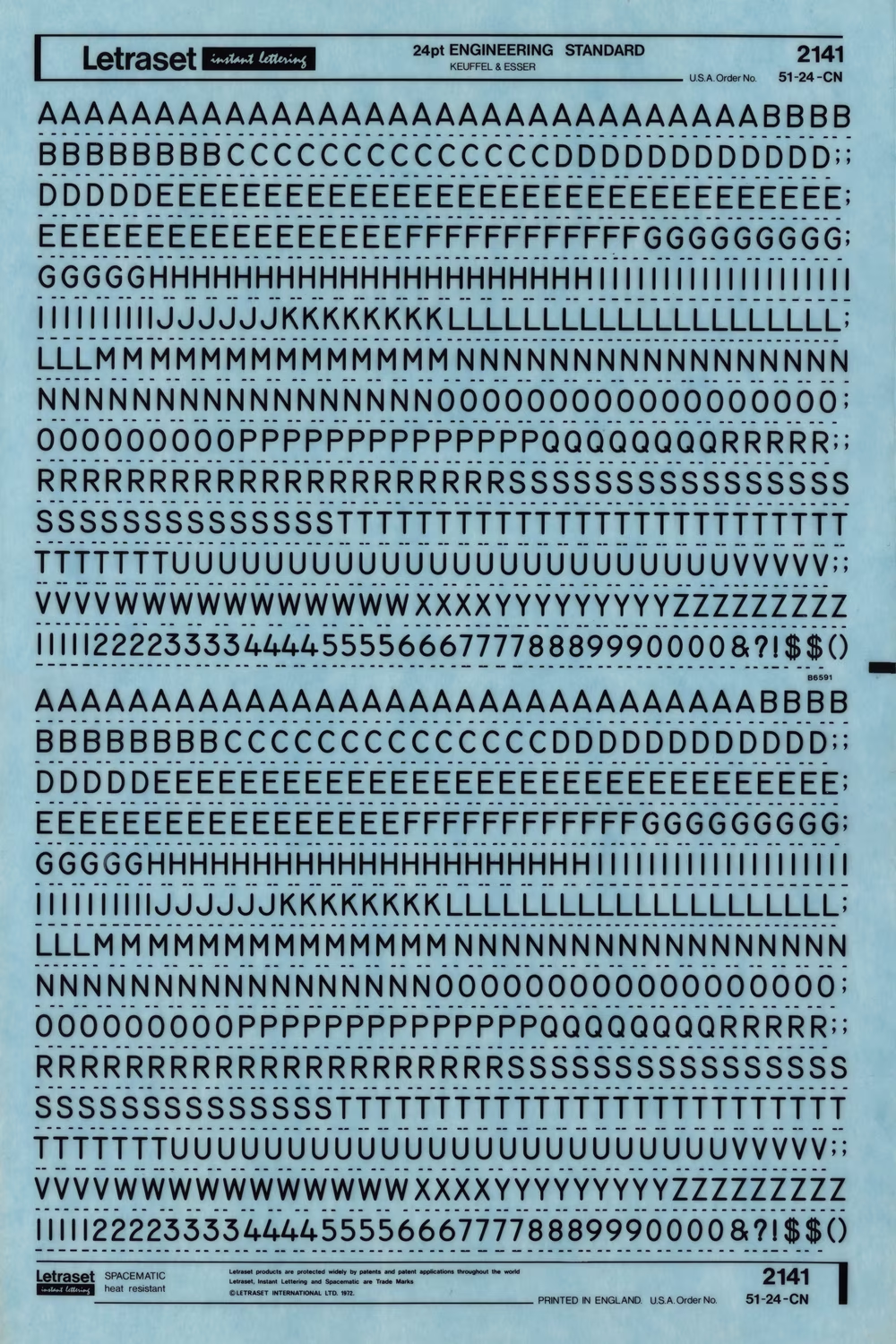
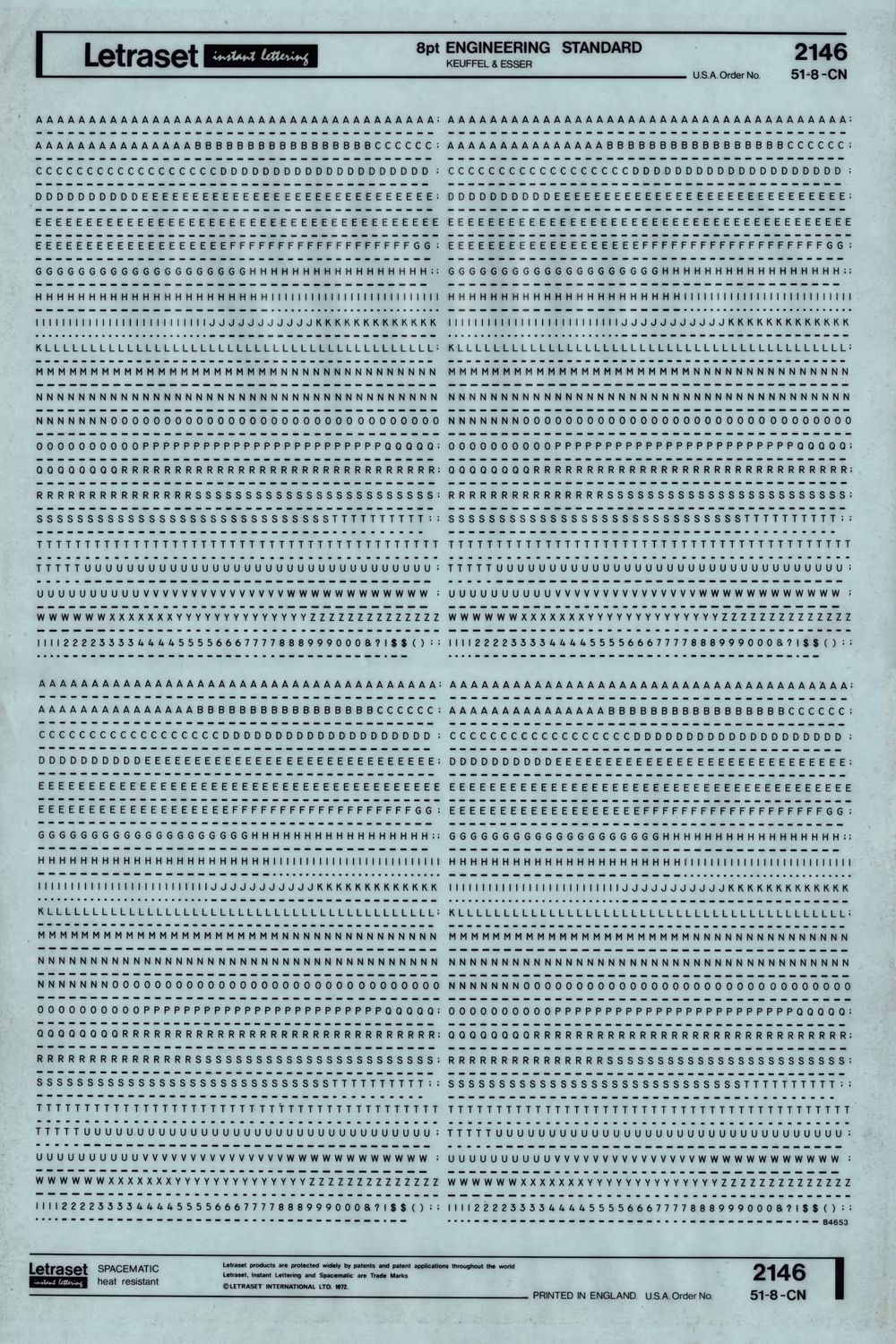
Leroy lettering sets started with one font, so similarly to Gorton the font started to be known as “Leroy,” then “Series C,” then “Gothic.” New Hermes called it simply “Block,” Letraset went with “Engineering Standard,” and Rotring – another producer of little computerized plotters – with “Universal.” I’ve also seen “A style,” “Plain Gothic,” and, mysteriously, “Standpoint.”
I don’t think this was meant to be disrespectful. “Standard,“ “Universal,” “A style” might not have had the connotations of “generic” we associate with them today, but rather meaning “the only one you need,” “approved of by millions,” or “the ultimate.”
But there was one name that felt somewhat inconsiderate. It appeared in one product in the 1980s, a few decades after the birth of another font whose name became recognizable and distinguished. In that product, Gorton was referred to as “Linetica.”
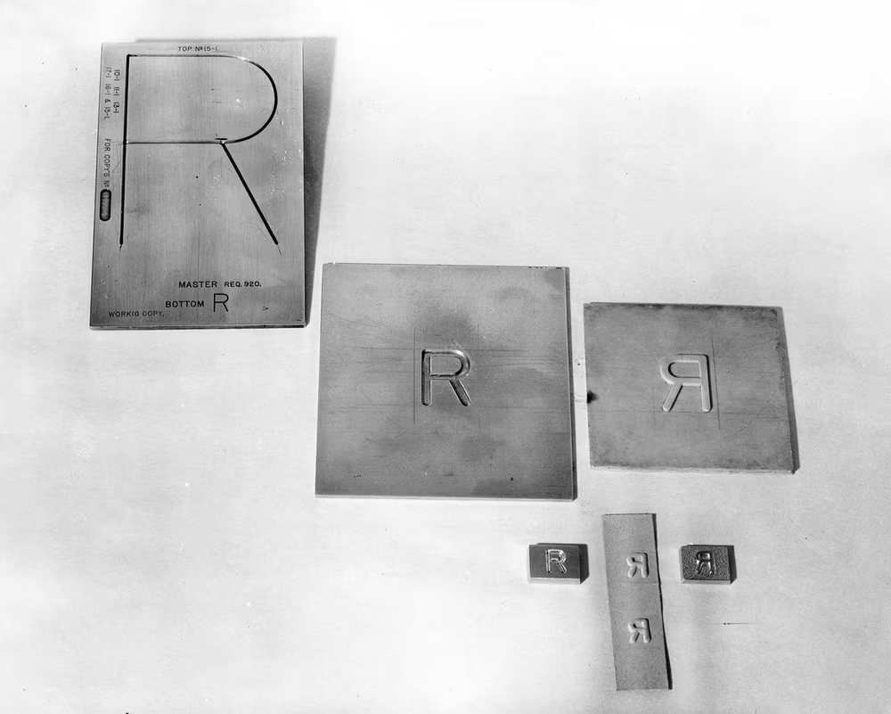
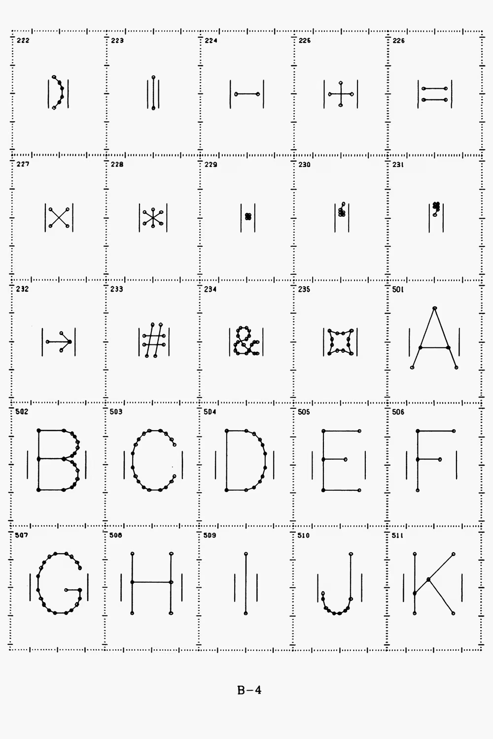
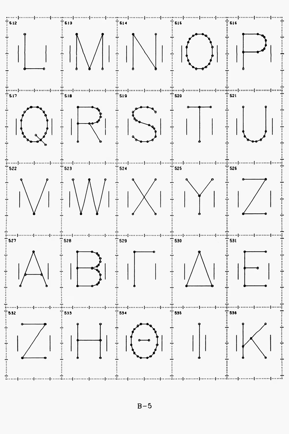
Each of these reappearances made small changes to the shapes of some letters. Leroy’s ampersand was a departure from Gorton’s. Others softened the middle of the digit 3, and Wrico got rid of its distinctive shape altogether. Sometimes the tail of the Q got straightened, the other times K cleaned up. Punctuation – commas, quotes, question marks – was almost always redone. But even without hunting down the proof confirming the purchase of a Gorton’s pantograph or a Leroy template set as a starting point, the lineage of its lines was obvious. (The remixes riffed off of Gorton Condensed or the normal, squareish edition… and at times both. The extended version – not that popular to begin with – was often skipped.)
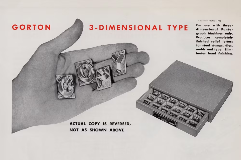
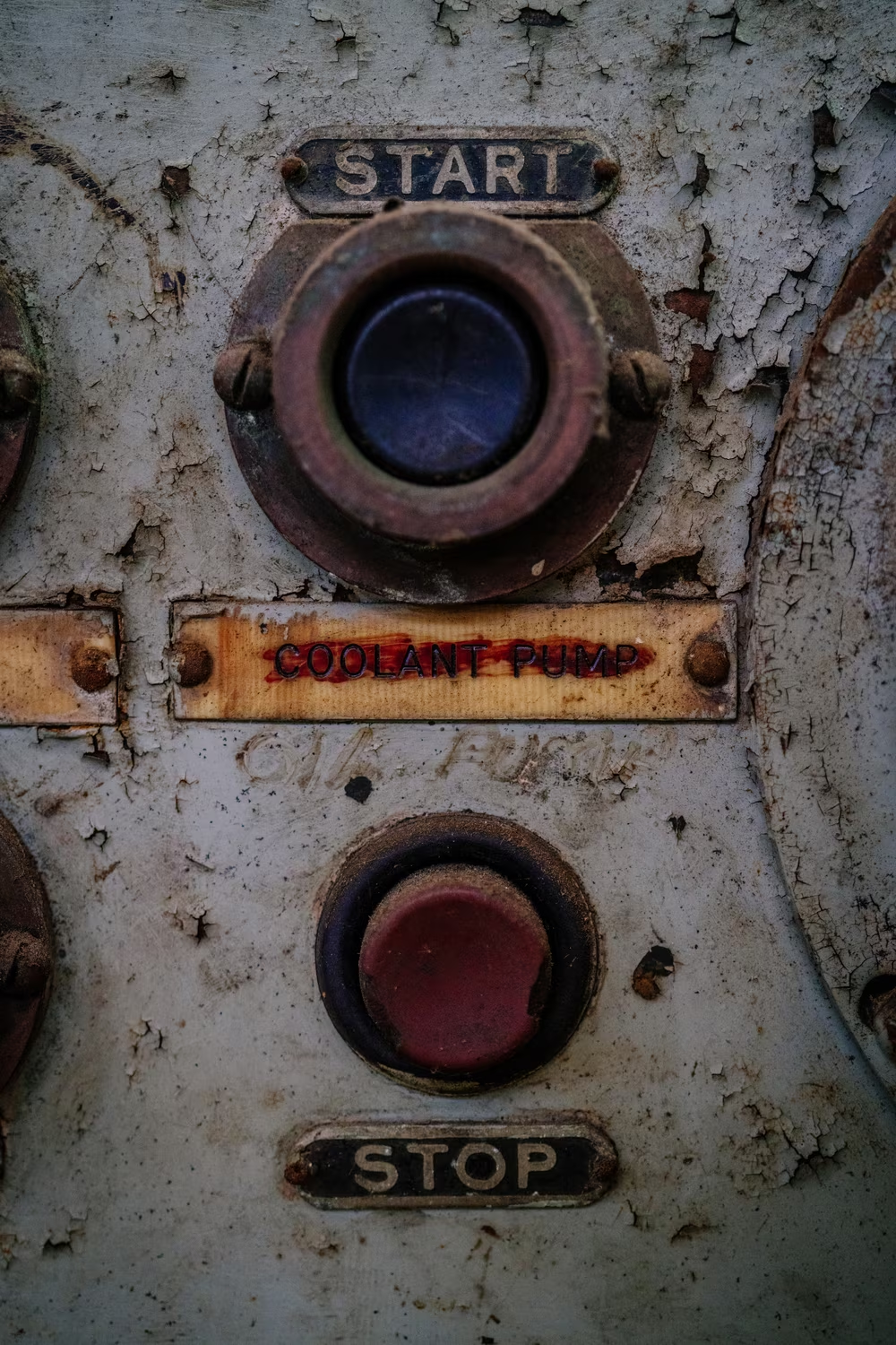
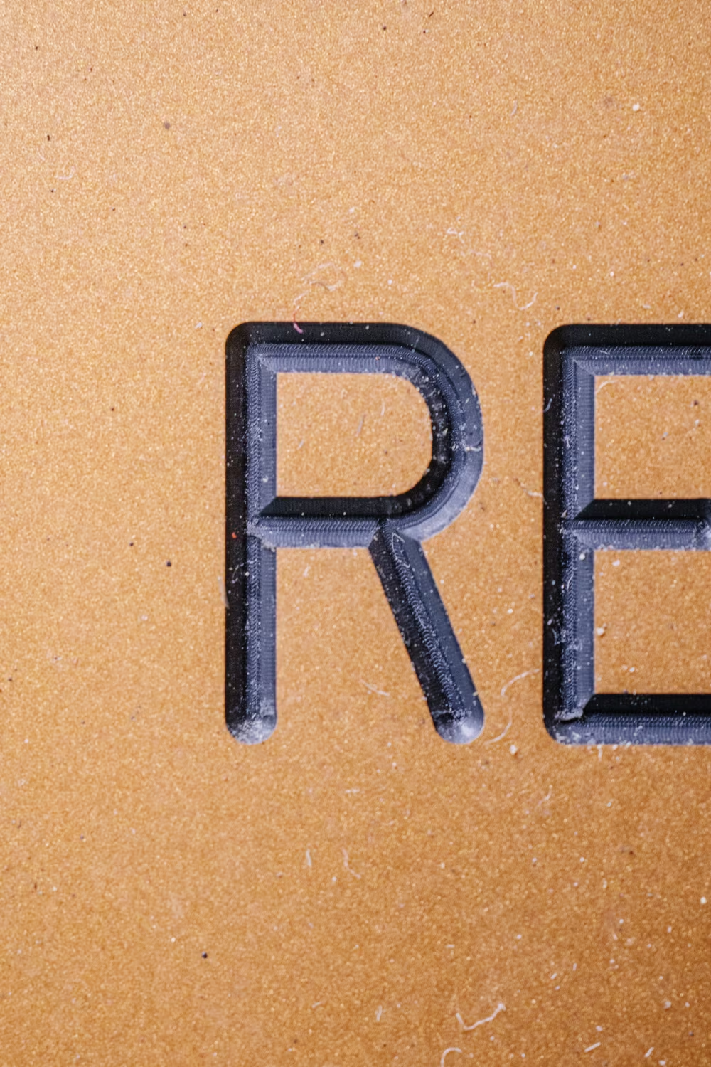
The only “official” update to Gorton I know of, and one actually graced with a name, was Gorton Modified. It was made some time in the 1970s by one of the main keyboard keycap manufacturers, Comptec (later Signature Plastics). It was almost a fusion of Gorton and Futura, with more rounded letterforms. Gone was the quirkiness of 3, 7, Q, C, and the strange, tired ampersand. This is the version people might recognize from some of the 1980s computers, or mechanical keyboards today.
It is also that last Gorton that mattered.

6
By the time I learned about this, seven years in, I’ve become truly obsessed with Gorton and made it public by writing about it in my newsletter.
My every walk in Chicago or San Francisco was counting down “time to Gorton” – sometimes mere minutes before I saw a placard or an intercom with the familiar font.
This might be embarrassing to admit, but I have never been so happy seeing a font in the wild, particularly as there was almost always some new surprise – a numero, a line going through the Z, a new use, or a new imperfection. And, for a font that didn’t exist, I saw it surprisingly often.

I even spotted Gorton a few times in Spain, or the U.K., and didn’t make too much of it, not thinking about the likelihood of machines from George Gorton’s company in a small town of Racine, Wisconsin making it all the way to different continents. In hindsight I should have.
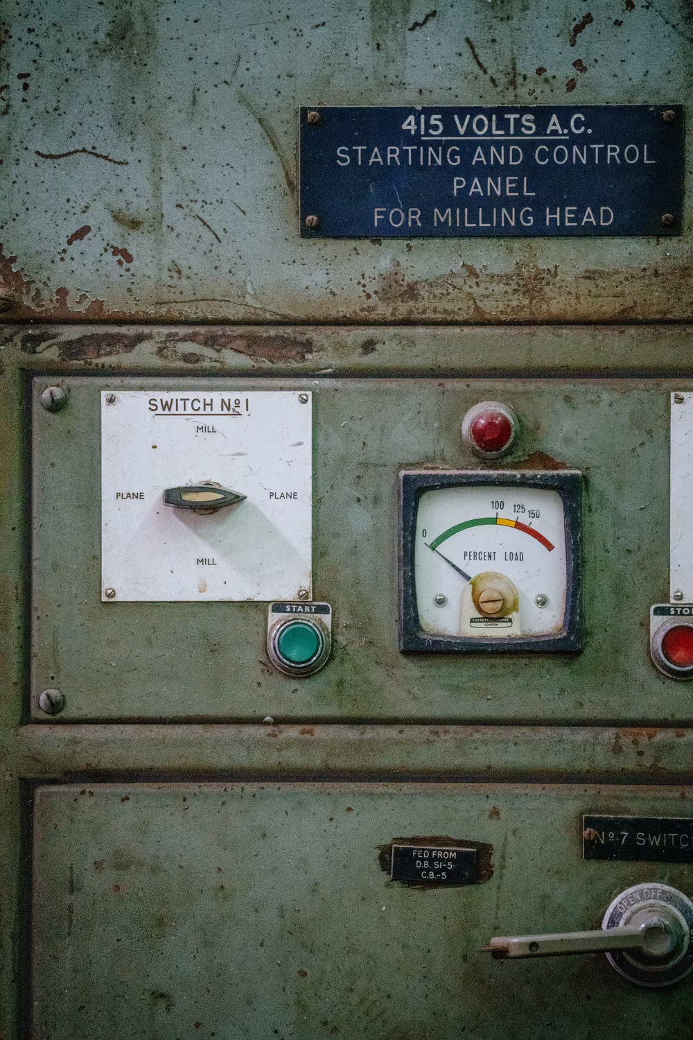
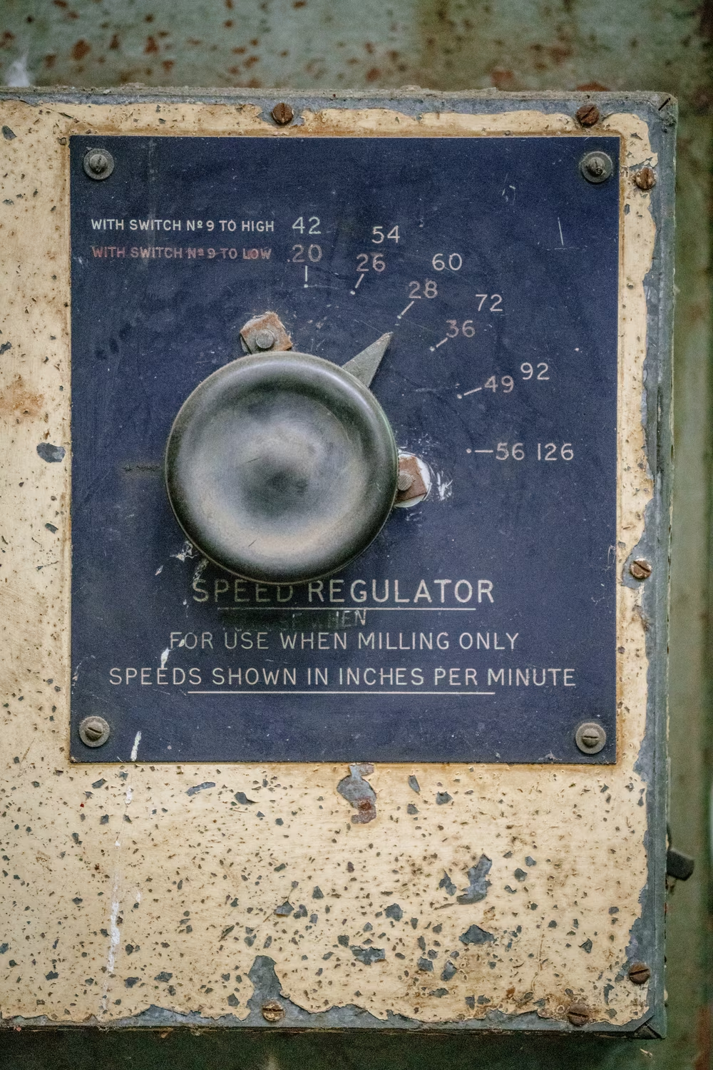
It was only on a trip to Australia where something started connecting. Here, once more, I saw Gorton on the streets, put to work in all sorts of unglamorous situations:
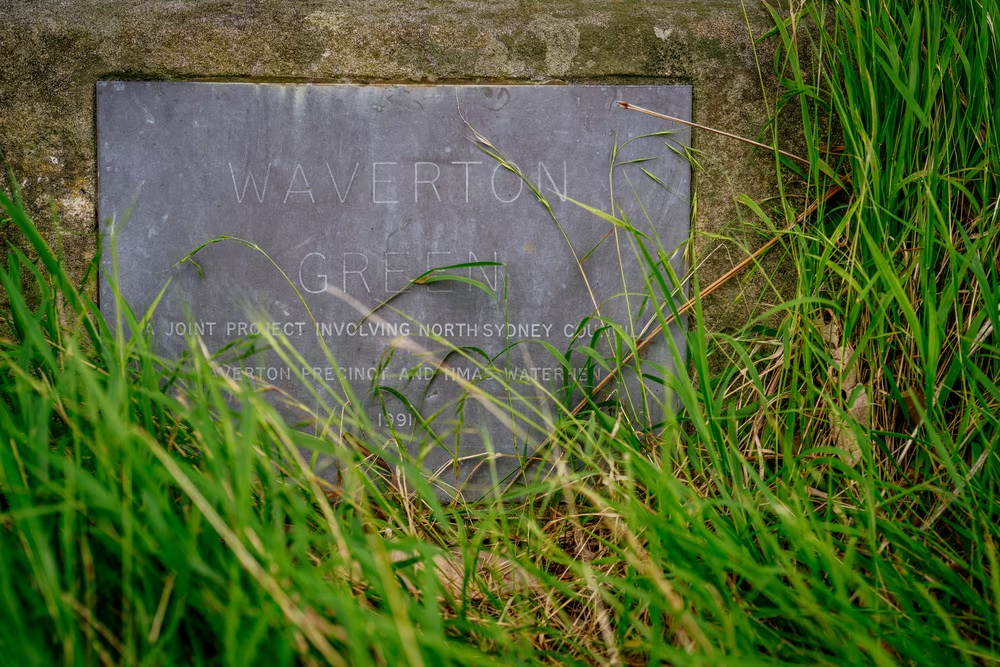
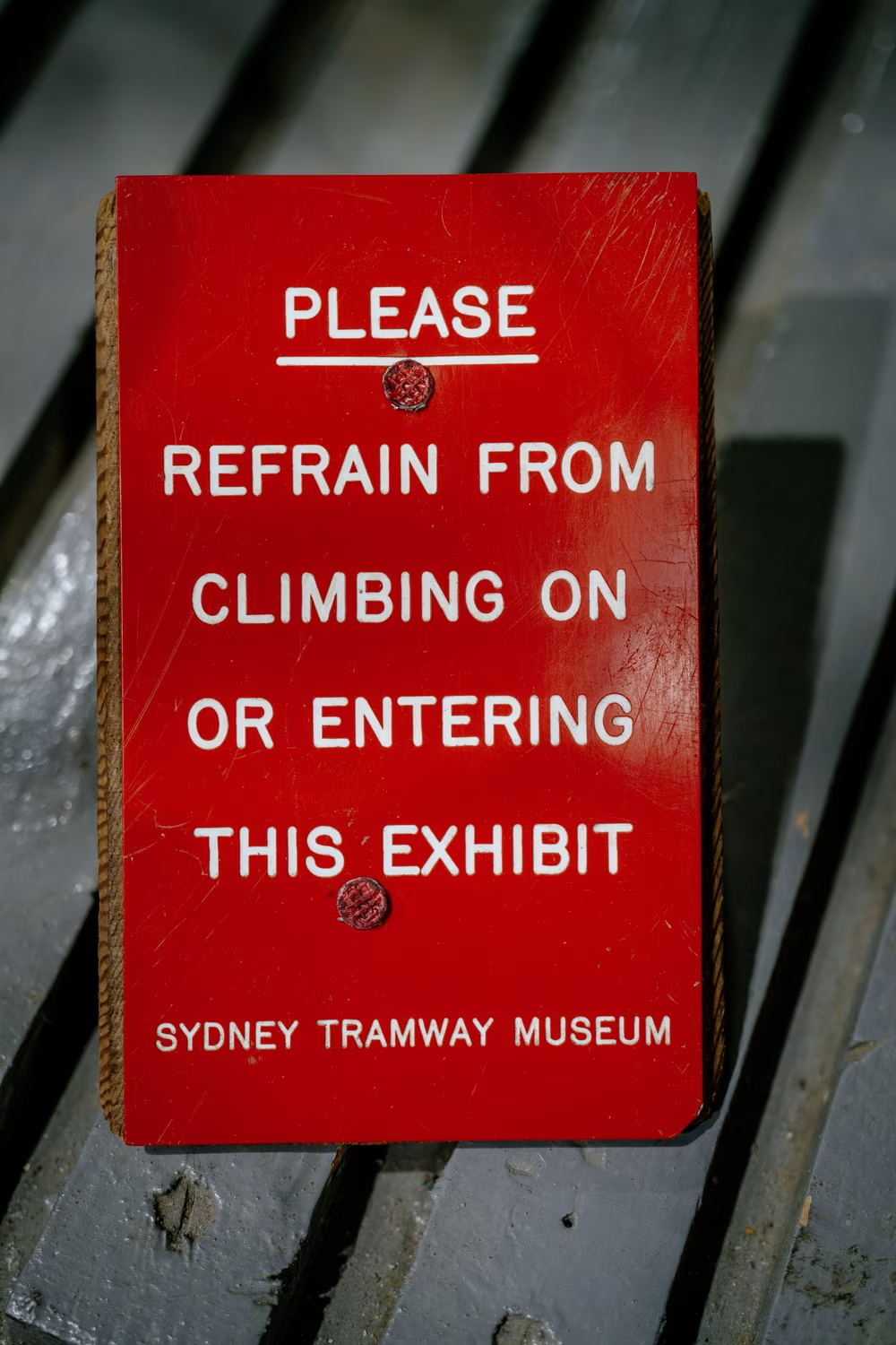

Some letterforms in the above photos felt slightly odd, and so did Gorton on the heavy machinery in an abandoned shipyard on an island near Sydney:

And a visit to a naval museum cemented it all:

It was Gorton, although with some consistent quirks: 2, 5, 6, and 9 were shorter, the centers of M and W didn’t stretch all the way across, and the distinctive shape of S was slightly different here.
What on literal earth!
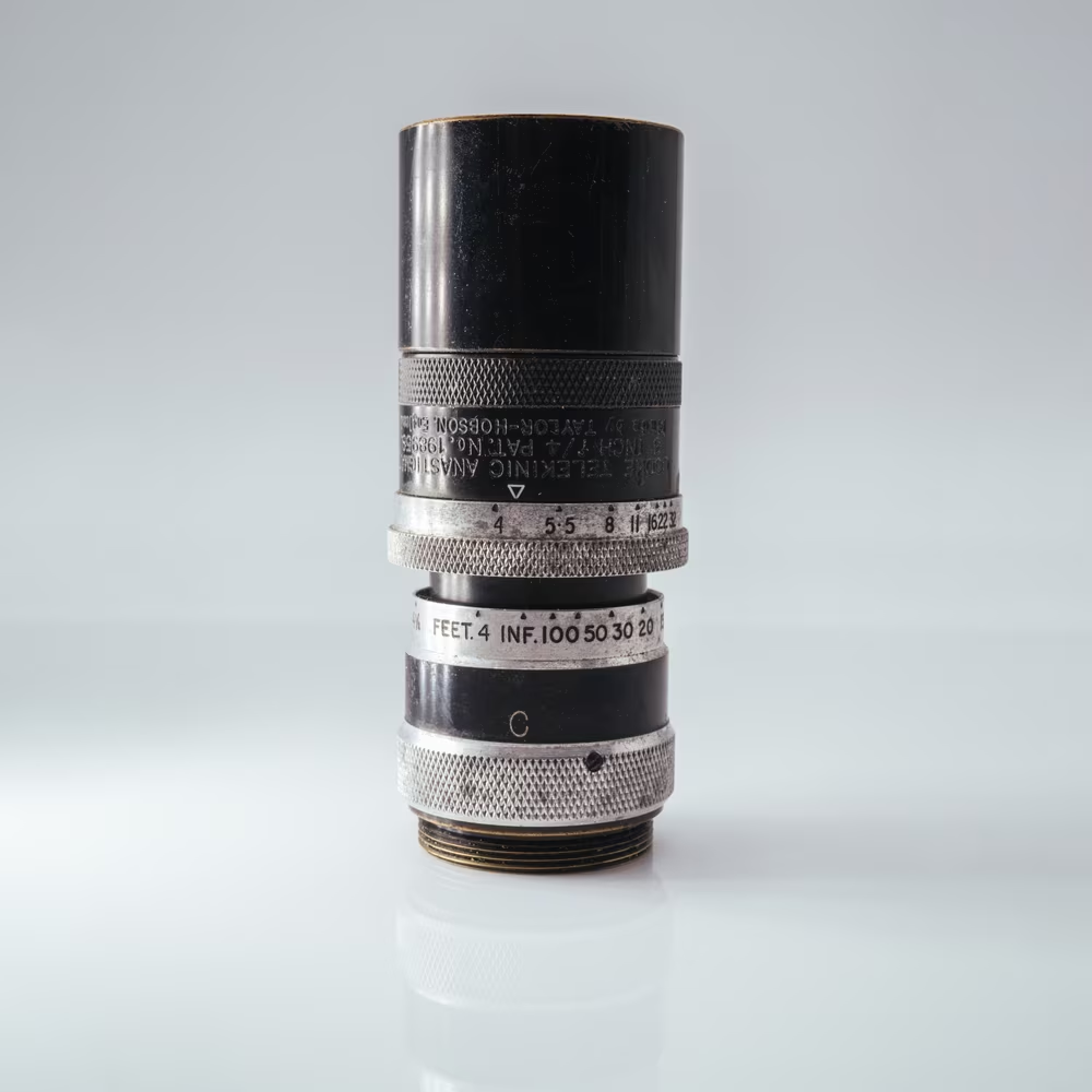
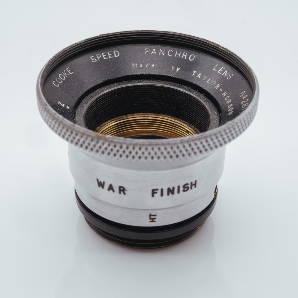
Fortunately, this time around, a type designer familiar with my now-public obsession with Gorton clued me in. Gorton didn’t actually originate from Racine, Wisconsin in the late 19th century. It started a bit earlier, and quite a bit further away, at a photographic lens maker in the U.K. called Taylor, Taylor & Hobson.
In 1894, TT&H needed some way to put markings on their lenses. This being late 19th century, their options were limited to manual engraving, which must have felt tricky given the small font sizes necessary. So the company did what makers sometimes do – instead of searching for a solution that might not have even existed, they made new types of machines to carve out letters, and then designed a font to be used with them.
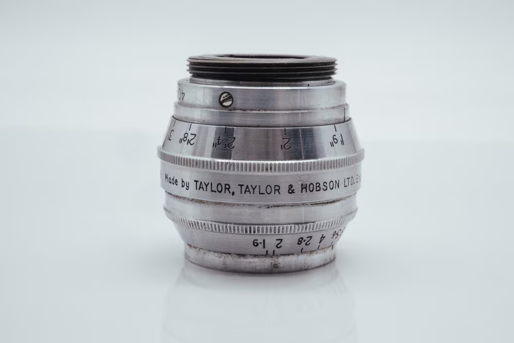
I don’t know how this first proto-Gorton was designed – unfortunately, Taylor, Taylor & Hobson’s history seems sparse and despite personal travels to U.K. archives, I haven’t found anything interesting – but I know simple technical writing standards existed already, and likely influenced the appearance of the newfangled routing font.
This was perhaps the first modern pantograph engraver, and perhaps even the arrival of a concept of an engraving font – the first time technical writing was able to be replicated consistently via the aid of the machine.
No wonder that other companies came knocking. Only a few years later, still deep within the 19th century, Taylor, Taylor & Hobson licensed their stuff to a fledgling American company named after its founder. Gorton Model 1 was the first U.S. version of the engraver, and the TT&H font must have been slightly adjusted on arrival.
This adds to the accomplishments of Gorton – the font was actually older than even Akzidenz-Grotesk, and has been used on World War II equipment and later on on British rifles and motorcycles (and 3,775 finger posts in one of the UK’s national parks), but it complicates the story of the name even more. Turns out, the font without a name has even less of a name than I suspected.
If the Taylor, Taylor & Hobson (or, Taylor-Hobson, as their engravers were known) “branch” of Gorton were more used, should it usurp the at least somewhat popular Gorton name? Or should it just because it was first and the letterform changes were small? Does it matter? Where does one font end and another begin? (Unsurprisingly, TT&H didn’t properly name the font either, eventually calling it “A style” for regular and “C style” for condensed variants. Google results for “taylor hobson font” are a lot more sparse than those for Gorton.)
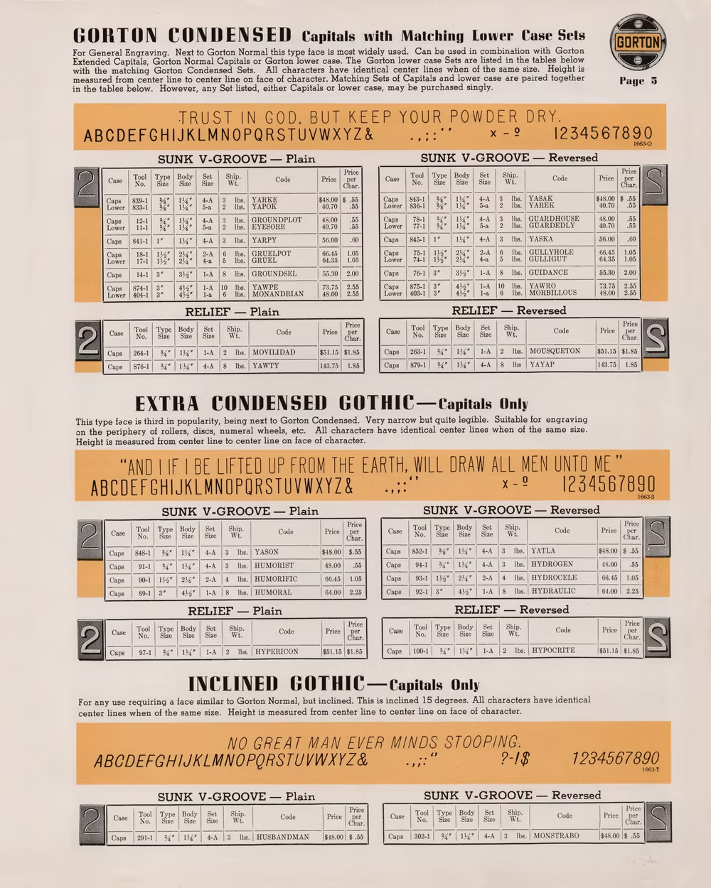
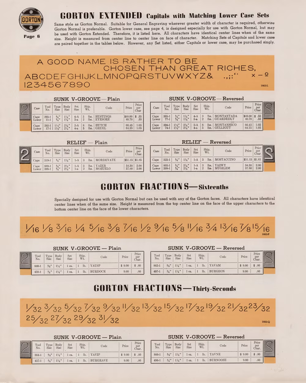
Gorton Condensed
Gorton Extended
In the end, I’m sticking with Gorton for the whole branch since that feels the most well-known name, but I feel ill-equipped to make that call for everyone. You might choose to call it Gorton, Leroy, TT&H, Taylor-Hobson, or one of the many other names. (Just, ideally, not Linetica.)
7
And so, throughout the 20th century, Gorton has lived two parallel lives – one originating in the U.K. and later expanding to its colonies and the rest of Europe, and another one in America.
I am still tracing various appearences of Gorton and perhaps you, dear reader, will help me with that. (Chances are, you will see Gorton later today!) I’m curious about whether Gorton made it to Eastern Europe, Africa, or Asia. I’m interested in seeing if it appeared in Germany where the objectively better-designed DIN fonts became much more popular in Gorton’s niche.
The history of this strange font spans over a century and I’ve seen it in so many countries by now, used in so many situations. But it’s impossible for me to say Gorton is the most hard-working font in the world.
To this title, there are many contenders. Garamond has a head start of 300+ years and has been released in more versions than letters in any alphabet. Helvetica is so famous and used so much that even its ugly copy, Arial, became a household name. Whatever font MS Office or a popular operating system appoint to be “the default” – from Times New Roman through Calibri to Roboto – immediately enjoys the world premiere that any Hollywood movie would be envious of. There is even a 5×7 pixel font originally started by Hitachi that you can see everywhere on cheap electronic displays in cash registers and intercoms – and these are only examples from western typography that I happen to be much more familiar with.
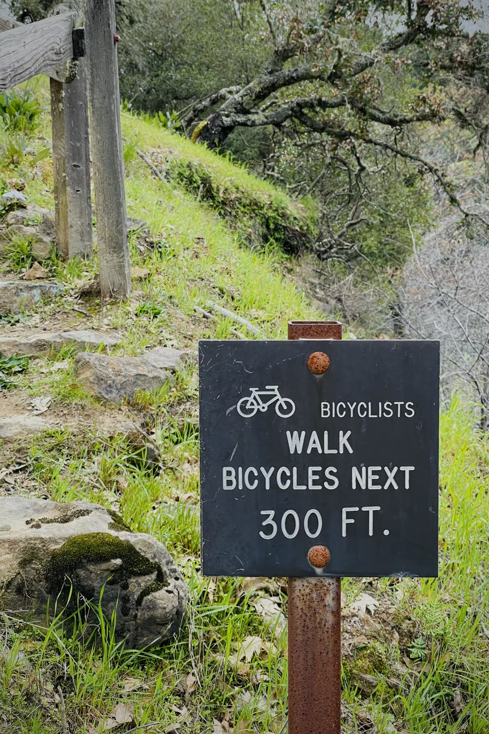
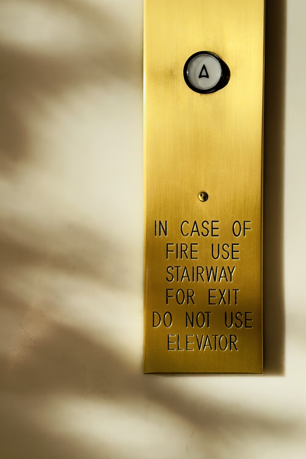
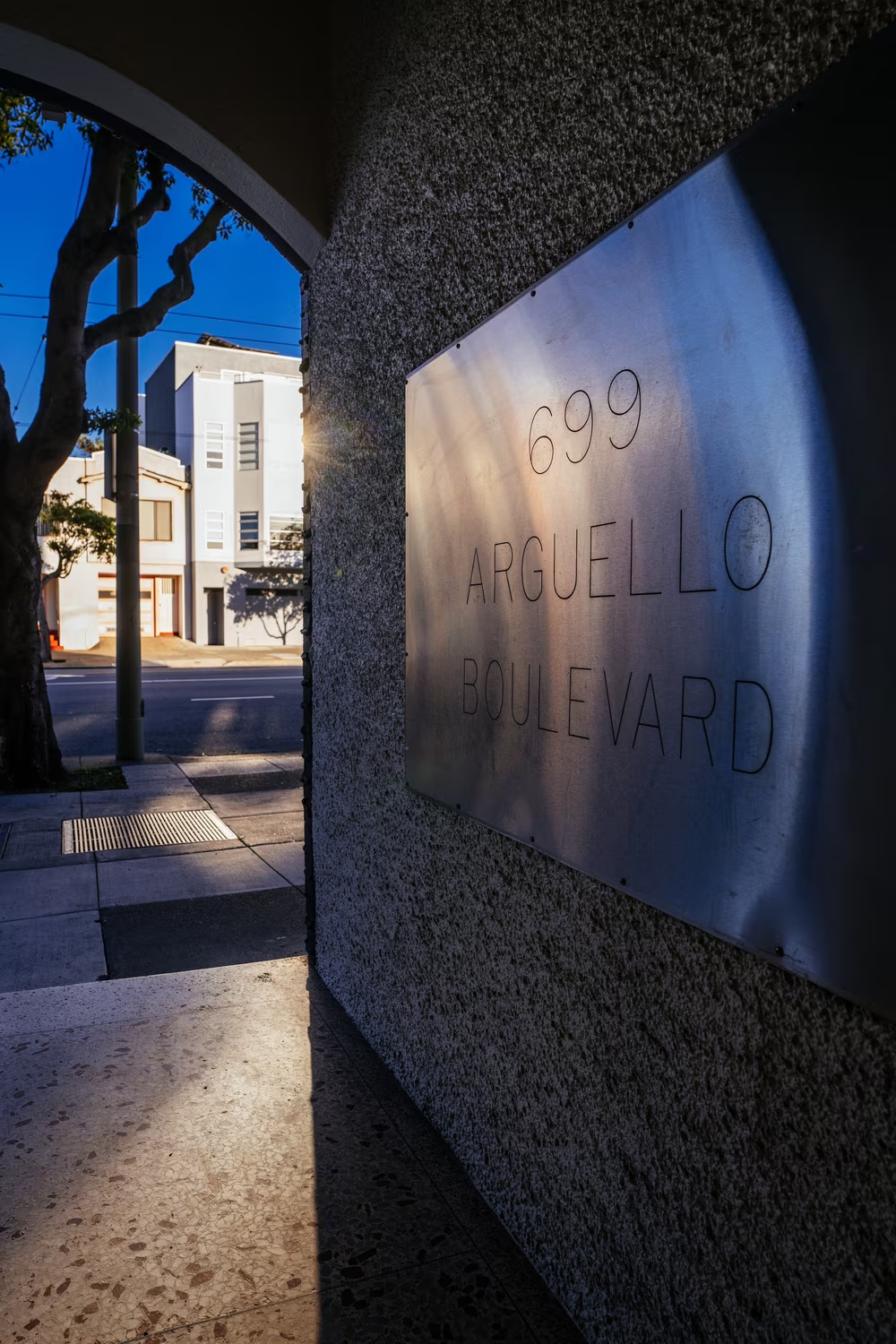
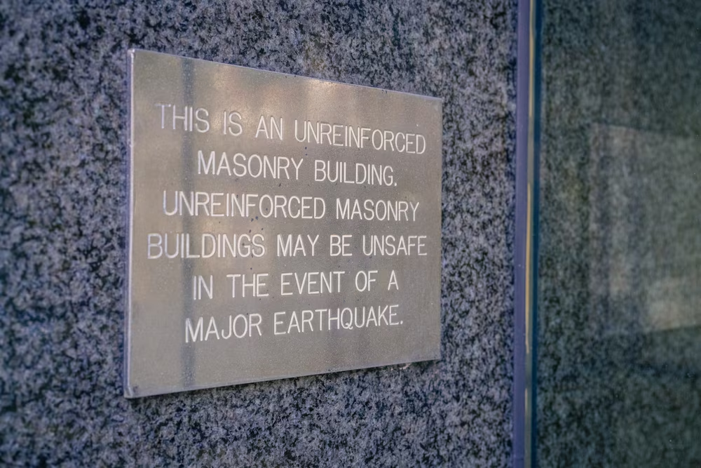
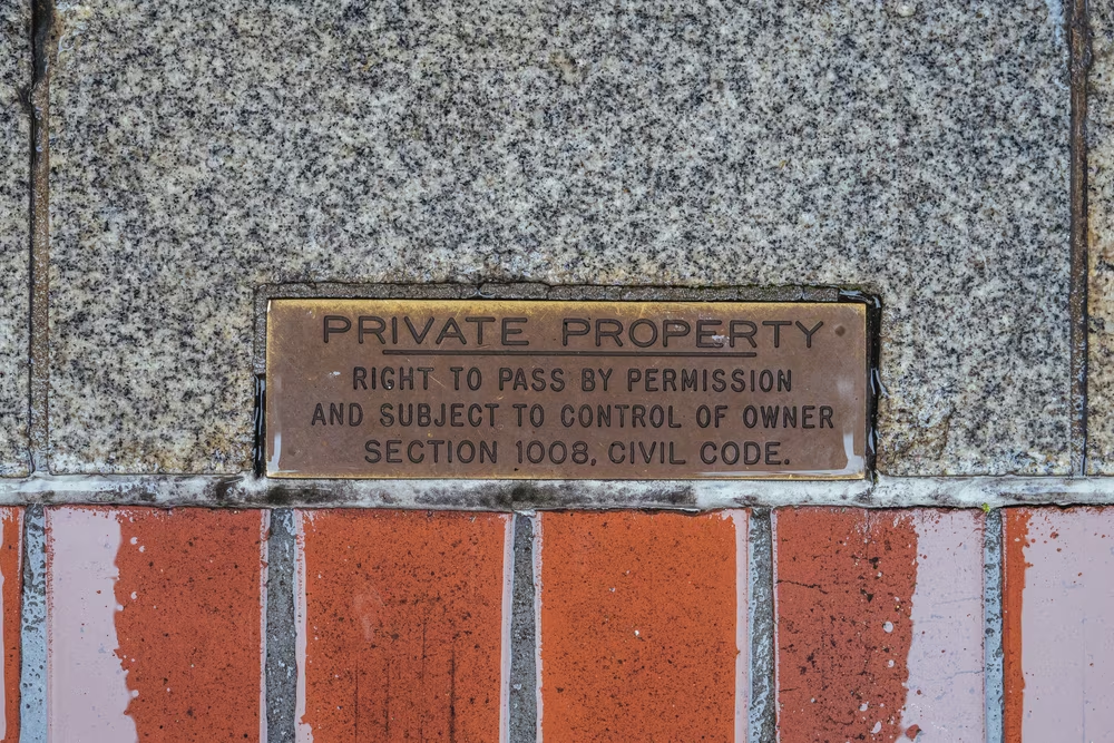
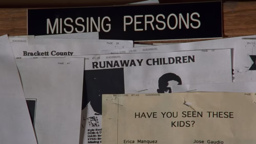
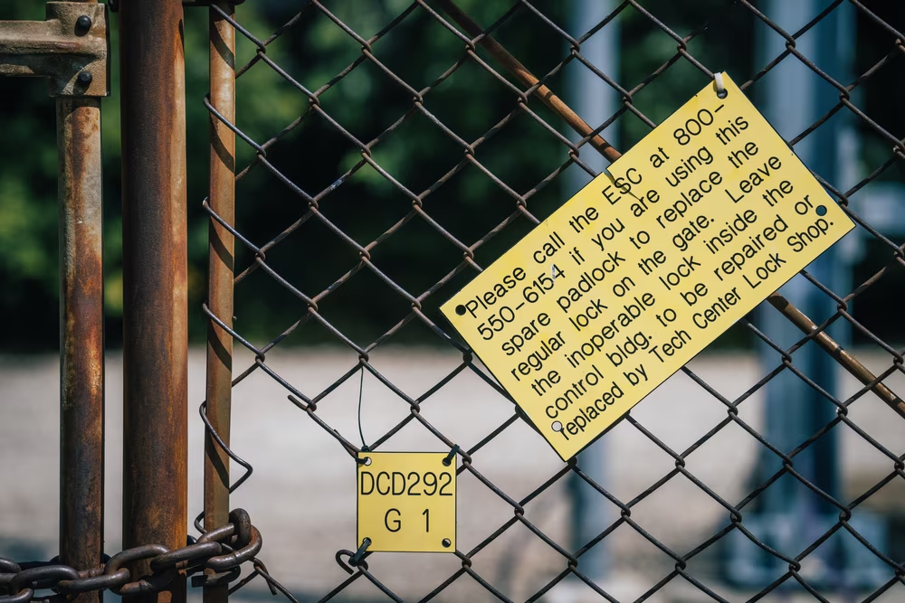
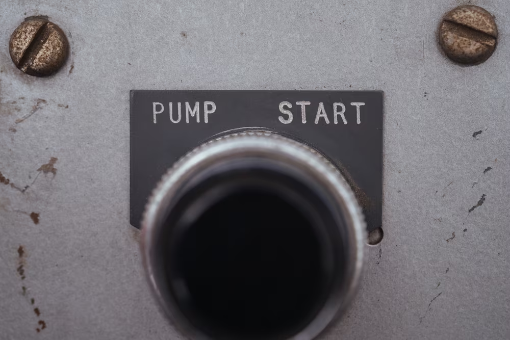
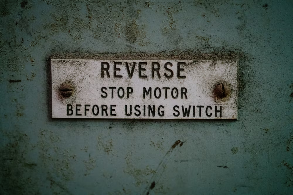
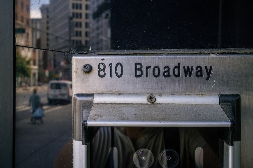
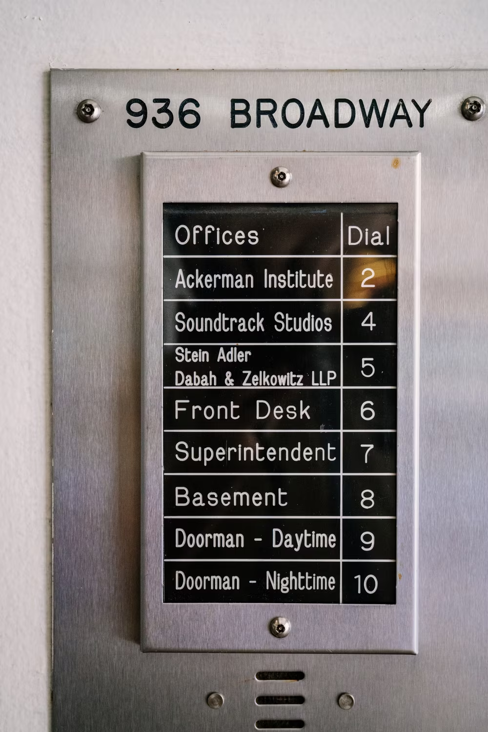
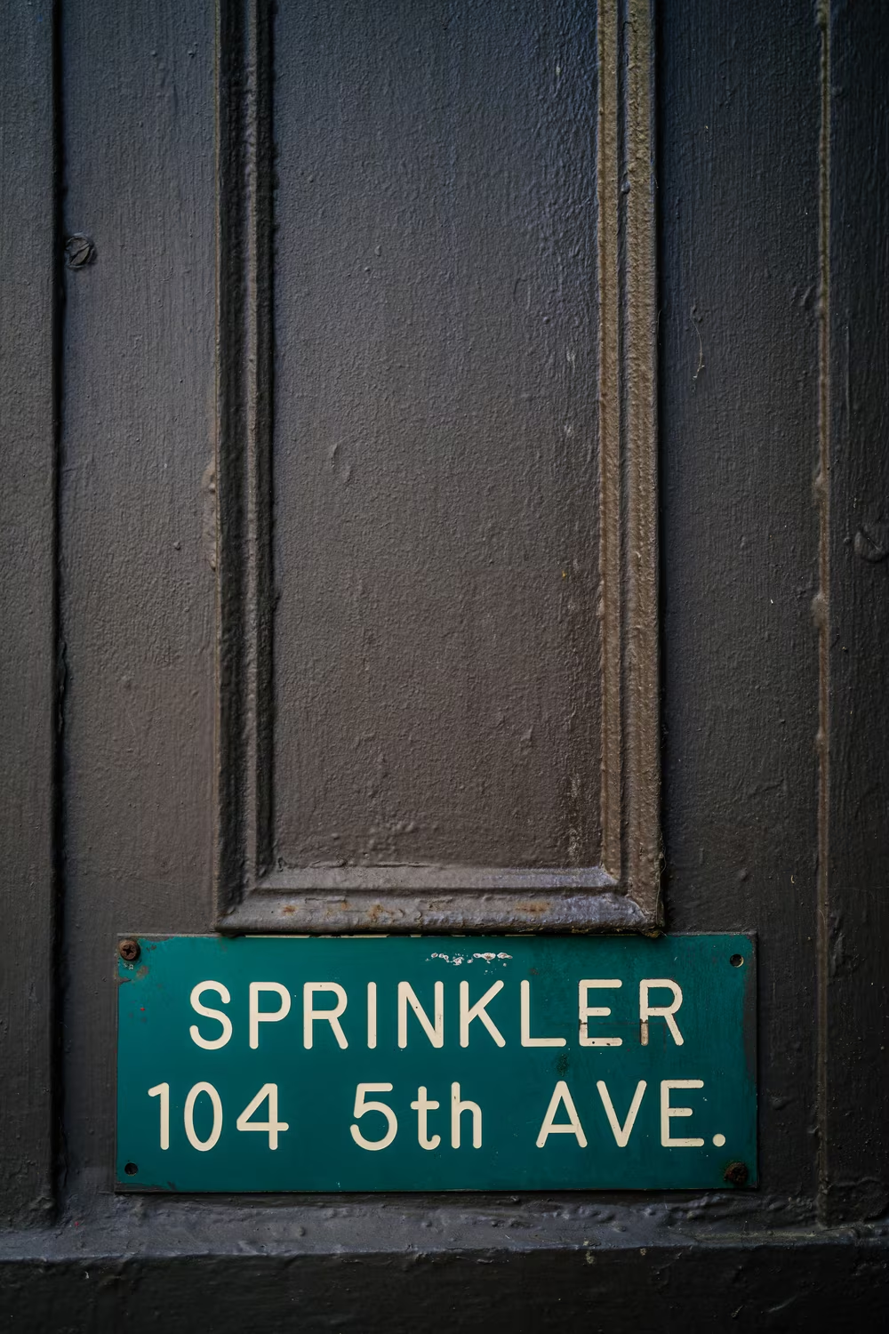
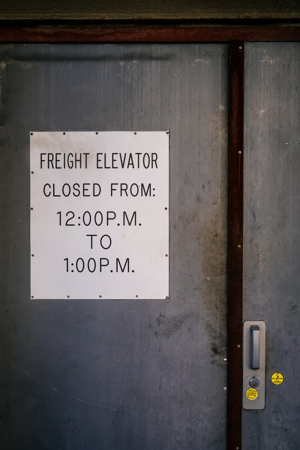
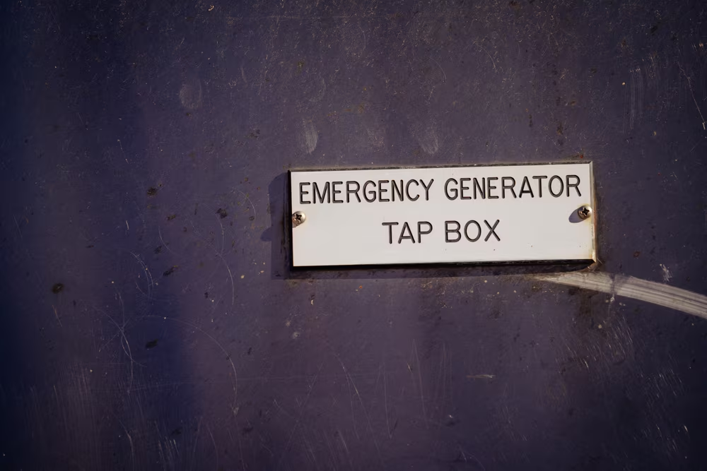
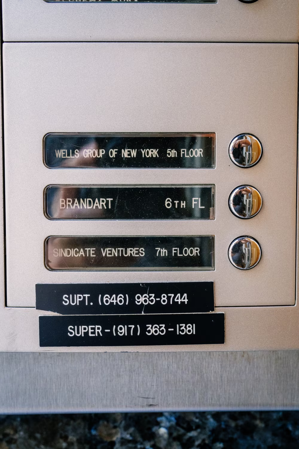
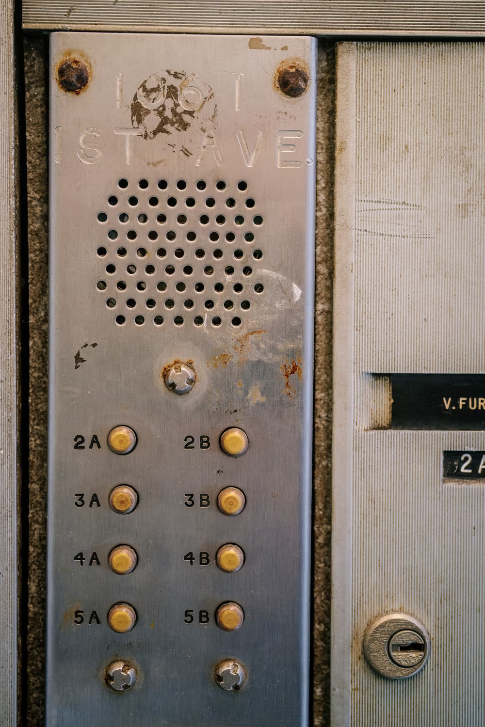
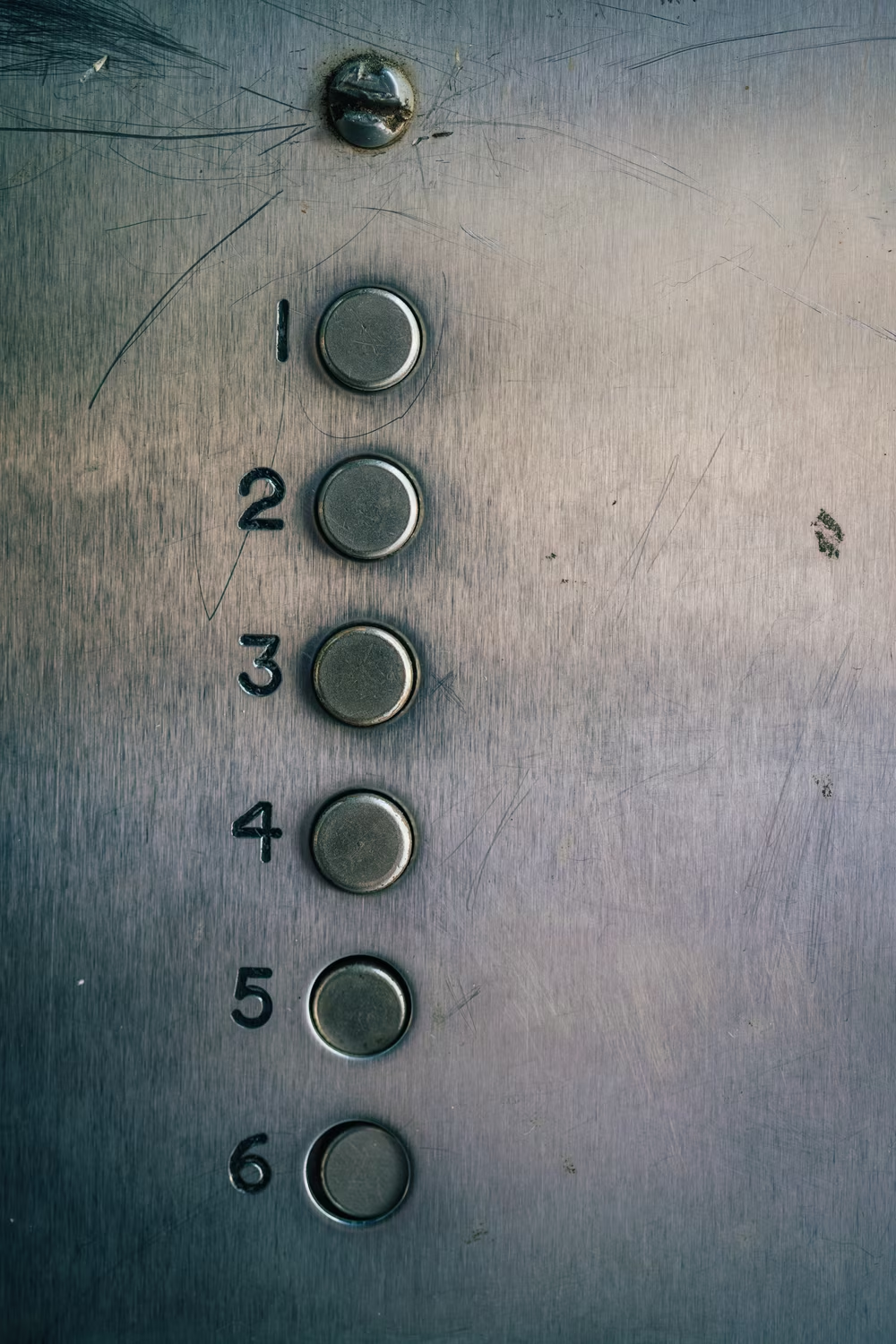
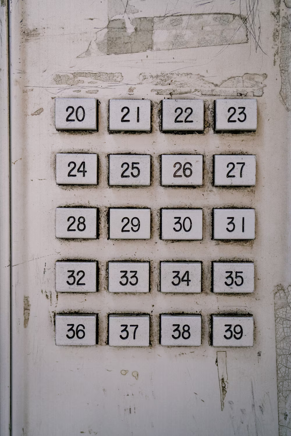
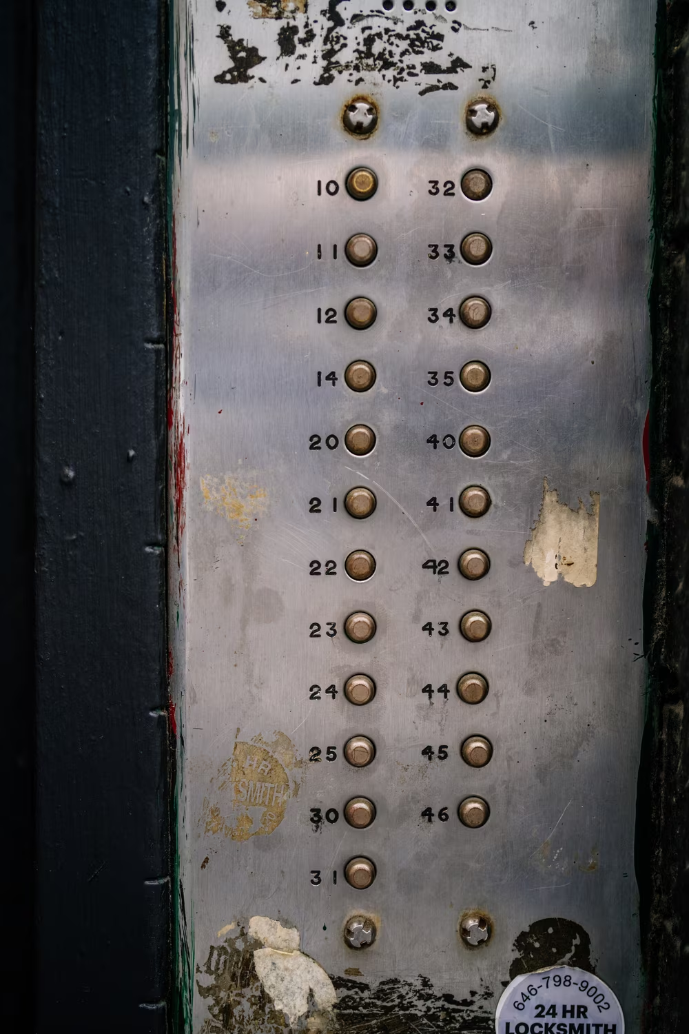
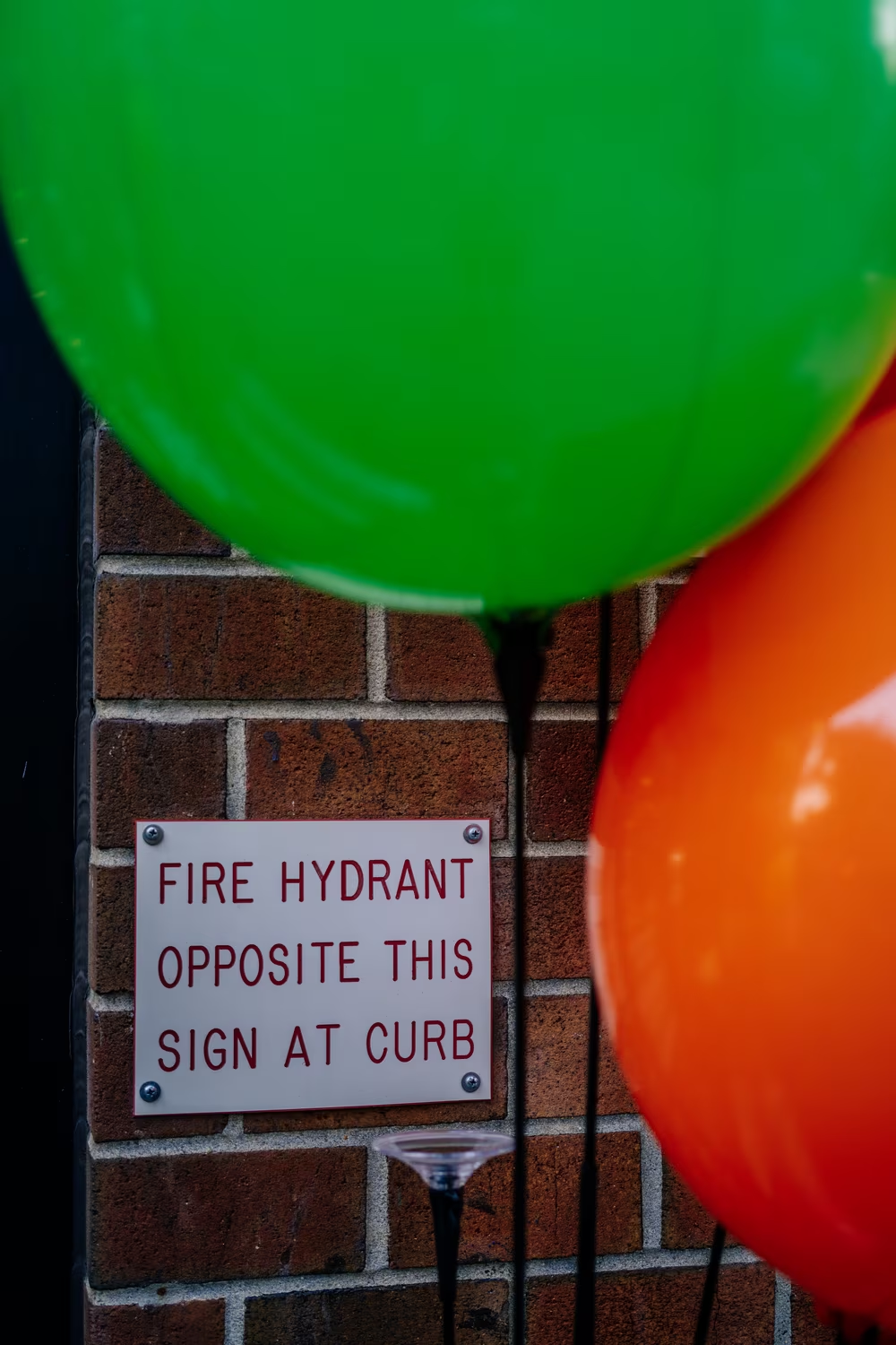
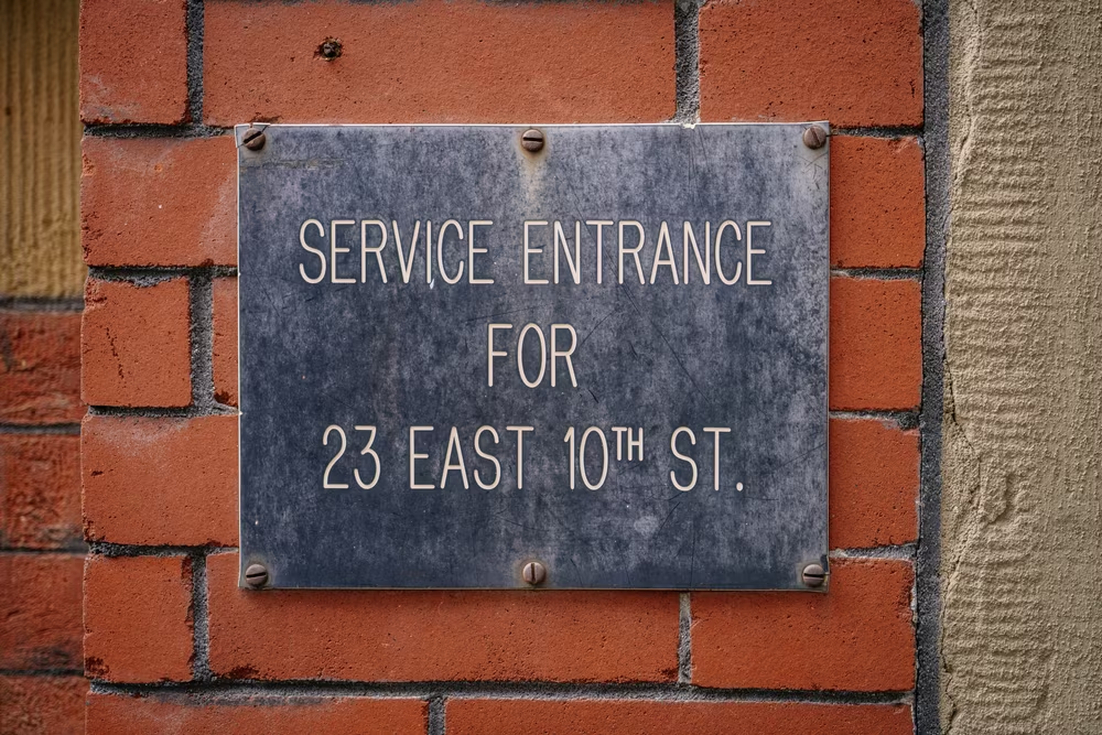
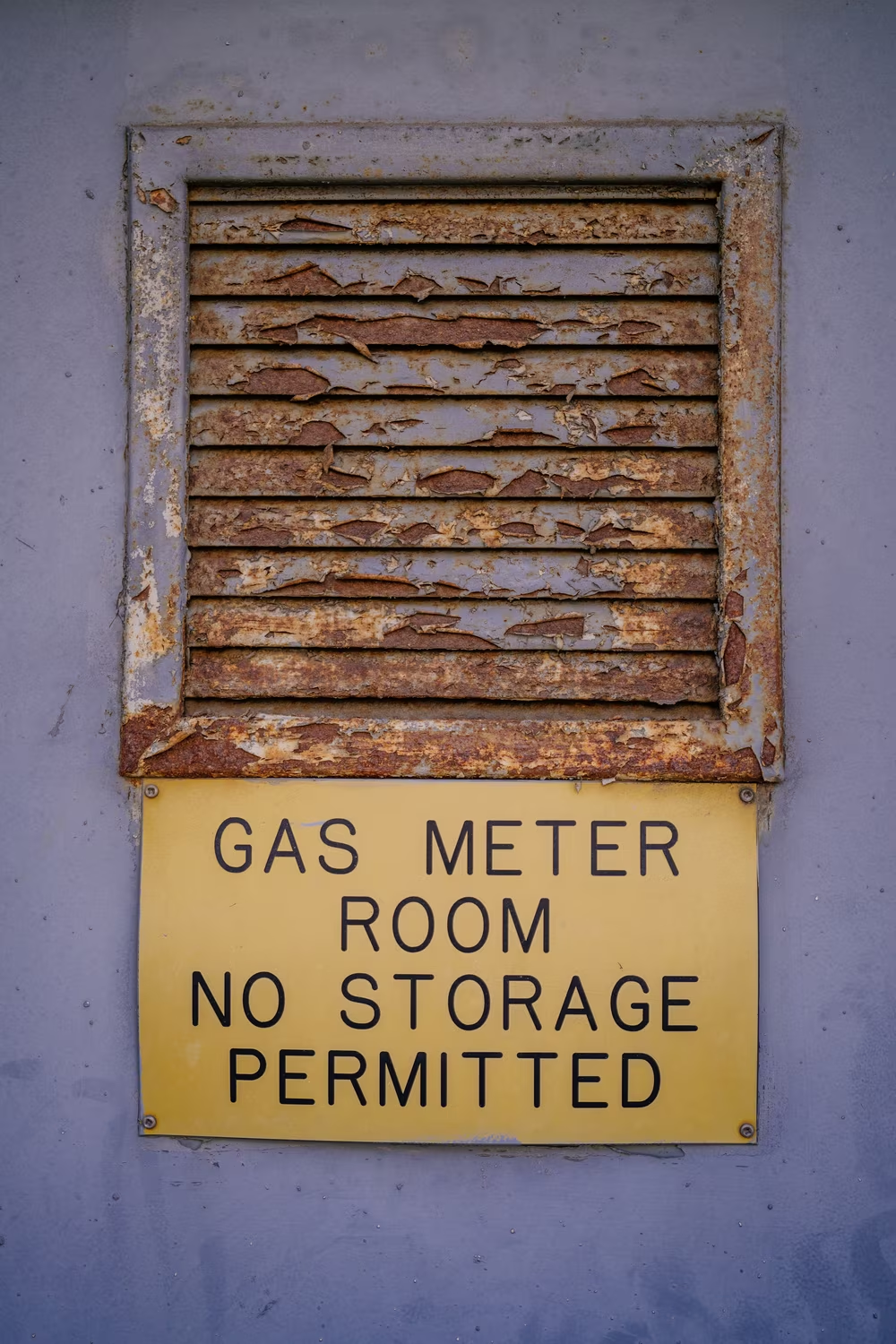
But there is one place in the world where Gorton pulls triple duty, and I feel confident in saying at least this: Gorton is the hardest working font in Manhattan.
In 2007, on my first trip to New York City, I grabbed my brand-new DSLR camera and photographed all the fonts I was supposed to love: American Typewriter, Helvetica, Gotham. But, in hindsight, I missed the most obvious one.
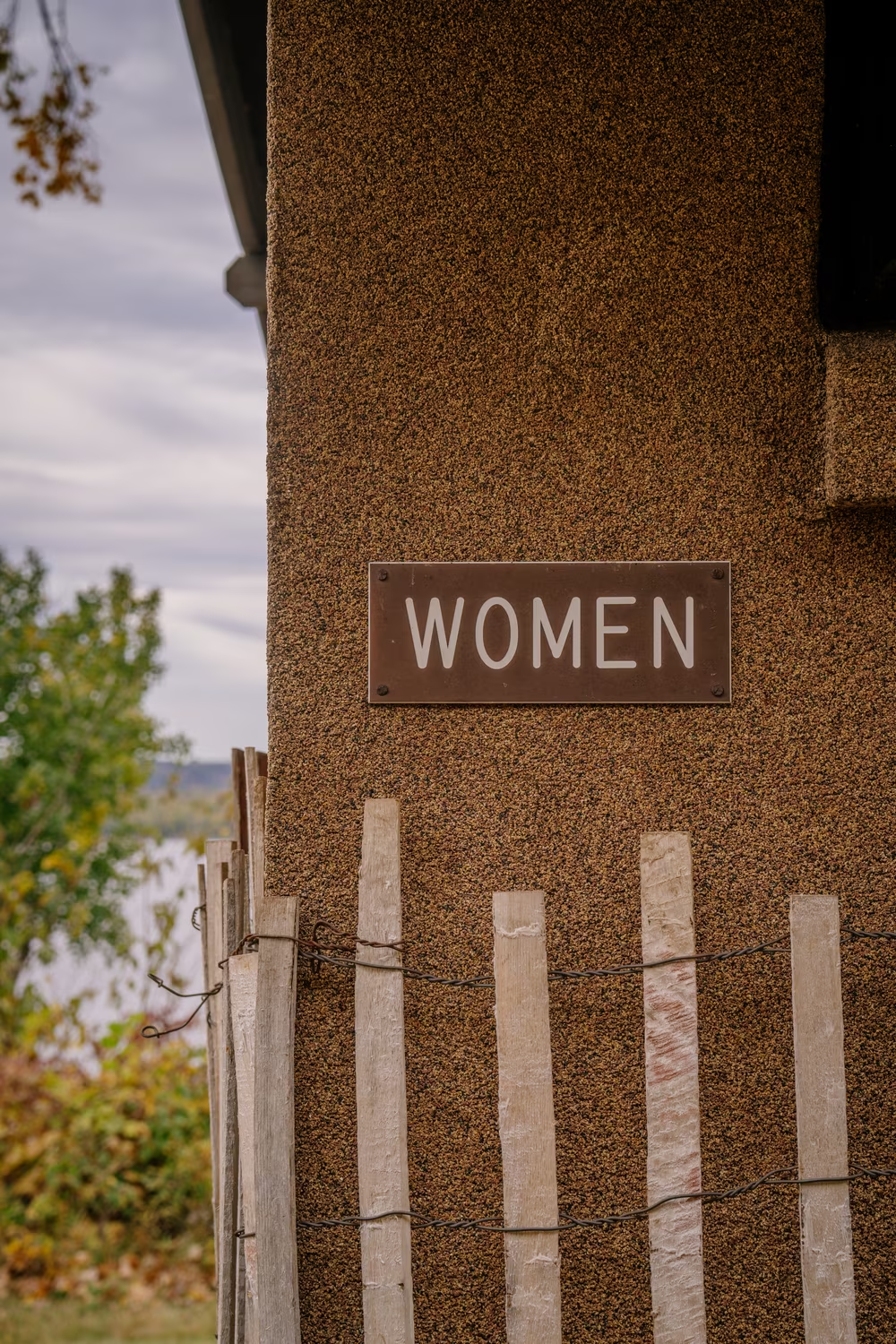
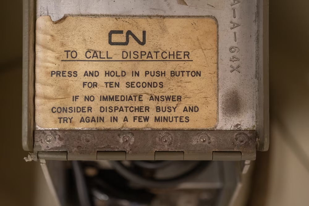
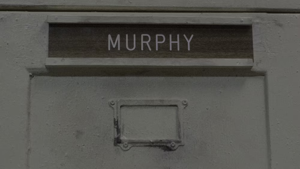
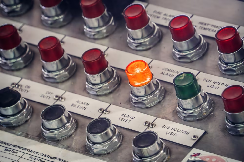
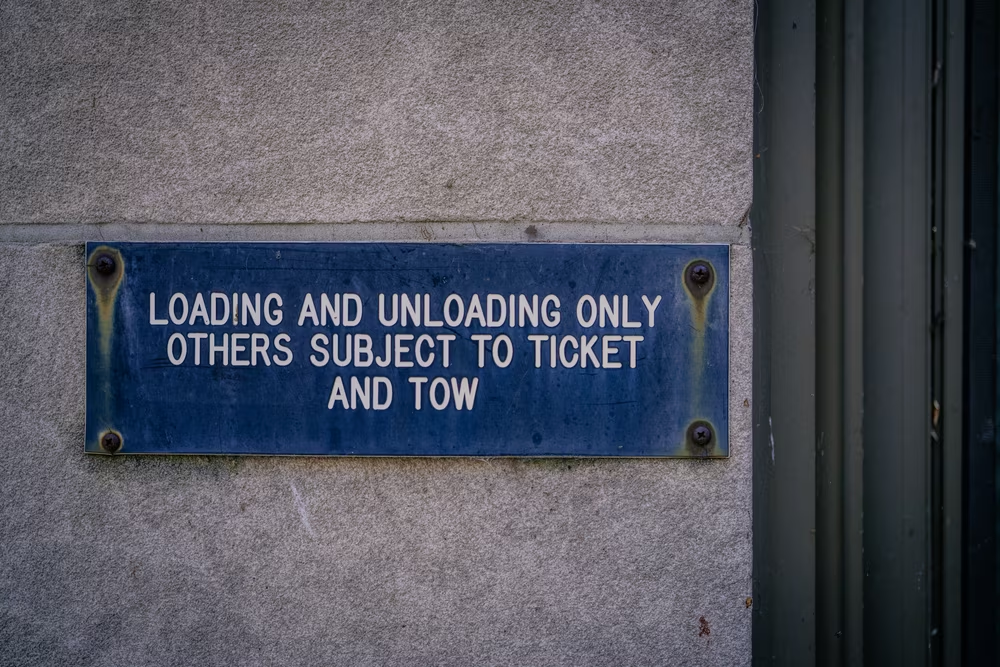
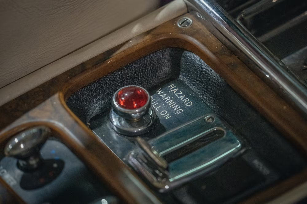
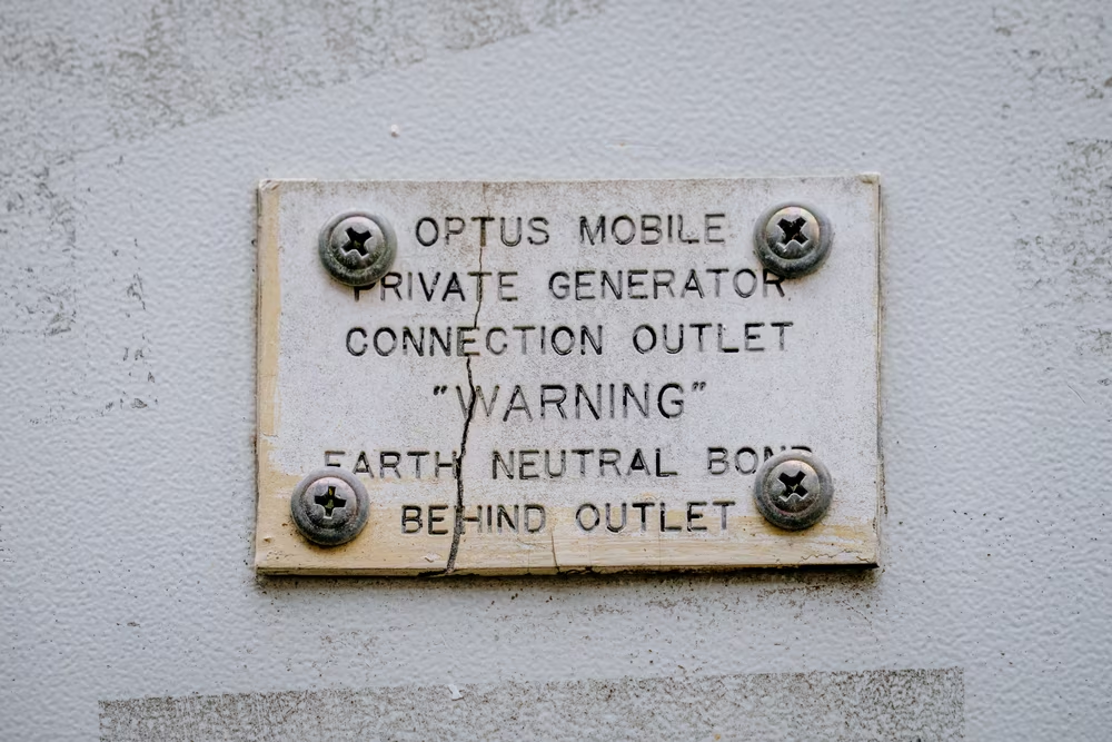
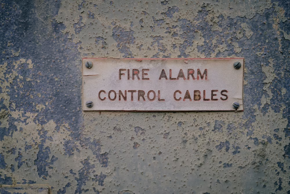
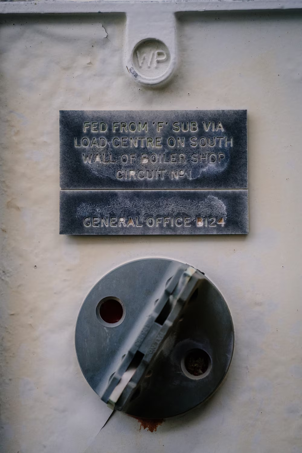
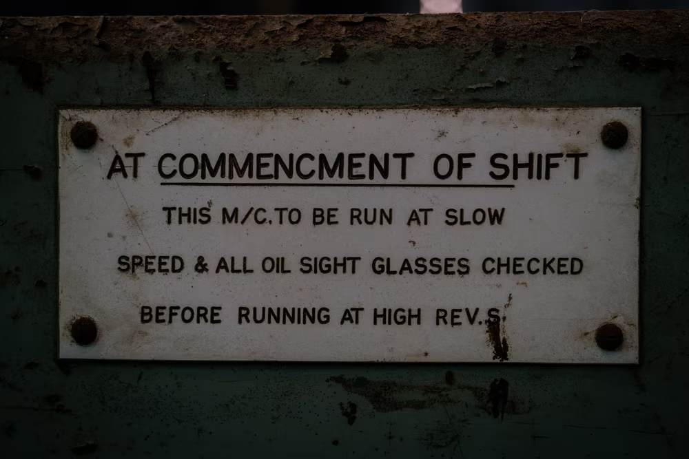
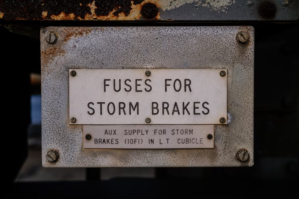
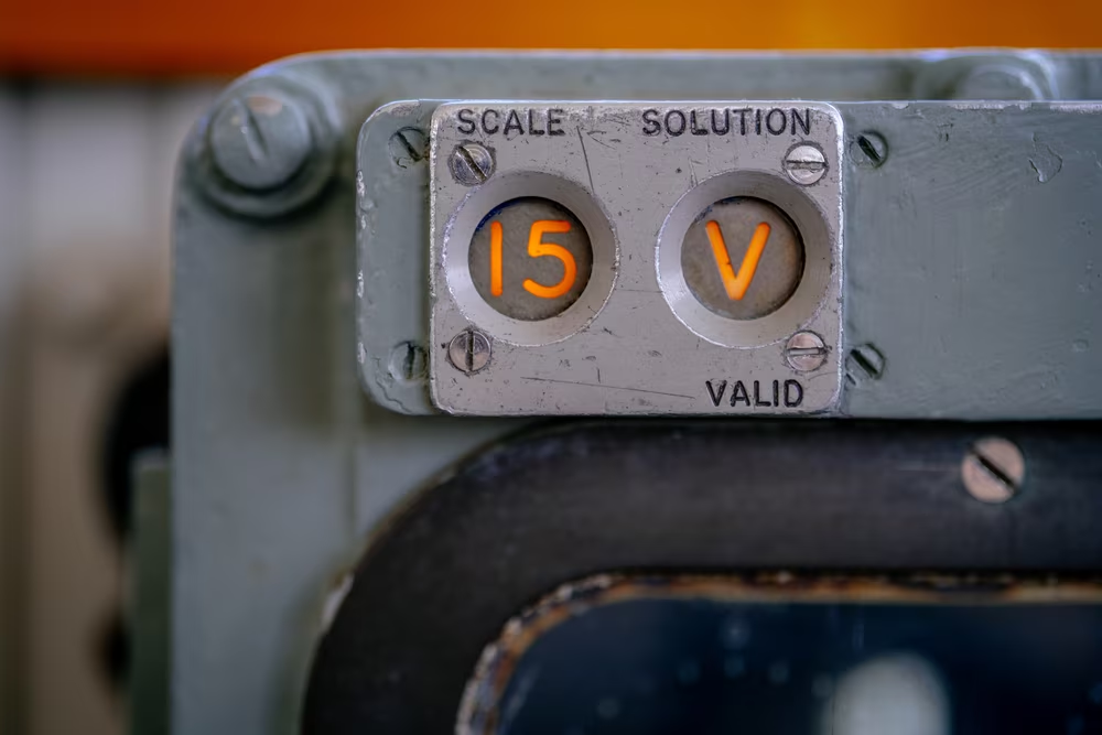
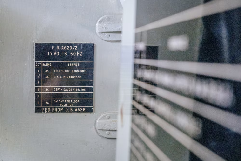
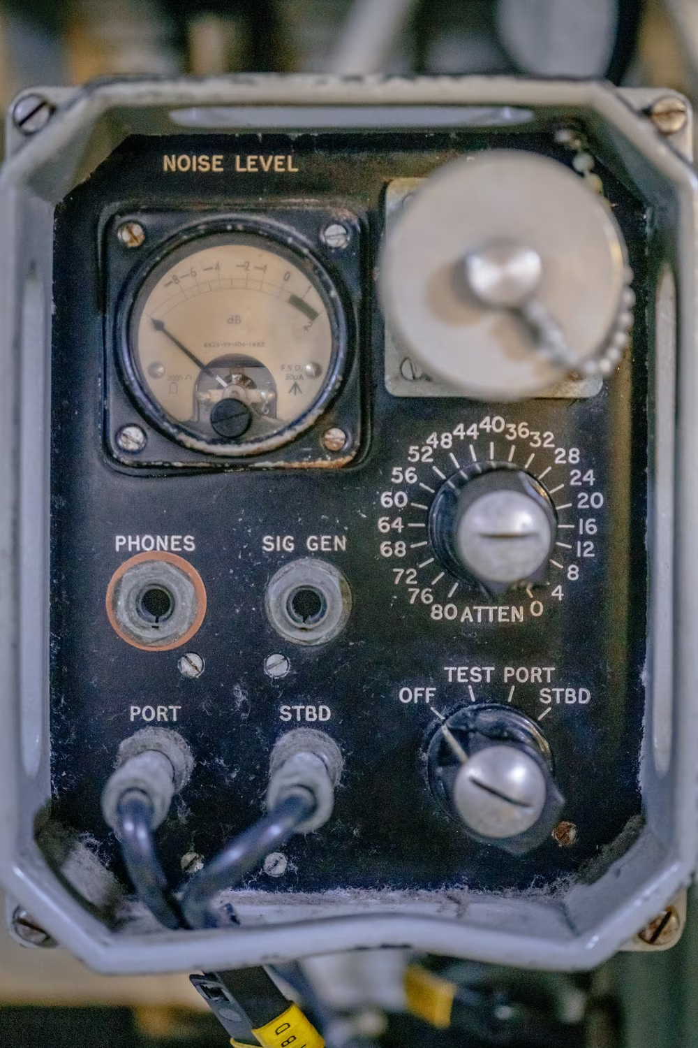
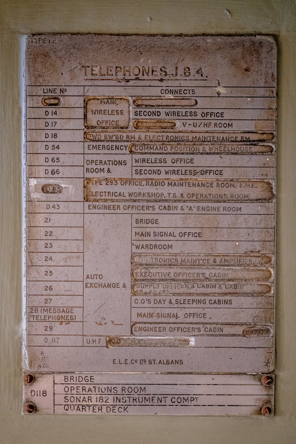
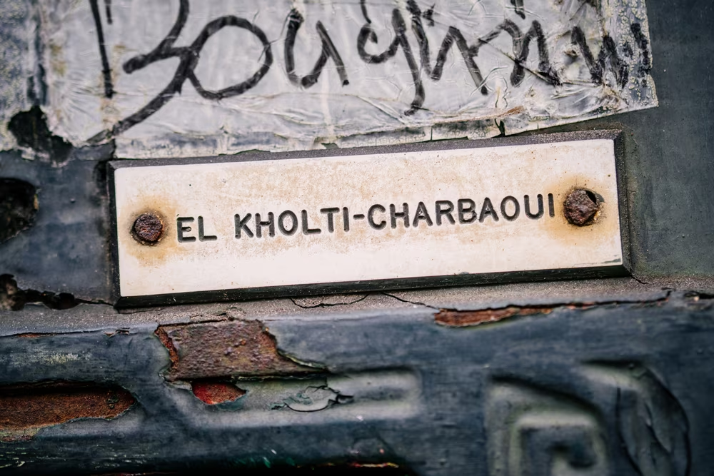
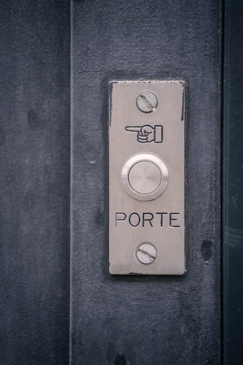
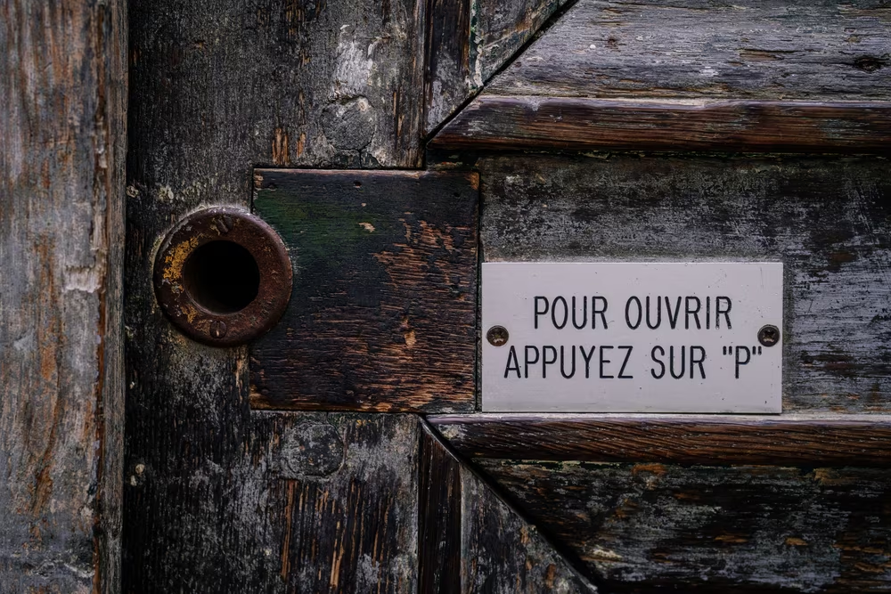
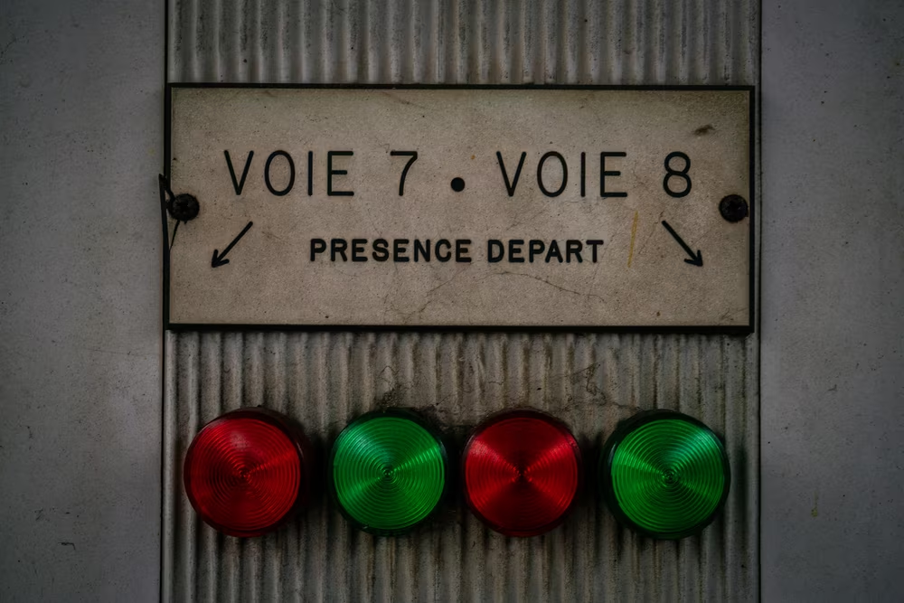
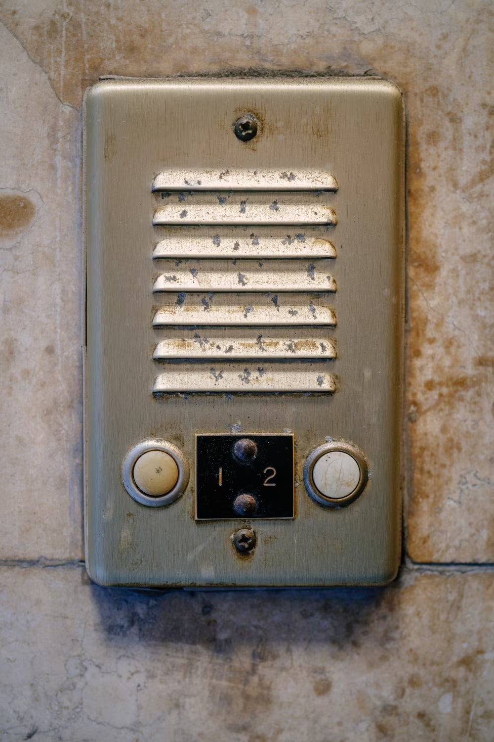
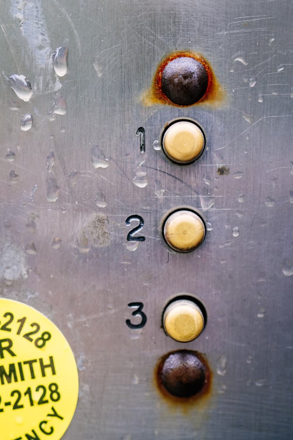
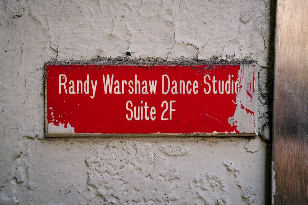
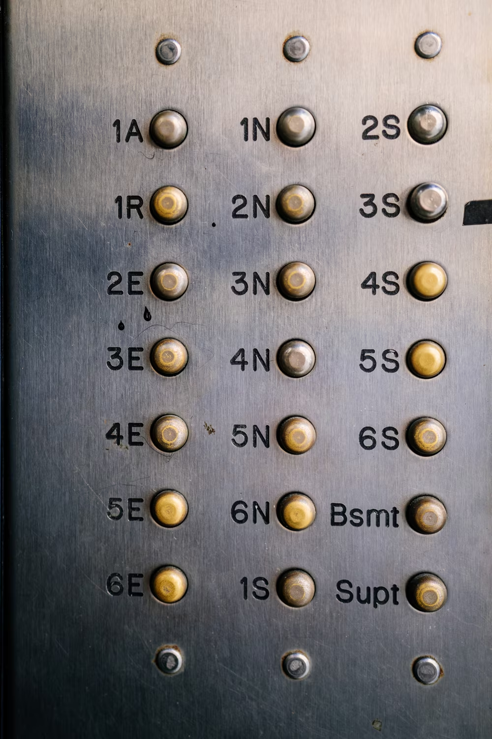
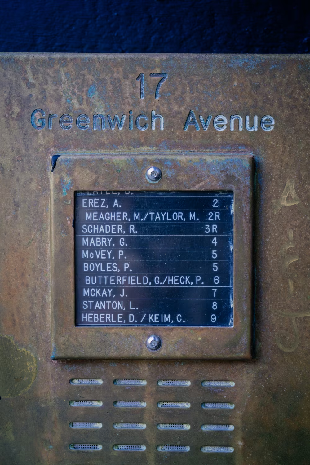
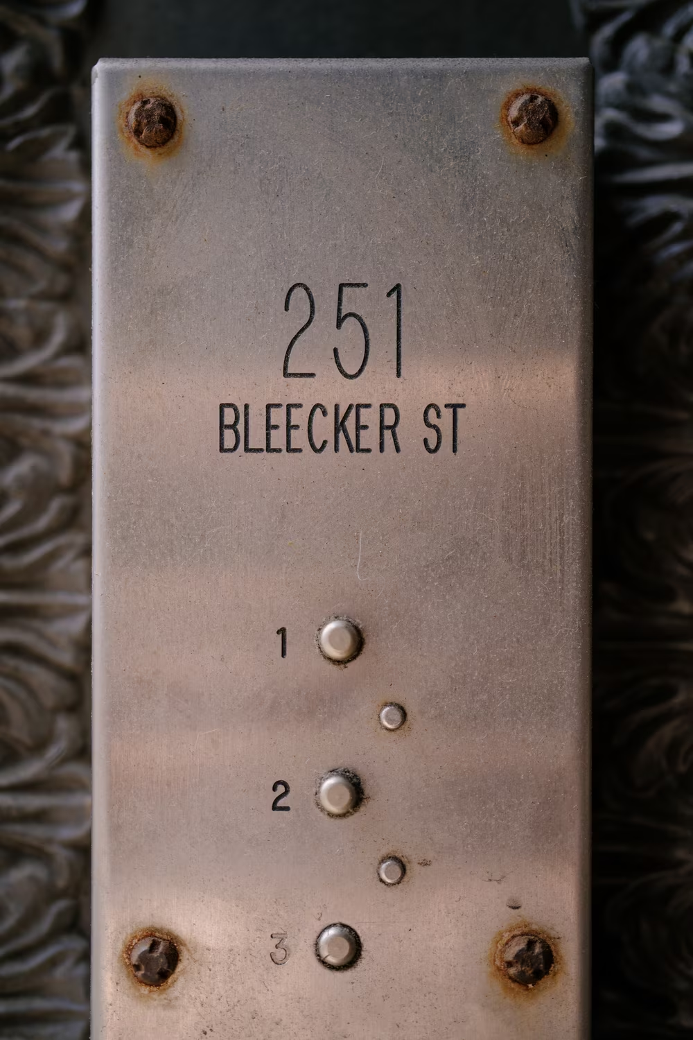
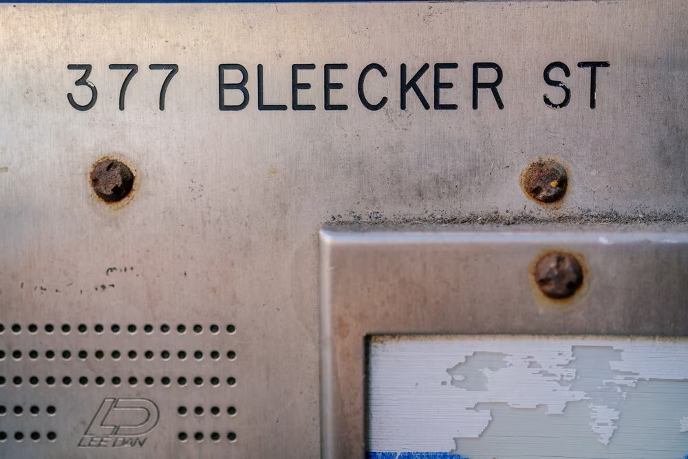
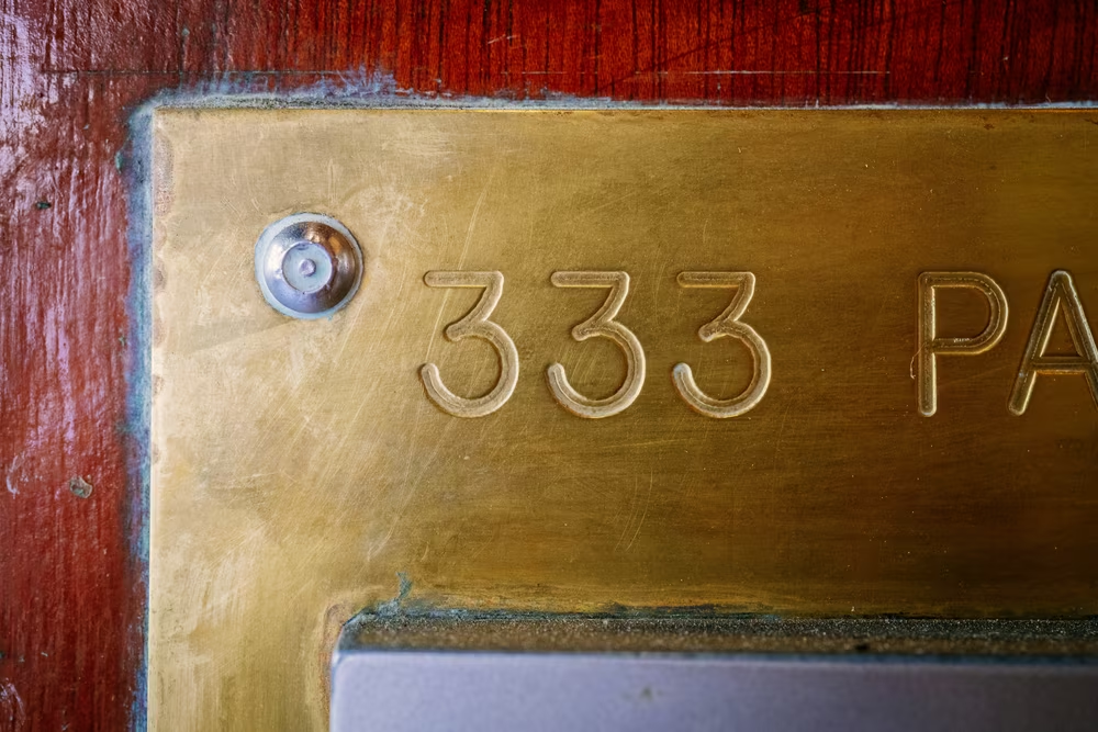
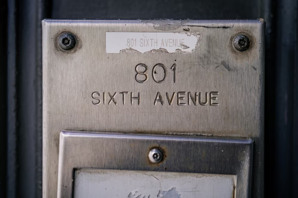
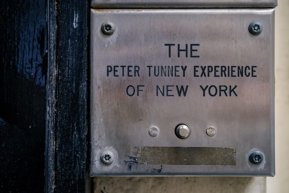
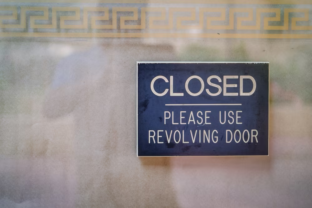
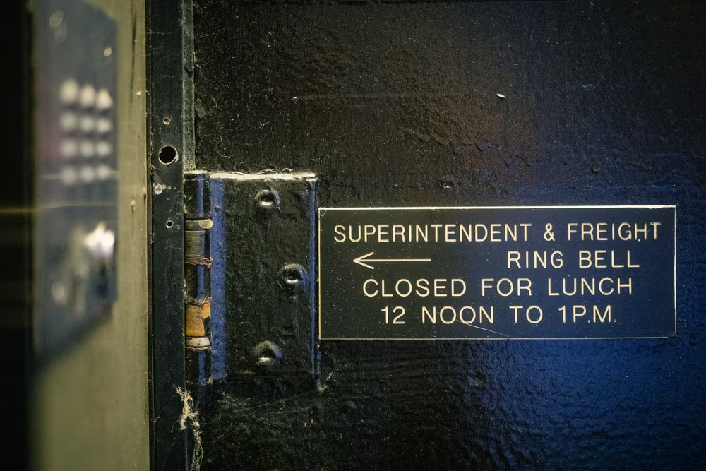
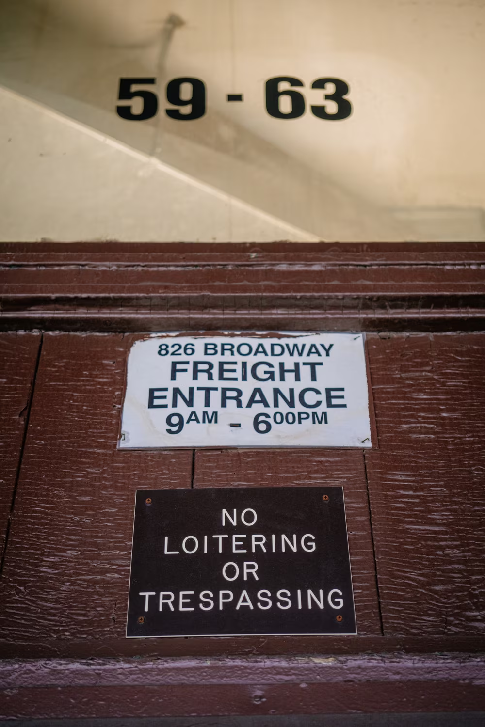
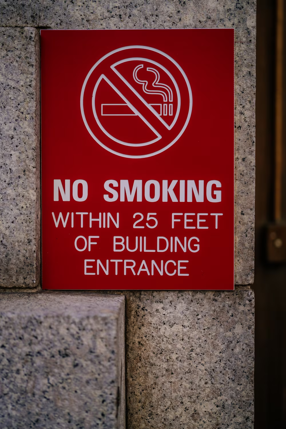
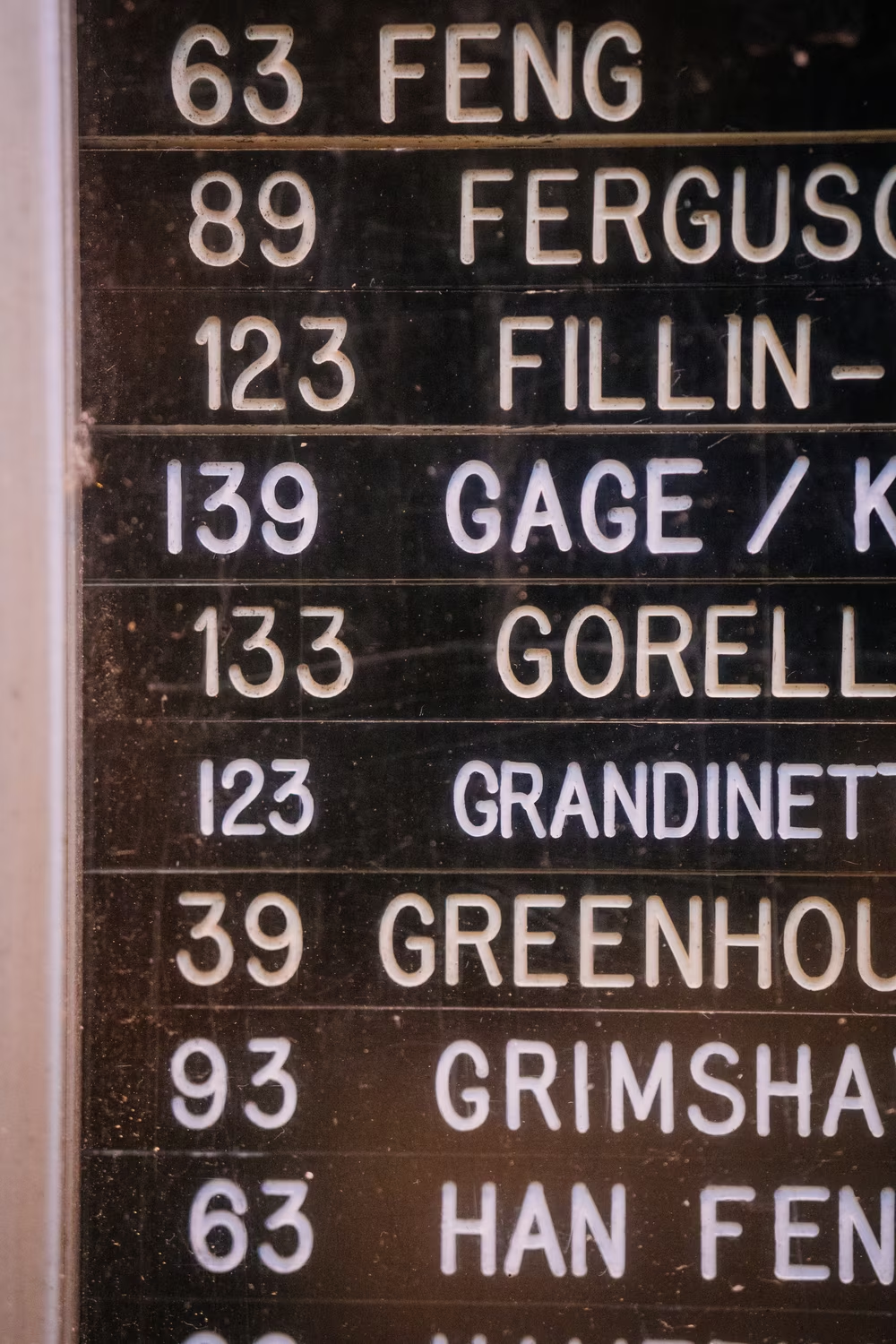
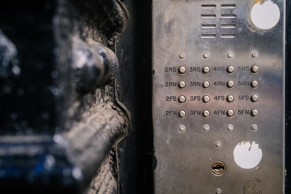
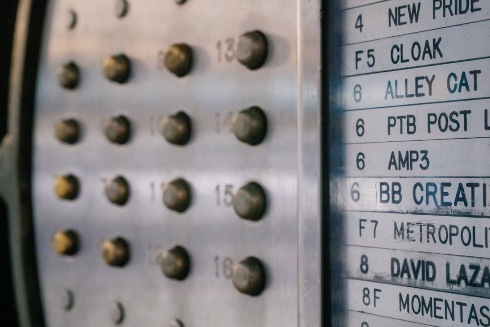
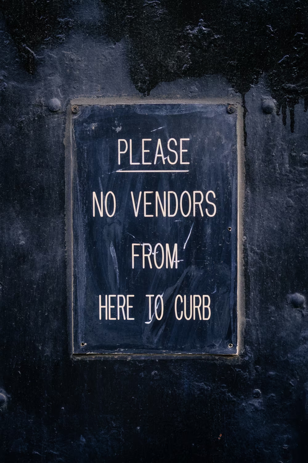
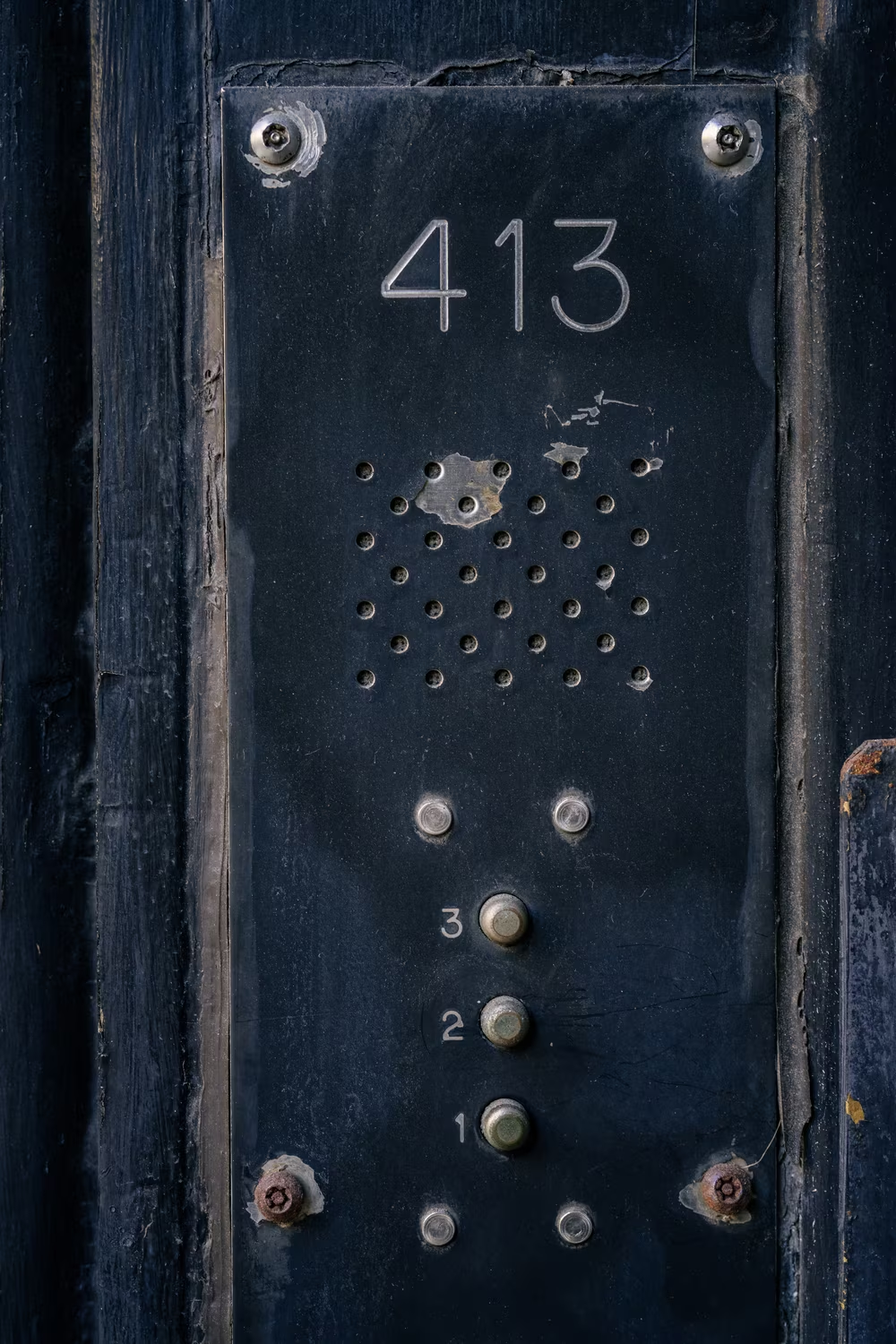
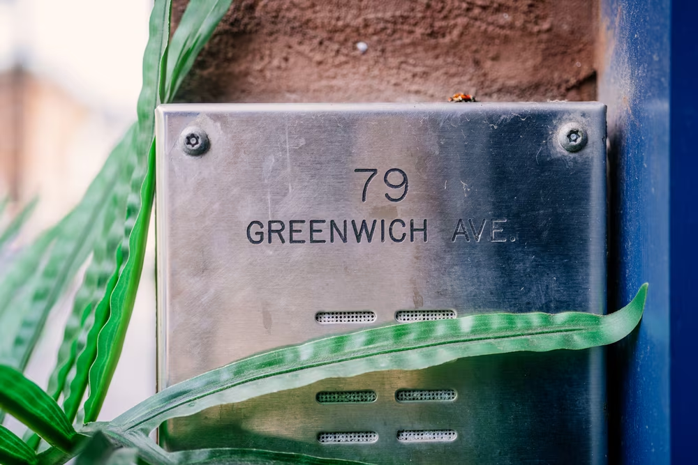
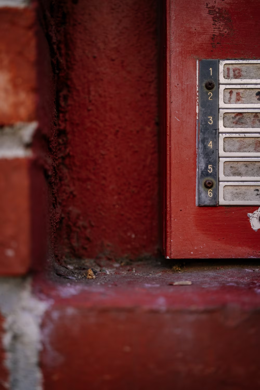
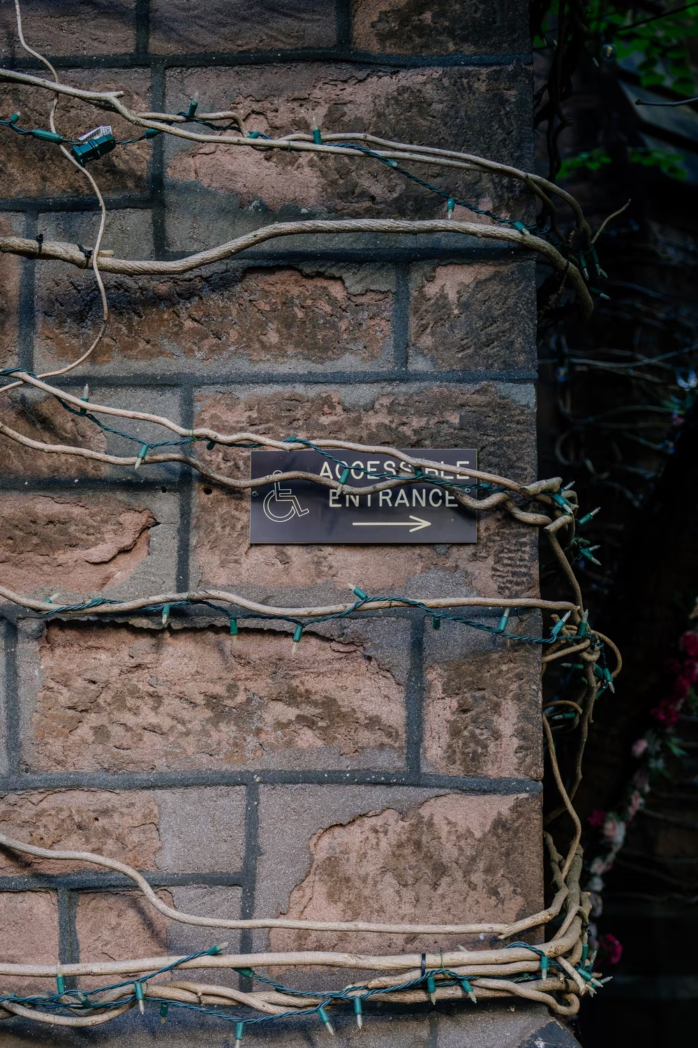
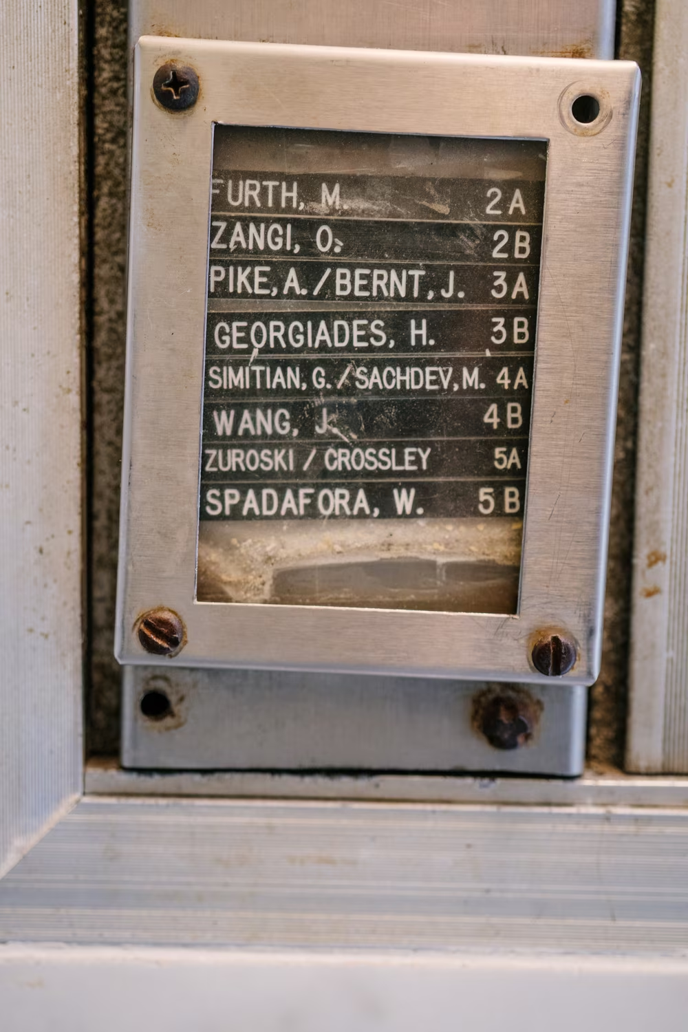
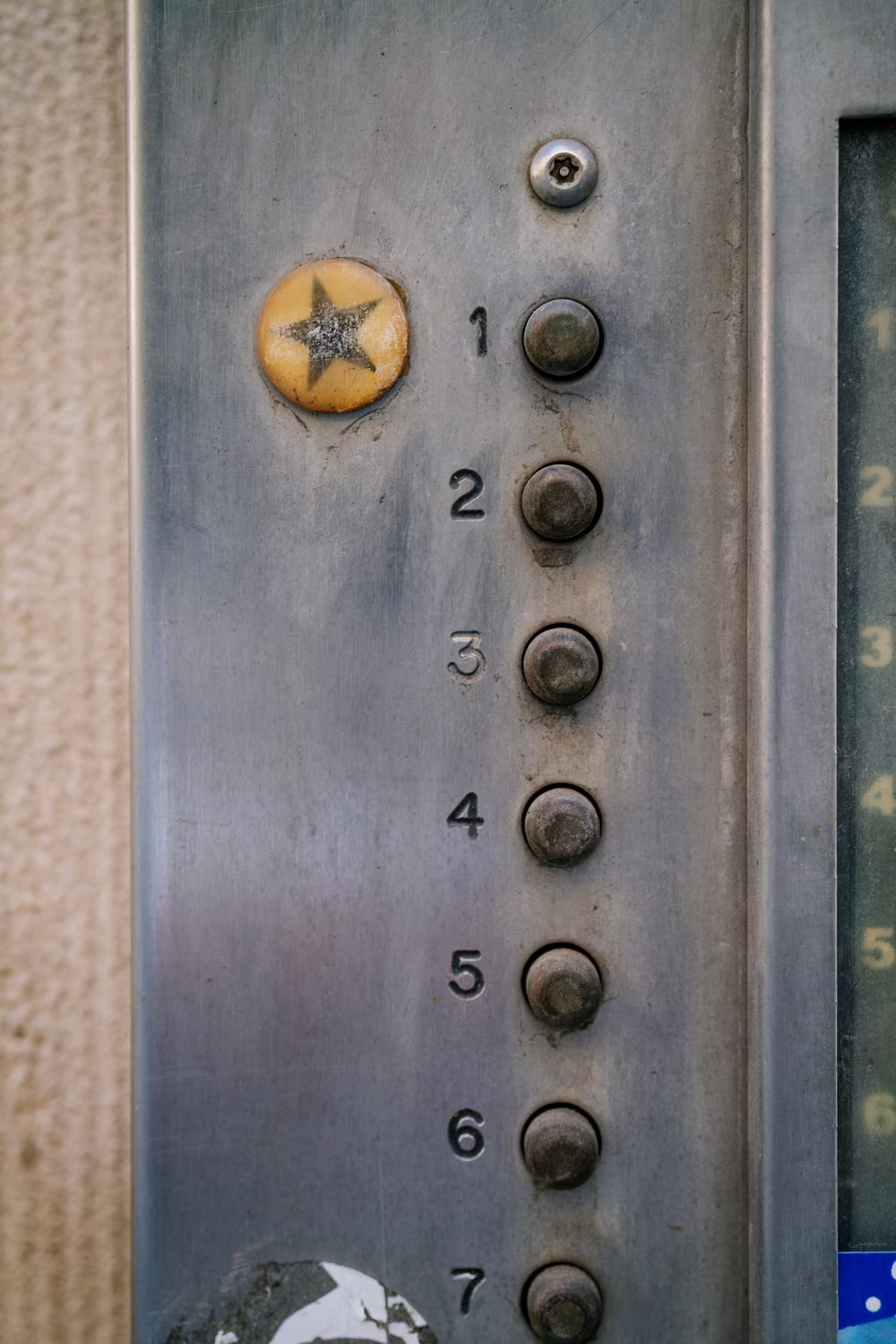
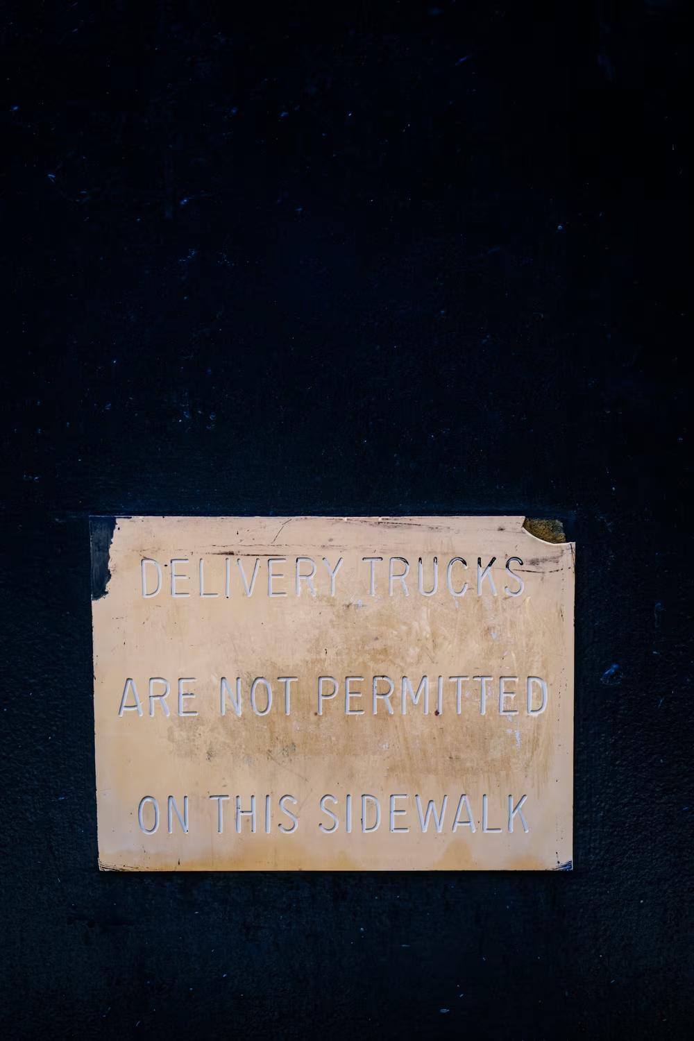
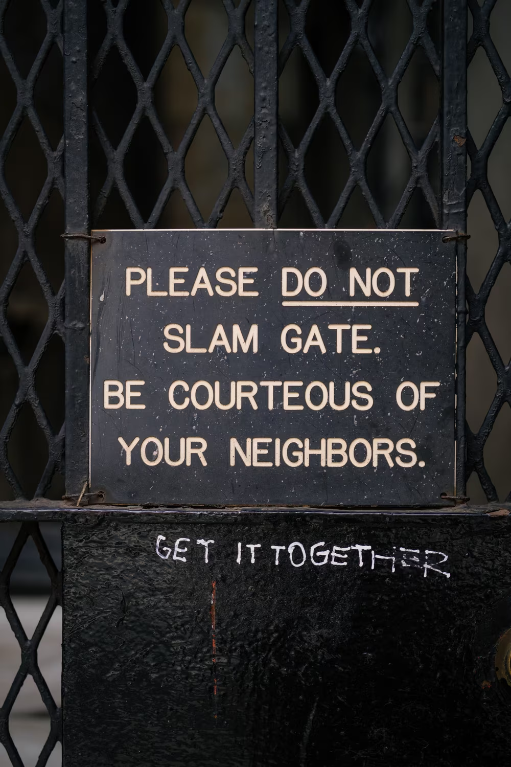
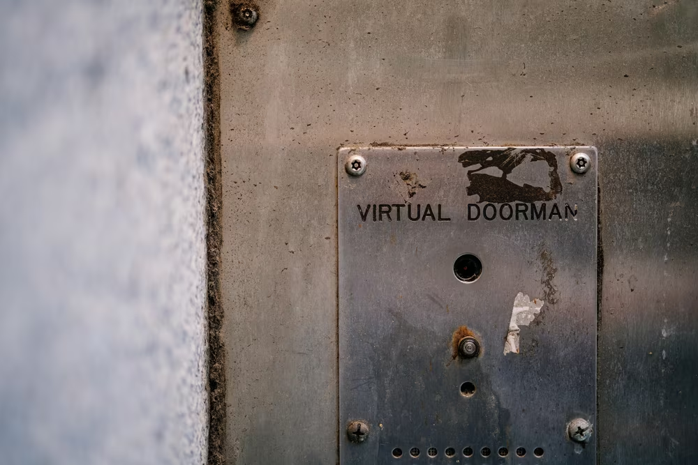
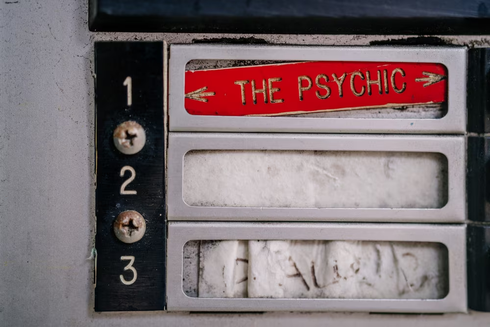
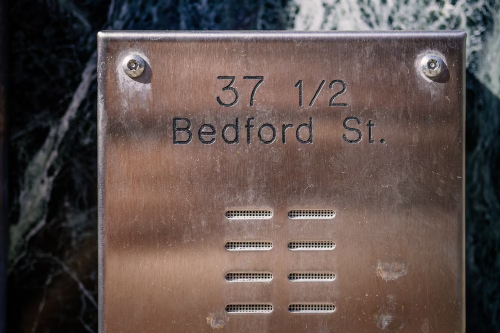
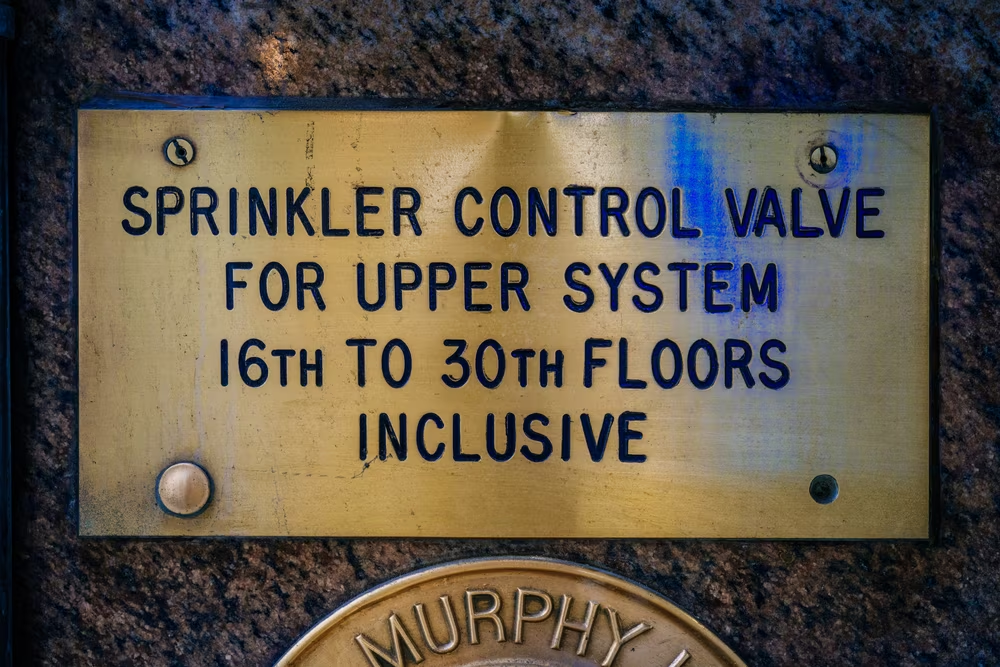
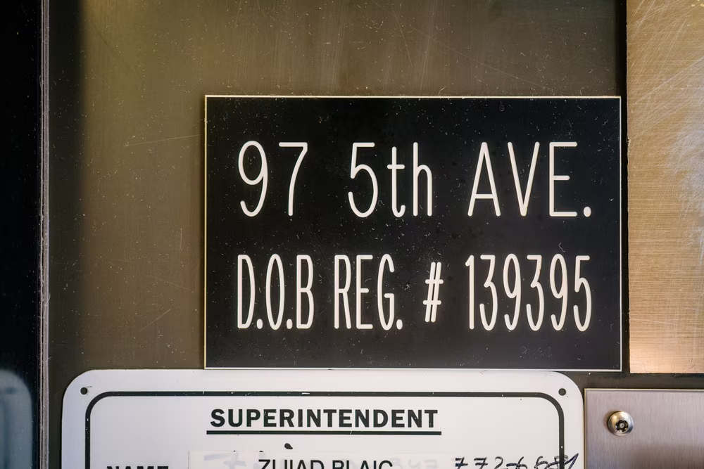
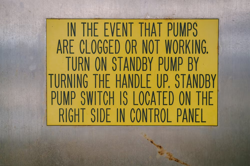
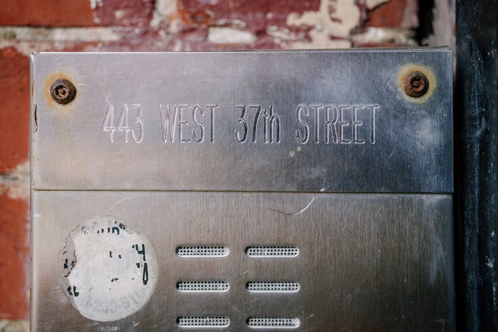
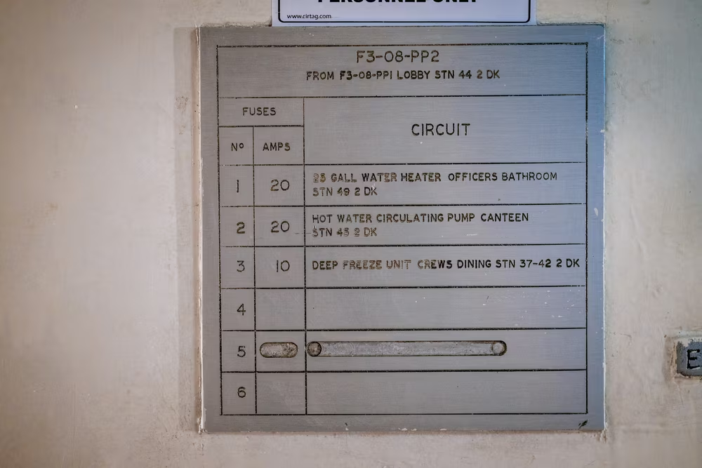
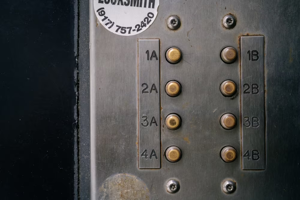
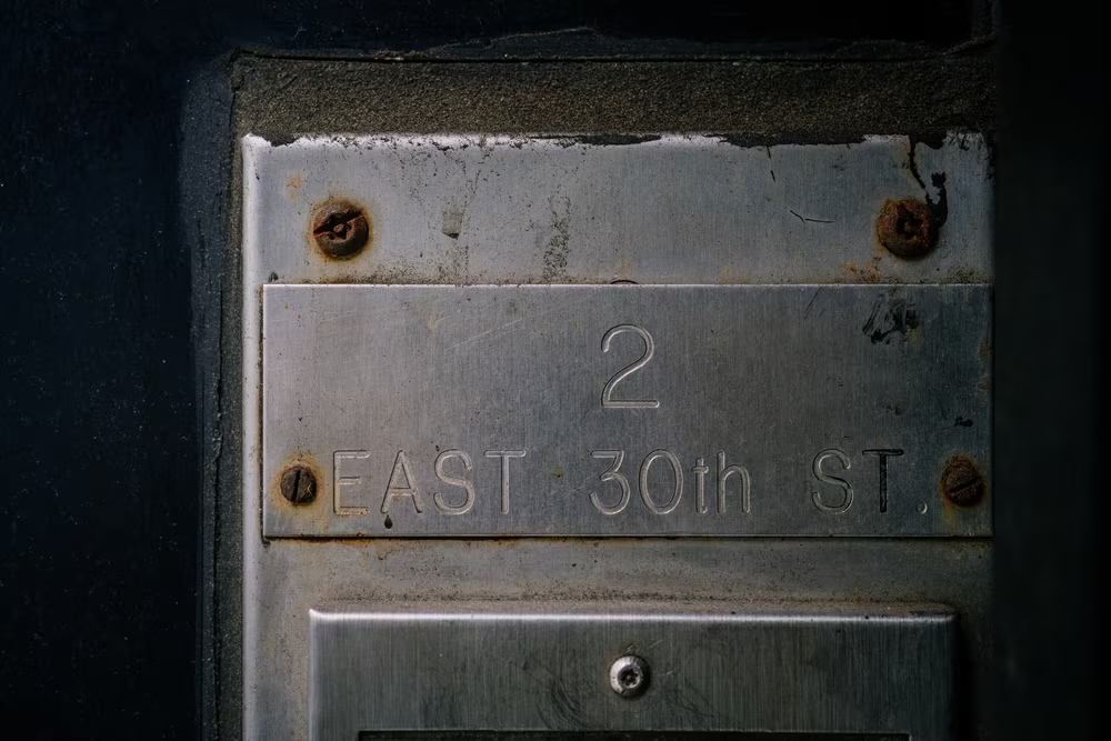
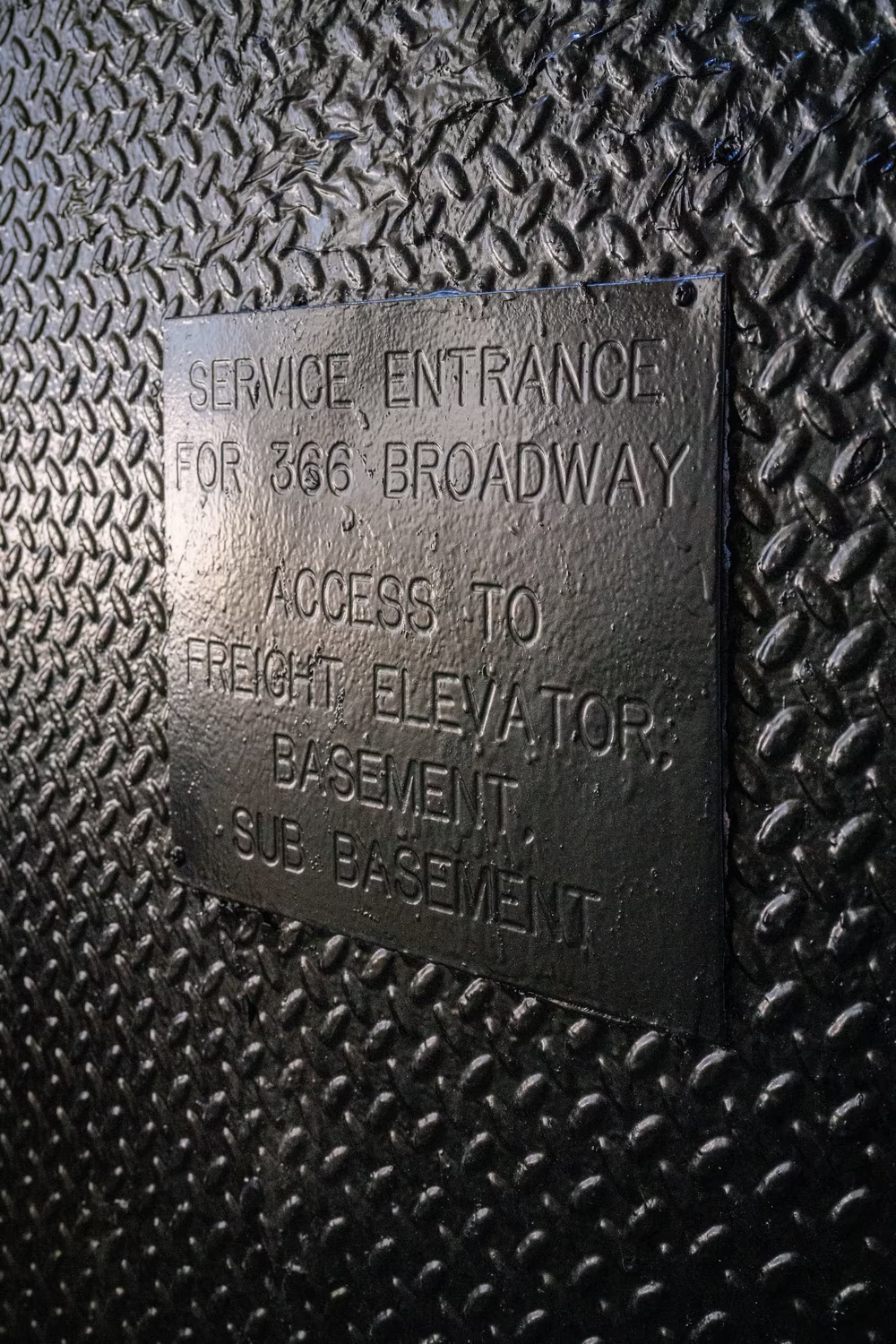
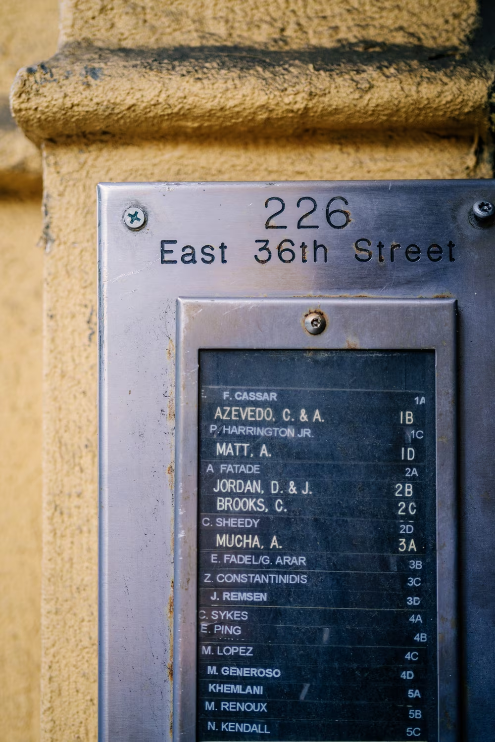
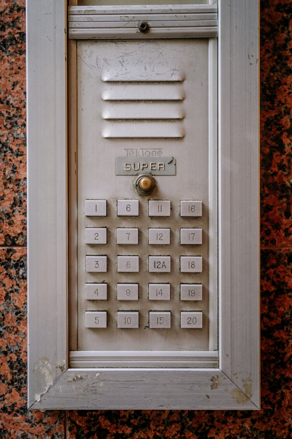
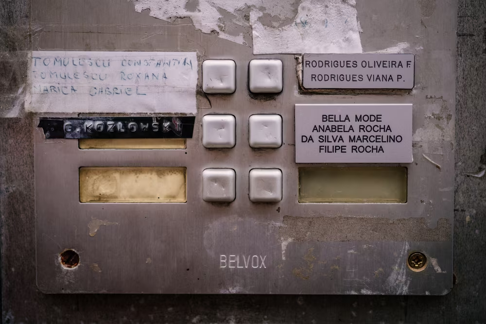
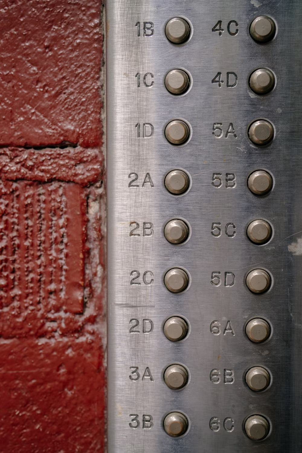
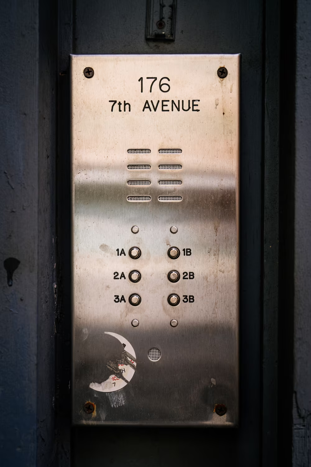
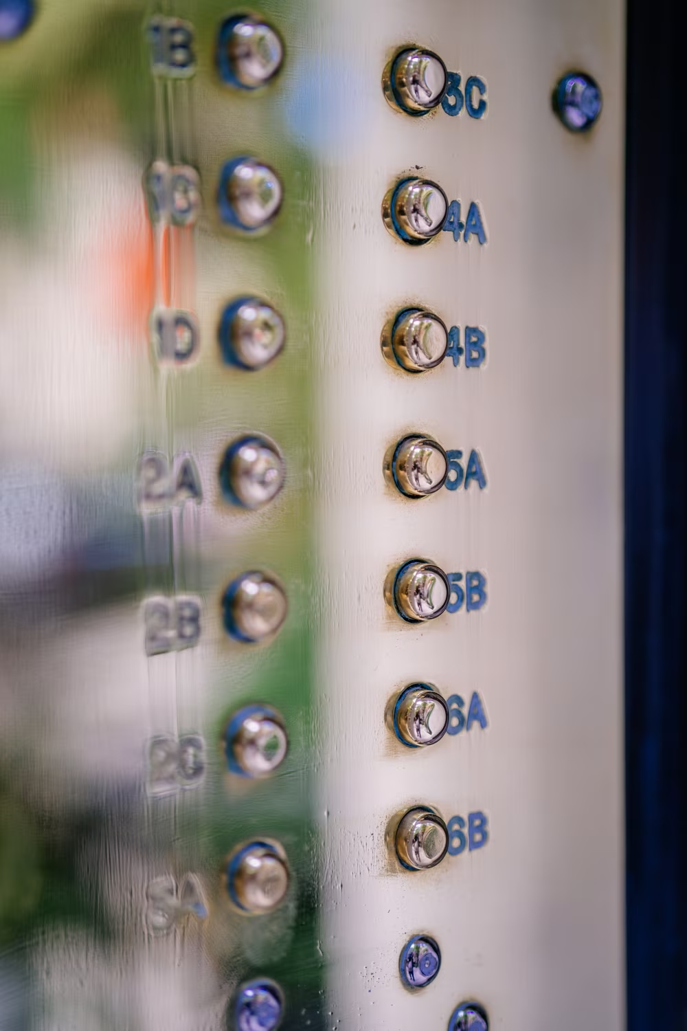
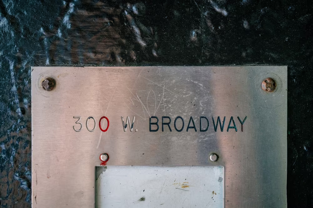
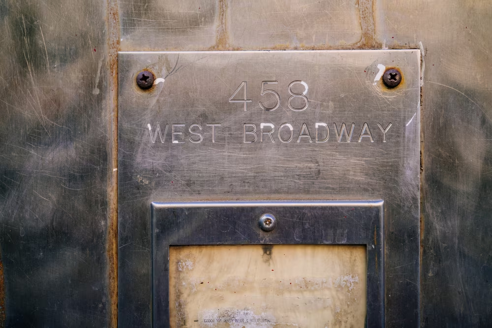
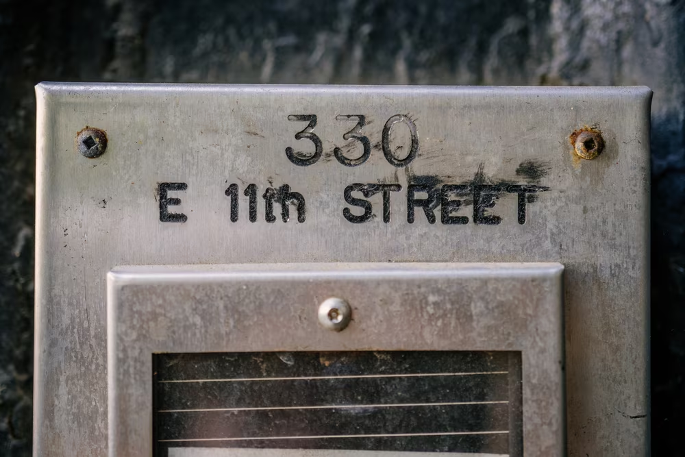
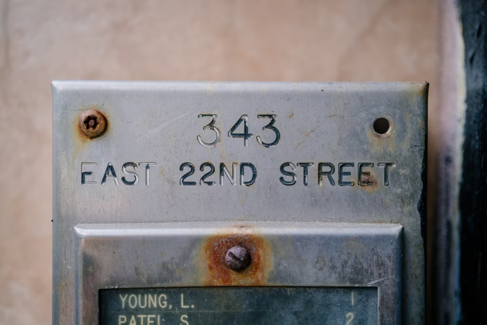
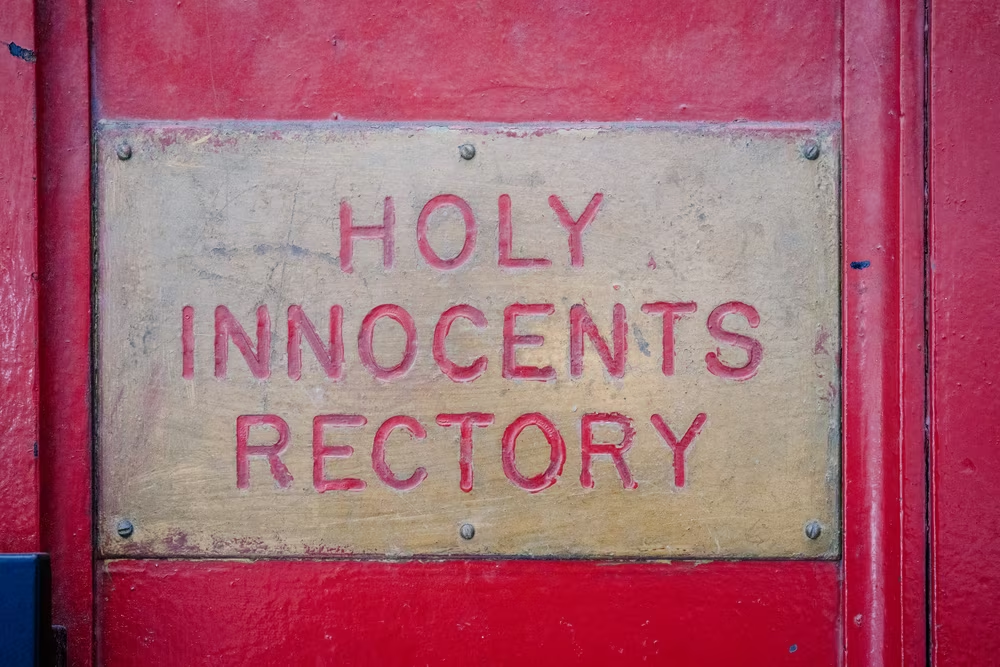
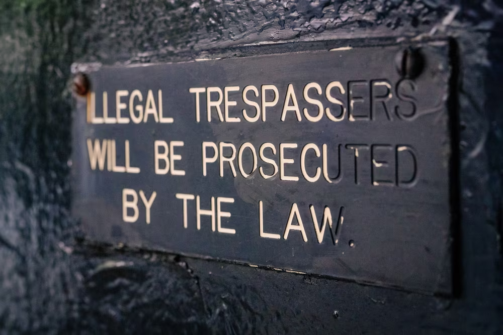
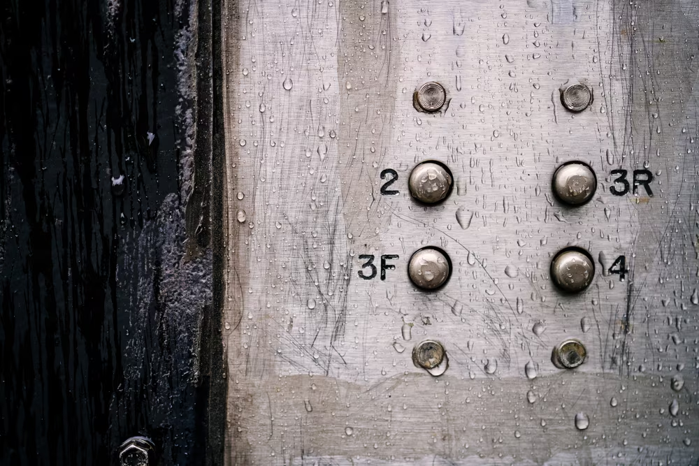
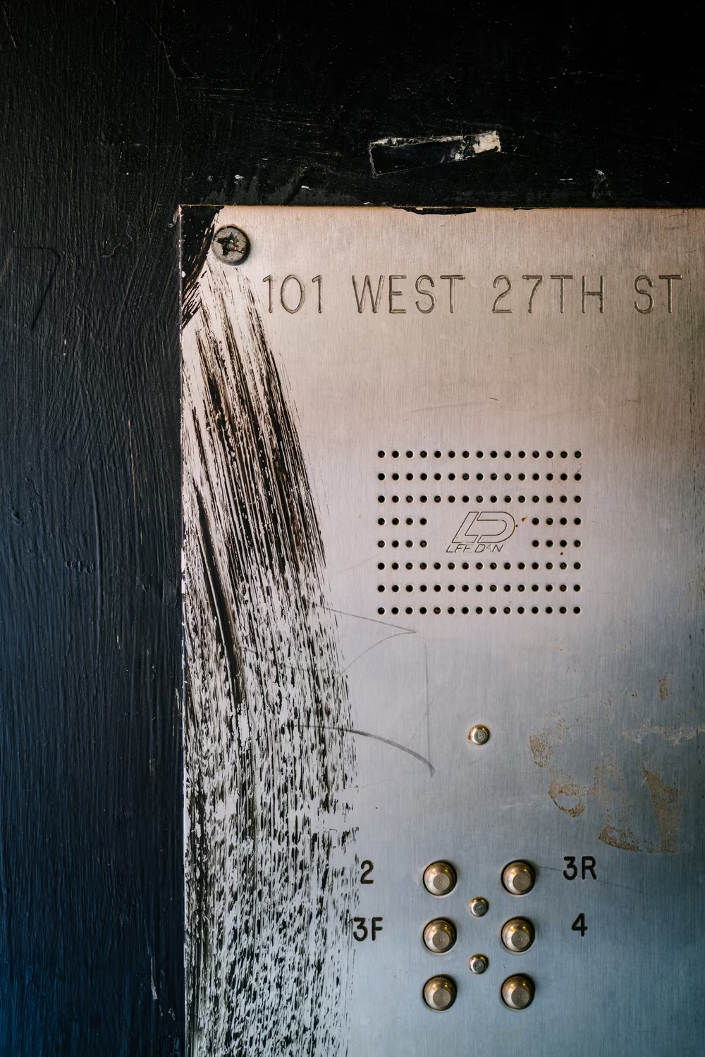
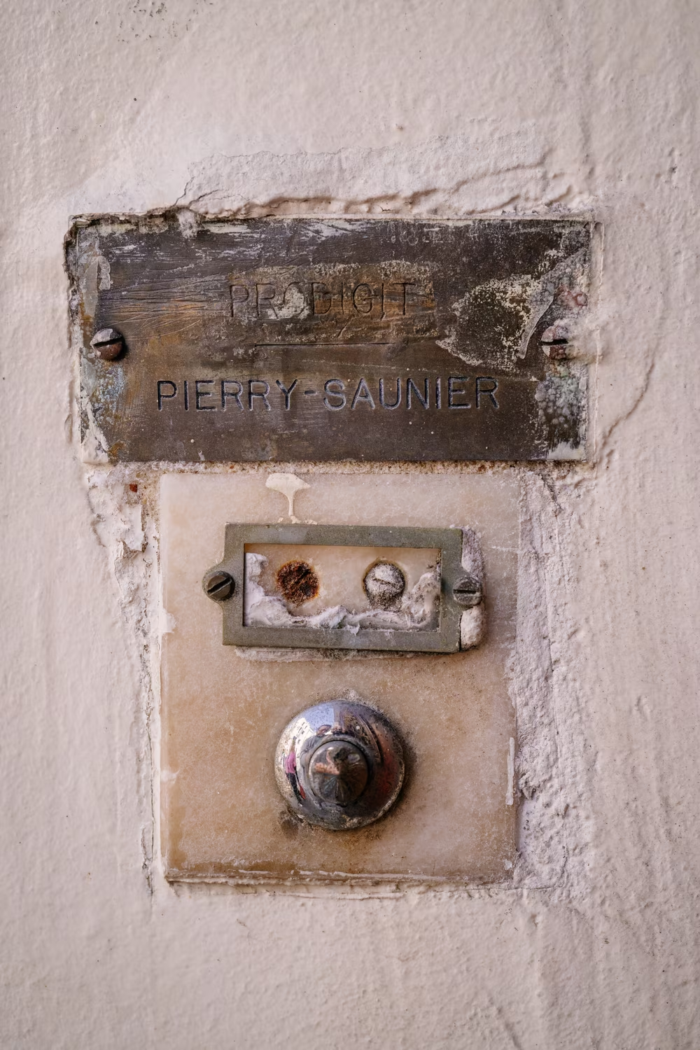
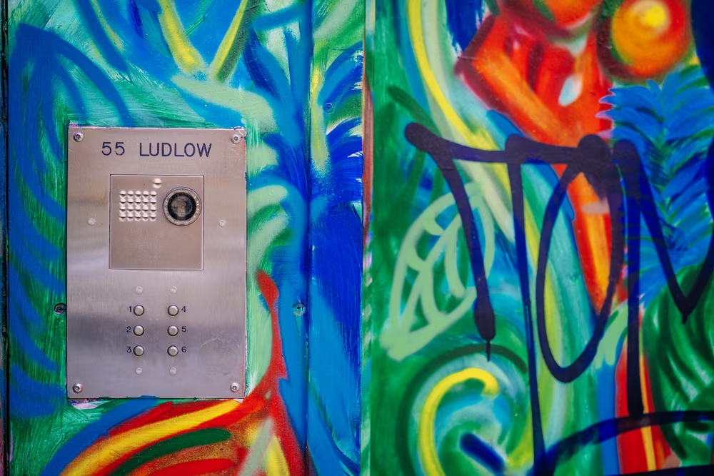
Gorton is everywhere in Manhattan. It’s there in the elevators, in the subway, on ambulances, in various plaques outside and inside buildings. And god knows it’s there on so, so many intercoms.


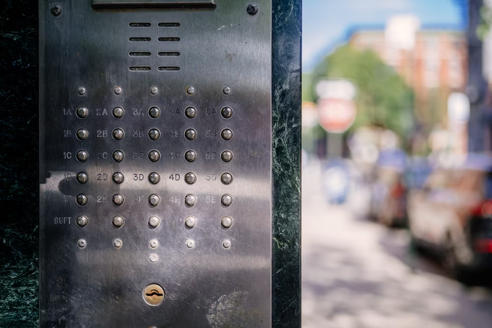
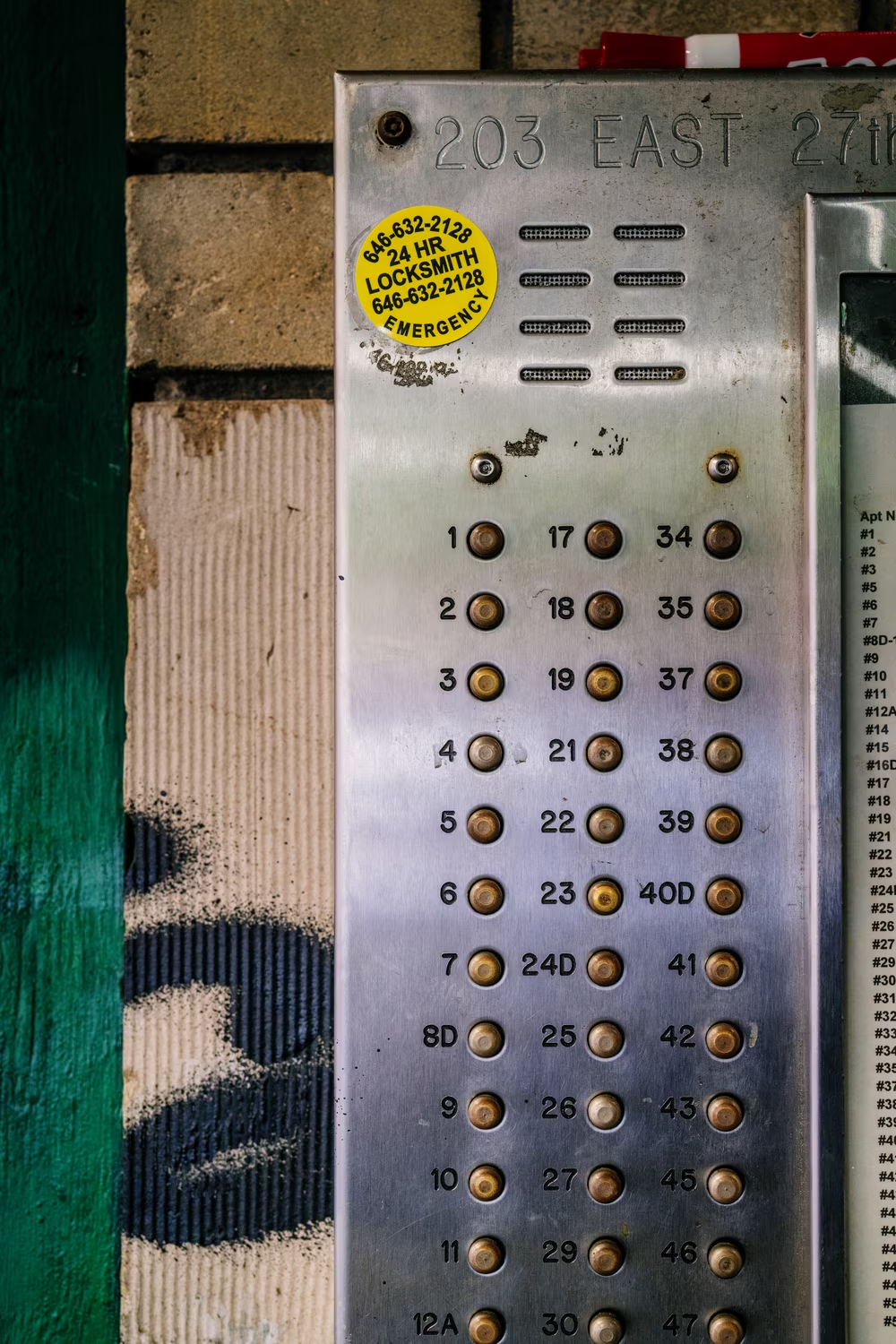
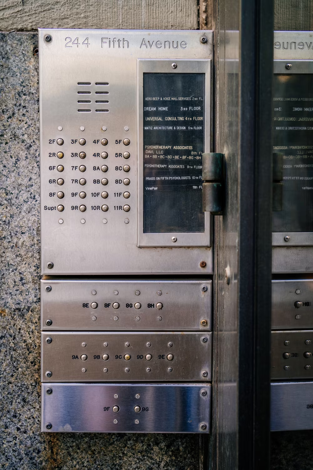
I wouldn’t be surprised if there weren’t a single block without any Gorton in a whole of Manhattan.
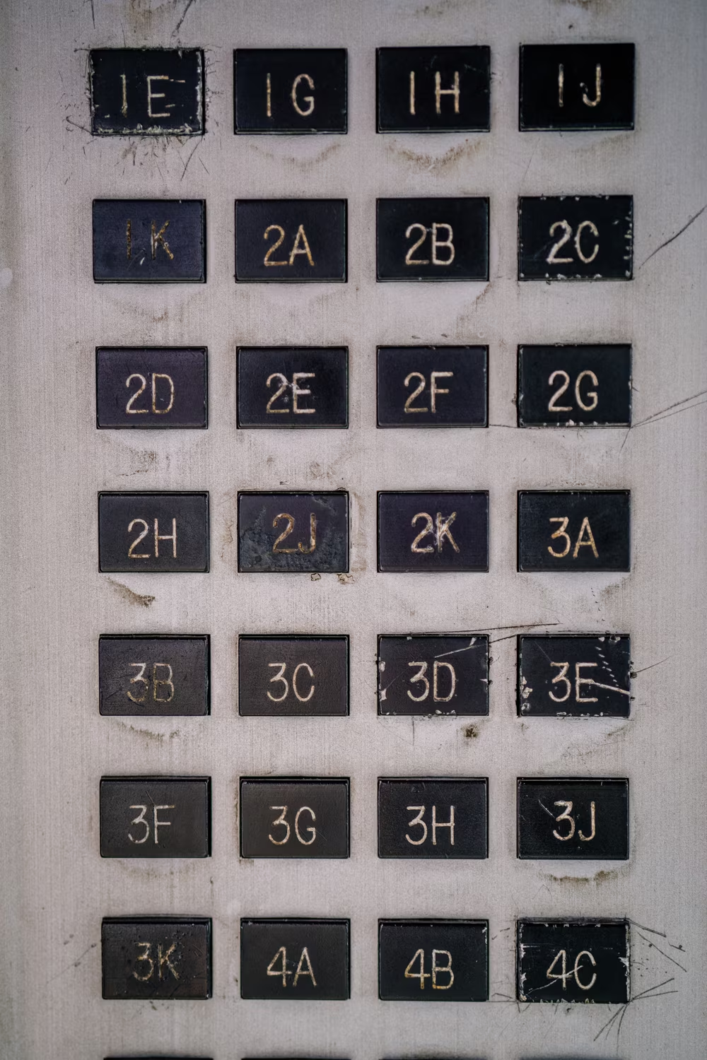
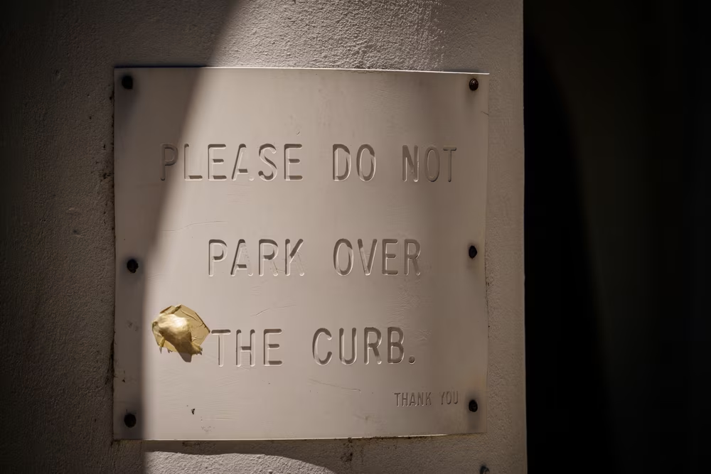
The omnipresence of Gorton makes it easy to collect all the type crimes layered on top of the font’s already dubious typographical origins. Walking through Manhattan, you can spot the abominable lowercase that should better be forgotten:
You can see all sorts of kerning mistakes:

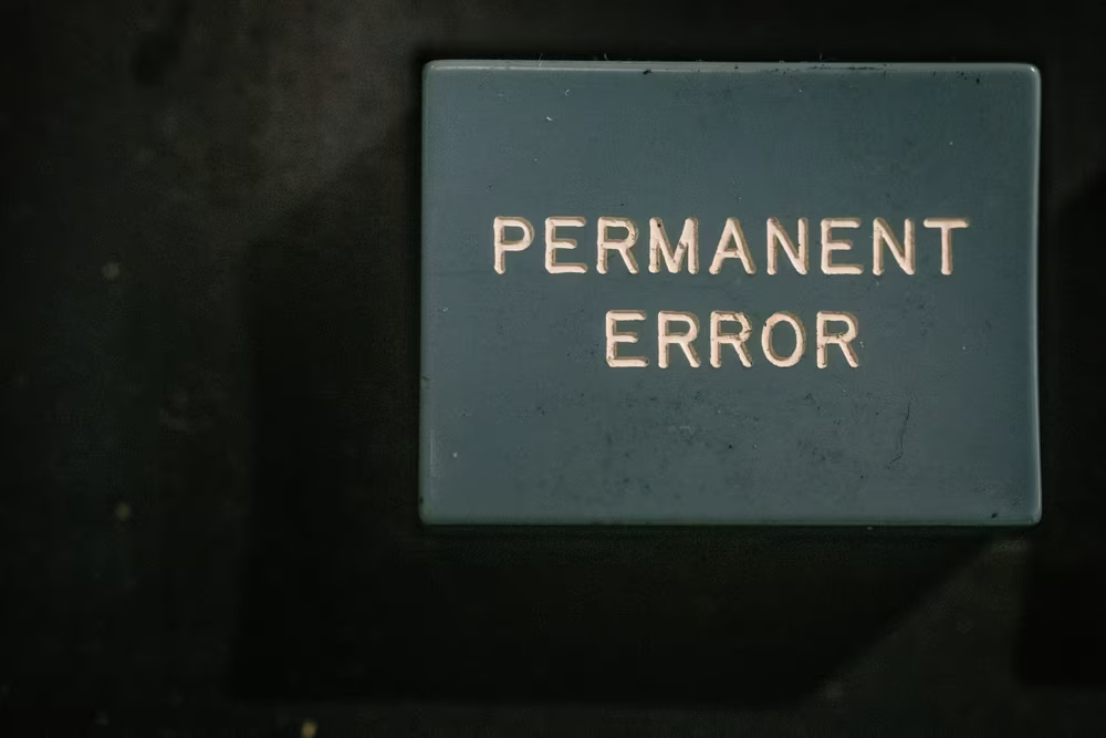
You will notice the many, many routing imperfections – an unfinished stroke, a shaky hand, or services of a pantograph that never felt the loving touch of regular maintenance:
There are all the strange decisions to haphazardly mix various styles of Gorton, or even to mix Gorton with other fonts:
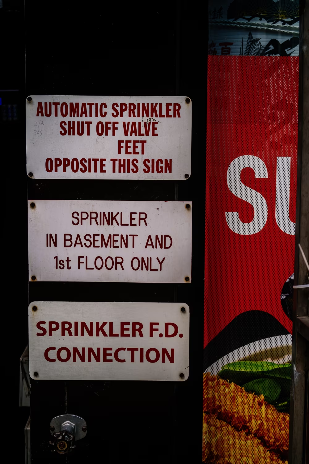
You can even spot reappearing strange characters like a weirdly deep 3, or a flattened 4:
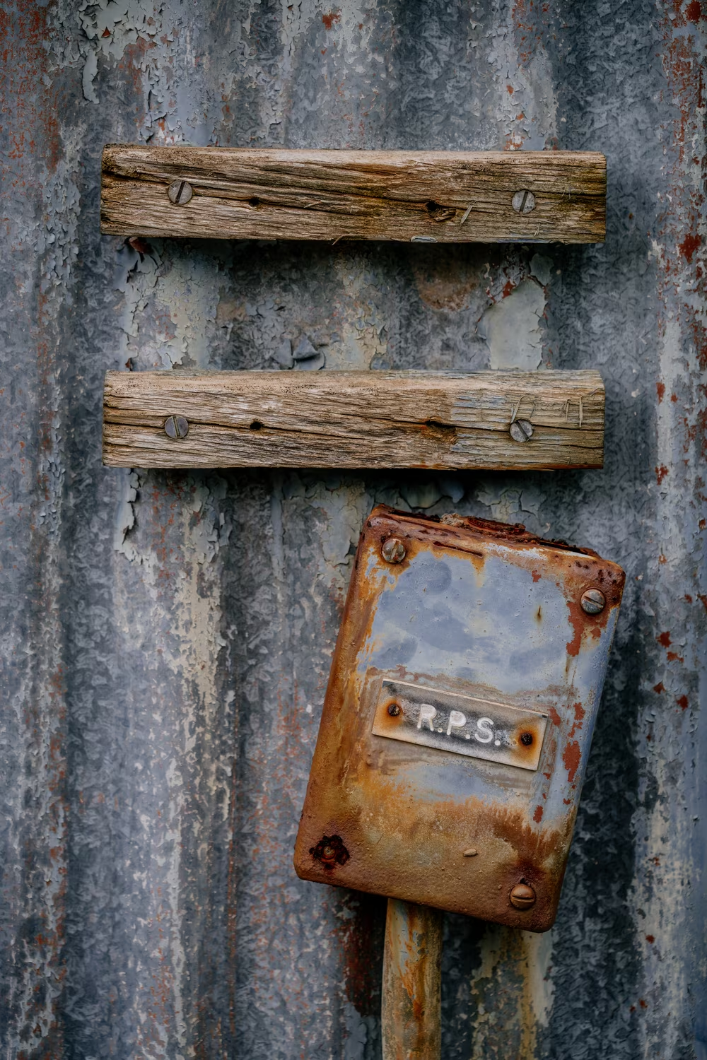
I wish I understood how they came to be, but I have a hunch. The nature of pantographic reproduction is that Gorton carved into metal is not that far away from the original Gorton font template you started with! So in addition to the George Gorton and Taylor Hobson originals, and the other named and above-the-table copies, they might have been bigger or smaller Gorton bootlegs. I have one myself, of unknown provenance and even more nameless than I thought possible for an already name-free font.
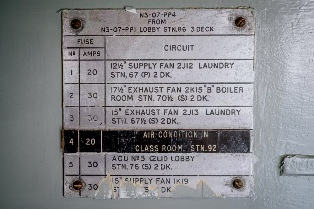
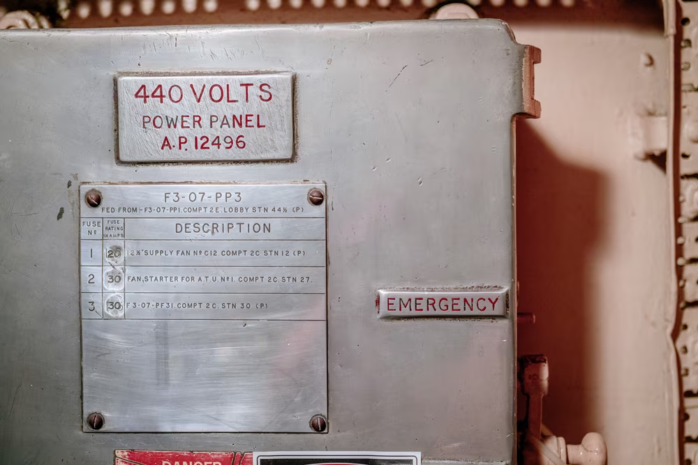
But New York Gorton holds pleasant surprises, too. Despite the simplicity of Gorton itself, the combinations of font sizes, cutter sizes, materials, reproductions, and applications can still yield some striking effects:
In a city that never sleeps, Gorton wasn’t allowed to sleep, either. Even in the richest and most glamorous neighborhoods of Manhattan, the font would be there, doing the devil’s work without complaining. Gorton made Gotham feel bougie; American Typewriter touristy.
And once in a while, I’d find Gorton that would wink at me with a story – followed by that aching in the heart as I realized I’d never know what the story was.
8
You’re not supposed to fall in love with an ugly font. No one collects specimens of Arial. No one gets into eBay fights for artifacts set in Papyrus. No one walks a hundred miles in a hot New York summer, sweating beyond imagination, getting shouted at by security guys, to capture photos of Comic Sans.
So why do I love Gorton so much?
The Occam’s Razor seems sharp on this one. Perhaps I like it because I’m a boy and Gorton is often attached to heavy machinery.
Or perhaps I have a strange affection to quirky hard-working fonts created by people who did not come from the world of type: the Toronto Subway font, London Underground font, or Computer Modern. (This essay is typeset in a strangely-spaced version of Century put together for Selectric Composer typewriters and recreated for on-screen use. If that didn’t bother you before, it will bother you through the rest of this article.)
But there must be more to it. Perhaps it’s all about the strange contrasts Gorton represents. The font is so ubiquitous, but also profoundly unrecognizable, sporting no designer and no name. Gorton is a decidedly toy-like, amateurish font deployed to for some of the most challenging type jobs: nuclear reactors, power plants, spacecraft. More than most other fonts, Gorton feels it’s been made by machines for machines – but in its use, it’s also the font that allows you to see so many human mistakes and imperfections.
Gorton is more forgiving of mistakes, anyway. The strange limitations of Gorton mean that some of the transgressions of other fonts don’t apply here. The monoline nature of the font means that messing with the size of Gorton is okay: Shrinking the font for small caps or superscript, for example, gives you still-valid letterforms, almost by accident.
Stretching or slanting Gorton is not as much a typographical crime as it would be with other fonts because you don’t stretch the tip of the router itself.
There are genuinely moments where I felt Gorton gave people freedoms to maul it decades before variable fonts allowed us similar flexibility. And on top of that, the simplicity of the letterforms themselves feels compatible with the typical naïveté of Gorton’s typesetting.
Sure, there are really bad renditions that are inexcusable. But most of the time, the imperfections and bad decisions are what makes Gorton come alive. They don’t feel like profound misunderstandings of typography, typesetting, or Gorton itself. They don’t feel like abuses or aberrations. No, they feel exactly how Gorton was supposed to be used – haphazardly, without much care, to solve a problem and walk away. (Later routing fonts copied Helvetica, but seeing Helvetica in this context with all the same mistakes grates so much more.)
The transgressions are not really transgressions. They all feel honest. The font and its siblings just show up on the job site without pretense, without ego, without wasting time on introductions. Gorton doesn’t aspire to be admired, celebrated, treasured; it’s meant to do some hard work and never take credit for it. It feels like it has always been a font, and never a typeface. (Depending on how rigid you are with your definitions, some versions of Gorton – especially those without instructions on how letters are positioned against each other – might not even classify as a font!)
And I think I love Gorton because over the years I grew a little tired of the ultra flat displays rendering miniature pixels with immaculate precision. With Gorton, carving into metal or plastic means good-looking fixes are impossible:

And unsurprising given its roots, Gorton has dimensionality that most fonts cannot ever enjoy: A routing tip picked in the 1980s and sun coming in from just the right angle forty years later can create a moment that thousands of letterpress cards could only dream of.
Perhaps above everything else, Gorton is all about texture.
Every kind of engraving has it, of course. But these are not precise submillimeter letters at the bottom of your MacBook Pro or Apple Watch. This is the utilitarian, often harried, sometimes downright careless Gorton, carved into steel of a mid-century intercom and filled in with special paste or wax, or put on an office placard made out of a special two-layer material made especially so engraving it reveals the second color underneath, without the need for infill.


(This is also true when it comes to the original reason I learned of Gorton. Letters on keycaps show the same artifacts – you just have to look very, very closely.)
That’s the last, and perhaps the best thing to fall in love with.
You won’t be able to fully appreciate it here, of course, but maybe this will give an approximation of how beautiful Gorton’s non-beauty can be:
9
This has been a strange thing to write. Gorton has been around for over 135 years and used in so many countries for so many reasons, and yet I found no single article about it.
I feel the burden of being an amateur historian, wanting to know and share so much more, but only being able to provide little. I don’t know the full extent of Gorton’s use. I don’t know who designed it. My chronology is rickety and pieced together from a few breadcrumbs. I dream of seeing the original drawings or drafts once laid on the tables of Taylor, Taylor & Hobson offices, or some notes, or some correspondence. I fear they might no longer exist.
Also, if part of the allure of Gorton is shying away from the limelight and not being admired, am I doing it a disservice by writing about it?
But mostly, I can’t shake the feeling that we all missed a window. That this essay can’t be just a celebration, but also needs to be the beginnings of a eulogy.
Walking around New York, you get a sense that even Gorton carved into metal can disappear. Some of the signs are rusted or destroyed beyond repair. Others get replaced by more modern, charmless equivalents.
Gorton itself is obsolete. All the keyboards that use Gorton Modified you can still buy new today are tipping a hat to nostalgia. The omnipresence of Gorton in New York City is already time shifted from its decades of glory, a simple confirmation of what Robert Moses knew so well: that once built, cities don’t change all that much. But few of the new placards use Gorton, and none of the new intercoms do.
Taylor, Taylor & Hobson went through multiple splits and mergers and survives as a subsidiary of Ametek, chiefly working on measuring devices. George Gorton Machine Co. from Racine has been bought by Kearney & Trecker, which became Cross & Trecker, was acquired by Giddings & Lewis, and then acquired again by ThyssenKrupp, but not before the Gorton branch was spun off as Lars, and in a sequence of events now resembling a telenovella, eventually bought by Famco in 1987. I do not believe any corporate grandchildren of TT&H and George Gorton’s company are today selling Gorton in any capacity.
It will take decades, perhaps even centuries, but one day the last of this font will be gone. The modern recreations (I eventually found quite a few) won’t help. They are perhaps all missing a point, anyway.
But there’s a somewhat silver lining. Yes, when Gorton is carved into fresh metal, there might be nothing more pretty than seeing its depths glistening in the sun.
But fresh, shining metal is at this point rare. Fortunately, the Gorton I love most is the weathered Gorton.
Manhattan’s tired Gorton is the best variant of Gorton: infill cracked by hot summers followed by frigid winters, the surface scratched by keys or worn out by many finger presses, the routing snafus meeting decades of wear and tear. Gorton’s no stranger to water, snow, rust, or dirt.
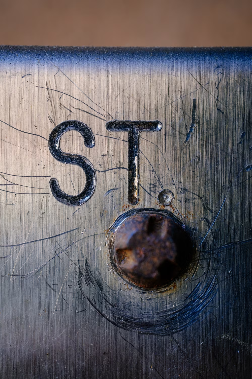

This is, perhaps, how you become gortonpilled. You learn to recognize the 7 with a crooked hook, the Q with a swung dash, the strange top-heavy 3, the simple R. You start noticing the endings of each character being consistently circular, rather than occasionally flat. A routing mistake, suspicious kerning, or the absence of lowercase are not a wrongdoing – they’re a confirmation.
You find yourself enchanted with how this simple font went so very far. And then you touch the letters, just to be sure. If you can feel them, chances are this is Gorton.